Outlook · Windows (Word engine)
Hero gradient that wouldn’t cover the block
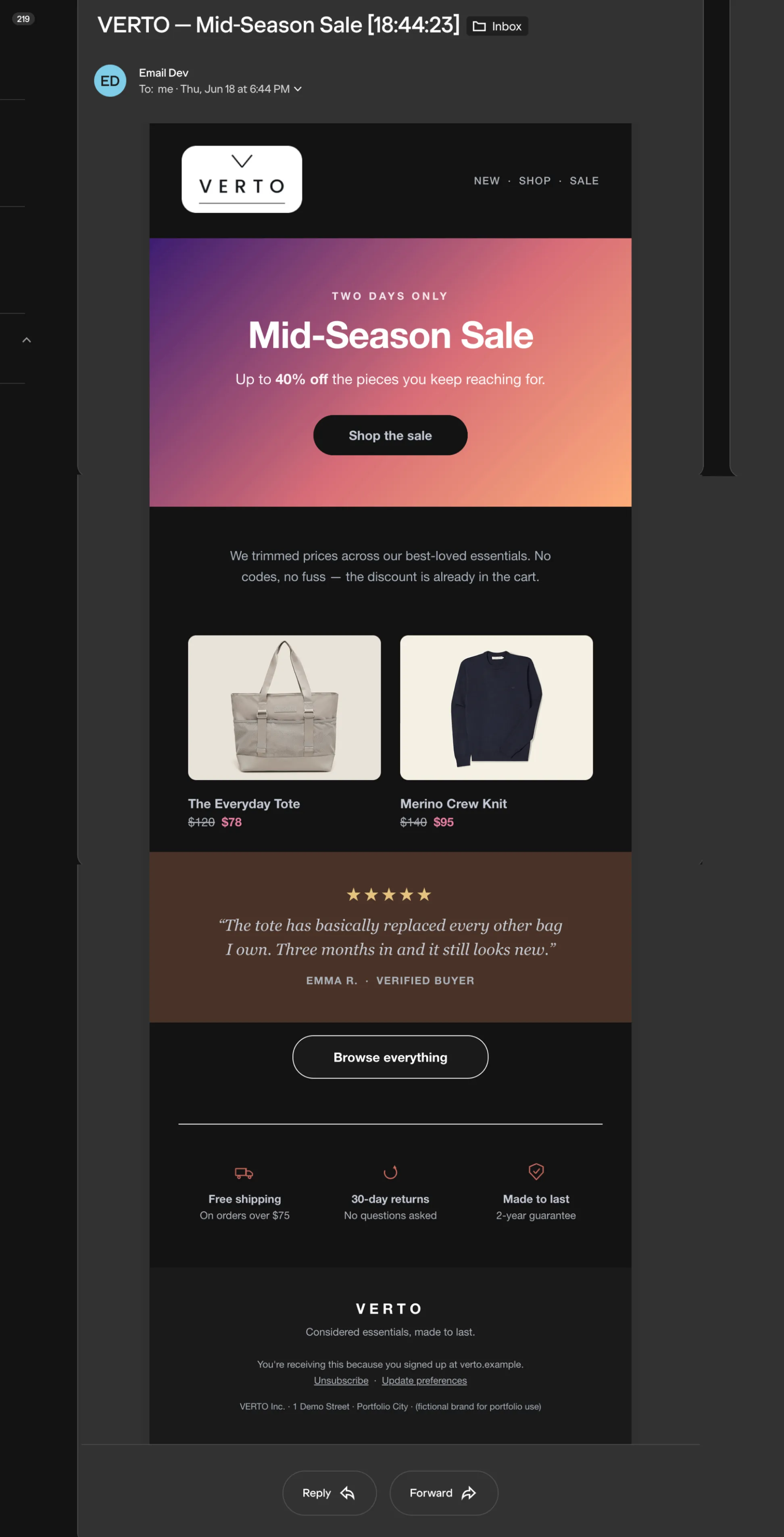
ProblemThe hero is a multi-stop gradient. Word ignores CSS gradients entirely, so Outlook needs a VML fallback.
Why it breaksA two-stop VML gradient bands visibly. And the inner padding cell carried a background-color, which Outlook paints over the VML fill — leaving only a thin sliver of gradient at the bottom edge.
The fixSwitch the VML fill from a gradient to a hosted image, keep color as the images-off fallback, drop the inner cell’s bg-color, and hide the wrapping <div> from Outlook so the content table sits directly inside the textbox and inherits an honest 600px width.
<!--[if mso]>
<v:rect fill="true" stroke="false" style="width:600px;height:360px;">
  <v:fill type="frame"
          src="https://pj-web.github.io/verto/assets/hero-gradient.jpg"
          color="#3a1c71" />  <!-- color = images-off fallback -->
  <v:textbox inset="0,0,0,0">
<![endif]-->
/* inner td.hero-pad: keep background-image (Gmail), remove background-color */
Outlook · Windows (Word engine)
A bulletproof button that stays the right size
ProblemThe CTA has to be tappable, centered, and correctly sized without relying on a background image.
Why it breaksheight + line-height drops the label to the bottom of the line-box in Word. And width / display / line-height on the <a> are ignored, so the cell collapses to the width of the text.
The fixSize the button with mso-padding-alt on the <td> (equal top and bottom), make the <a> an inline-block with matching padding, and set border-radius on both. Trade-off accepted: square corners in Outlook — legible and in place beats fragile rounding.
<td style="mso-padding-alt:15px 44px; border-radius:26px;
           background-color:#ffffff;">
  <a href="#" style="display:inline-block; padding:15px 44px;
     border-radius:26px; font-weight:700; color:#13151a;">Shop the sale</a>
</td>
Apple Mail · dark mode
The button surviving the dark-mode repaint
ProblemThe button’s background and rounded shape both have to survive the client recoloring the message in dark mode.
Why it breaksWhen the client fills the <a>’s background in dark mode, a missing border-radius on the <a> leaves a white square sitting on top of the rounded <td>. Separately, Apple clamps pure #ffffff to a darker tone in dark mode.
The fixPut border-radius on the <a> as well as the <td>; hold the button background on the <td> (Apple repaints td-backgrounds more predictably than inline <a> backgrounds); and use off-white #fffffe instead of #ffffff to slip past the white clamp.
@media (prefers-color-scheme: dark) {
  .btn-bg  { background-color:#fffffe !important; } /* not #ffffff */
  .btn-txt { color:#13151a !important; }
}
/* border-radius lives on BOTH the td and the a */
Gmail · dark mode (web / Android)
A logo that stays legible when Gmail darkens
ProblemThe wordmark has to read clearly after Gmail darkens the header background.
Why it breaksGmail supports neither prefers-color-scheme nor [data-ogsc] for swapping a light logo for a dark one, so the usual swap silently does nothing — the dark wordmark disappears into the dark background.
The fixDon’t rely on a swap. Ship a logo “chip” — the dark wordmark on a white rounded plate — that stays legible on any background, light or dark.
<!-- one asset, reads on any background; no swap needed -->
<img src="https://pj-web.github.io/verto/assets/verto-logo-chip.png"
     width="104" alt="VERTO">
Outlook · Windows (Word engine)
A two-column grid that stacks on mobile
ProblemA 2-up product grid on desktop that collapses to a single column on narrow screens.
Why it breaksA ghost <!--[if mso]><td> placed before the real <td> — without hiding the real one — makes Word see nested cells, which throws the column widths off.
The fixDrop the ghost cells, give the real cells a pixel width plus valign="top" (Word respects a pixel width), and let the mobile stack come from CSS: .stack-column{width:100% !important} beats the presentational width attribute.
<!-- no ghost td before the real one -->
<td width="264" valign="top" class="stack-column">...</td>
<td width="264" valign="top" class="stack-column">...</td>

/* mobile: CSS !important overrides the HTML width attribute */
.stack-column { width:100% !important; display:block !important; }