

Email marketing ROI gets cited constantly – the commonly referenced figure is $36-42 for every dollar spent, with Litmus and DMA both publishing data in that range. That’s real. But I’ve audited enough email templates over the years to know that a lot of campaigns are leaving most of that on the table, not because the offers are weak or the copy is bad, but because the design is actively working against the conversion goal.
Email design for conversions is a specific discipline. It’s not the same as “making emails look good,” though those goals overlap more than you’d expect. It’s about understanding how people actually engage with email – quickly, while distracted, often on a phone – and building the visual experience around that reality rather than around how the email looks in Figma.
These 12 strategies cover the fundamentals and some of the less-obvious technical details. Some of it is psychology, some is rendering constraints and client behavior, and some is just tested logic that holds up across different audience types.
Why email design determines your conversion success
Stanford’s Web Credibility Project (Fogg et al., 2003) found that 46.1% of people evaluate credibility based at least partly on visual design – layout, typography, color schemes. That research focused on websites, but the principle applies directly to email, arguably more so, because your email arrives without being requested. There’s a slight baseline skepticism from the moment someone opens it, and poor design confirms every suspicion they had about whether this email deserved their time.
Email design for conversions requires understanding three things that interact:
Cognitive load – Miller’s Law (1956) holds up in practice: the human brain processes about 7±2 pieces of information simultaneously. An email with too many competing elements – three CTAs pointing in different directions, a sidebar fighting the hero image, a promotional banner competing with the main offer – overloads the reader. The most common result is that they do nothing.
Visual hierarchy – where the eye goes first, second, third. This isn’t random; it’s engineered through size, contrast, spacing, and placement. Most poorly converting emails fail the simple test: “where should my eye go first?” There’s no clear answer.
Conversion psychology – specific design choices trigger specific decision-making responses. Color associations, urgency signals, social proof placement – these create conditions for action or remove friction from it.
The science behind email design for conversions
Understanding visual processing speed
Nielsen Norman Group’s eye-tracking research on email newsletters found that subscribers spend an average of about 51 seconds reading newsletters they’ve chosen to open. That’s the full read, and “reading” is generous – NNG’s own data shows that only 19% of newsletter recipients fully read the content. The rest scan.
Worth clarifying: those 51 seconds are total reading time, not impression formation time. Initial visual impressions form far faster – within milliseconds, based on visual processing research. By the time someone has consciously decided to read your email, their brain has already made a preliminary assessment of whether it looks credible and worth their attention. Your design either survives that assessment or it doesn’t.
During the scan phase – which is what most people are actually doing – two things direct behavior:
Pattern recognition – Western readers follow Z-pattern and F-pattern scanning. They don’t read linearly; they jump between visual anchors looking for the most relevant information. If your CTA isn’t a visual anchor, it gets skipped.
Contrast attention – high-contrast elements pull the eye. This is why your CTA button needs to stand out from the surrounding content. Not just aesthetically – functionally, because the reader’s eye is gravitating toward whatever breaks the visual pattern.
Color influences behavior throughout this process, though the precise percentages you’ll see cited in marketing content vary widely and often lack clear sourcing. What’s consistently supported by research: red creates urgency associations, blue builds trust, green connects to positive outcomes. The practical application matters more than memorizing percentage uplifts that may or may not apply to your specific audience.
Strategy #1: Master conversion-centered visual hierarchy
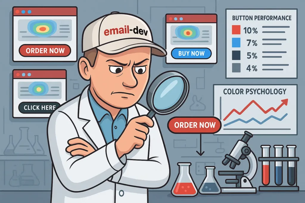
The inverted pyramid method
Email conversion rate optimization begins with structure, not aesthetics. The inverted pyramid is the most reliable framework for organizing email content around a specific goal:
Header section (top ~20%): value proposition, brand recognition, primary benefit statement. This is where you earn the next 30 seconds of attention.
Body content (middle ~60%): supporting evidence, social proof, feature explanations – everything that builds the case for action.
Action zone (bottom ~20%): primary CTA, secondary conversion paths, contact information.
The logic is filtering attention downward. By the time someone reaches the CTA, they’ve absorbed enough context to make a decision. A CTA that appears before you’ve given someone a reason feels pushy and gets ignored. One that appears after you’ve built the case gets acted on.
Research from Campaign Monitor consistently shows that clearly structured email content – with a defined hierarchy and a focused conversion path – outperforms disorganized layouts. The directional result is predictable even when specific percentage uplifts vary by campaign type.
Typography hierarchy in email design for conversions
Font sizing in email has to do real work, not just look proportional on a design canvas:
- Headlines: 24-32px – go smaller and you lose the visual weight that makes someone stop scanning
- Subheadings: 18-22px
- Body text: 14-16px minimum – 14px is the floor on mobile; anything smaller and you’re asking for pinch-zooming, which most people won’t bother doing
- CTA text: 16-20px
Line-height gets ignored more than it should. Body text needs at least 1.4-1.6 line-height in email – email clients handle line-height inheritance inconsistently, and tight text is harder to read on mobile regardless of font size. Small detail with a real readability impact.
Strategy #2: Leverage psychological color theory
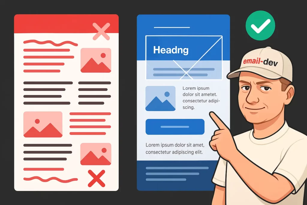
Primary color psychology for conversions
Color affects behavior – this is well-supported in psychology research – but the application in email design for conversions is more nuanced than any single rule suggests. Here’s what consistently holds up in practice:
Red: urgency, excitement, importance. Works for deadline-driven CTAs and limited-time offers. Where it fails: as a primary background color or when overused, it creates visual stress rather than motivation.
Blue: trust, reliability, authority. Consistently effective in B2B contexts and financial/healthcare verticals. If your audience makes considered, risk-aware purchasing decisions, blue in your CTA palette is typically a safe choice.
Green: positive outcomes, growth, approval associations. Works well for sign-up flows and anything framed as a beneficial action.
Orange: energy, enthusiasm, action. Tends to perform well in e-commerce CTAs – possibly because it reads as less corporate than blue and less aggressive than red. Strong in creative, lifestyle, and food/beverage segments.
Your A/B test results for color will vary by audience and context. These are tendencies based on research and observed patterns, not universal rules.
Strategic color application
80/20 principle: roughly 80% of your email using brand colors, 20% reserved for conversion elements. The contrast between brand context and conversion elements is what makes CTAs register visually.
Contrast ratios: minimum 4.5:1 contrast between text and background. This is both an accessibility requirement and a practical rendering consideration – CTAs need to read clearly on mobile screens in variable lighting.
Geographic context: color meanings differ across markets. Red reads as luck and prosperity in many Asian markets; as urgency or danger in most Western contexts. Worth considering if you’re sending internationally, though this doesn’t need to dominate your design process.
Strategy #3: Optimize mobile-first email design for conversions

Mobile conversion fundamentals
Somewhere between 40-55% of your emails are opened on mobile devices, depending on your list composition and industry. Litmus’ email client market share data consistently puts mobile opens at 41-47% for most commercial lists (pre-Apple Mail Privacy Protection data); consumer-focused brands skew higher. eMarketer’s 2023 data estimated 55%. The range varies, but the practical conclusion is the same: mobile is not an edge case. It’s where a significant portion of your conversions are happening or failing.
Mobile-first email design for conversions means:
Single-column layouts: multi-column email layouts that look clean on desktop frequently collapse unpredictably on mobile, particularly in older email clients. Single-column is safer and naturally focuses attention on the conversion path.
Touch target sizing: Apple’s Human Interface Guidelines and Google’s Material Design both specify 44-48px minimum for touch targets. Email buttons at 30px height might look fine on desktop but are genuinely difficult to tap accurately on a phone, especially for anyone with average-sized fingers.
Simplified choices: fewer decisions = higher conversion. One primary CTA per email is a reasonable target. If you have a secondary action, make its lower priority visible in the design – smaller, less contrast, clearly subordinate.
Progressive enhancement: design for mobile first, then layer in desktop enhancements. Building desktop-first and trying to strip down for mobile produces worse mobile results consistently.
Advanced mobile optimization techniques
Responsive typography: font sizes that work at 14px on mobile may benefit from scaling up for some audiences. Media queries let you control this for supporting email clients.
Load speed: images compressed below 100KB each, total file size ideally under 100KB. Emails that take more than 3 seconds to render lose readers on mobile – the patience threshold is lower on cellular connections than on desktop. A Litmus and Mailchimp joint study found that responsive design results in approximately a 15% increase in unique clicks for mobile users, which is a meaningful conversion difference at scale.
Thumb reach zones: if you’re designing for Apple Mail or modern mobile clients, primary CTAs that sit in the lower-center of the screen are naturally easier to tap than elements in the upper corners. Small consideration that costs nothing to apply.
Strategy #4: Perfect your call-to-action design

CTA design best practices
The CTA is where every other design decision either pays off or doesn’t.
Buttons vs. text links: Campaign Monitor’s research shows buttons outperform text links by an average of 28% in click-through rates, with higher gains on mobile. AWeber ran a more nuanced long-term test worth knowing about: over their first five split tests, buttons outperformed text links by an average of 33.29% in click-to-open rates. But over time, that advantage eroded – as subscribers got used to seeing buttons, text links occasionally won in later tests. The lesson isn’t “always use buttons” – it’s that contrast and novelty matter, and you should test periodically rather than assuming the same approach keeps winning indefinitely.
Action-oriented copy: “Get your guide,” “Claim your spot,” “Start free trial” – specific, benefit-oriented language consistently outperforms “Click here” or “Learn more,” which tell the reader nothing about what happens when they click.
Placement: primary CTA above the fold where possible, with a repeat lower in the email for people who scroll through before acting. The lower repeat doesn’t need to be identical – sometimes different framing catches people who needed more context first.
Visual isolation: your CTA needs to stand out through contrasting color, adequate sizing, and whitespace around it. A CTA button that blends into the surrounding design is a structural problem. No amount of copy optimization fixes it.
Advanced CTA optimization
Single CTA focus: WordStream’s research found that emails with a single, focused CTA increase clicks by 371% compared to emails with multiple competing calls to action. This is one of the most replicated findings in email marketing – fewer decisions, higher action rate. (Campaign Monitor has cited similar data.) If your email has four CTAs with equal visual weight, you’re splitting attention and reducing conversion on all of them.
Urgency in CTA copy: “Register by Friday” or “24 hours left” near CTA text increases clicks for offers with genuine deadlines. Don’t manufacture urgency that doesn’t exist – subscribers recognize patterns, and fabricated scarcity erodes list trust faster than it converts.
Personalized CTAs: dynamically adjusting CTA copy or context based on subscriber data – segment, behavior, purchase history – increases click rates. Experian’s research documented 6x higher transaction rates for personalized email experiences compared to generic sends (2014 study, still widely referenced; implementation quality matters significantly for results).
For longer emails, 2-3 CTA placements are reasonable as long as they have a clear visual hierarchy – one primary, others clearly secondary. What kills conversion is multiple CTAs competing for the same action at the same visual weight.
Strategy #5: Implement conversion-focused image strategy
Images in email design for conversions aren’t decoration. They either support the conversion path or distract from it.
Strategic image selection
Product-in-use imagery: products shown in context – being used by real people in realistic settings – tend to perform better for emotional connection than isolated product shots on white backgrounds. This isn’t universal – B2B SaaS often works fine with clean product screenshots – but for consumer goods and lifestyle brands, context adds relevance.
Directional cues: images where a person’s gaze or body orientation faces toward your CTA create a subtle visual guide. Small effect, but consistent, and costs nothing to apply when you have flexibility in image selection.
Emotional alignment: the feeling a hero image creates should match the emotional state you want when someone clicks. Happy outcome imagery for lifestyle purchases. Confident, competent imagery for professional services. The mismatch between visual emotional tone and CTA intent creates friction that’s hard to diagnose but real.
Brand consistency: dramatically different photography styles across campaigns create recognition problems. Consistent filtering, color grading, and compositional approach builds visual identity that subscribers recognize before they read a word.
Technical image optimization
File size: compress to under 100KB per image. Some email clients on cellular connections are genuinely slow to render large images, and that’s a direct conversion problem. I target 50-80KB for hero images using properly optimized WebP or JPEG with no visible quality loss.
Max width: 600px for the email canvas, which means sizing images at 2x for retina (1200px wide, displayed at 600px). Sounds counterintuitive, but this prevents blurry rendering on high-density screens without meaningful file size penalty when compression is applied correctly.
Alt text: include it for every image. Corporate email environments frequently block images by default. If your email doesn’t communicate the core message in HTML text (with descriptive alt tags for images), you’re invisible to a portion of your audience. Alt text is also a deliverability factor – spam filters look at image-to-text ratios.
Fallback planning: design so the content structure still makes sense with images disabled. An email that’s one large image with no HTML text is a single point of failure. Don’t build those.
Strategy #6: Master white space for conversion psychology
Strategic white space application
White space in email design for conversions isn’t minimalism for aesthetics. It’s functional.
CTA isolation: surround your primary button with meaningful whitespace – 30-40px on all sides at minimum. A button embedded in a text block is visually subordinate to the text. The same button with breathing room becomes the most prominent element in the section. VWO documented this with a case study showing that reducing clutter around a CTA increased one company’s conversion rate by 232% – a single-company result, but the directional principle is reliable.
Section separation: clear visual breaks between content sections help readers understand structure and prevent the “wall of content” feeling that causes premature exit before reaching your CTA.
Mobile adjustments: spacing that feels intentional on desktop often reads as cramped on mobile. Increase padding values for mobile via media queries where the client supports it.
Psychological impact of white space
Multiple UX research publications, including work from Wichita State University’s usability lab, consistently show that increased whitespace improves reading comprehension and reduces cognitive fatigue. The practical upside for email is straightforward: a reader who isn’t visually fatigued by the time they reach your CTA is more likely to act on it.
Perceived value signaling: generous whitespace is associated with premium positioning. Cluttered layouts read as low-budget regardless of content quality. If you’re selling something where trust and credibility matter at the price point, your email’s spacing is communicating something about your brand before the copy does.
Strategy #7: Optimize email width and layout structure
Optimal email dimensions
Desktop canvas width: 600-640px is the established standard, and it holds because of how email clients render within constrained window widths. Going wider creates horizontal scrolling issues in some clients; going narrower wastes screen real estate. 600px is the safest single number if you need to choose one.
Single-column mobile: your layout should collapse to a single column on narrow screens. Either build single-column by default (safest and most focused) or use hybrid techniques that manage column behavior without depending entirely on media query support – more on that in the compatibility section.
Content zones with defined purposes: divide your email into sections where each has one job. Hero zone, proof/content zone, CTA zone, footer. The more clearly you define this in the template architecture, the more consistent your campaigns become and the easier it is to diagnose what’s not working.
Advanced layout techniques
Modular design systems: build reusable content blocks – testimonial modules, product cards, CTA sections – that maintain consistency while allowing flexible assembly. This also speeds up production significantly and reduces the chance of layout inconsistencies across campaigns.
Grid alignment: use an underlying grid to align elements horizontally. Misaligned elements create visual noise that degrades perceived quality at a subconscious level. If you’re hand-coding, establish a 12-column or 4-column baseline.
Progressive disclosure: for emails with substantial content, structure information so the most essential points appear first. Give readers a reason to continue before asking them to read more.
Strategy #8: Leverage social proof for conversion boost
Social proof reduces the perceived risk of taking action. Nielsen’s “Trust in Advertising” research found that 92% of consumers trust peer recommendations over traditional brand advertising – a significant gap, and email is one of the better channels for placing social proof close to the conversion moment.
Effective social proof types
Customer testimonials: outcome-specific and detailed testimonials outperform generic praise. “I increased my open rates by 23% after restructuring my templates this way” carries more weight than “This was really helpful!” Photos and names when available – attributing testimonials to real, identifiable people increases credibility measurably.
Usage statistics: “Join 50,000+ subscribers” or “Used by teams at [recognizable company names]” – quantified social proof signals that others have made this decision before your reader.
Expert endorsements: third-party validation from recognized names in your industry, when genuine. Don’t manufacture these. The benefit of real endorsements is that they’re verifiable; fake ones get discovered.
User-generated content: actual customer photos, reviews, or screenshots work particularly well for consumer products because the authenticity is inherent in the format.
Strategic social proof placement
Adjacent to or just before your primary CTA: this is where social proof does the most conversion work. A well-chosen testimonial positioned directly before a signup button addresses last-minute hesitation at exactly the right moment.
Early in the email: establishing credibility in the first scroll can determine whether someone reads the rest.
Woven into benefit statements: integrating social proof into the narrative (“here’s what practitioners in your situation typically see”) reads more naturally than a separate testimonial block dropped in without context.
Strategy #9: Create urgency and scarcity elements
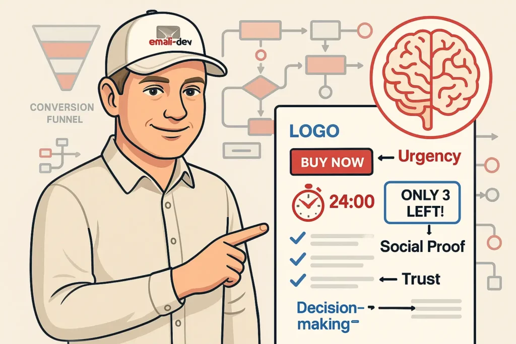
Urgency implementation techniques
Loss aversion is well-documented in behavioral economics – people respond more strongly to avoiding loss than acquiring equivalent gain. Urgency and scarcity work in email design for conversions because they activate this mechanism, and because email is a medium with a natural time dimension: it arrives at a specific moment.
Countdown timers: email-embedded countdown timers (tools like Litmus Personalize, Movable Ink, or Sendtric for simpler implementations) create visual urgency that static text doesn’t. They work for time-limited offers, event registration deadlines, and sale endings. The directional effect – timers increasing click rates on urgency-driven campaigns – is consistent across email marketing research, even if specific lift percentages vary by context.
Specific deadline language: “Offer ends Friday at midnight” is more effective than “Limited time offer.” Specific deadlines feel real because they are real. Vague urgency language has been overused enough that subscribers have developed resistance to it.
Availability indicators: “12 spots remaining” or “3 left at this price” when accurate and relevant.
Authentic scarcity strategies
Genuine inventory transparency: if you have limited capacity or stock, say so. This works better than manufactured scarcity precisely because it’s true and verifiable.
Subscriber-exclusive access: early access windows, subscriber-only pricing, or bonuses that expire create real scarcity without fabrication.
Time-sensitive bonuses: additional value included with purchase for a specific window – consultation calls, bonus content, expedited service.
One thing worth saying plainly: false scarcity – “only 3 spots left” for something with unlimited capacity – erodes list trust faster than it converts. Subscribers compare notes and check. Beyond the ethics of it, the long-term conversion cost of a damaged list relationship is greater than any short-term lift from manufactured urgency.
Strategy #10: Perfect cross-client compatibility

This is where I’ll spend the most time, because email client compatibility is where beautifully designed emails frequently fail in ways that nobody catches until after send.
Critical compatibility considerations
Email design for conversions principles mean nothing if your email renders broken in the clients your audience uses. Emails render across roughly 40+ different email clients, and each one handles HTML and CSS differently – sometimes dramatically differently.
Classic Outlook for Windows (2007-2021): uses Microsoft Word’s rendering engine – specifically Word 2007 – for HTML emails. Not a browser engine, not even a dated browser engine – Word’s document renderer. This means no CSS background images (use VML instead), no flexbox, no CSS Grid, predictable issues with margin and padding behavior, and a general CSS support level that’s stuck in 2007. This is why table-based layouts remain a baseline requirement in email development. However, Microsoft has been transitioning business users to the new Outlook for Windows since January 2025, and is ending support for the classic desktop versions using Word rendering in October 2026. The new Outlook uses a web-based rendering engine similar to Outlook.com, which supports considerably more modern CSS. If your audience is corporate, you may already be seeing rendering shifts.
Gmail: strips certain CSS from <head> and <style> blocks, particularly in the standard Gmail app. Partially supports media queries, which is usually sufficient for basic mobile adaptation. Inline styles survive significantly better than stylesheet-level styles in Gmail – this affects how you structure CSS in your HTML.
Apple Mail: the best CSS support of any major email client. Fully supports media queries, background images natively, and a substantial range of modern CSS properties. iPhone Mail is consistently one of the top email clients in open tracking data. The limitation: not everyone on your list uses Apple Mail, and you can’t depend on its CSS support as a baseline when other clients don’t match it.
Dark mode: roughly 35% of email users regularly use dark mode (Litmus data). Most email clients implement dark mode in ways that can invert or significantly alter your email’s colors if you haven’t accounted for it. Some clients do this aggressively; others don’t touch your CSS. At minimum, test in dark mode. Ideally, include prefers-color-scheme overrides in your CSS for clients that support it.
Technical implementation strategies
Progressive enhancement: start with a baseline HTML/table structure that works across all clients, then layer CSS enhancements for clients that support them. Don’t build for Apple Mail and try to degrade gracefully – it almost never degrades as gracefully as you hope.
Hybrid responsive approach: since classic Outlook doesn’t support media queries and Gmail only partially does, a pure media-query-only responsive approach will fail for a significant portion of your audience. The hybrid approach uses fluid percentage widths and max-width at the base level – making the layout adapt to different widths without media queries – then uses media queries to refine behavior for clients that support them. A two-column layout that stacks on mobile can be achieved this way, though it takes more table nesting than feels reasonable. That’s email development.
MSO conditional comments: Outlook-specific HTML goes inside <!--[if mso]>...<![endif]--> conditional comments that only classic Outlook processes. This is how you serve Outlook-specific VML background graphics or layout adjustments without affecting other clients.
Testing: Litmus and Email on Acid let you preview across 90+ client/device combinations. Given how many rendering environments your email needs to work across, testing only in your ESP’s preview window is genuinely insufficient for any campaign that matters. I’ve found rendering issues in Litmus testing that would have been invisible in any ESP preview – these are real bugs that affect real conversions.
Strategy #11: Implement advanced personalization
Personalized emails consistently outperform generic sends. Experian’s email personalization research documented 6x higher transaction rates for personalized emails compared to non-personalized campaigns (2014 study, widely cited and directionally consistent with subsequent research). Implementation quality matters – basic name personalization in a subject line produces a different result than behavioral targeting with dynamically adapted content.
Dynamic content strategies
Behavioral triggers: content based on what someone has actually done – purchased, browsed, clicked, abandoned a cart – is inherently more relevant than content based on assumed segment characteristics. Relevance drives conversion.
Geographic and time-zone targeting: adapting send time to local time zones increases open rates; adapting content and imagery to geographic context increases relevance.
Purchase history integration: product recommendations based on actual purchase behavior are among the highest-converting email content types in e-commerce. The recommendation is relevant by definition.
Lifecycle stage adaptation: what someone who just signed up needs to see is different from what a long-term subscriber needs. Treating them identically wastes the potential of both.
Technical personalization implementation
Merge tags: every major ESP provides merge tag functionality for inserting subscriber data – name, company, custom fields – into content and subject lines. Use them. Even basic name personalization has measurable effect when it’s not the only differentiation, and it’s essentially zero extra work.
Dynamic images: platforms like Litmus Personalize and Movable Ink support swapping hero images or product recommendations based on subscriber attributes or open-time context (time, location, device). More setup, more maintenance – but the conversion payoff on high-volume campaigns is documented.
Conditional content blocks: show different sections to different segments within the same template. Most major ESPs support this to varying degrees. It requires more QA time to verify all variations render correctly, which is easy to forget under deadline pressure. Build QA time into production schedules for conditional content campaigns.
Strategy #12: Master A/B testing for continuous optimization
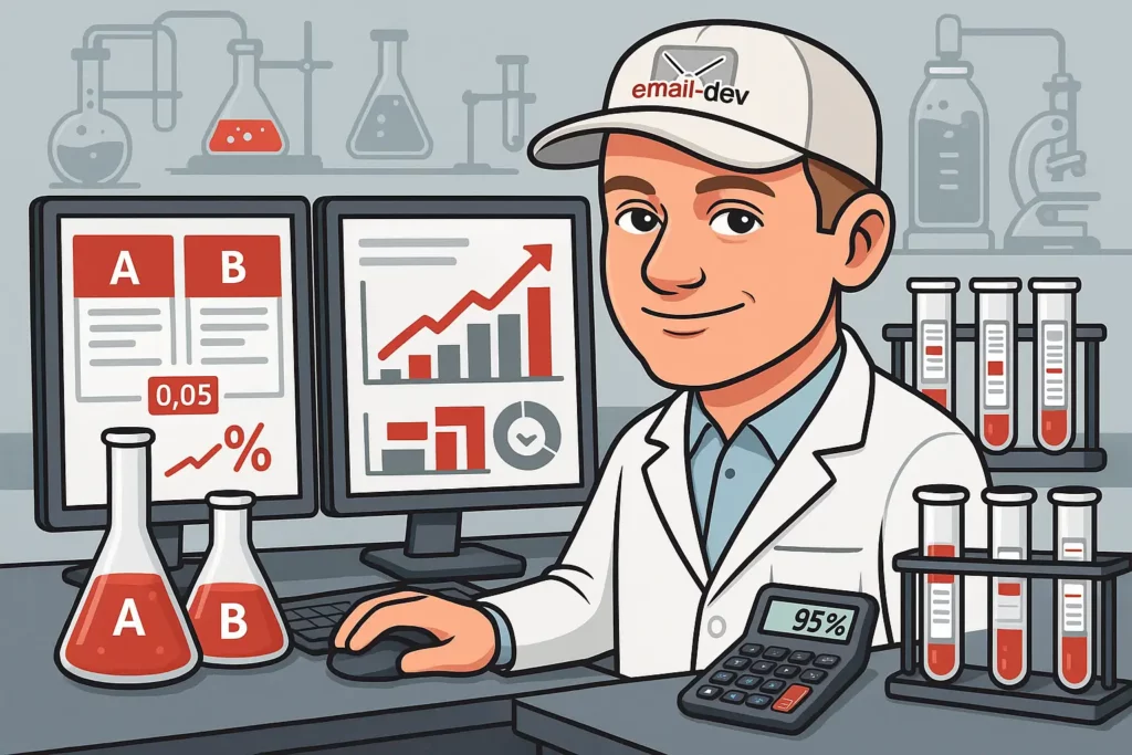
Email conversion rate optimization is iterative, not a one-time configuration. The email designs that perform best over time are the ones that have been tested and refined, not the ones that were designed most carefully.
Essential testing elements
Subject lines: length, tone, personalization, emoji usage, question vs. statement format, urgency vs. curiosity framing. Subject lines affect open rates, which affect the denominator of everything else.
Send timing: different audiences have different peak engagement windows. B2B audiences often engage during business hours Tuesday-Thursday; consumer audiences can look completely different. Test with your actual list rather than applying industry generalizations.
CTA variations: button color, copy, placement, size. Test one variable at a time if you want clean, actionable results.
Layout and structure: single-column vs. two-column, hero image vs. no image, long-form vs. short-form. These bigger tests require larger sample sizes to produce meaningful data.
Advanced testing strategies
Statistical significance: I see tests called at 200 sends. That’s not enough. For meaningful conversion data, you typically need 1,000+ recipients per variation, and you’re looking for at least 95% confidence before drawing conclusions. Anything below that threshold is noise that can mislead future decisions.
Segment-specific testing: what works for a re-engagement segment may actively underperform for new subscribers. Running tests across your full list and applying universal conclusions can reduce performance for specific segments. Test within segments when volume allows.
Multivariate testing: testing multiple elements simultaneously requires much larger sample sizes to isolate individual effects. For most email programs, single-variable A/B testing is more practical and produces more actionable data. Multivariate is worth pursuing when you have consistent volume that makes it statistically feasible.
Revenue-level tracking: a CTA color change that increased clicks by 8% is less useful if revenue per email went down. Track conversion completion, revenue, and downstream behavior – not just opens and clicks.
Measuring conversion success: key metrics and KPIs
Primary conversion metrics
Click-through rate (CTR): the percentage of recipients who click any link. A baseline engagement metric, but doesn’t tell you whether those clicks resulted in the action you wanted.
Conversion rate: the percentage of recipients who complete the desired action – purchase, sign-up, download. This is the metric email design for conversions actually optimizes for. Everything else is a proxy.
Revenue per email: total revenue generated divided by emails sent. Normalizes comparisons across campaigns of different sizes and evaluates design changes in terms that business stakeholders actually care about.
List health indicators: unsubscribe rate, spam complaint rate, re-engagement rate. Design decisions affect these too, particularly aggressive urgency and scarcity tactics. A design that lifts short-term conversions while damaging list health is trading future revenue for present-day numbers.
Advanced analytics considerations
Mobile vs. desktop conversion comparison: if your mobile open rate is 50% but mobile conversion rate is 15% of your desktop rate, you have a specific mobile design problem worth diagnosing. The gap between mobile open rate and mobile conversion rate is one of the more useful diagnostic signals in email analytics.
Time-to-conversion: how quickly after an email open does conversion happen? If most conversions happen within an hour of open, urgency and timing are high-leverage. If conversions spread over several days, retargeting sequences and multi-email flows matter more.
Multi-touch attribution: email rarely works in isolation. Understanding how email contributes to conversion paths that also involve paid, organic, or direct channels prevents both over-crediting and under-crediting its contribution.
Common email design for conversions mistakes to avoid
Design-related conversion killers
Too many competing CTAs: four CTAs with equal visual weight creates decision paralysis. Pick a primary action, make it visually dominant, subordinate everything else clearly.
Poor mobile experience: non-responsive layouts, sub-44px touch targets, 12px body text. Given that 40-55% of your audience is on mobile, this isn’t a minor edge case.
No clear visual hierarchy: if there’s no obvious answer to “where should my eye go first?”, the email has failed its basic structural job before a word of copy is read.
Brand inconsistency: visual elements that don’t match your website or other communications increase cognitive friction and reduce trust. This includes color palette, typography choices, and photography style.
Technical conversion blockers
Slow rendering: emails that take more than 3 seconds to fully render in a mobile client lose a meaningful percentage of readers before they see your content. File size and image compression matter.
Broken links: a CTA link that 404s is a complete conversion failure. Test every link in every email before send, from mobile, not just desktop. Link parameters get dropped sometimes on mobile; it’s worth checking.
Accessibility failures: poor color contrast, missing alt text, font sizes below 14px – these exclude real subscribers who want to convert but can’t interact effectively with your content.
Spam filter triggers: certain design choices increase spam placement rates – all-image emails with minimal HTML text, broken HTML structure, specific keyword patterns. Getting to the inbox is the prerequisite for everything else in this article.
Future trends in email design for conversions
Emerging technologies
AMP for Email: allows interactive elements within email – carousels, form submissions, live content, shopping cart interactions – without leaving the inbox. Gmail, Yahoo, and Mail.ru currently support it. Adoption is slower than the technology’s potential because it adds development complexity and requires maintaining separate AMP versions alongside standard HTML. For the right use cases – e-commerce product browsing, survey collection, appointment booking – the conversion potential is real and distinct from what standard HTML email can do.
AI-assisted personalization: machine learning for real-time content optimization is already in production at platforms like Movable Ink and Litmus Personalize, and is becoming accessible at lower price points. Real-time dynamic content based on open-time signals (location, device, time of day, even weather) is increasingly practical for mid-market email programs.
The Outlook transition: Microsoft’s move away from the Word-engine rendering model in classic Outlook – with the new Outlook for Windows rolling out to business users from January 2025 and support ending for classic versions in October 2026 – is the most significant rendering change in email client history for enterprise audiences. The new Outlook uses a web-based engine similar to Outlook.com, meaning far better CSS support. This will gradually reduce the constraints that have made email development unnecessarily complex for 15 years.
Design evolution trends
Dark mode as standard: designing explicitly for dark mode, rather than treating it as an afterthought, is moving from differentiator to baseline expectation. The prefers-color-scheme media query and targeted dark mode CSS should be standard in any template built today.
Accessibility as conversion strategy: proper contrast ratios, semantic HTML structure, responsive text sizing – these were sometimes treated as compliance issues separate from conversion goals. They’re not. Accessibility and conversion optimization have substantial overlap: both require clear hierarchy, readable text, touch-friendly targets, and reliable rendering.
Focused minimalism: the trend toward cleaner, more deliberately sparse email designs isn’t aesthetic preference – it’s functional. Less visual competition means clearer conversion paths. This is compounding with mobile-first constraints, which naturally push toward simplification.
Your next steps to conversion success
Email design for conversions is not a one-time project. It compounds over time as you test more, learn more about what your specific audience responds to, and refine your template system into something that works reliably rather than being rebuilt from scratch each campaign.
Start with structure: visual hierarchy, mobile optimization, CTA design. Get those working consistently before adding complexity. Then test systematically – one variable at a time, with sample sizes large enough to produce signal rather than noise, tracking actual conversions rather than just opens and clicks.
The cross-client compatibility work gets underweighted because it isn’t glamorous. Nobody gets excited about MSO conditional comments or VML background images. But a perfectly designed email that renders broken in classic Outlook 2019 for 30% of your list is a conversion problem that psychology and color theory won’t fix. Test in real clients, not just your ESP preview. Tools like Litmus and Email on Acid exist specifically because that’s necessary.
Keep the Outlook transition on your radar. The October 2026 deadline for classic Outlook means email development constraints will shift meaningfully for corporate audiences. If you’re building template systems now, design them to be maintainable as that transition happens.
Everything else in this guide – the psychology, the personalization, the testing strategy – has more impact when the technical foundation is solid. That sequence isn’t glamorous either, but it’s the sequence that works.
Footnotes
- Stanford Web Credibility Project (Fogg et al., 2003) – https://en.wikipedia.org/wiki/Stanford_Web_Credibility_Project
- Nielsen Norman Group email newsletter eye-tracking research – https://www.nngroup.com/articles/email-newsletters-inbox-congestion/
- Mobile email open rate data: Litmus email client market share (41-47% mobile, pre-MPP); eMarketer 2023 (55% estimate). Range varies by list composition and industry.
- Litmus and Mailchimp, “The Science of Email Clicks: The Impact of Responsive Design & Inbox Testing” (2014) – responsive design resulting in ~15% increase in unique mobile clicks
- Campaign Monitor on single CTA vs. multiple CTAs (371% more clicks): https://www.campaignmonitor.com/resources/knowledge-base/do-ctas-help-to-improve-email-response-rates/
- WordStream single CTA study (371% clicks, 1617% sales): https://www.wordstream.com/blog/ws/2014/10/09/call-to-action
- AWeber buttons vs. text links split test: https://blog.aweber.com/case-studies/buttons-vs-text-links.htm
- Experian email personalization (6x transaction rates): Experian “Email Personalization Study,” 2014
- Nielsen “Trust in Advertising” (92% trust peer recommendations), 2012
- VWO case study (Open Mile, 232% conversion increase from reduced CTA clutter): referenced via VWO case studies
- Microsoft Outlook transition timeline: new Outlook rollout to business users began January 2025; support ending for classic Word-engine desktop versions October 2026