

I keep having the same conversation with course creators and marketers who come to me after a campaign falls flat. The email looked good – they checked it in their ESP’s preview, it matched the brand guide, the images were sharp. And still, low clicks, low purchases, confused subscribers. The design looked fine. So what happened?
Usually it’s not a rendering bug, not a broken button. It’s a structural problem – the kind that’s invisible until you think about how someone actually reads an email on a phone while doing something else. Email design as a visual discipline and email design as a functional discipline are two completely different things, and most templates are built by people thinking about the first one when the second one is what actually drives results.
This article is about the second kind.
The brutal truth about email scanning patterns

Subscribers don’t read your emails – they scan them, and if nothing catches in the first few seconds, they’re gone. This is not a provocative claim, it’s just documented user behavior.
Nielsen Norman Group’s eyetracking research, which started in 2006 with 232 users viewing thousands of web pages and has been updated multiple times since, identified an F-shaped scanning pattern as the dominant behavior in text-heavy content: readers tend to read across the top, scan a shorter horizontal pass lower down, then drop down the left side in a vertical movement – reading progressively less as they go. The original research was on web pages, not emails, but the pattern gets applied to email by most practitioners, and there’s enough parallel logic there to make it worth understanding: people tend to give disproportionate attention to the top of a layout and to content along the left side.
What this means in practice:
- Your headline, opening line, and value proposition need to land at the very top – not below a large image, not after a navigation menu, at the top
- Left-aligned text is generally easier to scan than centered text because it aligns with the natural reading path in left-to-right languages
- CTAs buried below lengthy copy get seen far less often than ones placed early
The part that bothers me when I look at other people’s templates: the most visually “premium” element is usually the hero image, and it almost always sits exactly where the headline should be. The reader’s eye hits a large decorative photograph, gets no information from it, and is already deciding whether to scroll or close. That’s a design problem, not an aesthetic failure.
Mobile email design: the reality most designers ignore

Depending on your industry and audience, somewhere between 55% and 65% of your email opens are probably happening on mobile – HubSpot’s 2025 data puts it at 65% across industries, while eMailMonday’s research suggests the range runs from 26% to 78% depending on email type and target demographic. Since Apple’s Mail Privacy Protection rolled out in September 2021, open-tracking data became considerably less reliable anyway (Apple’s software pre-fetches emails, which can trigger open pixels regardless of whether a human actually read the message), so treating “80% mobile” as a universal fact oversimplifies things. The accurate version: mobile is probably the majority of your audience, the exact number varies, and designing primarily for desktop is backwards.
Mobile-first email design means:
- Single column as your baseline layout, not an afterthought you bolt on for small screens
- Touch targets sized for actual human fingers – Apple’s Human Interface Guidelines specify a minimum of 44×44 points; Google’s Material Design guidelines recommend 48×48 density-independent pixels; in practical email terms, that means buttons need to be tall enough and padded generously enough that someone can tap them on a phone without precise aiming
- Your core message and primary CTA visible without significant scrolling
- A hierarchy that works when someone is skimming with one thumb on a small screen
One thing worth flagging here because it trips people up: the responsive email design landscape is not uniform. Classic desktop Outlook for Windows (versions 2007 through 2021) uses Microsoft Word’s rendering engine – yes, Word, the document editor, specifically the 2007 version – which doesn’t respond to media queries at all. It just renders at whatever fixed width you set. Outlook.com, Outlook for iOS, and Outlook for Android support media queries partially. Apple Mail has the most complete support. Gmail’s partial implementation is usually enough for basic mobile adaptation. The point is: your responsive email design can’t rely on media queries alone. Your base layout needs to work reasonably at any width using percentage-based widths and max-width constraints, with media queries layered on top for the clients that can use them.
Worth noting: Microsoft began transitioning business users to the new Outlook for Windows in January 2025, and has signaled that support for the classic desktop versions using Word rendering will end in October 2026. So the landscape is shifting – but slowly enough that you still need to account for the old behavior for now.
The single column approach that actually works
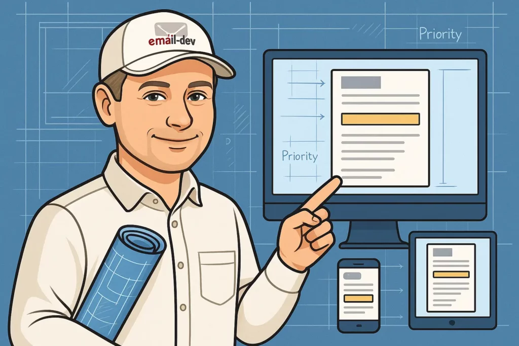
There’s a reason single-column layouts are the default recommendation for most email campaigns: they force a decision about what matters. If you have a sidebar, you can put things in it and kind of leave them there. Single column puts everything in sequence, and sequence demands hierarchy, and hierarchy requires you to decide what comes first.
The priority stack that works:
- Hook – the headline or opening line that gives someone a reason to keep reading
- Value – what’s in it for them, stated clearly and early, without making them work for it
- Proof – if you’re asking for trust, some evidence that trust is warranted
- Action – a clear, specific CTA
- Support – additional context for readers who want it before acting
Common mistakes I see in single-column templates: the logo is enormous and sits at the very top eating real estate that could communicate something useful; there’s a full-width hero image before any copy, so the first thing a reader encounters is a picture with no immediate information; the actual value proposition is buried four paragraphs in, inside a block of body text that looks daunting. Single column is supposed to simplify things – but you can still fill it with clutter.
The reverse pyramid: your conversion secret weapon

The reverse pyramid is a layout structure that starts wide at the top – broad headline, maximum visual width – and narrows down toward a focused CTA. It works because it follows a natural information processing path: wide general statement, more focused supporting explanation, single specific action.
Structure:
- Full-width headline that states the main benefit or creates genuine curiosity
- Slightly narrower block with supporting copy or proof
- A prominently designed, visually “pointed” CTA at the bottom of the funnel
For promotional emails, welcome sequences, and time-sensitive offers, this structure tends to perform well because it creates a visual funnel within the email itself – you’re not just hoping the reader finds the CTA, you’re directing them toward it through the layout itself.
The catch: it requires message clarity. If your main benefit is vague or poorly defined, the reverse pyramid just makes that confusion more visible, not less.
The zigzag layout: when you need visual interest
For longer emails – product showcases, feature explanations, educational sequences – a zigzag layout (image and text blocks alternating left-right-left-right) maintains visual rhythm and breaks up what would otherwise be a wall of stacked content.
On mobile, zigzag collapses to single column – images stack above their corresponding text blocks. This is expected and fine, as long as each image-text pair makes sense when stacked vertically, not only when side by side.
When zigzag makes sense: walking through multiple features or benefits; telling a sequential story; educational content that needs visual breathing room.
When it doesn’t: simple promotional emails where getting to the point matters more than visual engagement; time-sensitive campaigns; anything short enough that the added complexity just adds length.
CTA placement psychology: the 3-CTA approach
I typically recommend at least three CTA opportunities in most marketing emails: one early, one after the case has been made, one at the end. The reasoning is straightforward – subscribers are at different decision stages when they open an email. Some will click the first CTA immediately because they already know what they want. But some need context first. And while others will read everything before acting.
Strategic placement:
- First CTA – placed before the full argument is made, for people who are already convinced
- Mid-email CTA – after the value has been explained and some proof provided
- Final CTA – at the end, for subscribers who read everything before deciding
Avoid clustering all three in the same visual block – spread them through the email so each one has its own moment. And vary the copy; three buttons with identical text don’t give the reader any new information or reason to click the second or third one.
Also: buttons need to be tappable on a phone without precision targeting. The 44-48px height range I mentioned earlier is the relevant benchmark for email buttons as well. A thin text link is not a primary CTA – it’s a small target that’s easy to miss and easy to dismiss.
The cognitive load problem nobody talks about
Every additional element in an email – a second offer, a navigation row, social share buttons, a secondary promotion at the bottom – is a decision point, and each decision point adds cognitive friction. The research on choice overload is well-documented; Iyengar and Lepper’s 2000 study on consumer choice found that more options often reduced purchase likelihood rather than increasing it. The same principle applies here: the more you ask someone to process, the less likely they are to act on any of it.
Practically:
- One primary goal per email. If you want people to buy the course AND follow you on Instagram AND read your new blog post, that’s three separate emails. Cramming all three into one email means none of them get the attention they need.
- Visual hierarchy should make priority immediately legible – if everything looks equally important, nothing is.
- Generous white space isn’t wasted space; dense, packed layouts are harder to scan and feel cognitively heavier.
The one-goal rule is probably the advice I repeat most often, and it’s consistently the one that generates the most pushback. “But we have so much to tell them.” Sure. Save some for next time.
Typography hierarchy that guides action
Typography in email design is fundamentally a hierarchy problem. You have size, weight, color, and alignment as variables, and the job is to use them systematically so that the most important content looks the most important and the action you want taken is visually distinct from everything else.
A working hierarchy:
- Headline – largest and boldest; communicates the main point immediately
- Subheadline – smaller, supports the headline, adds proof or urgency
- Body text – readable size (16px minimum for mobile is a commonly cited baseline), regular weight, short paragraphs
- CTA text – visually distinct from body; action-oriented phrasing
- Fine print – smaller, lower contrast; legally necessary but not the focus
On alignment: body text reads better left-aligned because it aligns with scanning direction. CTAs can be centered in single-column layouts where centering adds visual emphasis rather than visual confusion. Centered body text – meaning paragraphs of centered prose – is harder to read than people expect and I’d avoid it.
One thing I see constantly: five or six different font sizes deployed without a clear system, which creates visual noise instead of hierarchy. Pick three sizes, use them consistently.
Image placement that actually converts
Images have a real cost in email: load time, inconsistent rendering across clients, and the fact that a significant number of email clients still block images by default until the subscriber explicitly enables them. That last point alone is a reason to make sure your email communicates meaning through copy, not through images – if everything loads as a broken image placeholder, the email should still make sense.
That said, images used strategically do real work. Product images showing the thing in use (not just isolated on a white background) tend to outperform product-only shots. Customer photos in testimonials add a layer of credibility that text alone can’t replicate. Supporting graphics that illustrate a concept can replace paragraphs of explanation.
Placement guidelines:
- Don’t open with just an image and nothing else – pair it with a headline or context
- Always include alt text, both as an accessibility requirement and as a fallback when images are blocked
- Images placed next to or just above relevant CTAs generally outperform images sitting in visual isolation
- Text-to-image balance matters for deliverability as well as readability; a rough 60/40 text-to-image ratio is often cited as a reasonable starting point, though this isn’t a hard rule
Personalization through strategic layout
Most ESPs support conditional content blocks, which means you can show different content to different segments without building entirely separate templates. The principle isn’t complicated: a new subscriber needs more context and reassurance before you ask them for anything; someone who has bought from you twice doesn’t need you to re-explain who you are.
Segment-specific layout considerations:
- New subscribers – more proof, more context, gentler selling
- Active buyers – streamlined, assumes some familiarity, focuses on the next logical action
- Re-engagement campaigns – needs to answer “why should I bother?” before asking for anything
- VIP or loyalty segments – the design itself should signal that this is intentional and different
Layout-level personalization requires thinking about email design as an audience-specific decision, not a one-size universal visual choice.
The header simplification strategy
Email headers are genuinely valuable real estate, and I watch people waste them constantly with navigation menus, multiple logo variations, social icons, and decorative banners that eat vertical space before the reader hits any actual content. All of these are website patterns being imported into email where they don’t belong.
What belongs in a header:
- Your logo, compact, if it genuinely adds credibility for your audience
- Nothing that competes with your opening message
What doesn’t:
- Full navigation menus – this is not a website
- Social media icons (footer is the right place)
- Large decorative banners that push your first line of real content down the screen
- Multiple logo lockups
The header’s job is to orient the reader and build trust. A clean, appropriately-sized logo does that. Everything else is noise.
Footer strategy: more than legal requirements
Subscribers who scroll all the way to your footer actually read the email – that’s a meaningful signal of engagement, and it means footer real estate can do more than just host compliance text.
Elements worth including:
- Unsubscribe link – required, and worth writing with some actual personality rather than just “unsubscribe” in grey 8px text
- Preference center link – letting people choose frequency or content type before they opt out entirely is good for list health
- Physical business address – legally required under CAN-SPAM (US), CASL (Canada), and GDPR-adjacent regulations in many other jurisdictions
- Secondary social links or cross-channel content
- Any trust signals relevant to your audience
One thing about unsubscribe links: burying them in illegible text, using confusing language, or requiring multiple steps to complete – these approaches increase spam complaints and damage sender reputation. Make it easy. The people who want to leave will leave; creating friction just makes them angry before they go, which is worse.
A/B testing your email design elements
Email design decisions that show up in every campaign – button placement, column structure, image use – are worth testing, not just deciding based on intuition. The hierarchy of what to test generally runs from highest potential impact to lowest.
Testing priority order:
- CTA placement – above fold versus below fold
- Layout structure – single column versus multi-section
- Image placement and type
- Headline size and positioning
- Content density and white space
Common testing mistakes: testing multiple design variables simultaneously (you can’t know what drove the result); stopping before statistical significance (week-long tests on small lists are almost meaningless); testing aesthetic preferences rather than conversion-relevant variables; looking only at overall performance without separating mobile and desktop, which can respond completely differently to the same design changes.
From experience: the version that wins the A/B test isn’t always the “better looking” one. Sometimes the plainer, more functional layout outperforms the polished version by enough of a margin to make you genuinely rethink your assumptions.
Industry-specific design strategies
E-commerce and physical products – product-focused layouts; images showing items in use rather than just isolated shots; urgency elements (limited availability, time-specific pricing) placed visibly; social proof near purchase CTAs.
Course creators and digital products – education-first content structure makes sense earlier in a sequence; transformation-focused copy and imagery (what changes after they complete the course) tends to outperform feature lists; social proof from student outcomes lands better than generic testimonials.
B2B and professional services – authority-building layouts with measurable results and case study references; problem-solution framing; recognizable client logos or specific outcomes as social proof rather than star ratings.
Small business and local – trust is the primary conversion variable; local proof and community references carry more weight than production polish; clear CTAs with low friction.
These are patterns, not rules. A course creator with a loyal audience can run stripped-down plain-text emails and convert well. An e-commerce brand with strong editorial voice might run long-form content emails successfully. But the patterns hold often enough to be worth starting from.
When email design decisions kill conversions
The failure modes I see most consistently:
- Hero images that communicate nothing useful – beautiful photography, zero information, subscriber moves on
- CTAs that look decorative – low-contrast buttons, thin text links, elements that don’t read as clickable
- Multiple font sizes deployed without a hierarchy system – visual noise rather than visual direction
- Centered body text paragraphs – harder to read than most people expect
- Multiple competing offers in a single email – dilutes attention, reduces action on all of them
- Social media follow icons placed more prominently than the purchase CTA
The filter I apply: does this element communicate value, build trust, reduce friction, or drive action? If it doesn’t do any of those four things, it probably doesn’t belong in the email.
The mobile preview test
Before sending, open the email on your actual phone – not the ESP preview, your real phone – and look at it for three seconds. Close it. Then ask: what did you actually absorb? What was the obvious action? Where did your eye go first?
If the answer is “the logo” or “a large image” or “I’m not sure” – that’s information you can act on. The ESP preview and the real email on a real device can look surprisingly different, especially in clients like Gmail on Android where rendering quirks don’t always show up in simulators. Tools like Litmus and Email on Acid are genuinely valuable for cross-client rendering checks – but there’s no substitute for looking at the actual email on an actual device before a major send.
This sounds too simple to mention. I keep mentioning it because I regularly see campaigns where it clearly wasn’t done.
The psychology of email design decisions
Why does email design go wrong so often? A few patterns keep showing up.
Designers optimize for how the email looks in the design tool, not how it renders in an inbox. A template that looks perfect in Figma may render with broken padding, missing background colors, or completely wrong layout in classic desktop Outlook – because that client uses the Word 2007 rendering engine, which doesn’t support most modern CSS properties. Background images, border-radius, certain shorthand padding declarations – all potential failure points. The new Outlook for Windows uses a web-based rendering engine closer to Outlook.com, which is much better, but the classic versions are still in wide use and will be until Microsoft completes the transition, currently planned for October 2026.
People import website design conventions into email. Navigation menus, full-bleed hero sections, multi-column product grids – these patterns exist in web design for reasons that don’t translate to a 600px-wide email container that needs to hold together across forty different rendering environments.
Beauty is mistaken for effectiveness. A polished, beautifully designed email is not automatically a converting email. Sometimes a plain, direct email outperforms the branded template by a meaningful margin, because it reads like a message from a person rather than a marketing asset.
Testing gets skipped. Litmus and Email on Acid exist because email rendering varies enough across clients that “looked fine in my preview” is not a sufficient quality check before a major send. Testing isn’t optional – it’s part of the job.
Your email design audit checklist
Layout:
- Is your most important element visible above the fold on a mid-range Android phone?
- Can someone understand your main point within a few seconds of opening?
- Is there one clear primary action the email is building toward?
- Does the layout hold together in a single column, as it would on most mobile devices?
CTA:
- Is the primary CTA placed early enough that a reader doesn’t have to scroll far to find it?
- Are buttons large enough to tap without precision aiming on a touchscreen?
- If you have multiple CTAs, are they spread through the email rather than stacked?
- Is the CTA copy specific and action-oriented, not generic?
Hierarchy:
- Is the most important content visually the most prominent?
- Can someone scan the email in a rough F-pattern and still get the main message?
- Are you using size, weight, and color systematically – not just picking whatever looks nice at the time?
- Is there clear visual separation between sections?
Technical:
- Does the email render without broken layout in both classic and new Outlook for Windows?
- Does it hold up in Gmail on iOS and Android?
- Are images paired with descriptive alt text?
- Does the email still communicate its core message if images are blocked?
The bottom line: design for humans, not pixels
Your subscribers are busy, distracted, and looking for a reason to delete your email. Email design that converts isn’t necessarily email design that wins awards – it’s design that makes the value immediately obvious, removes obstacles between the reader and the action, and works on the device the reader is actually using.
The practical rules:
- Mobile-first base layout – percentage widths, single column, max-width constraints
- One primary goal per email
- Above-the-fold placement for your main message and first CTA
- Touch-friendly tap targets (44-48px height minimum for buttons, accounting for platform guidelines)
- Visual hierarchy that’s systematic, not accidental
Businesses that obsess over pixel-perfect branding while their CTAs are tiny links buried below the fold are consistently outperformed by campaigns with less refined aesthetics and better structural decisions. The “ugly” email that converts well is a regular occurrence in this industry – it happens often enough that it should make everyone reconsider what they’re actually optimizing for.
Every design element is a conversion decision. Most people just don’t treat it that way.
If you want a second opinion on your email template – whether it’s rendering correctly across clients, whether the layout is working for you or against you, or whether the hierarchy actually makes sense – that’s exactly the kind of work I do. Course creators, marketers, agencies. If the email is underperforming and you can’t figure out why, let’s look at it.