Quick answer: Cross-client email design means building one email that keeps its shape, message, and call to action everywhere. That means every major client (Apple Mail, Gmail, classic and new Outlook), every device, dark mode, and now AI inbox summaries. You design a resilient baseline first. Then you layer the fancy stuff on top only for clients that support it. And you test against a coverage matrix built from your own audience data, not some generic 40-client checklist.
Here’s the thing nobody warns you about. The same email can arrive three different ways in three inboxes on the same morning. Every one of them is technically “your” email. That gap, the clean thing in your design tool versus the mangled thing on a phone, is the whole point. It’s the reason cross-client email design exists as a discipline. You are not building one email. You are building one email that has to survive around 40 clients. Plus a pile of devices, and now a machine reading it first.
This is the Design and Creative take. The design calls you make before a single <td> gets nested. The deep code lives over in the HTML Email Development section, and I’ll point there when it matters. For now, the decisions.
Let’s get into it.
- What cross-client email design actually means (and why it’s a design problem, not just code)
- A quick gut check you can run right now
- The three lotteries: provider, client, device
- One email, three judges
- Know your audience first: build the coverage matrix before you design
- The numbers, with an honest caveat
- The matrix shifts by audience type
- How to build your coverage matrix
- How the big clients actually render: a designer’s field guide
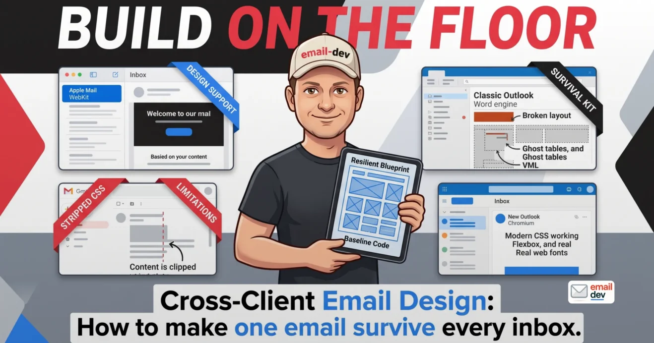
- Apple Mail – the standards-friendly one you design toward
- Gmail – the CSS editor with strong opinions
- Outlook – the two-headed problem, told accurately
- The rest, briefly
- Designing across devices (because the same client renders differently per device)
- The moves that matter
- The stat that justifies all of it
- The media-query reality
- Dark mode: the rendering condition you don’t get a vote on
- The three-way problem
- Design moves that survive the flip
- The fifth client is an AI: designing for the inbox summary
- Three flavors, and the differences matter
- The device-versus-provider punchline
- What this means for your design
- The philosophy that ties it together: progressive enhancement over graceful degradation
- Why progressive enhancement wins across clients
- Tie it back to the matrix
- Testing your cross-client email design without a 0 bill
- The tooling situation, honestly
- The manual cross-client test pass
- The platform mangles your layout, and the previewer won’t warn you
- The cross-client email design mistakes I flag on repeat
- Where cross-client email design is heading (2026 to 2030)
- The Word engine finally thins out
- Convergence on web engines, with an asterisk
- The AI inbox becomes the default reading layer
- Accessibility, AI-readiness, and cross-client resilience collapse into one job
- What stays true no matter what
- FAQ
- What is cross-client email design?
- Why does my email look different in Outlook, Gmail, and Apple Mail?
- Which email clients should I design for?
- Is designing for different email clients the same as responsive design?
- Do I still need to worry about the Outlook Word engine in 2026?
- How do I stop my email breaking in dark mode across clients?
- How do AI email summaries affect email design?
- What’s the cheapest way to test cross-client rendering?
- What email width works across all clients?
- Should I use tables or divs for cross-client email?
- The one-line takeaway
What cross-client email design actually means (and why it’s a design problem, not just code)
Short version: Cross-client email design is the set of design decisions that make an email robust before anyone writes the markup. It’s not responsive design (that’s the device axis) and it’s not HTML coding (that’s the execution). It’s the umbrella above both.
People blur three things together and then wonder why their fixes miss. So let me separate them.
Responsive design is about screen size. Cross-client design is about rendering engines. HTML email coding is how you carry out both. Related, sure. But different problems with different answers.
On the web, you design for a browser and it mostly behaves. Chrome, Safari, Firefox – they disagree at the edges, but the core is stable. Email threw that stability out years ago.
In email you design for around 40 clients. Each one has its own opinion about your code. And one of them, classic Outlook on Windows, still renders with Microsoft Word’s engine from 2007. So a “design” in email isn’t really a picture. It’s a bet about how 40 renderers will treat your choices.
The single most useful mindset in cross-client email design: build the resilient version first. Treat everything fancy as an enhancement, never a requirement.
A quick gut check you can run right now
Open your last campaign. Picture it with the hero image gone. Now imagine half the CSS got stripped on the way in. Is it still a working email? Can you find the message? Can you find the button?
That blurry survivor is your real baseline. If it falls apart, you built the whole thing on the enhancement layer instead of the floor. That’s the mistake this article keeps circling back to.
The three lotteries: provider, client, device
Short version: One email gets judged by three different systems people wrongly lump together. The provider decides if you land. The client decides how you look. The device decides who reads you first. Same email, three separate lotteries, three different sets of moves.
This is the spine of the whole piece, so I’m parking it early. Most bad fixes come from confusing these three. You “optimize for Gmail” and then find out Gmail was never the layer that broke your layout.
Here’s the split, plainly.
- The provider – Gmail, Outlook.com, Yahoo, a corporate Exchange server. It decides deliverability and strips or rewrites your CSS by policy. Not the focus here, but it shapes everything upstream.
- The client – the actual rendering engine. Apple Mail runs WebKit. New Outlook runs Chromium. Classic Outlook runs Word. Gmail runs its own stripped-down subset. This decides how your HTML becomes pixels. It’s the heart of cross-client email design.
- The device – iPhone versus Android versus desktop. It sets the screen size, the dark-mode behavior, and, new for 2026, which AI summarizes you before the open.
One email, three judges
| Layer | What it controls | What it punishes | Where you fix it |
|---|---|---|---|
| Provider | Deliverability, CSS stripping | Bloated HTML, spammy signals | Sending setup, code hygiene |
| Client | How your HTML renders | Modern CSS, unsupported layout | Design baseline, fallbacks |
| Device | Screen size, dark mode, AI summary | Fixed widths, image-only text | Fluid layout, live text |
The messy part is the overlap. A Gmail address, opened in the Apple Mail app, on an iPhone. That’s a Gmail provider, an Apple Mail client, and an Apple Intelligence summarizer, all at once. Three layers, one open. So “optimize for Gmail” is only ever a third of the instruction.
Keep this sentence somewhere. The provider decides if you land, the client decides how you look, the device decides who reads you first. Everything below hangs off that.
Know your audience first: build the coverage matrix before you design
Short version: You should not try to make every email perfect in all 40 clients. You design for your own distribution, pulled from your analytics. Then you let that decision shape the layout before you draw a single block.
Here’s a take that annoys people, and I’ll stand by it. Chasing pixel-perfection in all 40 clients is a waste of your life. You don’t have a generic audience. You have your audience. Design for them.
The email coverage matrix is just that idea written down. Which clients and devices actually matter, based on real open data, ranked, with a rule for each tier. Nobody frames the matrix as an upstream design input. That’s exactly why so many emails get built for the wrong client.
The numbers, with an honest caveat
Apple Mail sat around 64.66% of opens in Litmus’ May 2026 report. Gmail followed near 24.11%, Outlook around 6.49%. iPhone alone runs somewhere in the 28 to 34% range depending on whose dataset you trust.
But those are opens, not accounts. Big difference. A huge share of “Apple” opens are Gmail addresses being read in Apple Mail on an iPhone. Add Apple’s Mail Privacy Protection pre-fetching everything, and the number inflates further. Survey data has roughly three in four US people saying they use Gmail as a provider.
So “who is my provider” and “who is my rendering client” give different answers. For cross-client email design you need the client number, because that’s what decides your CSS.
The matrix shifts by audience type
- B2B lists skew Outlook and desktop. Office hours, corporate Exchange, a real slug of classic Outlook.
- B2C, retail, and creator lists skew Apple Mail and mobile.
- A course or creator audience is usually very Apple-heavy. A corporate marketer’s list can carry meaningful classic Outlook.
Different matrix, different constraints. That’s the point.
How to build your coverage matrix
This part is a real process, so here it is as steps.
- Pull client and device share from your ESP or your Litmus / Email on Acid analytics. Use the last 90 days.
- Set a coverage floor. Anything over about 5% of opens gets first-class design support. The 1 to 5% band gets “must not break”. Under 1% gets “graceful fallback only”.
- Write the matrix down as a design constraint, not a test list. It tells you upfront whether you can use a native rounded gradient button or need the VML fallback.
- Re-check it quarterly. The mix moves, sometimes fast.
You don’t design for all 40 email clients. You design for the clients your own analytics say your subscribers use. Then you make sure the rest merely don’t break.
That reframe – from “test everywhere” to “design for my matrix” – is most of the game. It separates cross-client email design that ships clean from cross-client email design that fights itself.
How the big clients actually render: a designer’s field guide
Short version: Think of each client as a personality with things it rewards and things it punishes. Not a CSS spec sheet – that lives in the dev section. This is what each client does to your design decisions.
Let me give you the shape of it, then go client by client.
| Client | Engine | Rewards | Punishes | Design move |
|---|---|---|---|---|
| Apple Mail | WebKit | Modern CSS, media queries | Nothing much – it’s forgiving | Design to it, never only for it |
| Gmail | Stripped subset | Lean HTML, inline styles | Big HTML, <style> reliance | Keep it early and light |
| Classic Outlook | Word (2007) | Tables, VML | max-width, div padding, backgrounds | Ghost tables and fallbacks |
| New Outlook | Chromium | Real CSS, flexbox | MSO conditional comments (ignored) | Treat like Outlook.com |
Apple Mail – the standards-friendly one you design toward
Apple Mail runs WebKit. Full CSS, full media query support, the most capable mainstream client by a mile. Roughly two-thirds of opens, depending on the month.
Here’s the trap. Because it’s so forgiving, it’s where your email looks flawless and lulls you into shipping something that dies elsewhere. Design toward Apple Mail’s capability. Never only for it.
One more thing. Apple Mail inverts aggressively in dark mode, especially pure black and pure white. I’ll come back to that in the dark-mode section.
Gmail – the CSS editor with strong opinions
Gmail strips a lot of CSS by policy. It caps HTML at around 102KB (the infamous clip). It re-hosts your images through its own proxy and caches them.
The design implications stack up fast. Keep the important stuff – your message and your CTA – early and lean. Don’t lean on <style> blocks surviving intact. Assume image caching quirks when you swap a file. And expect Gemini summaries to surface mostly in the Promotions and Updates tabs, which feeds the AI section below.
Outlook – the two-headed problem, told accurately
This is where most articles get sloppy. So I’ll be precise. There are two Outlooks for Windows right now, and they render your code differently.
Classic Outlook uses the Microsoft Word rendering engine. Roughly the 2007 build. It ignores max-width. It kills margins and padding on divs and images. No background-image. No real media-query responsiveness. Ghost tables plus VML are the survival kit here.
New Outlook for Windows runs a Chromium engine, basically Outlook.com. It supports flexbox, media queries, background images, border-radius, web fonts. Real modern CSS. And crucially, it ignores MSO conditional comments entirely. So your classic-Outlook ghost hacks just sit there, harmless and invisible to it.
Now the dates, because getting these right is a credibility flex.
- Microsoft ends support for the Word-engine desktop versions on October 13, 2026. Same day Office 2021 support ends.
- The forced opt-out phase, where new Outlook becomes the default for commercial users, starts April 2026.
- But classic Outlook, delivered through Microsoft 365 and Office LTSC, is supported at least through 2029.
So don’t oversell “Outlook is fixed in October 2026”. It isn’t. Realistically you’re designing for both Outlooks through roughly 2028, with the long tail thinning after. Peak dual-render pain is right now, 2026 to 2028.
Honest tone note, because I try to keep this proportionate. The classic Word engine is a shrinking slice for most lists. Don’t blame every bug on it. Check your matrix before you assume it’s the villain.
The rest, briefly
Yahoo and AOL have their own quirks but are generally okay. Samsung Mail matters on Android. In Germany, web.de and GMX carry real share and can’t be ignored on a German list. Outlook.com and 365 web run Chromium. One line each. The long tail is “don’t break” territory, not “design toward”.
Designing across devices (because the same client renders differently per device)
Short version: “Client” and “device” are not the same axis. Gmail on an iPhone, Gmail on Android, and Gmail web are three different rendering situations. So device coverage is its own design problem inside cross-client email design.
I go deep on the build side in the mobile-first email design piece, so I won’t re-teach fluid-hybrid coding here. Just the design-decision layer.
The moves that matter
- Single column first, as the safe default. It stacks predictably and rarely breaks.
- 600px as a cap, not a fixed width. Fill a phone fluidly, then stop expanding on desktop.
- Body text 16px floor. Below 14px you’re asking for pinch-zoom and deletes.
- Thumb-sized tap targets. 44x44px on Apple, 48x48dp on Android, minimum.
- One clear CTA above the fold, in the first 300 to 400 pixels.
The stat that justifies all of it
Reported figures land around 70 to 80%. That’s the share of people who delete an email that renders badly on their phone. They don’t rotate to landscape to give you a second chance. They swipe.
That single behavior is the entire business case for the device side of cross-client email design. You’re not chasing a nicer experience. You’re dodging an instant delete.
The media-query reality
Here’s the mechanical bit people skip. Only Apple Mail fully supports media queries. Gmail and Outlook mobile support them partially. Classic Outlook on Windows doesn’t do responsive at all – it renders at whatever width you set.
So your fluid baseline has to work without a media query firing. The query is polish, not foundation. If a client strips it, nothing should collapse.
Design the phone version as the real version and let it grow to desktop – not the other way round. A media query the client strips can serve your desktop layout to a five-inch screen.
Dark mode: the rendering condition you don’t get a vote on
Short version: Dark mode is a third of your opens now. Apple inverts hard, Gmail inverts partially, Outlook barely touches your colors. One email, three dark renderings. The job is to make all three readable, not identical.
You don’t choose whether dark mode fires. The client does, and they don’t agree with each other. That’s the whole headache in one sentence.
Dark mode adoption keeps climbing. Email-specific figures cluster near 35% of opens and rising. System-level smartphone adoption sits far higher, north of 80%, which sets the ceiling. Not an edge case anymore.
The three-way problem
- Apple Mail inverts aggressively, especially with pure black and pure white.
- Gmail does partial inversion, which is its own kind of unpredictable.
- Outlook barely touches your colors, so you get a third result again.
One email, three different dark renderings. You will not force them to look identical. Stop trying. Aim for readable in all three.
Design moves that survive the flip
The image and logo mechanics live in the email image best practices article. Here’s the design-level version.
- Use off-white instead of pure white. Something like
#FEFFFFdodges the harshest inversion triggers in some clients. - Build contrast in. Don’t let color carry meaning alone. It survives inversion and helps color-blind readers at the same time.
- Use transparent PNG logos with a little padding or a thin outline. A logo on a white box strands as a glaring rectangle when the background flips.
- Test on more than one client, because each one inverts differently.
You can’t force a single dark-mode look across clients. Design for readability in all three inversion styles instead of fighting for pixel-identical output.
That mindset – readable everywhere, identical nowhere – is dark mode’s version of the whole cross-client email design philosophy.
The fifth client is an AI: designing for the inbox summary
Short version: An AI now reads your email before, or instead of, the human, and re-presents it. Apple Intelligence, Gmail’s Gemini, and Outlook’s Copilot each do it differently. If your offer is baked into an image, the summary sells nothing.
This is the freshest shift in the whole topic, and it’s the thing the 2023-vintage guides simply don’t have. So I’m leaning into it.
The machine reads your email first. It grabs whatever live text it can parse. Then it hands the reader a short version of what your email is “about”. If your real message was a JPEG, that summary is working from scraps.
Three flavors, and the differences matter
- Apple Intelligence (Apple Mail) generates a pre-open summary that replaces your preheader right in the inbox list. This is the big one, because it hits before the open. It needs iPhone 15 Pro or newer hardware, so not everyone on your list gets it – but the eligible base is already huge. Apple had shipped more than 450 million Apple Intelligence-capable iPhones by early 2026, per Counterpoint Research, and it climbs every quarter. And it scans live text only. It can’t read image text, and it doesn’t use your alt text either.
- Gmail Gemini does post-open summaries. Gmail entered its “Gemini era” with a January 2026 update, adding AI Overviews and broader integration. Summaries surface mostly in Promotions and Updates and the side panel. It doesn’t replace the inbox preview the way Apple does.
- Outlook Copilot does post-open, on-demand summaries. You tap “Summarize”. Notable difference: it reads live text and can pull from more of the message.
One useful detail from the testing that’s out there. All three tend to lean on the first 150 to 200 characters, and all three respond well to semantic markup. Real heading tags and paragraph tags help each AI structure your content. That’s not a coincidence you should ignore.
The device-versus-provider punchline
Here’s the line worth repeating. The provider determines deliverability, but the device determines AI exposure. A Gmail address read in Apple Mail on an iPhone gets summarized by Apple Intelligence, not Gemini.
So “which AI reads me” is a device question. Which is exactly why the AI summary belongs in a cross-client design article. Not off in some marketing-strategy silo.
What this means for your design
The actionable core, short and blunt.
- Your real message and offer must be live, selectable text near the top. Not baked into a hero image, or the summary can’t lift it.
- Semantic structure – real heading order, proper paragraph tags – helps the summarizer grab the right sentence. Same structure that helps screen readers.
- Front-load the point. Don’t bury it under a boilerplate greeting the AI will surface as your “summary”.
If your headline and offer are trapped inside an image, the AI summary can’t read them. Design the core message as live text near the top of the email.
Accessibility advocates argued for live text on principle for years. Now the inbox itself is enforcing the same rule, louder, and it hits everyone – not just screen-reader users. Convenient, in a grim sort of way.
The philosophy that ties it together: progressive enhancement over graceful degradation
Short version: Design the resilient baseline first, then layer enhancements only for clients that support them. Nothing load-bearing should depend on an enhancement. That’s the design strategy the whole article has been building toward.
These two strategies get treated as code choices. They’re really design choices, and the difference decides whether your email holds.
Graceful degradation means you design the fancy version, then patch fallbacks for where it breaks. You’re always reacting to damage. Fragile by nature.
Progressive enhancement flips it. You design the resilient baseline – live text, single column, a bulletproof button, solid background colors, images-off legibility. Then you layer the gravy on top: rounded corners, gradients, background images, interactivity. Only for clients that support it.
Why progressive enhancement wins across clients
The baseline is the same everywhere. So the floor never collapses. The enhancements are a bonus for Apple Mail and new Outlook. Classic Outlook and stripped-down Gmail just miss the gravy, not the meal.
That’s the mechanical reason it works. Your load-bearing layer – message, CTA, structure – never depends on a feature some client might drop.
Tie it back to the matrix
Progressive enhancement lets you use modern CSS for the 65% on capable clients. And it does that without breaking the 6% on the Word engine. The matrix tells you where the line sits. The philosophy tells you how to build across it.
Quick word on interactivity and AMP. Accordions, carousels, embedded forms – promising, growing, real engagement in the right context. But treat them strictly as enhancement, with a static fallback underneath. Never the load-bearing layer. And take the vendor lift numbers with a healthy pinch of salt.
Testing your cross-client email design without a $500 bill
Short version: You don’t need an enterprise budget to test cross-client email design well. A disciplined manual pass catches most of the real risk. Real devices, dark mode on, images off, plus an AI-summary preview.
Let me be straight about tooling, because the landscape got expensive and small teams got burned.
The tooling situation, honestly
Litmus was the default for years. Then Validity acquired it in April 2025, and that August the pricing changed hard. The cheaper Basic and Plus tiers got scrapped. As of 2026, the Litmus Core plan starts around $500 per month, covering roughly 2,000 previews and five users. That’s a brutal jump from the old ~$99 entry point.
Putsmail, Litmus’ old free test-send tool, is gone too. So that quick free option no longer exists.
If $500 a month isn’t happening, look at Email on Acid (now part of Sinch). It tends to land friendlier for solo devs and small teams. Leaner previewer tools keep popping up as well. Watch that space.
The manual cross-client test pass
Here’s the routine that covers most of the risk for a small sender. It’s boring. Boring works.
- Real devices. At least one iPhone, one Android.
- Real clients that match your matrix. Apple Mail, the Gmail app, and whichever Outlook your list actually uses.
- Dark mode on. Check each client’s flavor of inversion.
- Images off. Does the message and the CTA still survive?
- AI summary preview. Run it through Apple Intelligence or a Gemini or Copilot summary. Does it surface your actual offer?
- Test the real export from the real platform. This one’s non-negotiable.
The platform mangles your layout, and the previewer won’t warn you
This part is for the course producers and small-shop owners reading along. You build a clean email. Then the sending platform quietly wrecks half your work.
- GetCourse and some ESPs rewrite widths, re-compress images, and inject their own styles.
- Injected width attributes can squash your fluid sizing and break the mobile stack.
- Re-hosting and re-compression turn your sharp export fuzzy.
The previewer has no idea what GetCourse is about to do to your code. It renders what you feed it, not what the platform spits out.
You don’t need Litmus to test cross-client email design. A manual pass on two real phones catches most of the real risk. Dark mode on, images off, plus an AI-summary preview and a real ESP export test.
Test the real export, from the real platform, on a real device. Not just the previewer. It’s tedious. It also catches the bug your subscribers would have caught for you.
The cross-client email design mistakes I flag on repeat
These are the ones I see over and over when I audit other people’s templates. None of them are exotic. That’s what makes them expensive – they’re boring and repeated and quietly bleeding clicks.
- Designing only in Apple Mail or the design tool and calling it done. It looks perfect there and dies elsewhere.
- Baking the headline and offer into a hero image. Dies in dark mode, images-off, screen readers, and every AI summary.
- Blaming every bug on the Outlook Word engine without checking whether your list even uses it. Check the matrix first.
- Treating “responsive” and “cross-client” as the same fix. One’s the device axis, one’s the rendering axis.
- Letting an enhancement carry load-bearing meaning. A gradient, a background image, a rounded button – with no fallback underneath.
- Color-only meaning that vanishes in dark mode or for color-blind readers. Pair it with size, weight, or position.
- A CTA sitting past the Gmail 102KB clip. The most important element, hidden behind “view entire message”.
- Never previewing the actual ESP export. Only the design tool, which knows nothing about GetCourse.
Fixing these is usually faster than people expect. Most are a decision, not a rebuild.
Where cross-client email design is heading (2026 to 2030)
Short version: The next few years push cross-client email design toward live text, semantic structure, and AI-legibility, while the new Outlook finally unlocks modern CSS. The fluid-hybrid gymnastics start to fade. The fundamentals don’t move.
I can’t see five years out perfectly. Email changes slower than the hype and faster than the laggards expect. But the signals are clear enough to plan around.
The Word engine finally thins out
Office 2021 hits end of support on October 13, 2026. The opt-out to new Outlook starts April 2026. But classic lingers via Microsoft 365 and LTSC to roughly 2029. So the dual-Outlook design pain runs about 2026 to 2028, then eases.
As the engine mix shifts, flexbox and grid become genuinely usable in email. Keep the ghost tables for now. The trajectory is good, but the long tail is real.
Convergence on web engines, with an asterisk
Apple Mail on WebKit, new Outlook and Outlook.com on Chromium, Gmail slowly modernizing. The gap between clients narrows. But a real gap stays through the decade because of that classic-Outlook long tail. Don’t declare victory early. That’s how you ship a broken email to the 6% who still matter.
The AI inbox becomes the default reading layer
This is the trend I’d build around hardest. AI previews are becoming a normal step between your send and your reader. Open rates blur further as a metric. The “top” of your email increasingly means the part the AI chose to show.
Designing for the summary stops being a nice-to-have and becomes a normal build step. Modern formats like WebP inch toward safe as engines converge. AVIF stays a later problem – I cover the format side in the email image best practices piece.
Accessibility, AI-readiness, and cross-client resilience collapse into one job
Here’s the convenient part. The same semantic, live-text, single-focal-point email wins on all three at once. Real heading order helps a screen reader, helps the AI summarizer, and helps the email survive a stripped-down client. Three problems, one discipline. Overdue.
What stays true no matter what
Through all of it, the fundamentals of cross-client email design don’t move. Design the resilient baseline first. Live text for what matters. One focal point. Strong contrast that survives inversion. Test on real devices. Engines change. The eye and the thumb don’t.
FAQ
What is cross-client email design?
Cross-client email design is building one email that holds its shape, message, and call to action everywhere. That means all major clients, devices, dark mode, and AI summaries. You do it with a resilient baseline plus client-specific enhancements. And you test against your own audience’s clients, not a generic checklist.
Why does my email look different in Outlook, Gmail, and Apple Mail?
Because they use different rendering engines. Classic Outlook uses Microsoft Word. Gmail uses a stripped-down CSS subset. Apple Mail and new Outlook use full web engines. Each one treats the same HTML and CSS differently, so identical code produces different pixels.
Which email clients should I design for?
Not all 40 – the ones your own analytics show your subscribers use. Build a coverage matrix from your last 90 days of opens. Give first-class design support to anything over about 5% of opens, and make sure the rest merely don’t break.
Is designing for different email clients the same as responsive design?
No. Responsive design adapts your layout to device and screen size. Cross-client email design is about surviving different rendering engines. They’re related but separate problems with different fixes. You need both, and you shouldn’t confuse one for the other.
Do I still need to worry about the Outlook Word engine in 2026?
Yes, for now. Office 2021 support ends October 13, 2026, and the opt-out phase starts April 2026. But classic Outlook via Microsoft 365 and LTSC is supported at least through 2029. So plan for dual-Outlook design through roughly 2028.
How do I stop my email breaking in dark mode across clients?
Design for readability in all three inversion styles – Apple aggressive, Gmail partial, Outlook minimal. Use off-white instead of pure white, transparent PNG logos, and built-in contrast. Don’t let color carry meaning alone. Then test on more than one client, because they each invert differently.
How do AI email summaries affect email design?
Apple Intelligence, Gemini, and Copilot read your email and re-present it. If your offer is baked into an image, they miss it entirely. Put the core message in live, selectable text near the top. Use real semantic heading structure so the summary grabs the right thing.
What’s the cheapest way to test cross-client rendering?
A manual pass on two real phones, one iPhone and one Android, across your matrix’s clients. Keep dark mode on and images off. Add an AI-summary preview and a real ESP export test. Litmus Core now starts around $500 a month, so Email on Acid is friendlier for small teams.
What email width works across all clients?
Use 600px, up to 640px, as a cap rather than a fixed width. Fill a phone fluidly up to that cap. It fits desktop preview panes and older clients without horizontal scroll. Treating it as a maximum, not a fixed number, is the key move.
Should I use tables or divs for cross-client email?
Tables still, for now, because classic Outlook’s Word engine needs them for reliable sizing. Div and flexbox layouts get safe as the Word engine fades toward 2029. But keep tables plus VML while classic Outlook is anywhere in your coverage matrix.
The one-line takeaway
An email that only looks right in your design tool isn’t a design. It’s a bug your subscribers will find first. Build the resilient baseline, layer the pretty on top. Then test cross-client email design against your real audience’s clients and devices. Plus the AI now reading them before anyone taps.
Maybe your emails keep falling apart across Gmail, Outlook, or Apple Mail. Maybe some platform like GetCourse keeps mangling the layout. Or you just want one letter built right, the kind nobody else wants to touch. That’s the work I do. Send it over. I’ll tell you straight what’s wrong and what it takes to fix it.