

Quick answer: Email image best practices come down to one rule that most guides bury at the bottom. Every image is a bet that it will load, render, and not get inverted into mush. So you design the email to work with images switched off, then layer the pretty on top. In 2026 that means picking formats for the email client, not the browser. Keep files light. Swap logos for dark mode. And never trap your message inside a hero JPEG that an AI summary cannot read.
I write and debug HTML email for a living. I have lost whole afternoons to a single image that looked perfect in my design tool and then betrayed me in four inboxes at once. So when I talk about email image best practices, I am not talking about a checklist somebody copied from a 2015 blog post. I am talking about the actual landmines.
Here is the thing nobody tells you up front. An image in an email is fragile in a way an image on a webpage never is. On the web you control the rendering engine. In email you are at the mercy of roughly 40 clients, each one with its own opinion about your code. Some of them will strip your image. Some will invert it. One of them, and I think you can guess which, renders your email using a word processor from 2007.
Let me show you how I actually handle images now. The real version of email image best practices, with the rough edges left in.
Images in email are not images on a website (and that is the whole problem)
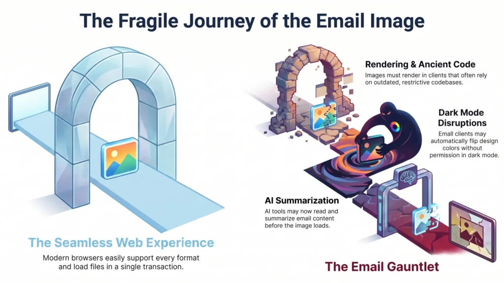
On a webpage, you drop in an image and it shows up. That is the whole transaction. The browser is modern, it supports every format, it loads your file, done.
Email does not work like that. Not even close.
Your beautiful image has to survive a gauntlet before a single human sees it. It has to actually download, which it sometimes will not and it has to render in a client that might be using ancient code. Also it has to look right in dark mode, which can flip your colors without asking. And now, before any of that, an AI might read your email and summarize it.
So I have one principle that sits underneath all my email image best practices. Here it is.
Every image is a bet that it will load. Design for the version where the bet loses.
That sounds gloomy. It is actually freeing. Once you assume the image might vanish, you stop leaning on it to do work it cannot reliably do.
A two second gut check
Open your last campaign. Turn images off. Just kill them.
Now read the email. Does it still make sense? Does the headline still exist? Can you still find the button and tell what it does?
If the screen goes blank, or turns into a wall of broken-image icons, you built your message on sand. That is the most common mistake I see, and it is the one this whole article exists to fix.
What still loads when images do not: the fallback-first mindset
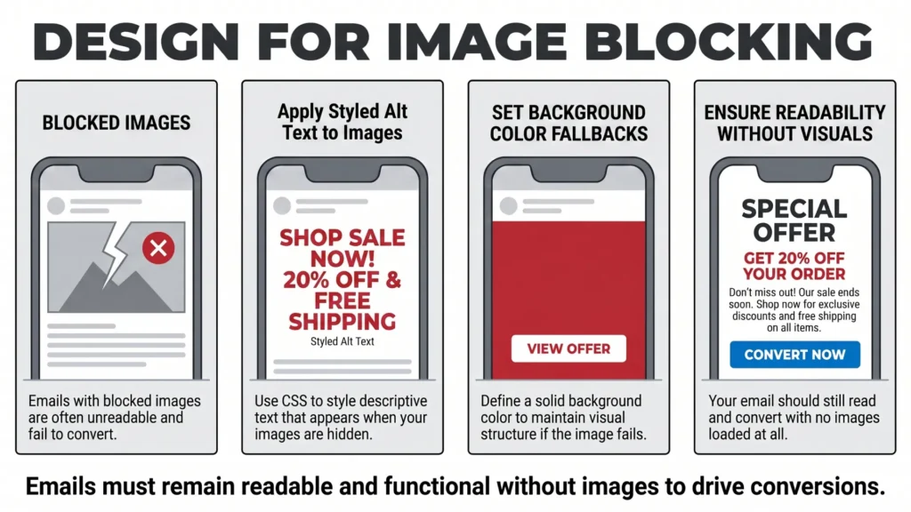
Here is a stat that should change how you build. A meaningful share of email opens happen with images blocked by default. Some corporate Outlook setups strip images automatically. Some people just browse with images off to save data or because they prefer it.
So images-off is not an edge case. It is a normal Tuesday for a chunk of your list.
Direct answer: to handle blocked images, give every image styled alt text and a background color fallback. The email should still read and convert with no images at all.
That is the fallback-first mindset, and it sits at the core of solid email image best practices. Build the working skeleton first. The images are the muscle and skin on top, not the bones.
What a fallback-first email actually has
I run through the same short list on every build. It is boring. Boring is good in email.
- Live HTML text for the headline and the offer, never baked into an image.
- A real HTML or VML button, so the call to action survives even with images dead.
- A solid background color behind every image block, so a blocked image does not leave a stark white hole.
- Alt text that reads like a sentence, not a filename.
None of that is glamorous. All of it saves you the day Gmail decides not to load your hero.
Alt text people skip (and should not)
Alt text is the most ignored line of code in email. It is also free insurance.
When an image fails to load, the alt text is what shows up in that empty box. Styled alt text takes it further. You can set the font size, color, and family on the image tag, so the fallback text matches your design instead of looking like an error.
A few rules I hold to:
- Describe the content, not the file. “Spring sale, 30 percent off boots” beats “hero_final_v3.jpg”.
- Decorative spacer or divider images get empty alt text. That tells a screen reader to skip them.
- Keep it short and human. A screen reader reads this out loud, remember.
Screen readers and Gmail image blocking reward the exact same habit here. Accessibility and resilience turn out to be the same job. I find that quietly satisfying.
Choosing the right image format in 2026 (the email reality check)
This is where I get a little heated, so bear with me.
The web has moved on. Out there, WebP is the default and AVIF is the shiny new thing that beats everything on file size. If you read a general image guide in 2026, it will tell you to ship AVIF with a WebP fallback and feel smart about it.
That advice is web advice. It is not email advice. And the gap between the two is the single most misunderstood part of email image best practices right now.
Email is still, mostly, a JPEG and PNG world. Here is the honest breakdown.
| Format | Best for | Email reality in 2026 |
|---|---|---|
| JPEG | Photos, gradients, busy images | Universal. Your safe default for anything photographic. |
| PNG | Logos, text, sharp graphics, transparency | Universal. Heavier files. Use PNG-24 when you need transparency. |
| GIF | Simple animation | Works almost everywhere, but Outlook desktop freezes the first frame. |
| WebP | Smaller photos and graphics | Apple Mail and Yahoo render it. Gmail and Outlook desktop are unreliable. Risky alone. |
| AVIF | Smallest files, modern color | Better than it used to be – Apple Mail and Yahoo render it, Gmail converts it to JPG. Classic Outlook on Windows still chokes. Not a safe default yet. |
| APNG | Animation plus transparency | Niche, but handy in dark mode. Falls back to a static frame elsewhere. |
The WebP irony nobody states plainly
Google invented WebP. Google also runs Gmail. And Gmail still does not reliably render WebP in the email body.
Sit with that for a second. The company that built the format will not consistently show it in its own mail client. The caniemail data lists WebP as only partially supported in Gmail and Outlook. The bug threads about it are years deep, full of developers asking Google to just fix it.
So when someone tells you “use WebP, it is 2026,” nod politely and keep shipping JPEG. WebP can save you 25 to 35 percent on file size, which is real. But if a third of your list cannot see it, those savings are worthless.
Where WebP actually fits
I do use WebP sometimes. The case has to be right.
- The list skews heavily Apple Mail, which I can check in my own analytics.
- I have a proper fallback in place and I have tested it in the real send.
And here is the catch with fallbacks. The classic <picture> element with a WebP source and a JPEG fallback works on the open web. Inside email service providers, it gets flaky fast. I have watched platforms ignore the WebP source entirely and serve the fallback to everyone. Which, fine, at least nobody saw a broken image. But it means the “smart” format swap did nothing.
AVIF: not dead, but not your default either
AVIF is genuinely brilliant. On the web it is past 90 percent browser support now (caniuse has it around 94 percent in early 2026), and it compresses harder than anything else out there.
Here is where I have to correct my own old advice, because I used to tell people AVIF was flat-out dead in email and to forget it exists. That is not true anymore, and I would rather eat the correction than repeat a stale line. caniemail currently estimates AVIF support across email clients at roughly two thirds – somewhere around 66 percent when you add full and partial together. Apple Mail and Yahoo render it. And here is the weird part: Gmail quietly converts a still AVIF into a JPG on the way in, so it actually shows up. So no, it is not the wasteland I once called it.
But – and this is the but that keeps it off my safe list – classic Outlook on Windows still does nothing with it. Microsoft Office cannot even decode AVIF natively in 2026 without an extension, which Microsoft’s own support docs admit. So an Outlook desktop user opening a raw AVIF gets a broken box, and that is still too big a chunk of most lists to gamble on.
So my actual rule now: AVIF is no longer something to laugh off, but I am not shipping it as the only version of an image. If you want to use it, treat it like WebP – serve it where it works, keep a JPEG underneath, and test the real send. For most senders, JPEG and PNG are still the boring, safe answer. Watch caniemail. The numbers are moving, slowly, in AVIF’s favor.
Email image size and weight: the numbers that matter
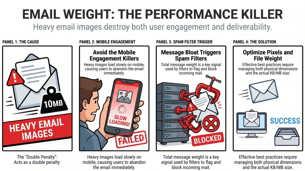
Heavy emails get punished twice. They load slowly, which kills engagement on mobile. And the bloat itself can trip spam filters, because total message weight is a signal.
So size matters in two ways: the pixel dimensions, and the file weight. Good email image best practices treat both. Let me give you numbers I actually use.
Direct answer: keep individual email images under roughly 100KB where you can, and heroes under 200KB. Keep the whole email under about 800KB to 1MB. Make full-width images 600 to 640 pixels wide.
Here is the working table I keep pinned.
| Use | Display width | File size target |
|---|---|---|
| Full-width hero | 600 – 640px (export at 2x) | under 200KB |
| Inline content image | match the column width | under 100KB |
| Logo | actual size, exported at 2x | under 50KB |
| Icons | 2x of display size | as light as you can get |
The Gmail clip nobody plans for
Gmail clips your email at around 102KB of HTML. Anything past that hides behind a “view entire message” link that most people never click.
Now connect that to images. If you embed images as base64 inside the HTML instead of hosting them, you balloon that HTML weight fast. Your call to action can get shoved past the clip and effectively disappear.
The fix is simple. Host your images on a server or CDN and link to them. Do not embed. Keep your HTML lean so your important content lands well before the 102KB wall.
Retina without the bloat
High-resolution screens are everywhere. A logo exported at exactly its display size looks slightly fuzzy on a retina display. It is a small thing, but it reads as “cheap,” and cheap is the exact feeling we are trying to avoid.
The trick is older than it looks and it still works.
- Export the image at twice the dimensions you plan to display. A 300px-wide logo gets exported at 600px.
- In your HTML, set the
widthandheightattributes to the 1x display size. - The browser packs those extra pixels into the same space, and the image looks crisp.
You ship a slightly bigger file, yes. But a 2x logo is still tiny if you compressed it. The sharpness is worth it.
Compression that does not wreck quality
Compression is where most people either do nothing or go too far. Both hurt.
My actual workflow, nothing fancy:
- Photos go out as JPEG at quality 70 to 80. Above 80 the file balloons for almost no visible gain.
- Logos and flat graphics go out as PNG, then through a lossless squeezer.
- I strip metadata. Camera EXIF data is dead weight in an email.
Tools I reach for: TinyPNG for quick PNG and JPEG crunching, Squoosh when I want to eyeball the quality slider myself, and ImageOptim on the Mac for batch jobs.
One war story. I once over-compressed a soft purple gradient hero, pushed the JPEG quality way down to save weight. Looked fine on my monitor. In Apple Mail it banded into ugly stripes, like a bad sunset. Tested it, caught it, bumped the quality back up. Lesson: gradients and skin tones punish aggressive compression. Test the soft stuff, always.
Email image best practices for dark mode (where good design quietly dies)
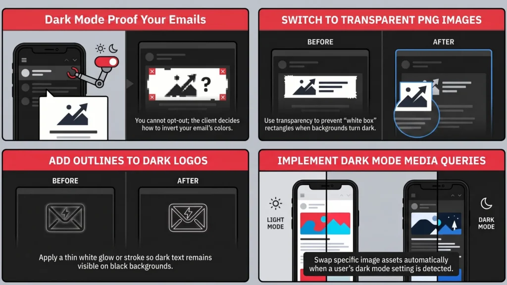
Dark mode is the part of email image best practices that catches even experienced people off guard. It is not your choice. The client decides whether to invert, partially invert, or leave your email alone. You do not get a vote.
And here is the cruel bit. Dark mode usually does not touch your actual images. It flips the background and the live text around them. So a logo sitting on a white background suddenly becomes a glaring white rectangle floating on black.
Direct answer: to protect images in dark mode, use transparent PNGs and avoid pure black and white. Add a thin outline or glow to dark logos. Swap images with a dark mode media query where you can.
Let me unpack each, because the why matters.
Transparent PNGs are your default
A logo saved as a JPEG with a white background is a time bomb in dark mode. The white box does not invert. It just sits there, harsh and ugly.
A transparent PNG adapts. It sits on whatever background the client throws at it, light or dark or that weird in-between grey. For logos and icons, transparent PNG should be your reflex.
Dodge pure black and pure white
Many clients specifically target true white (#FFFFFF) and true black (#000000) for inversion. So a pure white background can flip dramatically.
A common dodge is off-white, something like #FEFFFF. It looks white to a human. It sidesteps the aggressive inversion trigger in some clients. Small trick, real payoff.
The stroke and glow trick
If your logo is dark text on transparency, full inversion can turn that text invisible against a dark background.
The fix the email community settled on: add a thin light outline, or a soft translucent glow, around the dark elements. On light mode it is invisible or barely there. On dark mode it gives your logo a stable edge so it never disappears. The folks at Litmus and Email on Acid have shown this off for years, and it genuinely works.
Swapping images for dark mode
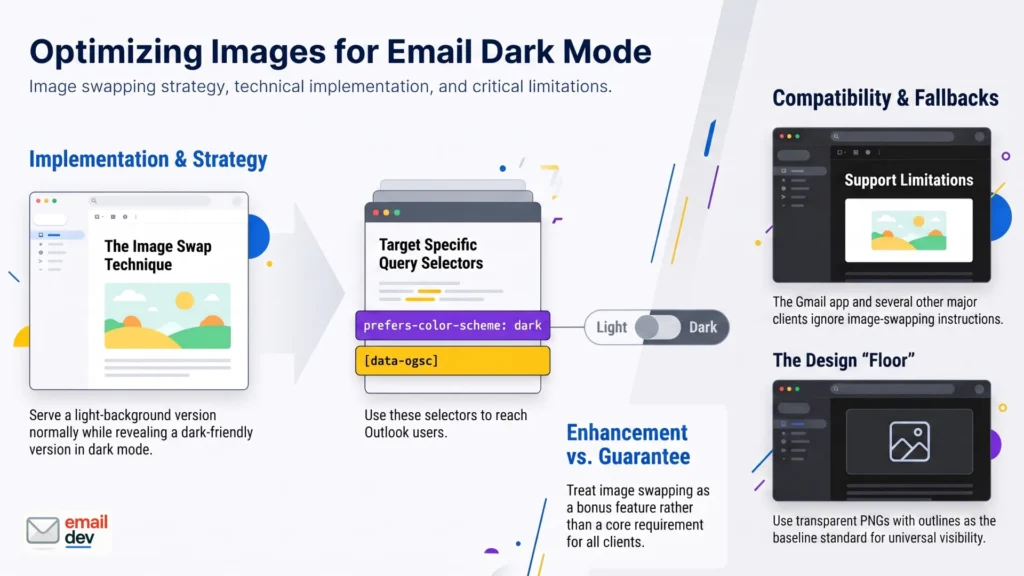
For clients that support it, you can serve two different images. Show a light-background version normally, hide it in dark mode, and reveal a dark-friendly version instead.
<!-- light logo, hidden in dark mode -->
<img class="light-logo" src="logo-on-light.png" alt="Company logo">
<!-- dark logo, hidden in light mode -->
<div class="dark-logo" style="display:none">
  <img src="logo-on-dark.png" alt="Company logo">
</div>
You drive that with a prefers-color-scheme: dark media query, plus the [data-ogsc] attribute selector to reach Outlook’s dark mode.
Here is the honest caveat. This swap does not work everywhere. The Gmail app and several other clients ignore it. So treat image swapping as an enhancement, not a guarantee. The transparent-PNG-plus-outline approach is the floor. The swap is the bonus when the client allows it.
APNG when you need motion and transparency
If you want animation that also handles transparency cleanly, APNG beats GIF. It has a wider color range and real transparency, so it holds up better in dark mode. Where it is not supported, it gracefully shows the first frame as a static image. Niche, but worth knowing.
The padding trick
One more, quick. Images that are not transparent should carry a little padding around the content. When the background shifts in dark mode, that breathing room stops the image from reading as a hard, ugly box. Cropping tight to the edge is what makes a logo look boxed-in when the colors flip.
Animated images: GIF, APNG, and the Outlook freeze
People love a GIF in email. A blinking button, a quick product spin, a bit of personality. Used well, it earns its place.
Then Outlook shows up and ruins the party.
Direct answer: GIFs animate almost everywhere except Outlook desktop, which only shows the first frame. So your first frame must carry the full message and the call to action on its own.
Desktop versions of Outlook from 2007 through 2019 use that Word rendering engine, and it just freezes on frame one. Outlook 2019 will play a GIF once, then drop a play button over it. Mobile Outlook and Outlook.com handle GIFs fine. So your animation strategy lives or dies on the first frame.
Build the first frame as the fallback
This is the whole game with GIFs. Make frame one a complete, standalone image.
- The key message sits in the first frame.
- The call to action sits in the first frame.
- The animation enhances. It never carries information that only appears later.
If your offer only shows up on frame seven, every Outlook desktop user just missed it. That is on you, not on them.
You can serve a static version to Outlook
For more control, swap a static image into Outlook using a conditional comment. Everyone else gets the GIF. Outlook gets a tailored still.
<!--[if !mso]><!-->
  <img src="animated.gif" alt="Product demo">
<!--<![endif]-->
<!--[if mso]>
  <img src="static-frame.png" alt="Product demo">
<![endif]-->
Keep GIFs light, or they fail
GIFs get heavy fast. They are capped at 256 colors, so gradients look splotchy, and long animations balloon in size.
A fat GIF over 1MB does two bad things. It pushes your email weight into spam-trigger territory. And it often just fails to load on mobile or a slow connection, leaving you with a broken box.
Keep them short. Trim the frames. Drop the frame rate. Animate only the part that needs to move. A static background with one subtly moving element is lighter and usually classier.
The new Outlook wrinkle
The new Outlook for Windows runs on a Chromium engine, basically the same as Outlook.com. It animates GIFs properly. Good.
But it ignores the old MSO conditional comments entirely. So your careful ghost hacks just sit there, invisible to it. From 2026 through roughly 2028 you are coding for both Outlooks at once, the dying Word engine and the new Chromium one. It is annoying. It is also temporary, which I will come back to.
Hero images and background images without the heartbreak
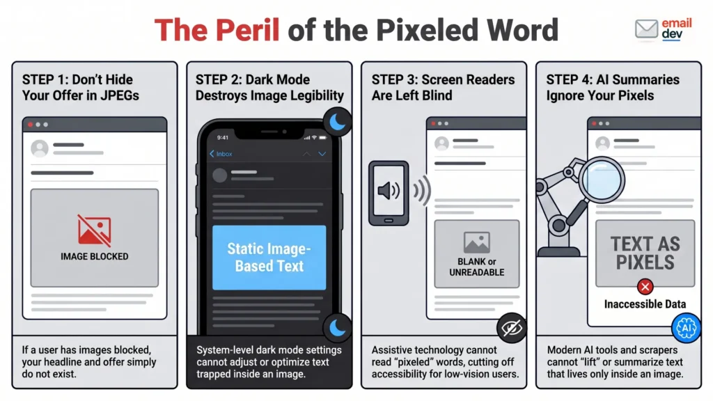
The hero image is the big swing at the top of your email. It sets the mood. It is also the place people make the most expensive mistake.
Never trap your message in the hero
I will say this plainly because it is the heart of good email image best practices.
The hero carries mood and proof. Live text carries the message and the ask.
If your headline and offer live only inside the hero JPEG, you have just handed your most important words to the least reliable part of the email. Dark mode cannot adjust them. A screen reader cannot read them. The AI summary cannot lift them. And if images are blocked, your offer simply does not exist.
So the brand-forward look that is trendy right now, big bold imagery, is totally fine. Just layer real HTML text over a decorative image. Do not flatten the words into the picture.
Background images and the Outlook problem
Background images make an email look rich. They are also notoriously flaky, and Outlook is the usual culprit.
Two non-negotiable habits:
- Always set a solid fallback background color behind the image. If the image fails, the section still reads.
- For classic Outlook support, use VML to force the background to show. It is ugly code, but it works.
Support for background images is slowly improving as the new Outlook spreads. Slowly. Not there yet. So the fallback color stays mandatory for now.
Where your images actually live: hosting, ESPs, and the platform that mangles them

This section is for the course producers and small shop owners reading along. You feel this pain constantly, and almost nobody explains it. It is the part of email image best practices that lives outside your HTML.
You build a clean email. The images look crisp. Then your platform gets its hands on them and quietly wrecks the work.
Host your images properly
Do not paste or embed images directly into the email body. Host them on a reliable CDN or your email service provider’s image storage, and link to them.
Embedded base64 images bloat your HTML, which feeds straight into that Gmail 102KB clip problem. Hosted images keep the email light and load on demand.
Platforms rewrite your images
Here is the part that drives my clients up the wall. Many platforms rewrite, re-compress, or resize your images on the way out.
- GetCourse and some ESPs strip or rewrite image paths and re-compress files. Your sharp export comes out fuzzy.
- Some builders inject their own width attributes and squash your careful sizing.
- A few re-host everything through their own system, changing the file in transit.
You did everything right. The platform undid half of it. So the testing rule is non-negotiable.
Test inside the real platform, with the real export. Not just in a previewer.
The previewer has no idea what GetCourse is about to do to your beautiful code. The only way to know is to send the actual email from the actual system and look at it.
Gmail caches your images
Gmail re-hosts your images through its own image proxy and caches them. Mostly that is fine. But it can break per-open or dynamic image swaps, because Gmail grabs one version and serves it to everyone. It can also occasionally show a stale cached image after you have updated the file. Worth knowing when a “fixed” image stubbornly refuses to update for Gmail users.
Images and the AI inbox: the new reason to stop baking text into pictures
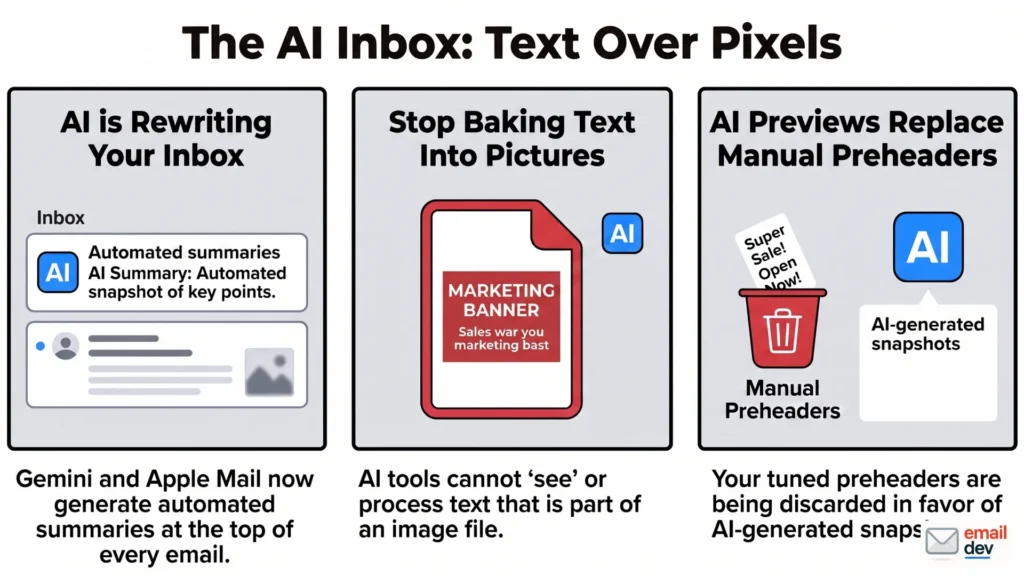
This is the genuinely fresh shift, and it changes the stakes on every email image best practices decision above.
Gmail now folds Gemini into the inbox and can drop an AI summary at the top of an email. Apple Mail generates its own AI preview, which is quietly replacing the preheader marketers spent years tuning.
And here is the catch. These summaries lean on live text and clean HTML. Gemini will sometimes try to OCR the words inside an image, but it is hit and miss, and Apple’s summarizer is worse at it. So the words baked into your hero are a coin flip at best – exactly the thing you do not want your offer riding on.
Direct answer: if your offer is trapped inside an image, the AI summary may never see it, so it hands your reader a three-line version of your email that sells nothing.
Think about what that means. The machine reads your email before your customer does. It grabs whatever live text it can parse. Then it tells the reader what your email is “about.” If your headline and offer were a JPEG, the summary is working from scraps.
So the AI inbox is now making the same argument accessibility advocates made for years. Use live text for what matters. The difference is the AI is making that argument louder, and it affects everyone, not just screen reader users.
My practical split has not changed, it has just gotten more urgent:
- Decorative, mood-setting, proof? Image it. Go nuts.
- The actual point of the email? Live, selectable, semantic text near the top.
Designers used to fight for that on principle. Now the inbox itself is enforcing it.
A quick email image best practices checklist
Here is the whole thing, compressed into a pre-send pass. I run something like this before every campaign goes out. Steal it.
- [ ] Format chosen for the email client, not the browser. JPEG or PNG as the safe default.
- [ ] No bare AVIF or WebP as the only format. Either one only with a tested JPEG fallback, ideally on an Apple-heavy list.
- [ ] Individual images under 100KB, heroes under 200KB.
- [ ] Total email under about 800KB to 1MB.
- [ ] Full-width images 600 to 640px, exported at 2x for retina.
- [ ] Images hosted on a CDN, not embedded as base64.
- [ ] Important content lands before the Gmail 102KB clip.
- [ ] Every image has styled, descriptive alt text. Spacers have empty alt.
- [ ] Logos are transparent PNGs with an outline or glow for dark mode.
- [ ] Off-white instead of pure white where inversion is a risk.
- [ ] GIF first frame carries the full message and the call to action.
- [ ] Background images have a solid fallback color, plus VML for Outlook.
- [ ] No core message baked into any image. Live text for the offer.
- [ ] Email still reads and converts with images switched off.
- [ ] Tested in the actual ESP, dark mode, and an AI summary preview.
If it clears all of that, ship it. If it fails one, you just caught a bug before your subscribers did.
A note on testing tools and cost
Cross-client previewing used to be cheap. It is not anymore.
Litmus was the go-to for years. Then Validity acquired it in April 2025, and that August the pricing changed hard. The cheaper Basic and Plus plans disappeared. As of 2026, the Litmus Core plan starts at around 500 dollars a month, which covers roughly 2,000 previews and five users. That is a brutal jump from the old 99 dollar entry point, and it priced a lot of freelancers and small shops right out. Putsmail, the old free test-send tool, is gone too, so that quick free option no longer exists.
If 500 a month is not happening for you, Email on Acid tends to land friendlier for solo developers and small teams. Newer leaner previewers keep popping up as well. And honestly, for a lot of small senders, a disciplined manual routine covers most of the risk. Real devices, a couple of inboxes, dark mode on, images off, the checklist above. I would rather a freelancer test by hand on three real phones than skip testing because the fancy tool costs more than rent.
Where email image best practices are heading (2026 – 2030)
I cannot see five years out perfectly. Email changes slower than the hype and faster than the laggards expect. But the signals are clear enough to plan around.
The Word engine finally sunsets
Microsoft ends support for the classic Outlook Word rendering engine on October 13, 2026. That is the same day Office 2021 support ends. Nineteen years of coding like it is 1999, finally winding down.
The new Outlook for Windows uses a Chromium engine. It supports real CSS, real backgrounds, real layout. Images get easier to place and harder to break. The catch is the long tail. Classic Outlook lingers in cautious enterprise environments through roughly 2029. So you keep your ghost tables and VML for a few more years, even as the trajectory points the other way.
Modern formats might finally reach email
As email clients converge on web engines, the format gap is already closing. WebP and AVIF both clear about two thirds support on caniemail now, and that number creeps up every time another client moves to a web engine. The holdout, as ever, is classic Outlook on Windows.
Not yet, though. In 2026, JPEG and PNG remain the safe defaults, and I would not bet a campaign on anything else. Watch caniemail and let the support numbers, not the hype, tell you when to switch.
The AI inbox reshapes what an image is for
This is the trend I would build around hardest. AI previews are becoming a normal step between your send and your reader. Open rates blur as a metric. The “top” of your email increasingly means the part the AI chooses to show.
In that world, images stop being able to carry your message at all. They carry mood, brand, and proof. The words, the ask, the offer, those become live text by necessity. Some teams are already writing summary-friendly copy and structuring emails so the machine grabs the right thing. Designing for the summary is becoming a normal part of the job.
Accessibility and AI readiness turn out to be the same project
For years, accessible email was the responsible choice plenty of people skipped. Now there is a selfish reason to do it. The same structure that helps a screen reader helps an AI summarizer. Styled alt text, live text, semantic order. It serves both readers at once. Convenient, and overdue.
What stays true no matter what
Through all of it, the fundamentals of email image best practices do not move. Lighter is better. Live text beats image text. Transparent PNGs survive dark mode. Strong fallbacks save you. And the email must still work with every image switched off. Tools change, engines change, the format wars rage on. The bet stays the same, and you still design for the version where it loses.
FAQ
What is the best image format for email?
JPEG and PNG are the best formats for email in 2026. Use JPEG for photos and gradients, and PNG for logos, sharp graphics, and transparency. They render in every major email client. WebP and AVIF are still unreliable in email, so they are not safe as your only format.
Can I use WebP images in email?
You can, but carefully. Apple Mail and Yahoo render WebP, while Gmail and Outlook desktop do not handle it reliably. So WebP is risky as your only format. Only use it for a known Apple-heavy list, with a tested JPEG fallback in place. Otherwise stick to JPEG and PNG.
What size should email images be?
Keep full-width images at 600 to 640 pixels wide, exported at 2x for sharp retina display. Aim for individual files under 100KB, heroes under 200KB, and the whole email under about 800KB to 1MB. Heavy emails load slowly and can trip spam filters.
How do I stop my email images from breaking in dark mode?
Use transparent PNGs for logos and icons so they adapt to any background. Avoid pure white and black, and add a thin outline or soft glow to dark logos. Where supported, swap images using a dark mode media query and the data-ogsc selector for Outlook. Then preview on more than one client.
Why are my images not showing in Outlook, and why is my GIF frozen?
Classic Outlook desktop uses Microsoft Word’s rendering engine, which only shows the first frame of a GIF and breaks many image effects. Put your key message and call to action in the first frame. For background images, set a solid fallback color and use VML. Relief is coming as the new Chromium-based Outlook spreads.
Should I send an image-only email?
No. An image-only email is a deliverability risk, since a poor text-to-image ratio is a spam signal. It also fails completely when images are blocked, and AI inbox summaries cannot read it. Always pair images with live text, a real button, and a healthy text-to-image balance.
How do I make email images look sharp on retina screens?
Export the image at twice its display dimensions, then set the width and height attributes to the 1x display size in your HTML. The browser packs the extra pixels into the same space, so the image stays crisp on high-resolution screens. Compress the file afterward so the bigger image stays light.
Email image best practices: The one-line takeaway
A gorgeous image that only works on your monitor is not a design asset. It is a liability waiting for your subscribers to find. Build images-off first, choose formats for the email client and not the browser, keep your message in live text, and test against dark mode, Outlook, blocked images, and the AI summary. That is what email image best practices actually look like in 2026.
If your emails keep falling apart in Gmail or Outlook, or some platform like GetCourse keeps mangling your images, that is the work I do. Send it over. I will tell you straight what is wrong and what it takes to fix it.