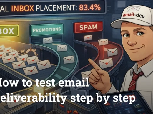
There’s this moment that happens maybe once a week where I’m staring at an email in a preview pane, everything’s crisp, spacing behaves, buttons look expensive (you know what I mean) – and I almost convince myself we’re done. Almost. Because somewhere in the back of my head is the reminder that “looks fine on my machine” is basically the email developer’s version of famous last words. Proper email testing is what separates the professionals from the people who ship a broken campaign and spend the next day collecting screenshots like it’s evidence.
- Why “send yourself a test email” isn’t real email testing
- The five types of email testing (and which ones you’re probably skipping)
- Email rendering testing: the cross-client nightmare
- Functional testing: the stuff that actually breaks conversions
- Email testing for deliverability: will it even arrive?
- Accessibility testing: the one most people skip entirely
- Mobile email testing: where most of your opens happen
- Building an email testing workflow that doesn’t drive you insane
- The pre-build checklist: before you write a single line of code
- Development testing: iterate as you build
- The pre-send email QA checklist: the final gate
- When to stop testing
- Email testing tools that actually help (and when free alternatives work)
- Professional email testing platforms: the honest comparison
- Free and low-cost alternatives that actually work
- What your ESP already offers
- When to pay vs. when to skip
- The most common email testing issues and how to spot them
- Outlook-specific problems: the gift that keeps on giving
- Dark mode disasters: when your colors betray you
- Mobile layout failures: where most of your opens live
- When good enough is good enough in email testing
- Conclusion: email testing as a habit
- Quiz to test your knowledge
- Footnotes
Here’s the annoying part: the phrase email testing is misleading to a lot of people. Marketers hear it and think A/B tests, subject lines, send-time experiments – conversion stuff. All useful, sure, but not what I mean. I’m talking about the more basic question: will your email render the way you intended when it lands in someone’s inbox? Will the two-column layout you built all afternoon still be two columns when Outlook gets involved? Will your carefully chosen brand colors survive Gmail’s dark mode treatment without turning into something that looks vaguely injured?
The gap between “works in development” and “works across dozens of real email clients” is where careers get tested. And yes, mine has been humbled in that gap more times than I’d like.
This guide is the email testing workflow I wish someone had handed me years ago – the one that catches problems before they become Slack fires. We’re going to talk about what proper cross-client email testing actually involves, how to build an email QA process that doesn’t make you hate your life, and which tools are worth paying for (plus the ones that aren’t).
Let’s get into it.
Why “send yourself a test email” isn’t real email testing

I used to do this thing where I’d send myself a test email, check it on my phone, maybe open it in Gmail on my laptop, and call it done. It felt responsible. It wasn’t.
The math problem with email testing is brutal. You’re dealing with something like 30-40+ email clients and environments (depending on how you count), and each one has its own weird interpretation of what HTML is allowed to be.
Take Outlook for Windows – the classic desktop app uses Microsoft Word as its rendering engine for HTML email. Yes, Word, the document editor. The “Word-based rendering” era started back in Outlook 2007 and the pain has been lovingly preserved for years. This isn’t an edge case either – corporate environments are full of Outlook desktop users, especially in B2B.
Then there’s Gmail. Gmail can handle a lot, but it’s not a browser, and it doesn’t behave like one. Embedded styles are supported (with rules and caveats), but plenty of CSS still gets ignored, filtered, or behaves differently depending on whether we’re talking Gmail web vs Gmail apps.1 And for dark mode specifically, you can’t count on @media (prefers-color-scheme) behaving like it does in Apple Mail – some clients just won’t let you target it cleanly.2
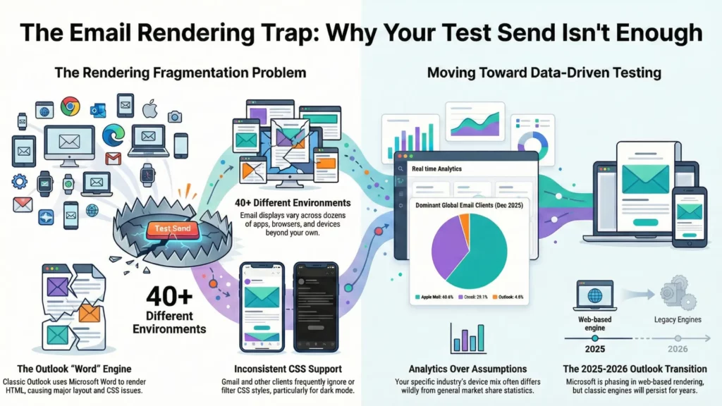
Apple Mail, meanwhile, is relatively sane: solid media query support, generally modern CSS behavior – great, until you remember that not everyone reads in Apple Mail.3
And yes, Outlook is in a weird transition period right now. Microsoft is rolling users toward the new Outlook for Windows (web-based rendering, closer to Outlook.com), with opt-out phases starting for some business users in January 2025 and wider waves scheduled through 2026.4 That changes the rendering picture over time… but it doesn’t magically delete classic Outlook overnight, and it definitely doesn’t erase the Word-engine reality you still have to support in a lot of inboxes today.5
Point being: when you test emails only on your own devices, you’re testing maybe three environments out of dozens. You have no idea what’s happening in that Outlook install someone’s finance team is using, or how Yahoo is caching your images, or what Samsung Mail decided to do with your spacing this week.
Your audience’s device mix matters more than your personal setup. Broad market share stats are fine for context – for example, Litmus’s December 2025 report puts Apple at about 60.6%, Gmail around 29.1%, and Outlook around 4.0% – but your list can look wildly different depending on industry and audience.6
So yes: pull your own analytics. Find out where your opens are actually coming from. Until you do that, you’re not making testing decisions – you’re guessing.
The five types of email testing (and which ones you’re probably skipping)

Most email testing conversations focus on one thing: does it look right? And sure, that matters. But “looking right” is maybe one-fifth of what you should actually be checking. Over the years I’ve ended up treating email testing as five separate buckets, because if you mash them together you miss stuff – and I’d bet money most teams are skipping at least two of them.
Email rendering testing: the cross-client nightmare

This is what most people mean by “email testing” – making sure the layout doesn’t collapse across clients. Rendering testing catches the obvious stuff: broken columns, images that don’t load, font fallbacks that go sideways, buttons that somehow end up three pixels wide.
The cross-client preview approach is what tools like Litmus and Email on Acid are built for – they render your email across a whole pile of real environments and hand you screenshots. It’s genuinely useful. The alternative is maintaining test accounts across every major client and sending manual previews, which… yeah. I’ve done it. For years. It’s tedious and you still miss things because you’re a human with limited patience.
My actual advice on which clients to prioritize is boring: pull your analytics first. Your audience is not the same as the global average. If 60% of your opens are Apple Mail and Gmail, maybe don’t spend four hours perfecting Outlook 2016. But if you’re in B2B and your list is full of corporate accounts, Outlook can easily be a big chunk of opens and you absolutely cannot ignore it.
And then there’s dark mode, which has basically graduated into its own recurring problem. Clients apply dark mode differently: some invert almost everything, some do partial changes, some leave your colors alone and just switch the UI around it. Apple Mail can respect @media (prefers-color-scheme: dark) if you use it. Gmail does not – not reliably, not in a way you can build a plan around.
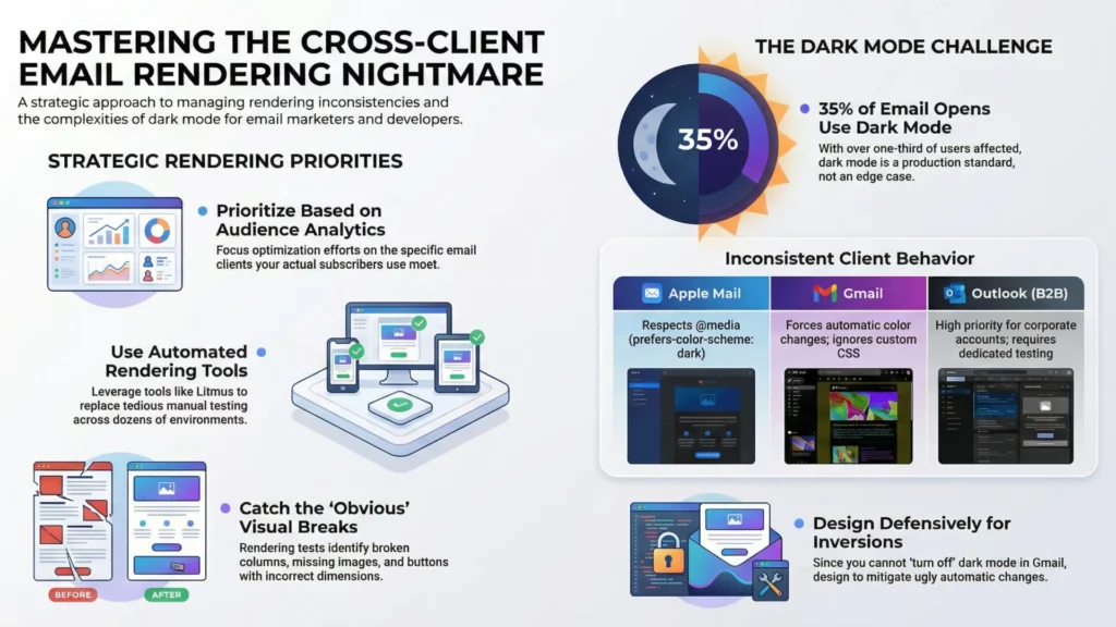
So in Gmail you’re often testing the outcome of its automatic color changes, not your clever dark-mode CSS. You can’t truly “turn it off.” You can mitigate it, design defensively, and check the ugly cases before they go live.
If you want a number to justify caring: Litmus has reported an average of about 35% of tracked opens using dark mode in 2022. That’s not “edge case,” that’s “you’re going to meet it in production.”7
Functional testing: the stuff that actually breaks conversions

Functional testing is the boring-but-critical category. Links. Every single link. Including the ones with UTM parameters, which can break in subtle ways when your ESP wraps or rewrites them.
I’ve seen campaigns go out where the main CTA link had a typo in a tracking parameter, so the click worked… but the analytics were garbage. Technically functional, practically a disaster.
Image loading lives here too. Are your images actually reachable from wherever you host them? Are they absurdly heavy? Are you forcing someone on mobile to wait for a hero image the size of a small planet? And alt text – not just “does it exist,” but “does it describe the image in a way that still makes sense if the image doesn’t load.” Because images not loading is a normal inbox experience, not a rare glitch.
Tracking pixels, analytics integration, dynamic content with merge tags – all of this needs testing with real data. Don’t test personalization with {{FIRSTNAME}} still in the template. Test with actual names from your database, including the annoying edge cases: blank fields, weird punctuation, non-Latin characters, double first names, all of it.
Email testing for deliverability: will it even arrive?

You can build the most beautiful email in the world and it means nothing if it lands in spam.
Deliverability testing is about checking whether your email will reach the inbox, and the bar has gotten higher. Gmail defines bulk sending at around 5,000+ messages to Gmail accounts in a 24-hour window and expects authenticated mail.8 Google and Yahoo also pushed stricter bulk-sender requirements starting in 2024 – authentication plus easier unsubscription and spam complaint thresholds.9
The authentication trio is still the core:
- SPF: says which servers are allowed to send for your domain.
- DKIM: cryptographically signs the message so recipients can verify it wasn’t altered.
- DMARC: ties SPF/DKIM together, requires alignment, and tells receivers what to do when checks fail.
If you’re a bulk sender and you don’t have this set up properly, you’re asking for rejections, spam placement, or throttling.
Also – and a lot of teams forget this part – bulk senders are expected to support one-click unsubscribe using the right headers. Gmail explicitly calls this out.10 Yahoo’s sender guidance is blunt about one-click unsubscribe and keeping spam complaints low (they mention staying under 0.3%).11
Yes, you can run spam-filter simulations and check blocklists. My take on spam scores: they’re directional, not definitive. A 10/10 doesn’t guarantee inbox placement. A 6/10 doesn’t mean you’re doomed. Use them to catch obvious problems, not as something to “optimize” like a videogame stat.
Accessibility testing: the one most people skip entirely

I’ll be honest: accessibility testing in email is still behind where the web is. A lot of teams treat it as optional, which is unfortunate because the basics aren’t hard and they make emails easier for everyone.
Screen reader compatibility is the big one. Does your email make sense when read linearly? In email land, that usually means: keep structure sane, don’t hide meaning in images, and don’t make assistive tech wade through table markup like it’s reading a spreadsheet.
If you’re using tables for layout (you are), mark layout tables as presentational: role="presentation". This tells screen readers to stop announcing row/column structure and just read the content.
Alt text should describe the image when the image carries meaning. If it’s decorative, an empty alt (alt="") is fine – but that should be a deliberate choice, not an accident.
Color contrast matters too. WCAG’s common baseline is 4.5:1 for normal text and 3:1 for large text. (W3C) That’s not only “accessibility” – it’s “someone reading your email on a phone outside.”
Link text should make sense out of context. “Click here” is useless when someone is navigating by links and hears “click here” twelve times. “Download the pricing guide” tells them what happens.
Mobile email testing: where most of your opens happen

Depending on your audience, mobile is often the majority. So if the email doesn’t work on mobile, it doesn’t work.
Media query support is the first gotcha. Apple Mail is generally friendly to responsive styles. Gmail supports many media queries, but support is still partial and can differ between Gmail web and the apps, which is why “it worked on my iPhone” isn’t a strategy.12 Classic Outlook for Windows doesn’t support media queries at all (Word engine rules), but that’s a desktop client – it’s not your mobile problem.
The practical solution is hybrid/fluid layout: build a base layout that adapts naturally using percentage widths and max-width, then layer media queries on top for the clients that support them.
Touch target sizing is another thing people mess up constantly. Apple’s general guidance is a minimum hit area of 44×44 points for tappable controls.13 So your button that “looks fine” on desktop becomes annoying on a phone if it’s too small. Make buttons big. Bigger than your designer thinks is tasteful.
Preview text is the last mobile landmine. It’s the snippet after the subject line, and if you don’t set it intentionally, clients will grab whatever shows up first in your body – “view in browser,” random navigation text, whatever garbage happens to be first. Set it deliberately, and test it, because different clients show different lengths.
Building an email testing workflow that doesn’t drive you insane

Email testing is one of those things that either happens systematically or it happens in a panic at 11pm the night before a campaign is supposed to go out. I’ve done both. The systematic approach is better for your blood pressure and your email quality, but getting there requires a bit of structure upfront – the kind that quietly pays you back later.
What I’ve learned the hard way: testing can’t be a single phase you “do at the end.” It has to be threaded through the whole build. Catch problems early when they’re cheap, not late when you’re rewriting half the template while someone asks if the send is “still on schedule.”
The pre-build checklist: before you write a single line of code

The most expensive bugs are the ones baked into a design that was never buildable for email in the first place. I’ve had designers hand me gorgeous mockups with CSS grid layouts, overlapping elements, and typography that assumes the inbox is basically Chrome. It isn’t. The result is always the same: the email either ships looking different than the mockup, or it ships broken, or you burn time trying to fake modern layout in clients that don’t want to cooperate.
So: design review before coding isn’t optional. Someone who understands email constraints needs to look at the Figma and ask the annoying questions early.
- Can this actually be built for real inboxes?
- Does it rely on CSS Outlook will ignore?
- Are there background images that will need VML fallbacks for Outlook desktop?
- Is the responsive behavior obvious, or are we going to “interpret” it on mobile?
If you are using background images, treat Outlook as the special case it is and plan VML from the start. It’s not “extra polish,” it’s the difference between “works in Outlook” and “mystery grey box.”14
Asset prep happens here too. Export images at the right sizes, compress them, and if you care about retina, prep higher-res versions so things don’t look like they were screenshot through a sock. Font decisions also belong in this phase: are you using web fonts with fallbacks, or sticking to system fonts? Web fonts can look great in clients that support them (Apple Mail is friendly), but plenty of inboxes will still show fallbacks (Gmail is a common one). So decide what “acceptable” looks like before you code yourself into a corner.
And here’s the one people skip because it’s boring: test with real content, not lorem ipsum. Placeholder text is always the perfect length. Real headlines aren’t. Real names contain weird characters. Real product descriptions vary wildly and punch your spacing in the throat. If you can’t get final copy, at least use “realistic fake” content that behaves like the real thing.
Development testing: iterate as you build

The worst approach to email development is building the entire thing end-to-end and only then checking whether it works. The better approach is incremental email preview testing: build a section, test it, fix it while it’s still isolated, then move on.
During development I’m constantly sending test emails, checking quick previews, and validating that the chunk I just built behaves before I stack more code on top of it. If a two-column block breaks and you only wrote that block, you know where to look. If you’ve got 300 lines and a bunch of nested tables and something’s wrong… congratulations, you’ve invented a new hobby.
It’s also worth setting up a consistent test inbox setup. Not “my one Gmail.” An actual little ecosystem: a couple Gmail inboxes, an Outlook.com inbox, a Yahoo inbox if your audience skews that way, and iCloud mailboxes opened in Apple Mail on iOS/macOS. Yes, it’s tedious once. Then it saves you over and over.
Code validation helps too, with one caveat: validators don’t understand “email HTML culture,” so they’ll complain about things that are normal in email. Still, running your HTML through a validator is useful for catching dumb mistakes – unclosed tags, broken attributes, weird nesting – the stuff that causes truly unhinged rendering bugs.
The pre-send email QA checklist: the final gate

Before any email goes to your list, it should go through a structured QA pass. Not “glance at it and hit send.” A methodical walkthrough of the things that ruin campaigns.
My priority order looks like this:
- Deliverability first
Because if it doesn’t reach inboxes, nothing else matters. Authentication in place, no obvious red flags, unsubscribe working the way bulk senders are expected to support it, and nothing in the send setup that screams “please spam-folder me.” - Rendering second
Cross-client email testing across your top clients. Dark mode checks. Mobile rendering. This is the time sink, but it’s the job. - Functionality third
Every link clicked. Every merge tag verified with real data. Tracking behaving. I’ve caught so many “technically correct” links at this stage that were pointing to staging, or had a typo in UTM parameters, or got rewritten in a way nobody expected. - Content last
Final proofread for embarrassing stuff: wrong dates, wrong names, placeholder text that somehow survived three reviews.
Team vs solo testing is a real problem. If you’re working alone, you’re checking your own work, which means you’ll miss things because your brain is too familiar with it. Fresh eyes catch the obvious errors you’ve looked at fifty times without seeing.
And here’s the part that makes email testing feel permanently slightly cursed: clients change under you. Litmus has shared research showing the top popular clients can change frequently – on the order of an update every ~1.2 days on average in their study window. So yes, an email that tested perfectly last week can pick up a new quirk this week because something updated. That’s not paranoia, that’s just inbox reality.
Final proof should come from your actual ESP, sent to real test addresses. Not your dev environment. Not only a preview tool. The real sending system. ESPs often rewrite links for tracking, add pixels, inject snippets, and sometimes mangle code in ways that only show up after the platform touches it. So: send from the system that will send the campaign, then check what arrived.
When to stop testing

At some point, you have to stop and ship. Testing can turn into procrastination with better branding.
My rule of thumb: fix anything that’s broken for more than 5% of your audience. Optimize anything over 10%. For the long tail of obscure clients, “graceful degradation” is acceptable – readable, functional, not necessarily pixel-perfect.
Document known limitations. If you know an effect won’t work in a specific client and you’re choosing to live with it, write it down. Then when someone asks later why Outlook looks different, you can answer like a professional instead of squinting at screenshots and pretending you’ve never seen your own email before.
The goal isn’t perfection across every possible environment. That’s not a goal, that’s a trap. The goal is professional quality for your real audience, with sane fallbacks for everyone else.
Email testing tools that actually help (and when free alternatives work)

Here’s the part tool vendors don’t love hearing out loud: you don’t always need a $500/month platform to do email testing properly. Sometimes you do. But plenty of the time you can get 80% of the value from a messy stack of cheaper tools and a bit of discipline.
So, instead of pretending everyone has an enterprise budget, here’s what’s actually worth paying for – and what’s fine to keep free.
Professional email testing platforms: the honest comparison

In the cross-client email testing world, the two names you run into first are Litmus and Email on Acid.
I’ve used both. Both can save your skin. Both can also feel like overkill depending on what you send and how often you send it.
Litmus is the “premium suite” option, and the pricing story got spicier in August 2025. Reporting from the email industry showed Litmus quietly revised pricing around August 1, 2025, with the plan equivalent to the old Plus tier listed at $500/month (versus $199/month before), with 5 users and 2,000 previews/month called out in the comparison.15
The product itself is genuinely strong. The preview workflow is fast, the platform feels mature, and if you work with a team (approvals, comments, “who changed what,” all that) it’s built for that kind of reality. Litmus also pushes always-on monitoring via Email Guardian – the idea is you don’t just test once, you monitor for client changes and broken/slow links and images.16
But – and this matters if you’re solo or running a small agency – preview allotments can make you stingy. If you test three variations across 30 clients, that’s 90 previews right there. Do that a few times and you start rationing tests like they’re expensive sushi.
Email on Acid is usually the “I still want serious email QA, but I also like having money” option. Their published pricing is blunt: $74/mo billed annually for Basics and $134/mo billed annually for Premium, both listing unlimited email previews (and unlimited projects). Premium also adds things like full content checking, deliverability checks, and commenting – basically the “pre-send QA checklist in a tool” vibe.17
Their “unlimited” claim isn’t marketing fog either – they explicitly say previews and testing functionality are unlimited. The free trial is 7 days, but it’s limited (they mention 5 tests during the trial).
My honest take: Email on Acid makes more sense for most developers and small teams right now, because unlimited previews removes the mental tax of counting screenshots. If you’re on a big team with complex approval flows and you want the whole “testing + monitoring + collaboration” suite under one roof, Litmus can still make sense – it’s just harder to justify casually after the 2025 pricing shift.
Either way: use the trial aggressively. Don’t test a sample email. Test the ugly real campaign you’re about to send.
Free and low-cost alternatives that actually work

Not every email needs a professional platform. When budget is zero (or you’re just not in the mood to pay for screenshots today), here’s what works.
Mail-tester is the quick spam-score gut check. You send your email to their generated address and they give you a breakdown. Free usage is limited to 3 tests per 24 hours, which is usually enough for spot checks.18 It’s not “deliverability testing” in the inbox-placement sense, but it catches obvious problems before you embarrass yourself.
Mailtrap email sandbox is great for dev/testing environments, especially if you’re building emails inside an app. It captures outbound emails safely and gives you analysis – spam score, headers, HTML support checks, the whole “what did we just send” autopsy. Just don’t oversell the free tier – limits exist (for example, their spam checker mentions a monthly cap in the free tier).19
Can i email is mandatory reading. It’s a compatibility reference that shows HTML/CSS feature support across clients. Before you try something fancy, check it. It won’t test your specific email, but it’ll tell you whether the thing you’re about to build is fantasy.
Your own test inboxes still matter: Gmail, Outlook.com, Yahoo, iCloud opened in Apple Mail on iOS/macOS. Free to set up, annoying to maintain, but they’re perfect for quick sanity checks while building. The downside is obvious: you’re testing a handful of environments, not the full matrix.
Browser dev tools help for basic debugging and “why is this HTML broken,” even if browsers aren’t email clients. They’re good for catching malformed markup before it becomes an Outlook crime scene.
HTMLemail.io tools can be handy for quick tests – they have a “send test HTML email” flow and other utilities like a CSS inliner. Useful when you want something lightweight and you don’t feel like opening a full platform.
(Also: yes, PutsMail is retired. Pour one out.)
What your ESP already offers

Before you pay for more tools, check what your email service provider already includes. Most ESPs have at least basic preview/testing. It’s often enough to catch major layout failures and obvious content mistakes.
The limitation is coverage: ESP previews usually show a handful of popular clients, not the broader cross-client email testing matrix you get from dedicated tools. So treat ESP previews as “fast iteration,” not “final approval.”
My workflow: use ESP previews while building, then do a real pre-send QA pass using either a dedicated platform or your own test inbox ecosystem before the campaign goes out.
When to pay vs. when to skip
Pay for professional tools when:
- A broken email means real money lost (big list, launch, revenue-critical sends)
- Your audience uses a wide mix of clients you can’t cover manually
- You need team collaboration and approvals
- You’re doing complex layouts, dark mode hardening, or heavy personalization
Skip paid tools when:
- Your emails are simple and mostly text
- Your audience is heavily concentrated in one or two clients (and you’ve confirmed that in analytics)
- It’s a low-volume newsletter or side project
- You’re reusing battle-tested templates you’ve already validated
- Budget doesn’t allow it and you’re willing to compensate with manual testing
There’s no shame in the manual approach. It’s slower, it’s messier, and you’ll miss things occasionally. But it works – and pretending everyone needs enterprise tooling is how you end up writing advice nobody follows.
The most common email testing issues and how to spot them

After years of debugging emails across dozens of clients, certain problems show up like they pay rent. Here’s what to watch for, what usually causes it, and what to check before your subscribers are the ones QA’ing your work.
Outlook-specific problems: the gift that keeps on giving

Classic Outlook for Windows desktop has been the bane of email developers for nearly two decades because it renders HTML using Microsoft Word’s engine, not a browser engine. So yeah, a significant chunk of business users are still viewing your “email design” through something that behaves more like a Word document than a modern web page.
Quick reality check on timelines: October 13, 2026 is end of support for Office 2021 – that’s a real date. But it’s not a magical “Word rendering ends” switch for every Outlook user everywhere. Assume you’ll be dealing with classic Outlook longer than you’d like.20
The list of things classic Outlook doesn’t support is genuinely impressive: CSS background images (in the normal way), a lot of modern CSS, inconsistent spacing, layout behaviors that feel like they were invented to test your moral character.
VML for background images
If you need background images in classic Outlook desktop, you usually can’t rely on CSS background-image. The common workaround is VML, wrapped in conditional comments so only Outlook sees it. Email on Acid has solid examples and explanations of how this works and why.
Your snippet is fine as “the vibe,” but it’s missing the closing pieces and a couple practical details (like namespaces). A more complete “skeleton” looks like this:
<!--[if gte mso 9]>
<v:rect xmlns:v="urn:schemas-microsoft-com:vml" fill="true" stroke="false" style="width:600px;height:300px;">
  <v:fill type="frame" src="your-image.jpg" color="#1C1C1C" />
  <v:textbox inset="0,0,0,0">
<![endif]-->

  <!-- your HTML content here -->

<!--[if gte mso 9]>
  </v:textbox>
</v:rect>
<![endif]-->
It’s ugly, it’s verbose, and it works. “Bulletproof background” generators exist for a reason, and you don’t need to reinvent them every time.
Conditional comments
Your description is correct: <!--[if mso]> lets you feed Outlook-specific code to Outlook, and the “not mso” pattern helps you hide code from it. If you do any amount of cross-client email testing, you’ll end up using conditional code sooner or later.
DPI scaling issues
This one is sneaky because it’s not “Outlook version” – it’s Windows display scaling (125%, 150%, etc.). Classic Outlook can scale images/layout in ways that don’t feel proportional, and you can get weird breaks that only happen for people with non-100% scaling. If your audience is corporate Windows, it’s worth checking.
The new Outlook transition
The new Outlook for Windows is the hopeful part: it’s web-based and closer to Outlook.com in how it renders email, which generally means fewer Word-engine nightmares. Microsoft has official docs on the new Outlook rollout, and the email community has been testing its rendering behavior for a while.21
But I’m not writing “VML is dead” on my calendar yet. The new Outlook changes the landscape over time, not overnight – and classic Outlook is still very much a thing.22
Dark mode disasters: when your colors betray you

Email dark mode testing is no longer optional. Litmus has reported that an average of 35% of tracked opens used dark mode in 2022, and depending on your audience that can be higher. So if your email only looks good in light mode, you’re basically flipping a coin and calling it “brand consistency.”
Logos disappearing is the classic. Dark logo on transparent PNG, client flips the background dark, logo vanishes. Fixes that actually work:
- use a version of the logo with a built-in light background,
- add a light stroke/keyline around dark shapes,
- or ship different assets for different modes where targeting is possible.
Color inversion making text unreadable happens when the client transforms your colors and your contrast falls apart. A palette that’s “fine” in light mode can become dark-on-dark or grey-on-grey after transformations. The only reliable way to catch this is: test in the clients your audience uses and check contrast with your eyes like a normal person, not like a design system.
About prefers-color-scheme and Gmail
Apple Mail is one of the friendlier clients for @media (prefers-color-scheme: dark). Gmail, on the other hand, does not support it (web or apps), so you don’t get to “code your way out” of Gmail dark mode.
So in Gmail, you’re designing defensively: assume backgrounds and text may be transformed, assume transparent assets might look cursed, and test what actually happens in Gmail dark mode instead of what you hoped would happen.
Mobile layout failures: where most of your opens live

If your emails don’t work on mobile, they don’t work. For a lot of lists, mobile is the majority, and even when it isn’t, it’s still the place where small layout problems become “I can’t read this, I’m out.”
Stacking that doesn’t stack
Two columns stay two columns on a phone, everything becomes tiny, nobody reads it. Common causes: your layout isn’t fluid/hybrid enough, or you’re relying on responsive techniques that a client partially ignores. The more resilient approach is still hybrid/fluid: percentage-based structure as the base, media queries as enhancement.
Text that’s too small
If your email is readable on desktop and miserable on a phone, it’s usually because you designed it as a poster instead of a reading experience. Check it on an actual device. Not a screenshot. Not a preview window. A real thumb-scroll.
Buttons too small to tap
Apple’s general guidance is a hit region of at least 44×44 points for buttons. In email land, translate that into “make the button chunky and give it real padding.” If your CTA is hard to tap, you’ve built a conversion tax into your layout.23
Images breaking layouts
A single unconstrained image can blow out your mobile layout. Set dimensions thoughtfully, use responsive scaling where appropriate, and don’t assume the client will “do the right thing” because it never promised you that.
When good enough is good enough in email testing

Here’s the truth that makes people calm down (or angry, depends on the day): you will never get pixel-perfect rendering everywhere. Email clients are a zoo, and they keep rearranging the cages.
Prioritize based on your actual audience. Pull analytics. If Apple Mail and Gmail are 80% of opens, that’s where your time goes. Don’t spend half a day perfecting Outlook 2013 for 0.3% unless someone is paying you specifically to suffer.
Understand diminishing returns. The first chunk of work catches the obvious failures. The last chunk is you wrestling edge cases and polishing stuff nobody will notice. Sometimes that’s worth it. Often it’s just you stalling.
Distinguish between broken and degraded.
Broken: links don’t work, text is unreadable, layout is so mangled the message is lost.
Degraded: spacing is a bit off, a font falls back, a background becomes a flat color.
Broken is unacceptable. Degraded is usually fine.
Document known limitations. If you choose to accept a rendering difference, write it down. “Background image doesn’t appear in classic Outlook – fallback color shows instead – acceptable.” That turns “we missed it” into “we decided.”
Graceful degradation is a feature, not a failure. Apple Mail users might get the fancy version. Outlook users get the clean version. Both should still get the message and be able to click the button without playing a mini-game.
Conclusion: email testing as a habit

Email testing is what separates professional email development from amateur-hour chaos. It’s tedious, sometimes annoying, and completely necessary. The payoff is that you stop sending apology emails, you build patterns you can trust, and your whole production process gets less fragile.
If there’s one thing to take from this guide: testing isn’t a phase at the end. It’s woven through everything. Test the design before you code. Test sections while you build. Test the final campaign from the actual ESP before it goes out – because platforms rewrite links, inject tracking, and occasionally “help” in ways nobody asked for.
Get the free email QA checklist – I’ve put together a downloadable checklist covering everything in this guide in a format you can actually use during production. It’s the same checklist I use on client projects. [Link to download]
If you’re dealing with a specific rendering issue that’s driving you insane, reach out. I’ve probably broken it the same way at some point.
Now go test your emails. If nobody notices anything weird, that’s the success condition.
Quiz to test your knowledge
Let’s play! To solidify what you have learned, take a short quiz.
Results


#1. Which software serves as the rendering engine for classic Outlook for Windows, creating significant layout challenges for email developers?
#2. In the context of email authentication, which protocol specifically allows a sender to cryptographically sign an email to verify it wasn’t altered in transit?
#3. According to the guide, what is the primary limitation regarding dark mode support in Gmail (web and mobile apps)?
#4. When building an email for accessibility, what is the purpose of adding role=”presentation” to a table tag?
#5. Based on the comparisons in the guide, what is a distinct advantage of using Email on Acid over Litmus for a small development team?
#6. What is the recommended minimum touch target size for buttons in mobile emails to ensure they are easily tappable?
#7. At what daily volume does Google define ‘bulk sending’ to Gmail accounts, triggering stricter authentication and unsubscription requirements?
#8. For basic accessibility and readability, what is the WCAG baseline contrast ratio recommended for normal text in an email?
#9. Why is it considered a ‘famous last word’ to claim an email is ready because it ‘looks fine on my machine’?
#10. Which specific issue can cause an email to look broken only for corporate Windows users, even if the version of Outlook is the same as the developer’s?

Footnotes
- https://developers.google.com/workspace/gmail/design/css ↩︎
- https://www.caniemail.com/features/css-at-media-prefers-color-scheme/ ↩︎
- https://www.emailonacid.com/blog/article/email-development/media-queries-in-html-email/ ↩︎
- https://support.microsoft.com/en-us/office/switch-to-new-outlook-for-windows-f5fb9e26-af7c-4976-9274-61c6428344e7 ↩︎
- https://support.microsoft.com/en-us/office/fixes-or-workarounds-for-recent-issues-in-classic-outlook-for-windows-ecf61305-f84f-4e13-bb73-95a214ac1230 ↩︎
- https://www.litmus.com/email-client-market-share/ ↩︎
- https://www.litmus.com/blog/the-ultimate-guide-to-dark-mode-for-email-marketers ↩︎
- https://support.google.com/a/answer/14229414 ↩︎
- https://blog.google/products-and-platforms/products/gmail/gmail-security-authentication-spam-protection/ ↩︎
- https://support.google.com/a/answer/81126 ↩︎
- https://senders.yahooinc.com/best-practices/ ↩︎
- https://developers.google.com/workspace/gmail/design/css ↩︎
- https://developer.apple.com/design/human-interface-guidelines/buttons ↩︎
- https://www.emailonacid.com/blog/article/email-development/html-background-images-in-email/ ↩︎
- https://emailexpert.com/litmus-from-validity-introduces-significant-price-hikes/ ↩︎
- https://www.litmus.com/email-guardian ↩︎
- https://www.emailonacid.com/pricing/ ↩︎
- https://www.mail-tester.com/faq ↩︎
- https://mailtrap.io/email-spam-checker/ ↩︎
- https://support.microsoft.com/en-us/office/end-of-support-for-office-2021-cae4a42b-1234-4d1f-bf45-c504a64c7352 ↩︎
- https://learn.microsoft.com/en-us/microsoft-365-apps/outlook/overview-new-outlook-windows ↩︎
- https://support.microsoft.com/en-us/office/install-or-reinstall-classic-outlook-on-a-windows-pc-5c94902b-31a5-4274-abb0-b07f4661edf5 ↩︎
- https://developer.apple.com/design/human-interface-guidelines/buttons ↩︎