

Email marketing ROI is somewhere in the $36–42 range per dollar spent – Litmus and the DMA both publish data in that neighborhood, and it’s not inflated. But those numbers assume your emails actually render the way you built them. The gap between campaigns that hit that benchmark and ones that quietly underperform almost always comes down to the same thing: visually appealing email templates that don’t just look good in the design file, but hold together across the clients your subscribers actually use.
I’ve been building email HTML for years, and the pattern I see most often is this: the design looks great, the copy is solid, the offer is real – and then the whole thing falls apart in Outlook 2019, or the colors invert weirdly in Gmail dark mode on Android, or the mobile layout breaks in a way that nobody noticed because they only checked the ESP preview. Not because anyone did bad work. Because email is a genuinely difficult environment to build in, and the rules are completely different from everything else in web development.
This guide is about what actually works – the technical decisions, the testing approach, the design logic that makes email templates visually appealing and functional across the clients you can’t ignore. No made-up secrets framework, just the things I’d walk through with anyone trying to get their email output to a professional standard.
Why visually appealing email templates succeed or fail before anyone clicks

The case for caring about visual quality in email is pretty direct: a broken layout gets deleted. An email that’s hard to read on mobile gets ignored. And an email that looks like it was assembled from five different templates gets treated as cheap, regardless of what the offer actually is.
Research on personalized, well-structured email campaigns consistently shows substantially higher transaction rates compared to generic or poorly formatted alternatives. Experian’s email benchmark data found up to 6x higher transaction rates for personalized emails – that’s older data at this point, but the mechanism hasn’t changed: when an email looks like it was made with intention, for a specific person, readers stay longer and act more. Visual clarity is part of personalization whether or not you’re putting a first name in the subject line.
The catch is that “visually appealing” in email isn’t the same thing as visually appealing on a website or in print. Email has a ceiling imposed by client limitations, and ignoring that ceiling is exactly where most design problems originate. Complexity that works fine in a browser often becomes the source of breakage in an email client. The better you understand those constraints, the better your design decisions will be.
There’s also a subtler thing worth saying: a lot of email templates that look fine in an ESP preview actually have rendering problems that only show up in specific clients. The ESP preview is not a substitute for real client testing. I’ve seen this trip up experienced marketers repeatedly, and it’s not a knowledge gap so much as a workflow gap.
The technical reality that makes email development genuinely difficult

The situation with email client compatibility is genuinely fragmented in a way that browsers aren’t anymore. Web browsers have converged – not perfectly, but close enough that you can write modern HTML and CSS and expect it to work. Email clients have not converged. Each one makes its own decisions about what to render and what to ignore, often based on implementation choices that are years or even decades old.
Differences in display across different email clients
Outlook on Windows
Outlook on Windows remains the most notorious example. The classic desktop versions still use the rendering engine from Microsoft Word – specifically the version from 2007, not as a metaphor, but as a literal architectural decision. Background images frequently don’t render. Margins behave unpredictably. A large portion of modern CSS just gets dropped. Microsoft is transitioning away from this: the new Outlook for Windows, which uses a web-based rendering engine similar to Outlook.com, began rolling out to business users in January 2025, with Microsoft planning to end support for the classic Word-based rendering in October 2026. That transition is underway but hasn’t landed for most inboxes yet – so building for both rendering environments is the current reality.
Gmail
Strips <style> tags in some scenarios and has inconsistent CSS support that varies depending on whether you’re looking at the web app, the iOS app, or the Android app. Gmail also handles dark mode by force-applying its own color transformations to emails that haven’t declared explicit dark mode styles, and the results can be genuinely unpredictable.
Apple Mail
Apple Mail is actually quite solid – good modern CSS support, reasonable dark mode implementation, accurate rendering. The frustrating thing is that Apple Mail’s strength doesn’t help you with the clients where most rendering problems actually occur.
Dark mode
Dark mode is worth separate attention. According to Litmus email analytics data, approximately 35–40% of tracked email opens happen in dark mode – which is enough that ignoring it has real consequences for a meaningful portion of your audience. The behavior varies across clients: Apple Mail respects prefers-color-scheme and lets you override styles; Gmail may force dark transformations; Outlook on iOS does partial color inversions. These aren’t the same problem and don’t have the same solutions.
Mobile accounts for roughly 41–46% of email opens depending on your audience and industry, per Litmus data. That figure has been relatively stable for a few years.
Building visually appealing email templates that hold together means building for this fragmented environment, not just for the preview that looks good on your screen.
Secret #1: Master the foundation – HTML table structure
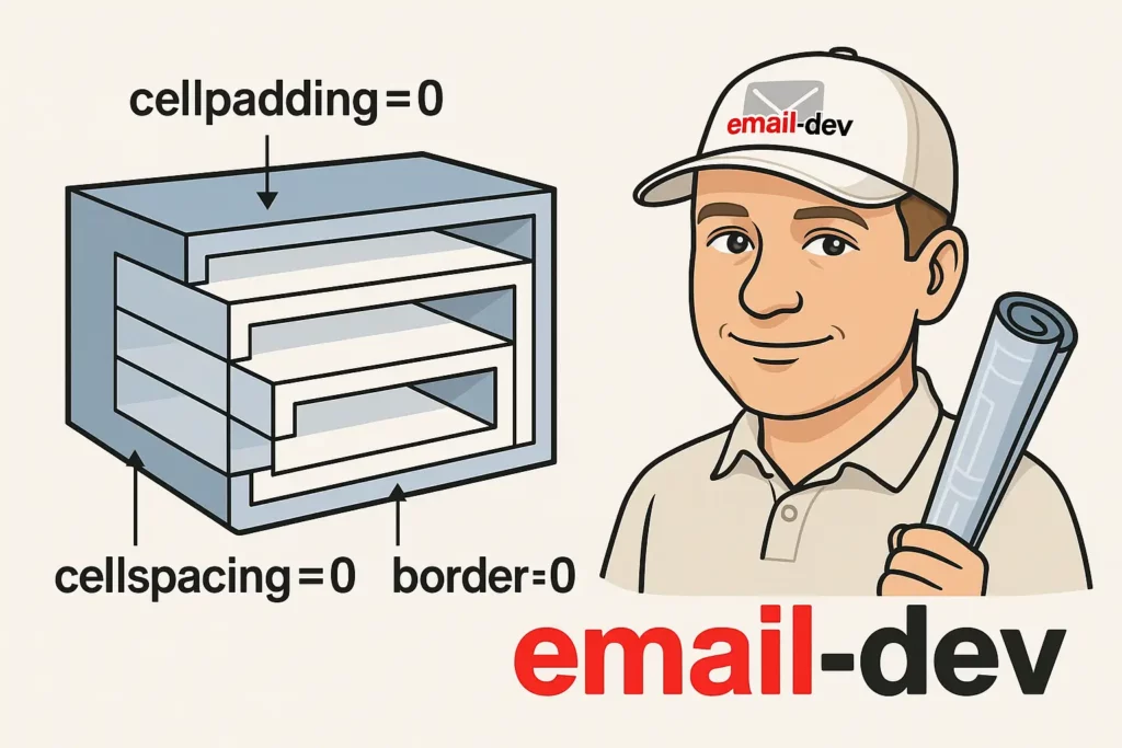
Email HTML is not web HTML, and the instinct to reach for modern layout tools is the first thing that needs to go. CSS Grid and Flexbox are unsupported or unreliable in enough email clients – including major ones – to create real problems if you build your layout around them.
Tables are the foundation of professional email template design because they’ve been supported since the early days of HTML. When Outlook’s Word renderer encounters CSS it doesn’t understand, it often just drops it. When it encounters a table, it renders a table. That predictability is the whole point.
The nested table approach is what separates templates that hold together from ones that fall apart at inconvenient moments. Outer table as wrapper, inner tables for individual content sections – so that if one section breaks in a specific client, the rest of the layout stays intact rather than everything collapsing.
Always include cellpadding="0", cellspacing="0", and border="0" on your table tags. These aren’t suggestions. Without them, different email clients apply different default spacing, and your precisely aligned layout ends up with gaps in random places that you didn’t put there.
The basic structural pattern looks like this:
<table width="600" cellpadding="0" cellspacing="0" border="0" style="margin: 0 auto;">
  <tr>
    <td>
      <!-- content sections go here -->
    </td>
  </tr>
</table>
600 pixels for the container width is the working standard – proportioned well for desktop, narrow enough to not force horizontal scrolling on smaller screens. Some developers use 640px; some narrower for specific use cases. 600 is the defensible middle.
One thing worth being explicit about: for a responsive email template, you don’t simply set the table width attribute to 600 and leave it there. You combine max-width: 600px in the inline style with width: 100% so the template scales down on smaller screens. The width="600" table attribute is a fallback for clients that ignore CSS entirely. Both matter.
Secret #2: Build bulletproof buttons that actually work in Outlook

CSS-dependent buttons are one of the most reliable ways to create a broken experience for part of your list. In clients where CSS rendering is incomplete – and Outlook on Windows is the obvious example – a button styled entirely with CSS can disappear or render as an unstyled link with no visible click target. Which is worse than no button, in a way, because it looks broken rather than just missing.
The fix that actually works across clients combines VML (Vector Markup Language) for Outlook with padding-based button design for everything else.
VML is a Microsoft-specific markup language that Outlook’s Word renderer supports. Wrapping your button in VML conditional comments means Outlook users see a properly rendered, clickable button regardless of CSS support:
<!--[if mso]>
<v:roundrect xmlns:v="urn:schemas-microsoft-com:vml" href="https://yourlink.com"
  style="height:44px; width:200px; v-text-anchor:middle;" arcsize="10%"
  fillcolor="#007bff" strokecolor="none">
  <v:textbox style="mso-fit-shape-to-text:false" inset="0,0,0,0">
    <center style="color:#ffffff; font-family:Arial, sans-serif; font-size:16px;">
      Button text
    </center>
  </v:textbox>
</v:roundrect>
<![endif]-->
For everything else: padding-based buttons are more reliable than width and height properties because padding is more consistently supported across clients. A <td> with generous padding containing a linked <a> tag gives you a large, clickable area that works broadly.
Color contrast here isn’t optional either. WCAG 2.1 AA requires at least 4.5:1 contrast ratio for normal text – this is the difference between a button that reads clearly on a wide range of screens and lighting conditions and one that’s technically present but functionally invisible to some readers.
Touch target size: Apple’s Human Interface Guidelines recommend at least 44×44 points for interactive elements on touchscreens, and WCAG 2.5.5 (Level AAA) specifies 44×44 CSS pixels for the same reason. Small buttons get missed or accidentally tapped on mobile – which is a bad experience on a primary CTA.
Secret #3: Dark mode without destroying your brand

Dark mode behavior in email clients is one of the areas where I see the most unexpected results when testing. The same template can look fine in Apple Mail dark mode and genuinely broken in Gmail dark mode, because these clients handle color transformation completely differently.
The prefers-color-scheme media query is the starting point:
@media (prefers-color-scheme: dark) {
  .email-background { background-color: #1a1a1a !important; }
  .body-text { color: #e0e0e0 !important; }
}
This works reliably in Apple Mail, which has solid support for the media query and respects your overrides. Gmail is a different story – Gmail applies its own dark mode transformations to emails that haven’t explicitly handled dark mode styling, and the results aren’t always what you’d expect even when you have declared styles. Outlook on iOS does partial color inversions. These require different approaches.
A few things that consistently help across the board:
Color selection: Pure black (#000000) and pure white (#ffffff) are the most likely values to get inverted by clients applying automatic dark mode. Using slightly off-black and off-white values, and being deliberate about which elements use transparent backgrounds versus declared solid colors, gives you meaningfully more control over what clients can mess with.
Logo and image preparation: If your logo is dark text on a transparent background, it’ll disappear in dark mode. If it’s light text on transparent, it disappears in light mode. The practical fix is having two versions – one for each context – and using CSS to show/hide them conditionally. This sounds like extra work, and it is, but it’s the kind of detail that separates professional-looking emails from ones that have an obvious oversight.
Testing, not assumptions: Dark mode rendering in Gmail on Android is genuinely different from dark mode in Apple Mail on macOS, which is different again from dark mode in Outlook for Mac. You can’t verify dark mode behavior without actually testing it in the relevant clients.
Secret #4: Mobile responsiveness done right
Before committing to a mobile responsive strategy, it’s worth actually understanding the media query support landscape in email, because it’s more fragmented than most people expect.
Classic Outlook for Windows (Word-based renderer): no media query support. It renders at the fixed width you set.
New Outlook for Windows (rolling out from January 2025, web-based rendering): partial media query support, similar to Outlook.com.
Outlook.com: partial support.
Gmail: partial support – usually sufficient for basic stacking behavior on mobile, but not complete.
Apple Mail: full media query support.
So a responsive email template that relies purely on media queries will be partially broken for a non-trivial portion of your audience. The approach that actually works is hybrid: your base layout needs to function at any width using fluid percentages and max-width constraints, and then media queries layer on top for the clients that support them.
A two-column layout that stacks to a single column on mobile is achievable, but you’re doing it with a combination of fluid widths, max-width settings, and media queries – not any one technique alone:
@media only screen and (max-width: 600px) {
  .mobile-stack {
    display: block !important;
    width: 100% !important;
  }
}
Content hierarchy on mobile is a separate question from layout. On a 375px screen you have less horizontal space and less patience from readers. What’s a reasonable amount of content on a desktop layout can become overwhelming on mobile. Tighter paragraphs, more prominent CTAs, fewer decorative elements – these decisions need to be made deliberately for the mobile context, not just assumed to work out via responsive scaling.
Secret #5: Typography that doesn’t collapse under pressure
Font support in email is worse than in browsers, and the way you handle it needs to reflect that reality from the start.
Custom web fonts (via @font-face or Google Fonts import) work in Apple Mail, some versions of Outlook for Mac, and a handful of other clients. They don’t work in Gmail (web or mobile app), in classic Outlook for Windows, or in several other major clients. Which means if you’re using a custom font, you’re guaranteed that a significant portion of your list sees your fallback font instead – not some of the time, consistently, every send.
This means the fallback font stack isn’t an afterthought – it’s as important as the primary font choice:
font-family: 'Your Custom Font', 'Helvetica Neue', Helvetica, Arial, sans-serif;
And your design needs to look intentional with the fallback, not just passable. If your brand typography is doing significant design work, you need to verify that the layout still holds when Arial shows up instead.
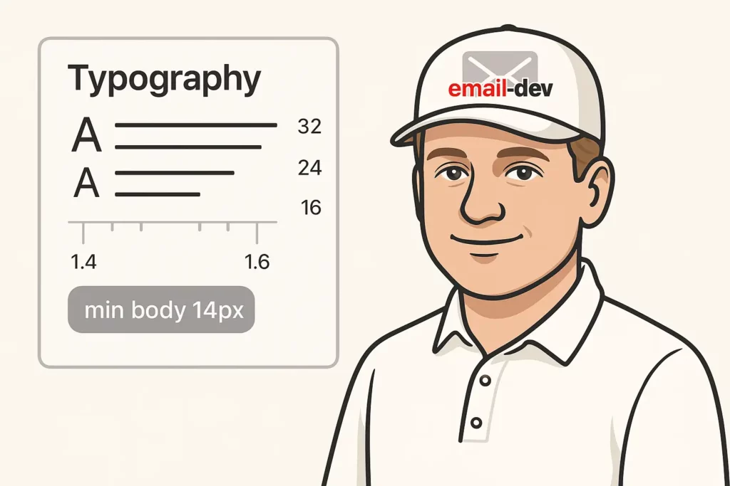
Minimum 14px for body text is the practical floor – smaller than that starts becoming hard to read on mobile without zooming, and iOS will sometimes force-zoom text below a threshold, which can break your layout in ways you didn’t design for.
Line height of 1.4–1.6 is the generally accepted range for comfortable reading. The reason it matters particularly in email is that fallback font substitutions often have different character metrics than your intended font, and what looked properly spaced with your custom typeface can feel cramped with a web-safe fallback.
For display headings: there’s a genuine tradeoff between making heading text part of an image (so it always renders in your exact display font) versus keeping it as live HTML text (so it’s accessible, searchable, selectable, and survives image-blocking). I lean toward live text with a thoughtful fallback stack most of the time. An image headline that gets blocked is an empty space; a live headline in Arial is still a headline.
Secret #6: Testing – because you can’t skip this part

Testing email across clients is tedious. I’ll just say that directly. There’s no workflow that makes it genuinely pleasant, and there’s no substitute for actually seeing how your template renders in the clients that matter – not just in an ESP preview, not just in the one browser tab you have open.
The categories worth covering:
Desktop clients: Gmail web, Outlook 2016/2019/365 on Windows, Outlook for Mac, Apple Mail. These are the highest-usage desktop environments and they behave very differently from each other. What’s fine in Apple Mail may be broken in Outlook 2019. Checking one doesn’t tell you about the others.
Mobile clients: Gmail on iOS and Android, Apple Mail on iOS, Samsung Mail. Mobile rendering has its own quirks that are separate from desktop rendering, and issues that are invisible on desktop show up clearly on a 375px screen.
Dark mode variants: For each major client you test, check both light and dark mode. A template that looks correct in light mode can have genuine problems in dark mode that you won’t find unless you look.
Image-off scenario: Some email clients and corporate environments block images by default. An email that depends entirely on images for its message becomes a mostly empty rectangle with alt text. Always verify that your email communicates something meaningful even when images don’t load – and that your alt text is actually written for that context, not just alt="" to pass validation.
Litmus and Email on Acid are the main professional tools for this. Both give you rendered previews across a wide range of clients without needing to maintain live accounts in each environment. They’re not free, but the cost of a missed rendering bug in a campaign to a significant list is usually higher than the tool subscription. I’ve used Litmus for years and the cross-client coverage is genuinely useful – dark mode testing in particular.
Manual testing on real devices is still worth doing in addition to tool-based previews, especially for interactive elements and anything involving touch targets. Simulation doesn’t always match reality, particularly for dark mode behavior.
Secret #7: Conversion-focused design – making visually appealing email templates actually work
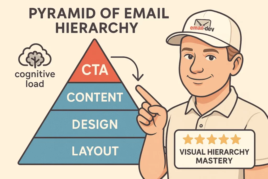
The technical foundation matters, but a template that renders correctly in every client and still produces no clicks has a different problem. Design that creates visually appealing email templates also needs to do the job of directing attention and making action feel natural.
Visual hierarchy
The reader’s eye moves through your email in a sequence, and that sequence is determined by size, contrast, positioning, and spacing. If everything competes for attention equally, nothing gets attention. The most important element in your email – usually the primary CTA – should dominate visually. Not in a way that feels aggressive, but in a way that makes it unmissable.
Reducing cognitive load
Simpler, less cluttered layouts perform better in email than complex, information-dense ones. This is partly because email is a context with low attention tolerance – people are processing their inbox, not reading at leisure – and partly because complexity creates more surface area for things to go wrong during rendering. Clean layouts are both better UX and easier to build reliably.
Color psychology
This gets cited so often that it has become a bit of a cliché, but the basics are real. Red creates urgency; blue reads as trustworthy; green reads as approval or progress. These associations aren’t universal across cultures, but they’re relevant for the majority of Western-market email audiences. More importantly: color contrast and color consistency across your campaign build familiarity over time, which improves engagement rates even when you’re not actively thinking about it.
Social proof
Testimonials, review counts, user numbers – these work best when they’re specific and visually integrated rather than dropped in as an afterthought. A generic “loved by thousands of customers” reads as filler; a real quote with a name and context reads as evidence.
Urgency and scarcity
Countdown timers and deadline-based copy do drive action when used appropriately – meaning when the deadline is real. Fake urgency gets noticed, erodes trust, and eventually stops working. If the deadline is genuine, making it visible is good design, not manipulation.
Email template design best practices for maximum impact

Beyond the seven sections above, there are a few consistent patterns across well-performing email template design that are worth naming separately:
Brand consistency: The same color palette, font choices, and spacing rhythm across all your campaigns builds recognition. It also makes individual campaigns easier to build once you’ve established a system. Brand inconsistency often comes from building every email from scratch – a template system with reusable components is the fix.
Text-to-image balance: The rough rule of 80% text to 20% images isn’t a hard law, but it exists for a reason. Emails that are primarily images face deliverability risks (spam filters treat image-heavy emails with more suspicion) and they fail completely when images are blocked. Text-primary layouts are more resilient.
Alt text that does actual work: Write alt text for your images as if someone is going to read it in place of the image. For a hero image that contains your headline, the alt text should be the headline. Alt for a product photo, a description of the product. For decorative spacers, alt="" is fine. But alt text on meaningful images should convey the same information the image was meant to convey.
Preheader text: The line of text that appears in the inbox preview after the subject line has a significant effect on open rates and is frequently treated as an afterthought. It should complement the subject line and add information – not repeat it, and not default to “View this email in your browser” because you forgot to set it.
Image optimization for load speed: Large image files create slow rendering, particularly on mobile on slower connections. A properly optimized email image is usually under 200KB. If your hero image is 2MB, that’s going to be a problem in some environments regardless of how well the template is coded.
Common mistakes that undermine visually appealing email templates

There are a handful of mistakes I see repeatedly, even in email programs that are otherwise well-run. Worth naming them directly:
Over-dependence on images: Templates where the entire message is conveyed visually – headline in an image, CTA in an image, product info in an image – completely fail in the image-off scenario. And corporate email environments blocking images by default is more common than people realize. The email needs to work when images don’t load.
Ignoring Outlook’s limitations: A significant share of business email opens happens in Outlook for Windows. Building a template without testing it in Outlook, or without implementing the VML and conditional comment fallbacks that Outlook requires, means you’re knowingly delivering a broken experience to a meaningful portion of your list.
Desktop-only testing: The mobile rendering can be completely different from desktop, and “it looked fine in preview” doesn’t catch mobile-specific issues. Testing on actual mobile devices – or at minimum in a tool that shows mobile rendering – is not optional when 40%+ of your opens are on mobile.
Using generic templates without adaptation: A template from an ESP library isn’t a finished product. It needs to be adapted to your brand, tested in the clients that matter for your audience, and verified to work in both light and dark modes. Using it as-is means you’re inheriting whatever rendering problems it has without knowing about them.
Inconsistent testing across campaigns: Testing once and assuming all future emails are fine is how bugs accumulate. New ESPs, updated email clients, and changes to your template introduce new variables. Consistent testing before each major send is just part of professional email production.
Advanced techniques worth knowing

Once the foundations are solid, there are a few techniques that separate reliably professional templates from adequate ones:
Progressive enhancement: Build the base experience to work everywhere – no CSS required, table-based layout, web-safe fonts, solid color buttons. Then layer enhancements for clients that support them: custom fonts, advanced CSS, animated elements. Clients that support the enhancements get a richer experience; clients that don’t get a clean, functional email. This is the right mental model for email development.
Conditional comments for Outlook: Microsoft-specific conditional comment syntax lets you serve Outlook-specific HTML and CSS without affecting other clients. This is how you handle VML buttons, mso-specific spacing fixes, and other Outlook-only corrections without breaking your layout in Gmail or Apple Mail.
CSS inlining: Many ESPs and some email clients handle external or embedded styles inconsistently. Inlining critical CSS directly into HTML elements as inline style attributes is the most reliable approach for styles that must render correctly everywhere. You can keep embedded styles in a <style> block for progressive enhancements targeting capable clients, but the core layout and typography should be inlined.
Systematic image optimization: This means compression (without visible quality loss), appropriately sized source images, alt text written for the image-off context, background image declarations paired with background-color fallbacks, and where needed, separate image assets for light and dark mode.
Tracking and iteration: Litmus Email Analytics and similar tools let you see where your audience actually opens email – which clients, which devices, light mode versus dark mode. That data should inform your testing priorities. If 60% of your audience is in Gmail on iOS, that client gets the most thorough testing. If 20% are in Outlook for Windows, VML buttons are non-negotiable.
Building your email template workflow
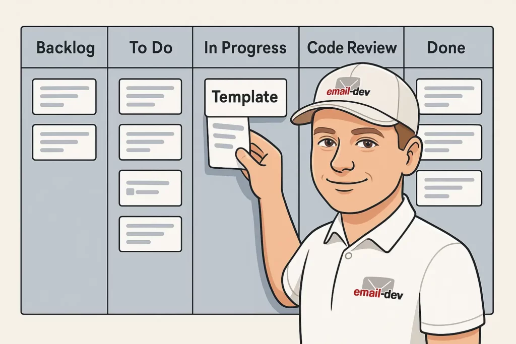
Creating consistently good visually appealing email templates requires a process, not just skill. Ad-hoc template production is where inconsistency and quality problems come from.
Planning before designing: Define the goal of the campaign, the primary action you want recipients to take, and what the key message hierarchy is before the design file is opened. It’s much easier to build effective visual hierarchy when you know what needs to be communicated and in what order.
Component-based design systems: Rather than building each email from scratch, develop reusable components – header sections, CTA blocks, content rows, footers – that are pre-tested and on-brand. Each new template assembles from these components with campaign-specific customizations. This is how professional email teams achieve consistency and speed simultaneously.
Defined coding standards: If more than one person touches your email code, or if you’re maintaining templates over time, having explicit standards for how Outlook is handled, how dark mode is implemented, how images are prepared, and how testing is conducted prevents drift and makes debugging much faster.
Testing checklist before every send: Not “test when you remember to.” A literal checklist – clients to verify, devices to check, dark mode, images-off, CTA functionality, mobile rendering – run before every significant campaign. This sounds tedious. It’s less tedious than the alternative.
Retrospective on performance: Track rendering success (did the testing catch actual client issues?), engagement metrics by device and client where possible, and conversion outcomes. Use that data to improve the next template. Email template quality is iterative – the templates that work best are the ones that have been tested and adjusted, not the ones that were built perfectly the first time.
What’s changing in email template design

A few things worth tracking:
The Outlook transition: The shift from Word-based rendering to the new web-based Outlook for Windows is the most significant technical change in email development in years. Microsoft began this rollout to business users in January 2025 and plans to end support for classic desktop versions using Word rendering in October 2026. This is going to simplify some things (VML becomes less critical over time) and create new considerations (the new Outlook’s rendering behavior has its own quirks). Worth staying current on.
Interactive email content: AMP for Email and CSS-only interactive techniques (tabs, accordions, hover states) are seeing growing support in capable clients. Apple Mail and some others support reasonably advanced CSS interactivity. Gmail’s AMP support exists but has seen limited adoption. For most use cases, these are progressive enhancements rather than primary functionality – but they’re worth building toward.
Accessibility standards: Growing attention to email accessibility means semantic HTML structure, proper alt text, adequate color contrast, and logical reading order for screen readers. This overlaps with good design practice in most cases and is increasingly expected rather than optional in professional email production.
Privacy changes: Apple’s Mail Privacy Protection (MPP) pre-fetches tracking pixels, which significantly distorted open rate data after iOS 15. These kinds of privacy-driven changes are likely to continue and will require adaptation in how email performance is measured.
Getting your templates to a point you’re proud of

Creating visually appealing email templates that consistently perform – meaning they render correctly, communicate clearly, and drive the action you want – is a combination of technical craft and design discipline. Neither one on its own is enough. A technically bulletproof template that looks generic and fails to direct attention won’t convert. A visually striking template that breaks in Outlook and has no dark mode handling looks unprofessional to a substantial portion of its audience.
The starting point is always the foundation: HTML table structure, bulletproof buttons, and a testing process that actually covers the clients your audience uses. From there, dark mode handling and mobile responsiveness address the two most common failure modes in modern email. Typography decisions and conversion-focused design thinking take a functional template and make it genuinely effective.
The businesses and marketers who get the most from email consistently treat template quality as infrastructure – something that gets built properly, maintained over time, and improved iteratively based on real data. That’s a different posture than treating each email as a one-time build. It takes more upfront investment and pays back substantially in consistency and reliability.
If you’re working through this and not sure where to start: the table structure, the VML buttons, and Litmus testing are the three things that catch the most common and most damaging issues. Start there, and add layers as you get those fundamentals solid.