Quick answer: WCAG (Web Content Accessibility Guidelines) is the W3C standard for making digital content usable by people with disabilities. It is built on four principles – perceivable, operable, understandable, robust – across levels A, AA and AAA. WCAG 2.2 is current. It was written for browsers, not inboxes, so only about a third of its success criteria meaningfully apply to HTML email. Level AA is the target.
The awkward thing about WCAG in email is that the standard assumes a browser, and an inbox is not a browser. WCAG expects JavaScript, focus management, ARIA that gets honoured, a DOM the user actually controls, and colours that stay the colours you wrote. Email guarantees none of that. Gmail supports about seventeen of the thirty-seven accessibility features the Email Markup Consortium tests for – and strips your style block entirely when someone forwards the message. Classic Outlook for Windows flattens semantic intent into Word-shaped mush. Gmail on iOS inverts your palette after delivery and never asks permission.
This entry is written for people who have to ship a real campaign on Thursday, not for a compliance PDF that gets filed and forgotten. The legal ground also moved under everyone between 2025 and 2026, which means half the advice online is stale in one direction and chaotic in the other. So: what the standard is, which parts of it apply to email, which parts physically cannot, and what to do about it.
- What WCAG actually is
- Which level are you actually aiming for
- Does WCAG apply to email? (the honest answer)
- The three buckets: what WCAG asks of email, and what email can’t give it
- Bucket one – the boring failures that make up almost all of it
- Bucket two – the criteria the email client takes away from you
- Bucket three – stop auditing against criteria that do not exist here
- The WCAG email checklist that actually matters
- Alt text on every image, alt=”” on decorative ones (1.1.1)
- Real semantic HTML, not divs wearing a costume (1.3.1)
- role=”presentation” on every layout table (1.3.1, 4.1.2)
- lang and dir, in two places, not one (3.1.1)
- Contrast: 4.5:1 body text, 3:1 large text and UI (1.4.3, 1.4.11)
- Link text that means something out of context (2.4.4)
- Tap targets: 24×24 minimum, and be more generous than that (2.5.8)
- Don’t let colour carry meaning on its own (1.4.1)
- Text, not text baked into an image (1.4.5)
- A <title> and a preheader that both say something
- Dark mode: where WCAG contrast quietly falls apart
- WCAG and the law: EAA, ADA, Section 508 (2026 status)
- European Accessibility Act
- EN 301 549
- ADA Title II
- What this actually means for your sending programme
- WCAG 3.0 – what it is, and why you should not wait for it
- The changes are structural, not incremental:
- How to actually test WCAG conformance in email
- Tooling and the 2026 pricing reality
- WCAG and the next five years
- Frequently asked questions
- What is WCAG?
- Does WCAG apply to HTML email?
- Is WCAG a law?
- What WCAG level do my emails need to meet?
- What is the minimum colour contrast for email?
- What is the minimum tap target size under WCAG?
- Do I need role=”presentation” on layout tables?
- When does WCAG 3.0 come out, and should I wait for it?
- How do I test my emails for WCAG conformance?
- Key takeaways
What WCAG actually is
WCAG stands for Web Content Accessibility Guidelines. It is published by the W3C through the Web Accessibility Initiative. It is a technical standard, not legislation.
Versions, quickly.
- WCAG 2.0 landed in 2008.
- WCAG 2.1 in 2018.
- WCAG 2.2 was published on 5 October 2023 and is the current recommendation – it was also adopted as ISO/IEC 40500:2025 in October 2025, which matters mostly for procurement paperwork.
- WCAG 3.0 exists, but it is a Working Draft, and there is a whole section on that further down.
The structure goes four principles, thirteen guidelines, then success criteria. Each criterion is graded A, AA or AAA.
A note on the count, because you will see two different numbers and both are defensible. WCAG 2.1 had 78 success criteria. WCAG 2.2 added nine and made one – 4.1.1 Parsing – obsolete. So the document lists 87, and 86 of them still do anything. Quote whichever you like, just know why the other one exists.
The four principles get the acronym POUR:
- Perceivable – people can sense the content, whether by seeing, hearing or feeling it.
- Operable – people can use it without a mouse.
- Understandable – people can read it and predict what it does.
- Robust – assistive technology can parse it.
That is the whole framework. It is not complicated. The complications arrive when you try to apply it to a medium the authors were not thinking about.
One more thing, and it gets mangled constantly. WCAG is not a law. It is a standard that laws point at. Confusing the two is how people end up buying compliance products they do not need.
Which level are you actually aiming for
Level A is the floor. Level AAA is aspirational and rarely required anywhere.
AA is the number. Every meaningful law, procurement questionnaire and enterprise checklist references Level AA. Build to AA. Treat AAA (7:1 contrast, for instance) as a bonus where it happens to be cheap.
Does WCAG apply to email? (the honest answer)
Yes. Email is HTML, HTML is digital content, and none of the laws that reference WCAG carve out the inbox. Anyone telling you email is exempt is guessing.
The longer answer is more useful. WCAG was written with the open web in mind. Email clients strip JavaScript, support ARIA unevenly, mangle CSS and rewrite colours after delivery. So applying WCAG to email is a translation job, not a copy-paste.
Here is the number that anchors this. Of the 86-ish success criteria in WCAG 2.2, roughly a third are genuinely relevant to email. Stripo’s 2026 enterprise analysis lands on about that figure, and it matches what you see in practice. The rest describe navigation menus, login flows, media players, multi-step forms – things an email does not have.
WCAG 2.2 added nine new success criteria over 2.1. Most of them are irrelevant here: dragging movements, accessible authentication, consistent help, redundant entry. Email has no drag interactions and no login screen. The one addition that matters in practice is target size, because tap targets are very real on a phone.
A standard that assumes focus states, keyboard traps and a stable DOM, applied to a medium where Gmail can delete your style block the moment someone forwards the message. That is the job. It is not impossible, it is just not what the spec authors had in mind.
The three buckets: what WCAG asks of email, and what email can’t give it
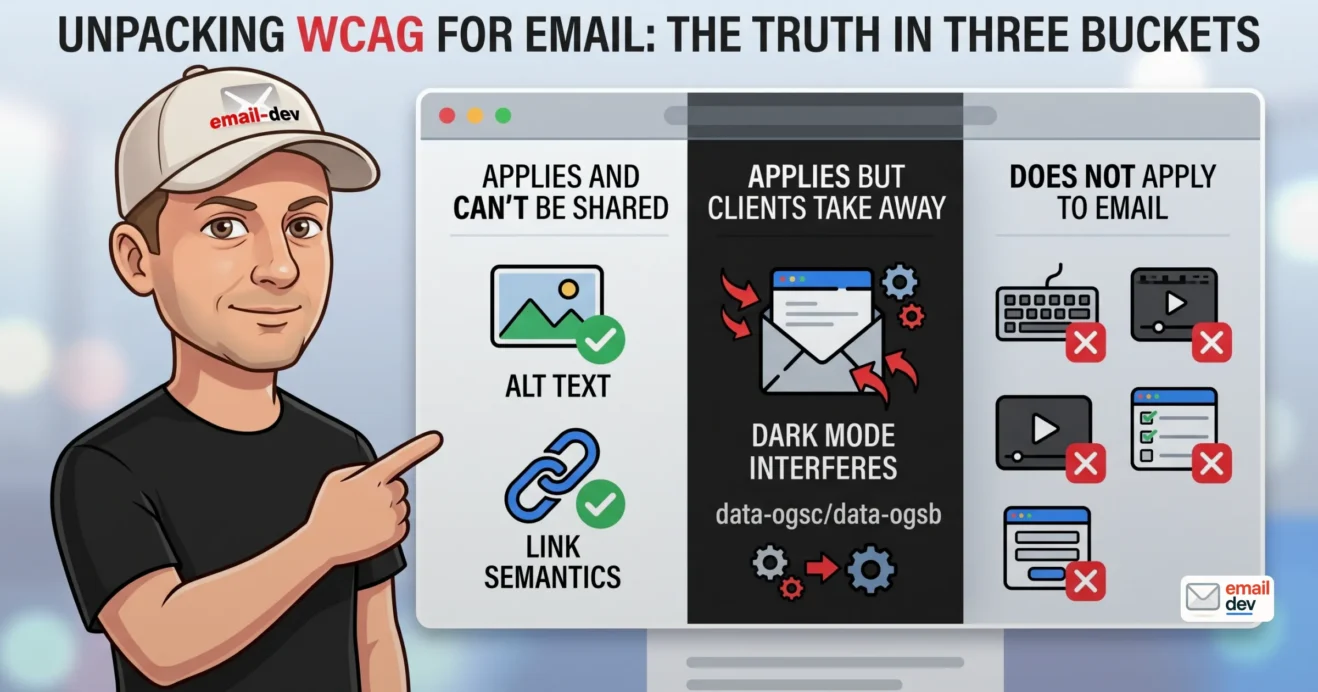
This is the framing that matters, and almost nobody says it out loud. WCAG success criteria fall into three buckets when you drop them into an inbox.
| Bucket | Examples | Who controls it |
|---|---|---|
| Applies, fully on you | 1.1.1 alt text, 1.3.1 semantics, 1.4.3 contrast, 2.4.4 link purpose, 3.1.1 language, 2.5.8 target size | You. No excuses |
| Applies, but the client interferes | 1.4.3 contrast under dark-mode rewriting, 1.4.4 resize text, 1.4.10 reflow, 4.1.2 name role value | Shared. You set intent, the client overrides |
| Does not meaningfully apply | 2.4.1 bypass blocks, 3.3.x error handling, 2.5.7 dragging, 3.3.8 accessible authentication, most media criteria | Nobody. Email has no forms, no login, no drag |
Bucket one – the boring failures that make up almost all of it
The Email Markup Consortium published its Accessibility Report 2026 on 21 May. It analysed 376,348 emails collected between May 2025 and May 2026, tested with Parcel’s accessibility checker. The results are grim in a very specific, very fixable way.
- 99.88% contain issues rated Serious or Critical. Only eight emails passed, from three brands – Customer.io, NaomiWest.ca and Noble Panacea. That is a 0.002% pass rate.
- 97.41% are missing a
dirattribute on the body content. - 95.66% are missing a body-level
lang. A separate check,<html lang>, is missing in 62.16%. - 83.78% have layout tables with no
role="presentation"orrole="none". - 74.23% have no
<h1>anywhere in the document. - 71.23% have at least one link with no discernible text at all – usually a linked image with no alt.
- 58.48% have an element failing colour contrast.
- 47.88% have images with no alt text. Classified Critical.
- 45.21% have no
<title>element. This is the only rule in the top ten that got worse year on year.
EMC calls the year-on-year picture a technical standstill. The 2025 figure was 99.89%. So the industry moved essentially nowhere.
None of that is hard. It is four attributes and a heading. The industry is failing WCAG on the easiest possible ground, which means fixing it is cheap and, right now, genuinely differentiating. New for 2026: EMC also audited 10,566 emails sent through Substack, Shopify and Beehiiv. None passed. The defaults are doing most of the damage there, not the senders – Shopify’s builder, for instance, does not appear to expose a language setting to the user at all.
Bucket two – the criteria the email client takes away from you
This is the section nobody else writes, and it is the one that changes how you build.
You test a CTA button at 4.6:1. Passes. Then Gmail on iOS inverts the whole email and your button is now dark text on a dark plate at something like 1.8:1. You passed WCAG at build time and failed it at read time. Nothing you did was wrong. The render changed after send.
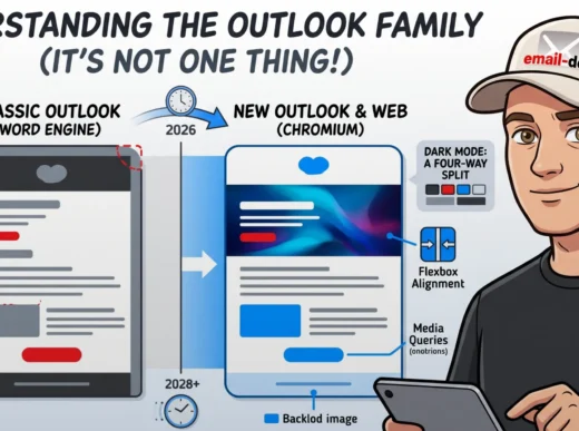
Classic Outlook for Windows does its own version of this. It runs the Word engine, ignores a good chunk of what you meant, and flattens semantic structure on the way through. It is one row of the client table now, and a shrinking one – but where it exists, it exists in B2B inboxes, which is where the procurement questions come from.
EMC expanded its client benchmark this year from 20 accessibility feature tests to 37, run across 43 clients, covering semantic HTML, ARIA, focus states, user-preference media queries, language and direction attributes. No email client supports all of them. Not one. The scoreboard is worth internalising:
| Client | Accessibility features supported (of 37) |
|---|---|
| Apple Mail (macOS) | 34 |
| Apple Mail (iOS) / Samsung Email | 31 |
| Proton Mail (web, iOS) | 29 |
| Outlook (Android) | 25 |
| Outlook (macOS) / Outlook (iOS) | 22 |
| Outlook.com | 20 |
| Gmail (desktop webmail) | 17 |
| Gmail (iOS, Android) | 15 |
| Classic Outlook (Windows) | 11 |
| Windows Mail | 8 |
Twenty-five of the 43 clients tested support fewer than half. Gmail, for a company that publishes some of the best accessibility work on the open web, sits at 15 to 17 and still does not honour prefers-color-scheme in any way you can build on. That gap drives me genuinely up the wall.
What this means practically is that your conformance claim needs a scope. “This template conforms to WCAG 2.1 AA as authored” is an honest sentence you can defend. “Our emails are WCAG compliant” is a claim you cannot fully back, because you do not own the rendering layer. Write the first one. Document what you tested.
Bucket three – stop auditing against criteria that do not exist here
Do not let a generic web accessibility auditor bill you for keyboard-trap testing on a newsletter with four links. Scope the audit to email.
I have seen agencies pay for a full WCAG 2.2 AA audit run by a web-only vendor and get back a forty-page report where half the findings were “no skip link” and “no form error identification.” There is no form. There is no skip link. That is budget lit on fire.
The WCAG email checklist that actually matters
Not forty items. Ten. These carry almost all the weight, and they map directly onto what EMC found failing.
Alt text on every image, alt=”” on decorative ones (1.1.1)
A missing alt attribute is worse than an empty one. Miss it entirely and some screen readers read the filename aloud, which means your subscriber hears “hero-final-v3-USE-THIS-ONE dot jpg.” An image inside a link with no alt announces as a link to nowhere – which, per EMC, is the single biggest cause of that 71.23% “links must have discernible text” failure.
Bonus: alt text is what displays when images are blocked. So this is a deliverability-adjacent win too, not purely an accessibility one.
Real semantic HTML, not divs wearing a costume (1.3.1)
<h1>, <h2>, <p>, <ul>. A <div> styled at 32px bold is not a heading, no matter how heading-shaped it looks. Screen reader users navigate by heading, and 74% of emails do not give them one.
Email caveat: use margin rather than padding on semantic elements, and pair your heading tags with mso-line-height-rule: exactly; so classic Outlook does not stretch them into something strange.
role=”presentation” on every layout table (1.3.1, 4.1.2)
Screen readers announce table structure aloud unless you tell them not to. Row one, column one, and so on, before your subscriber reaches a single word of copy.
The critical detail, and it catches nearly everyone: the role does not inherit. Setting it on the outer table does nothing for the tables nested inside. Every layout table needs its own. The nested tables entry goes deeper on this.
Genuine data tables – a receipt, a pricing grid, a schedule – keep their semantics. Do not blanket-apply the role.
lang and dir, in two places, not one (3.1.1)
The cheapest fix in the entire medium, and almost everyone gets it half-right.
Put lang on the <html> element. Then put langanddir on the direct children of <body> as well, because a number of clients strip the language setting off <html> on the way in. That is not a belt-and-braces flourish, it is the reason EMC checks both separately: 62% miss it on <html>, and 96% miss it in the body.
If you truly cannot determine the value, lang="und" and dir="auto" are both better than nothing – they let the client make a judgement instead of inheriting whatever the reader’s inbox is set to. Which is how a Hebrew-language user opening your English newsletter ends up with a layout that reads backwards. For multilingual programmes, add lang on the parts that switch language too (3.1.2).
Contrast: 4.5:1 body text, 3:1 large text and UI (1.4.3, 1.4.11)
Large means 18 point and up – that is roughly 24px – or 14 point bold, roughly 18.5px. Note the units. WCAG is written in points, not pixels, and the number of people who read “18” and set an 18px paragraph and think they have earned the 3:1 allowance is not small. They have not. An 18px paragraph is body text and needs 4.5:1.
The usual killers are predictable: pale grey footers, white text on a pastel button, a brand colour that nobody ever ran through a checker. EMC found 58.48% of emails failing contrast somewhere. WebAIM’s contrast checker is free and takes ten seconds.
Link text that means something out of context (2.4.4)
“Click here” repeated six times, read out as a bare link list, is useless. “View your order” is not harder to write. EMC flags non-descriptive link text in 15.83% of emails – and notes its own test only catches generic English phrases, so the real number is higher.
Tap targets: 24×24 minimum, and be more generous than that (2.5.8)
This is the one genuinely relevant WCAG 2.2 addition for email, and it is also the one that gets misquoted more than any other criterion in the standard.
SC 2.5.8 Target Size (Minimum), Level AA, asks for 24 by 24 CSS pixels. Not 44. The 44×44 figure everyone repeats is SC 2.5.5 Target Size (Enhanced), which is Level AAA, and it is also – not coincidentally – Apple’s Human Interface Guidelines number. Two different things wearing the same digits.
So 24 is the compliance floor. Design sense says go bigger anyway: roughly 16px vertical and 32px horizontal padding on a text CTA lands you comfortably past 44, which is where a thumb actually wants it. Padding counts toward the target area, so a small icon in a generous cell is fine.
Inline links inside a paragraph are explicitly exempt, which is a relief, because line-height would make them impossible otherwise.
Don’t let colour carry meaning on its own (1.4.1)
Underline your links. A red “error” state with no word “error” in it is not an error to a colour-blind reader, it is just text.
Text, not text baked into an image (1.4.5)
The single thing that torpedoes the most campaigns. An image-only email is invisible to a screen reader and invisible to anyone with images blocked. It is also, incidentally, a spam-filter magnet. Worth noting that even the eight emails that passed EMC’s automated checks got dinged on manual review for exactly this – unreadable text inside images at narrow viewports.
A <title> and a preheader that both say something
45% of emails have no <title> at all, and the number is climbing. It costs one line. It shows up in the browser version, in some clients’ tab, and as the screen reader’s first announcement.
Then the preheader. Otherwise the first thing announced aloud is “Email not displaying correctly? View in browser. Unsubscribe.” Which is a hell of an opening line.
Dark mode: where WCAG contrast quietly falls apart
Contrast is a ratio between two colours you chose. Dark mode means the client can change one or both of them after delivery. So a passing ratio is a passing ratio in the light-mode render you tested, and nowhere else guaranteed.
The four-way split, briefly – the email clients entry covers this in depth:
- Apple Mail respects
prefers-color-scheme. You get real control. - Gmail on iOS fully inverts. Backgrounds, text, sometimes images. And Gmail supports neither
prefers-color-schemenorprefers-reduced-motionin any dependable way, so you cannot opt out of the treatment. - Gmail on Android applies partial, algorithmic darkening. Different from iOS, so test both.
- Classic Outlook and Outlook.com rewrite your inline styles into
data-ogscanddata-ogsbattributes, which you can target.
Defensive rules that keep contrast alive across all four:
- Avoid pure white and pure black. They invert hardest.
- Avoid faint greys. They go harsh and muddy.
- Give logos a transparent PNG with some breathing room, or an outline.
- Test the CTA button specifically, in dark mode, in each client. A button that loses contrast loses revenue.
And gradients. Gradients are especially fragile here, which is a hill I will happily die on. A gradient behind text can pass contrast at one end of the ramp and fail badly at the other, and dark-mode rewriting handles gradients about as gracefully as a forklift handles dressage. Check contrast at the worst point of the gradient, never the average.
The honest line: there is no way to guarantee a WCAG contrast ratio in every possible dark-mode render. Design for the floor, test what your analytics say your audience uses, and write down what you checked.
WCAG and the law: EAA, ADA, Section 508 (2026 status)
WCAG is not a law. Laws reference it. I will keep repeating that, because the confusion sells a lot of unnecessary software.
European Accessibility Act
Applied from 28 June 2025. Enforcement is scaling through 2026, and this is the first full year national authorities are supervising against a deadline that has already passed. Sweden’s PTS has been running market surveillance on e-commerce sites. Penalties are set by each member state, not centrally, and they are not trivial. Microenterprise carve-outs exist for services – under 10 staff and under €2m turnover – which covers a decent slice of small senders. Say that plainly, because a lot of small businesses are being frightened into buying things they do not need.
EN 301 549
EN 301 549 is the technical standard the EAA points at. The version in legal effect is v3.2.1, published March 2021, which incorporates WCAG 2.1 Level AA. Version 4.1.1 – circulated as a v4.1.0 draft in November 2025 – is expected to be referenced in the Official Journal around October 2026, and it moves the baseline to WCAG 2.2 AA. Which is precisely why building to 2.2 AA now is the sane hedge rather than an act of enthusiasm. Until that OJ citation lands, though, 2.1 AA is what actually carries legal weight in the EU. Both things are true at once.
ADA Title II
ADA Title II in the US. The DOJ’s 2024 final rule adopted WCAG 2.1 Level AA for state and local government. On 20 April 2026, four days before the original deadline, the DOJ published an interim final rule pushing the dates back a year. Entities serving 50,000 or more now have until 26 April 2027. Smaller entities and special districts have until 26 April 2028. The DOJ’s stated reason was that it had “overestimated the capabilities” of covered entities. The substantive requirement did not change, and the DOJ said it “fully anticipates implementing the regulation at the new deadline.” A reprieve, not a cancellation – and the extension is already being challenged in federal court.
Section 508 still references WCAG 2.0 A/AA, with no published refresh timeline. Federal contractors should build to 2.1 or 2.2 AA anyway – it is a superset, and you will be asked eventually.
ADA Title III litigation against private businesses continues at volume and references WCAG 2.x. Not 3.0. Nobody is suing over a draft.
| Regime | References | Status as of mid-2026 |
|---|---|---|
| European Accessibility Act | EN 301 549 v3.2.1 → WCAG 2.1 AA (2.2 in v4.1.1, expected around Oct 2026) | Applying since 28 June 2025; enforcement scaling |
| ADA Title II (US public bodies) | WCAG 2.1 AA | Deadlines extended April 2026: 26 Apr 2027 (50k+), 26 Apr 2028 (smaller) |
| ADA Title III (US private) | WCAG 2.x via case law and settlements | No formal rule; litigation volume high |
| Section 508 (US federal) | WCAG 2.0 A/AA | Unchanged, no refresh published |
| UK PSBAR | WCAG 2.2 AA | In force for public sector bodies |
And a flat statement, because it needs one. Overlay widgets do not create compliance. One line of JavaScript does not fix an inaccessible template. In email it does not even run, because email clients strip JavaScript. Anyone selling you an overlay for your newsletter is selling you nothing.
What this actually means for your sending programme
If you send commercial email to EU consumers and you are not a microenterprise, WCAG 2.1 AA is now the floor for your templates, with 2.2 arriving shortly behind it.
If you are a US B2B sender, nobody is coming for your newsletter this quarter. But your enterprise clients’ procurement teams are already asking for conformance statements, and that questionnaire is not going away. The realistic pressure point in 2026 is procurement, not lawsuits.
WCAG 3.0 – what it is, and why you should not wait for it
WCAG 3.0 is a Working Draft. It is not a standard, it is not law, and no regulator anywhere references it.
The most recent draft was published on 3 March 2026. The acronym has changed meaning: it now stands for W3C Accessibility Guidelines, dropping “Web Content” to widen the scope beyond pages to apps, XR, voice and whatever comes next.
The changes are structural, not incremental:
- Guidelines, requirements, assertions and methods replace the old pass/fail success criteria.
- Conformance moves from binary A/AA/AAA to graded Bronze, Silver, Gold.
- Scope moves from pages to views and processes.
- The March 2026 draft carries roughly 174 requirements – renamed from “outcomes” in this revision – and that count keeps moving between drafts.
Timeline. A Candidate Recommendation is anticipated around Q4 2027. A final Recommendation is not expected before 2028, and several analysts put it later – the working group’s own co-chair has floated the end of 2029 in public. Regulatory adoption then trails by another one to three years. Which means WCAG 2.2 stays the de facto standard until somewhere around 2029 to 2031.
The reassuring bit: Bronze is broadly equivalent to WCAG 2.2 AA. The work you do now is the on-ramp, not wasted effort. W3C has also been explicit that WCAG 3.0 will not deprecate WCAG 2 for years after it lands.
Practical guidance: build to WCAG 2.2 AA. Ignore anyone selling “WCAG 3.0 certified” scanning in 2026. There is no stable conformance model to certify against yet. That is a roadmap being sold as a product, and the invoice is real even when the standard is not.
One thing worth planting for later. WCAG 3.0’s expanded cognitive-accessibility work – plain language, readability, findable help – will eventually push on email copy, not just email code. That is a thing to watch, not a thing to act on this year.
How to actually test WCAG conformance in email
Automated tools catch maybe a quarter to a third of accessibility issues. That figure is consistent across the accessibility industry, and EMC says the same thing in its own report – every one of the eight emails that passed the automated checks still picked up problems on manual review, from vague alt text to 10px footer copy to text baked into images at sizes nobody could read on a narrow screen.
A green scan is not conformance. It is a starting point.
The realistic pass has three layers.
- Code check. Parcel’s accessibility checker is what EMC’s own report runs on, and it is available on Parcel’s free Community plan. Inbox Monster has an accessibility tab. These catch alt, lang, dir, role, heading structure, title – the machine-checkable stuff that makes up most of the failure rate.
- Contrast and colour. WebAIM’s contrast checker for ratios. Check the gradient at its worst point, not its average. Litmus previews include colour-blindness filters if you have access.
- Actual assistive technology. VoiceOver on macOS and iOS is free and already installed. NVDA on Windows is free. JAWS if your enterprise already licenses it. Send yourself the email, close your eyes, listen to it. Ten minutes tells you more than any scanner will.
Then render-test in both light and dark mode across the clients your analytics actually show. Accessibility QA and rendering QA are the same pass. Do them together or you will do them twice.
Tooling and the 2026 pricing reality
This shifts often enough that stale tutorials genuinely mislead people, so here is where things stand.
Litmus changed its pricing hard after Validity acquired it in April 2025. The new structure landed that August. As of 2026 the Core plan starts at $500 per month, covering 5 users and 2,000 previews. The old Basic tier is gone entirely, and Core is what the $199 Plus plan used to be. Worth it for a team shipping weekly campaigns. Painful for a solo freelancer, and I say that as someone who has used Litmus for years.
Email on Acid, now under Sinch, remains the more budget-friendly competitor. A lot of small shops moved there after the Litmus change.
Parcel is purpose-built for email, includes the accessibility checker EMC uses, and has a free tier. If you have no budget at all, start here.
Putsmail is no longer available. If a tutorial points you there, the tutorial is stale and probably wrong about other things too.
Recommendation: pull your top clients from your own analytics, then test those in both modes. Do not buy a forty-client matrix you will never open.
WCAG and the next five years
Nobody owns a crystal ball. But the direction is clear enough to plan around.
- 2026 to 2027. WCAG 2.2 AA is the target. EN 301 549 v4.1.1 is expected in the Official Journal around October 2026 and pulls the EU baseline from 2.1 to 2.2. EAA enforcement gets real at member-state level. Procurement questionnaires start asking for email conformance statements, not just website ones.
- 2027 to 2028. WCAG 3.0 reaches Candidate Recommendation, anticipated Q4 2027. Nothing changes legally. Meanwhile the new Outlook for Windows spreads – Microsoft’s enterprise opt-out is now March 2027, cutover no earlier than March 2028 – which quietly lifts the ceiling on what accessible markup email clients will actually honour. EMC’s own client benchmark shows why: classic Outlook for Windows scores 11 out of 37, Outlook on Android scores 25.
- 2028 to 2029. WCAG 3.0 possibly finalised, possibly not. Classic Outlook for Windows stays supported through at least 2029, so the Word engine remains a floor constraint for B2B senders. The ADA Title II smaller-entity deadline lands 26 April 2028.
- Beyond. Bronze, Silver and Gold start appearing in procurement language well before they appear in law. Accessible-by-default frameworks do more of the work – EMC’s 2026 report credits framework defaults for what small improvement there has been in attribute-level compliance, and gives Maizzle a platform in the report to say exactly that.
One thing does not change across any of it. The client still owns the final render. Whatever WCAG version you build to, you cannot fully control what dark mode does to your email after it leaves. Real-client testing does not retire.
Frequently asked questions
What is WCAG?
WCAG is the W3C standard for accessible digital content. It is organised around four principles – perceivable, operable, understandable, robust – with success criteria graded A, AA and AAA. WCAG 2.2, published on 5 October 2023, is the current version. It lists 87 success criteria, 86 of which still apply (4.1.1 Parsing is obsolete), which is why you see both numbers quoted. Level AA is the level that laws and procurement checklists reference.
Does WCAG apply to HTML email?
Yes. Email is HTML content, and the laws that reference WCAG do not exempt it. But WCAG was written for browsers, so only about a third of the success criteria are meaningful in an inbox. The remainder describe navigation, forms, media players and login flows that emails simply do not have.
Is WCAG a law?
No. WCAG is a technical standard. Laws point at it – the European Accessibility Act through EN 301 549, ADA Title II through a DOJ rule, Section 508 through the Access Board. WCAG itself carries no legal force on its own, which is why the specific law and jurisdiction matter more than the standard’s name.
What WCAG level do my emails need to meet?
Level AA. Every serious legal reference and procurement questionnaire lands on AA. Level A is not sufficient for compliance purposes. Level AAA is rarely required and often impractical in a medium where you cannot control the final render, though some AAA criteria are cheap enough to adopt anyway.
What is the minimum colour contrast for email?
4.5:1 for normal text, and 3:1 for large text and UI components. Large means 18 point and up – about 24px – or 14 point bold, about 18.5px. WCAG is written in points, not pixels, so an 18px paragraph is still body text and still needs 4.5:1. The complication in email is dark mode: a client can rewrite your colours after delivery, so a ratio that passes in your build can fail in a subscriber’s inbox. Test in dark mode, not only light.
What is the minimum tap target size under WCAG?
24 by 24 CSS pixels. That is SC 2.5.8 Target Size (Minimum) at Level AA, new in WCAG 2.2. The 44×44 figure that circulates constantly is SC 2.5.5 Target Size (Enhanced), which is Level AAA, and it is also Apple’s platform guidance. For an email CTA, roughly 16px vertical and 32px horizontal padding clears both comfortably. Inline links inside a paragraph are exempt.
Do I need role=”presentation” on layout tables?
Yes, on every layout table, including nested ones – the role does not inherit. Without it, screen readers announce rows and columns before reaching your content. Genuine data tables, like a receipt or pricing grid, keep their table semantics. EMC’s 2026 report found 83.78% of emails failing this single check.
When does WCAG 3.0 come out, and should I wait for it?
Do not wait. WCAG 3.0 is a Working Draft, updated 3 March 2026, with a Candidate Recommendation anticipated around Q4 2027 and a final Recommendation no earlier than 2028 – possibly considerably later. Regulatory adoption trails by years after that. Bronze, its baseline tier, is broadly equivalent to WCAG 2.2 AA, so building to 2.2 AA now is the on-ramp rather than wasted work.
How do I test my emails for WCAG conformance?
Three layers. An email-specific code checker such as Parcel, which is what the Email Markup Consortium’s own report uses and which has a free tier. A contrast checker such as WebAIM. Then real assistive technology – VoiceOver or NVDA, both free. After that, render-test in light and dark mode across the clients your analytics show. Automated tools catch only a quarter to a third of issues, so the manual pass is not optional.
Key takeaways
- WCAG is the W3C accessibility standard – four principles, 86 applicable success criteria in version 2.2, and Level AA is the number that matters.
- Only about a third of WCAG’s success criteria meaningfully apply to email, and auditing against the rest wastes budget.
- The failures are boring and cheap to fix. EMC’s 2026 report found 99.88% of emails carry serious or critical issues, mostly missing
alt,lang,dir,<title>androle="presentation". - Tap targets are 24×24 CSS pixels at Level AA, not 44×44 – that is the AAA number, and half the internet quotes it wrong.
- Contrast is the criterion you cannot fully control, because dark mode lets the client rewrite your colours after send.
- WCAG is not a law, but the EAA (since June 2025) and ADA Title II (deadlines now April 2027 and April 2028) point at it, and EN 301 549 moves to WCAG 2.2 around late 2026.
- Build to WCAG 2.2 AA now. WCAG 3.0 is a draft until at least 2028, and its Bronze tier is broadly what 2.2 AA already asks for.
WCAG in email is not a heroic engineering problem. It is four attributes, one contrast check, a heading structure and ten minutes with a screen reader, and the industry is failing at all of it, which means doing it properly right now is a very cheap way to be better than almost everyone else in the inbox. The standard will keep moving. The subscriber who cannot read your email will not care what version it moved to.
« Back to Glossary Index