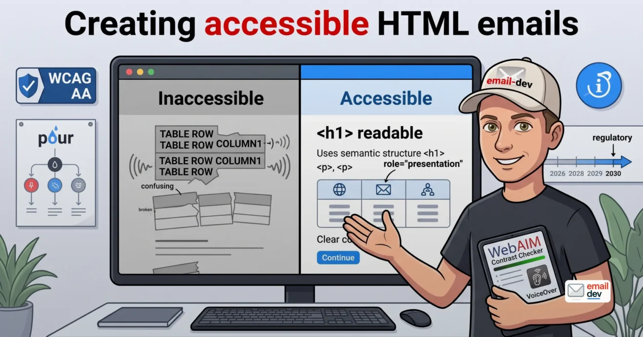
Most email developers have never heard their own work read out loud, and it shows. An accessible HTML email sounds fine to a screen reader. A normal one sounds like a spreadsheet being dictated by a bored robot. “Table. Row one, column one. Table. Row one, column one.” That goes on for a while before the thing reaches an actual word.
Here’s the part that stings. That email isn’t broken because someone screwed up. It’s broken because someone did the normal thing. Tables for layout, because Outlook still runs on Word’s engine. So the same trick that makes your email render also breaks it. A third of the tools people read email with can’t parse it.
Nobody in the approval chain ever notices. The designer looks at it on a Retina screen. The client signs off looking at it on their MacBook, images loaded, dark mode off. The email “passes” review and fails silently for the screen reader crowd. That’s the whole story of email accessibility in one sentence.
And in 2026 this stopped being a manners problem. It’s law in the EU now, and a live lawsuit risk in the US. So let’s fix it.
Quick answer: An accessible HTML email follows WCAG’s POUR principles – perceivable, operable, understandable, robust. In code, that means
role="presentation"on every layout table, descriptivealttext, alangattribute, and semantic headings. It also needs 4.5:1 colour contrast and descriptive link text instead of “click here.” Since June 2025, the EU’s Accessibility Act makes this a legal requirement, not just best practice.
- What “accessible email” actually means (and why WCAG is the yardstick)
- WCAG in one minute
- The honest caveat nobody says out loud
- The state of the accessible HTML email in 2026 – it’s genuinely bad
- What’s actually failing
- The newsletter-platform trap
- Why an accessible HTML email is harder than an accessible web page (the table trap)
- What that sounds like
- The reframe
- The developer’s accessible HTML email checklist – what to actually code
- 1. Mark every layout table role="presentation"
- 2. Use semantic HTML, not styled <div>s and <br>s
- 3. Write alt text that means something
- 4. Hit the contrast ratios
- 5. Handle dark mode without breaking contrast
- 6. Make links and buttons speak for themselves
- 7. Set language and direction (the multilingual bit everyone skips)
- 8. Write like a human (readability counts as accessibility)
- Is email actually covered by the ADA, the EAA, and WCAG? The honest legal read
- The EAA (European Accessibility Act)
- The ADA (US)
- Everyone else
- The pragmatic takeaway
- The overlay warning (please read this one)
- Accessibility in the ESPs that fight you – what breaks
- GetCourse
- Mailchimp
- Klaviyo, Braze, Salesforce Marketing Cloud
- HubSpot
- The through-line
- Testing an accessible HTML email – screen readers, checkers, and what the tools cost now
- Actually test with a screen reader
- The keyboard-only pass
- The paid checkers (and honest pricing)
- The QA loop, in two lines
- Does accessibility get easier as the new Outlook takes over? A 2026 – 2030 read
- The facts as of mid-2026
- The regulatory arrow points one way
- The five-year read (this is guesswork, treat it as such)
- The part that outlives the Outlook transition
- Pragmatic recommendation box
- Frequently asked questions
- What is an accessible HTML email?
- What does role=”presentation” do in an email?
- Are emails covered by WCAG, the ADA, or the EAA?
- What color contrast ratio do emails need?
- Do decorative images need alt text in email?
- How do I test an email with a screen reader?
- Why does my email read out as “row 1, column 1” in a screen reader?
- Is “click here” bad for accessibility?
- Does the lang attribute matter in email?
- Can a non-developer make an email accessible?
- The short version
What “accessible email” actually means (and why WCAG is the yardstick)
Let’s define it without the fluff. An accessible HTML email is coded and written so everyone can read it and act on it. That includes people using screen readers. It includes keyboard-only users. It includes people on screen magnifiers, in high-contrast mode, or just squinting at a phone on a bright bus.
It’s not a design style. It’s a code-and-content discipline. You can have a gorgeous email that’s completely inaccessible. Most of them are.
WCAG in one minute
WCAG stands for Web Content Accessibility Guidelines. It’s a W3C standard. The current version is WCAG 2.2, first published in October 2023 (there was a minor editorial update in December 2024, but the requirements didn’t change). Everything in accessibility points back to it.
It’s organised under four principles, which spell POUR:
- Perceivable – people can sense the content (see it, hear it, or have it read out).
- Operable – people can use it, including with a keyboard alone.
- Understandable – the content is clear and predictable.
- Robust – it works with assistive tech, now and later.
There are three conformance levels: A, AA, and AAA. The one that matters is AA. That’s the level the laws reference. Aim there.
The honest caveat nobody says out loud
WCAG was written for web pages. Not for email. There is no official “WCAG for email” spec anywhere.
So you’re applying web guidelines to a medium where half the proper tools don’t work. Semantic layout, reliable CSS, real structure – Outlook breaks most of it. That gap is exactly why an accessible HTML email is harder to build than an accessible web page. It’s why this article needs to exist at all.
One more thing. WCAG 3 exists, but only as a draft, and it’s years off. Build for 2.2 AA. Don’t wait around for 3.
The state of the accessible HTML email in 2026 – it’s genuinely bad
Now the number that reframes everything. Grab a coffee first.
The Email Markup Consortium runs an annual accessibility report. The 2026 edition analysed 376,348 emails sent between May 2025 and May 2026. Of those, 99.88% carried Serious or Critical accessibility issues. Only 8 emails passed the automated checks, from just three senders. And even that handful didn’t come out clean – manual review afterwards still turned up problems, like alt text that didn’t really match the image.
Read that again. Eight. Out of three hundred and seventy-six thousand.
This isn’t a “some brands need to improve” story. It’s “basically the entire industry is shipping inaccessible email, and almost nobody has noticed.”
What’s actually failing
The frustrating bit is how cheap most of these failures are to fix. Here’s the machine-checkable stuff from the EMC 2026 data:
| Failure | % of emails |
|---|---|
Missing dir attribute on the body | 97.41% |
Missing body-level lang attribute | 95.66% |
Layout tables without role="presentation" | 83.78% |
Images with no alt text (rated Critical) | 47.88% |
| Non-descriptive link text (“click here”) | very high |
None of that is a hard design problem. These are attributes people forget. That’s it. Which means getting an accessible HTML email right is one of the highest-leverage, lowest-effort wins available to you. Bang for buck, almost nothing else compares.
The newsletter-platform trap
New for 2026, EMC also audited emails from Substack, Shopify, and Beehiiv. Roughly ten and a half thousand of them. None passed.
The reason is simple. The defaults are inaccessible, and most senders never touch the markup. So if you want an accessible HTML email off a drag-and-drop builder, watch out. If you don’t control the code, you’ve probably inherited these failures without seeing them. Worth checking before you assume you’re clean.
Why an accessible HTML email is harder than an accessible web page (the table trap)
This is the part nobody else connects, so stay with me. It’s the reason the whole topic exists.
On the web, you’d never lay out a page with <table>. You’d be laughed out of the room. In email you have no choice. Outlook runs on Microsoft Word’s rendering engine. Yes, Word – the thing you type letters in. It won’t do modern layout. So every email gets built out of tables used for structure.
Here’s the catch. A <table> means one thing to a screen reader: “here comes a data grid.” So it announces the grid.
What that sounds like
Without any intervention, a screen reader reads a layout table cell by cell. Position and all.
“Table. Row one, column one. [logo] Row one, column two. [nav] Row two, column one…”
Your neat three-column footer becomes a spoken spreadsheet nobody asked for. It’s genuinely awful to listen to. And it drives me a bit mad, because the developer did nothing wrong by normal standards.
The reframe
So here’s the whole insight. The hacks that make email render are the exact hacks that break it for assistive tech. Tables. Spacer cells. Sliced images. Ghost tables for Outlook. Every one of them is a landmine for a screen reader.
Which means accessibility in email isn’t a separate discipline you bolt on at the end. It’s the cleanup layer for the cross-client compromises you already make. If you already fight Outlook with tables, you’re already halfway into an accessibility problem – you just haven’t heard it yet.
That framing ties this piece to the rest of the blog. The fluid-hybrid layout guide, the background-images piece, the image-optimization one – same worldview, different symptom.
The good news? The new Chromium Outlook is slowly killing the layout reason for some of this. More on that later. But the fix – role="presentation" – is a one-attribute non-negotiable regardless. So we start there.
The developer’s accessible HTML email checklist – what to actually code
This is the list I run before I send. Most of it is attributes you’re forgetting, not rocket science. I’ve mapped it loosely to POUR so it doubles as a WCAG reference.
Bookmark this section. It’s the meat.
1. Mark every layout table role="presentation"
Single highest-impact fix. Remember, 83.78% of emails miss it. Add it to every <table> you use for layout. Not every <td> – just the table element itself.
<table role="presentation" cellpadding="0" cellspacing="0" border="0" width="100%">
That one attribute tells the screen reader to drop the grid semantics and read the content in order. The “row one, column one” nightmare stops instantly.
The gotcha: only layout tables. Got a genuine data table? A pricing grid, an order summary, a shipping breakdown? Leave it as a real table. Keep its <th> headers. That’s the one place tables should stay tables. (role="none" does the same job as role="presentation", in case you see both.)
2. Use semantic HTML, not styled <div>s and <br>s
Screen reader users navigate by heading. It’s how they skim, the way you’d skim by scrolling. If your “heading” is just bold text in a <span>, they can’t find it.
So use the real thing:
<h1>/<h2>/<h3>for headings.<p>for paragraphs, not<br><br>for spacing.<ul>/<ol>for lists.<strong>/<em>for emphasis.
One <h1> per email – that’s your headline. <h2> for sections. Honestly, you almost never need <h4> and below in an email. If you do, the email’s too long. Cut it and link out.
The Outlook tax: headings and <p> carry default margins that wreck your careful spacing. Outlook also mangles line-height. Reset it inline, and add the MSO fix on headings:
<h2 style="margin:0; mso-line-height-rule:exactly; line-height:28px;">Section title</h2>
That mso-line-height-rule:exactly is the detail you only learn by shipping. Skip it and Outlook adds phantom space above your text.
3. Write alt text that means something
Every meaningful image gets a descriptive alt. This does double duty. It’s the fallback when images are blocked, and it’s what a screen reader announces. Two problems, one fix. (More on the image-blocking side in the image-optimization guide.)
Decorative stuff – spacers, swirls, background flourishes – gets an empty alt. Empty, not missing.
<img src="hero.jpg" alt="Spring collection - three linen shirts on a rail" width="600">
<img src="spacer.gif" alt="" width="20" height="1">
The decision is quick. Ask what the image is doing:
- Functional (a linked button) – describe the action.
- Informative (a product, a chart) – describe the content.
- Decorative (a swirl) –
alt="", skip it entirely.
Traps to avoid:
- Don’t keyword-stuff the alt. Screen readers read the whole thing.
- Don’t write
alt="image1.jpg". That’s worse than nothing. - Don’t add a
titleon top ofalt. Some readers announce both. Double announcement, ugly. - If text is baked into the image, that text goes in the alt or as live text nearby.
One more that trips people up, and I had this backwards myself for a while. If you put both alt and aria-label on the same image, it’s the aria-label that wins – most screen readers announce it and quietly override your alt. So the careful alt text you wrote gets ignored for the read-aloud, and only survives as the image-blocked fallback. Real-world email testing (the folks at a11y.email did a painstaking pass on this) backs that up. Upshot: don’t split them. Keep your description in alt, since it does double duty, and only reach for aria-label where there’s genuinely no alt to lean on.
4. Hit the contrast ratios
WCAG AA wants 4.5:1 for normal text against its background. Large text gets a break at 3:1 – and “large” here means 18pt, which is around 24px, or 14pt bold, which is about 18.5px bold and up. People mix this up constantly and quote “18px,” but the spec is in points, so 18px regular still needs the full 4.5:1.
This is the single most common failure across all digital content. Not just email. Everywhere.
Never use colour alone to carry meaning. The “required fields are red” thing. The “sale price in red” thing. Colour-blind users lose it. Grayscale renders lose it. Pair the colour with text or an icon so the meaning survives.
Tools worth a bookmark: the WebAIM Contrast Checker and TPGi’s Colour Contrast Analyser. Both free. Both fast.
And a warning that bridges to the next point. Contrast you tuned perfectly for light mode can collapse when a client flips to dark. Which is its own special mess.
5. Handle dark mode without breaking contrast
Dark-mode inversion is inconsistent and infuriating. Apple Mail inverts aggressively. Gmail does it partially. Outlook barely bothers. So your palette can flip into something unreadable.
Common casualties:
- A dark logo lost on a dark background.
- Text stranded over a now-dark image.
- Contrast that was 5:1 in light and 2:1 in dark.
High-level fixes:
- Use
prefers-color-schememedia queries for Apple Mail. - Pick non-pure fallback colours (avoid pure
#FFFFFFand pure#000000). - Use transparent-PNG logos with a padded safe zone.
- And test the inverted version’s contrast. Not just the light one.
I’m keeping this short on purpose. Dark mode plus accessibility genuinely deserves its own article, and yes, I’ve promised that piece more than once now. The background-images guide covers a chunk of the dark-mode fallback logic in the meantime.
6. Make links and buttons speak for themselves
Screen reader users pull up a list of all links, stripped of surrounding context. Eight links that all say “click here” is eight identical useless entries. Write “See the spring collection.” Write “Read the setup guide.” Sighted skimmers benefit too.
Buttons: build bulletproof buttons with live HTML text. Add a VML fallback for Outlook. Never ship an image-only button. An image button that doesn’t load is a dead CTA and invisible to screen readers at once. Accessibility and image-blocking resilience are the same fix here.
Keyboard and focus: keyboard-only users tab through links and buttons. Tab order should follow reading order. In a single-column layout, source order equals reading order – which is one more argument for single-column, by the way. Make sure focus is visible.
aria-hidden="true" can hide decorative or duplicate elements from screen readers. That’s fine. But never, ever put it on a focusable link or button. You’ll create an element a keyboard can reach but a screen reader can’t name. Cruel.
7. Set language and direction (the multilingual bit everyone skips)
This one’s for the course creators and anyone mailing across languages.
Set the language:
<html lang="en">
That tells the screen reader which voice and pronunciation to use. Without it, the reader guesses, and it guesses wrong a lot. Remember, 95.66% of emails miss body-level lang. If part of your email is in another language, lang can go on that element or <p> too.
Set the direction:
<html lang="ar" dir="rtl">
dir handles text direction. It’s essential for Arabic and Hebrew. And 97.41% of emails omit it. If you send across languages, this is not optional.
Here’s the direct hit for the course-creator crowd. Say you mail the same launch in English, Russian, Polish, and Turkish. This is exactly where your emails silently fail non-English readers. It’s a two-attribute fix. (It also ties into the glyph and font traps in the web-fonts guide.)
8. Write like a human (readability counts as accessibility)
WCAG cares about understandable, not only perceivable. So the writing matters too.
- Short paragraphs. Three or four sentences, max.
- Clear subject line and preheader.
- Plain language over clever language.
- Left-aligned body text. Justified and centred body copy is harder for dyslexic readers.
- Sane font size. 14px floor, 16px comfortable.
Emojis: fine at the end of a line. Not mid-word. Never as the only carrier of meaning. A screen reader reads “face with tears of joy emoji” out loud, and it wrecks the flow. Emoticons built from punctuation are worse. Skip those.
Plain-text version: include one. Some screen readers and high-security setups fall back to it. It helps deliverability too. Most ESPs auto-generate it – just check it’s actually readable and not stripped garbage.
That’s the checklist. Nine-tenths of it is attributes. Which is either depressing or encouraging, depending on your mood.
Is email actually covered by the ADA, the EAA, and WCAG? The honest legal read
Right, the anxious question. Let me answer it straight, no fear-bait. Quick disclaimer first: I’m a developer, not a lawyer. This is the engineering view. Get real legal advice for real legal decisions.
Start with the framing that clears up half the confusion. WCAG is not a law. It’s a technical standard that laws point at. So the real question isn’t “must my email meet WCAG.” It’s “does a law that references WCAG apply to my email.”
The EAA (European Accessibility Act)
This is the big one that changed. The EAA became enforceable on June 28, 2025.
It applies to businesses selling covered products and services to EU consumers. E-commerce, banking, e-books, ticketing, telecoms, transport. Broad on purpose. Crucially, it applies to non-EU businesses selling into the EU too. Being based in the US or wherever doesn’t get you out.
The EAA points to a standard called EN 301 549. That standard currently incorporates WCAG 2.1 AA. An update, v4.1.1, is expected in 2026, and it moves the bar to WCAG 2.2. Electronic communications – which covers marketing emails and newsletters – is named in the guidance.
So: if your email is part of a covered commercial service to EU consumers, yes, it’s in scope. 2026 is the first full year national authorities are actively supervising. France filed its first EAA cases in November 2025. The Netherlands lined up audits for spring 2026.
Honest nuance, because I’d want it: there’s limited relief for the smallest microenterprises (under 10 staff, under €2M turnover). And “email specifically” enforcement is newer and murkier than website enforcement. But the direction is one-way. It’s not loosening.
The ADA (US)
No email-specific rule exists. But US courts and the DOJ lean on WCAG 2.1 / 2.2 AA as the de facto standard. And digital accessibility lawsuits keep climbing.
Depending on whose methodology, 2025 saw somewhere between ~3,948 and ~8,667 web/Title III filings. About 70% target e-commerce, increasingly small businesses. Email gets dragged in as part of the overall customer experience. Treat it as risk, not certainty.
One more US date worth knowing, and it moved recently, so watch out. Under updated ADA Title II rules, state and local governments (population 50k+) were staring down a WCAG 2.1 AA deadline of April 24, 2026. Then, days before it landed, the DOJ published an interim final rule on April 20, 2026 that pushed the big-entity deadline out a year, to April 26, 2027 (smaller entities and special districts got bumped to April 26, 2028). The substance of the rule didn’t change – just the clock. Public sector only, but it signals where the wind blows, and it’s a reminder that these dates slip.
Everyone else
- Section 508 – US federal agencies and contractors. Converges on WCAG AA.
- AODA (Canada), and other national laws – same convergence.
The pragmatic takeaway
You don’t need to become a compliance lawyer to survive this. Target WCAG 2.2 AA. That single target satisfies basically all of them at once. Hit it, and the legal exposure mostly takes care of itself.
The overlay warning (please read this one)
You’ll see “accessibility widget” overlays that promise instant compliance. One line of code, fully compliant, done. Be very skeptical.
They don’t fix email at all – they’re a website JavaScript injection, and email doesn’t run JS. And on the web side, they don’t work well either. The FTC fined overlay vendor AccessiBe $1 million in 2025 for overstating what its product does. The final order landed in April 2025. On top of that, roughly a quarter of sued sites already had an overlay installed. It didn’t save them.
Code-level fixes are the only real fix. There’s no shortcut here. Anyone selling you one is selling you a problem.
Accessibility in the ESPs that fight you – what breaks
You can hand-code a perfectly accessible HTML email and still watch the platform undo your work. The ESP is a second rendering pass. It gets an opinion. Here’s the short version per platform.
GetCourse
The drag-and-drop output is inaccessible by default. No role="presentation", no lang, generic markup. And if you hand-code and paste in, it can strip or rewrite your attributes. Course creators, flag this one hard – it’s probably where your launches are failing.
Mailchimp
The new builder re-inlines styles and can drop your attributes. The classic / “code your own” path preserves accessibility markup much better. Either way, the stock templates aren’t accessible out of the box.
Klaviyo, Braze, Salesforce Marketing Cloud
The native drag-and-drop blocks generate their own tables. Usually unmarked. Going custom is the only way to guarantee role="presentation" and semantic structure survive the export.
HubSpot
Strips MSO conditionals in some template types. Same behaviour I flagged in the fluid-hybrid and web-fonts pieces. It matters here because your Outlook contrast and dark-mode fixes often ride inside those conditionals.
The through-line
Test after the platform has had its way with your HTML. Not just in your local file. The ESP will quietly undo accessibility work, and you won’t see it unless you look at the sent version. And if you’re on Substack, Beehiiv, or Shopify, the EMC data is grim. None of those platforms passed. You’ve likely inherited failures already.
Testing an accessible HTML email – screen readers, checkers, and what the tools cost now
You cannot eyeball accessibility. Full stop. Your Chrome preview shows a pretty email and tells you nothing about what a screen reader announces.
And here’s the credibility line I’ll die on: automated checkers only catch about 30% of issues. A checker tells you the alt text is missing. It can’t tell you the alt text is useless. Think “image,” or “banner-final-v3.” Or “Brown bread on white ceramic plate” – a real overlay-generated alt for a filet mignon photo. The machine finds the cheap failures. The real test is manual.
Actually test with a screen reader
This is free, and it’s the thing 99% of senders never do.
- NVDA – Windows, free, open source.
- VoiceOver – built into Mac and iOS, already on your machine.
Read through the whole email and listen for four things:
- Does the heading structure make sense?
- Do links make sense out of context?
- Are images announced usefully?
- Does the table read as content, not a grid?
Highest-signal test there is. Costs nothing but time.
The keyboard-only pass
Tab, Shift+Tab, Enter through the entire email. Every link and button should be reachable, in reading order, with a visible focus state. If something’s unreachable, or the focus jumps around randomly, you’ve got work to do.
The paid checkers (and honest pricing)
Litmus is still the most thorough for previews – around 100 client and device combos. It has an Accessibility Checker built into Builder. It also has a colour-blindness filter in Previews. Both are legitimately handy for contrast and dark-mode work.
Now the asterisk I keep repeating across these articles, because it matters. Validity acquired Litmus in April 2025. The Basic plan was killed in August 2025. Everyone got pushed onto Core at ~$500/month. And Putsmail, the old free send-test tool, has been retired. So recommend Litmus honestly – it’s worth it for teams whose volume earns it. It’s overkill for a freelancer testing two emails a week.
Mailgun Inspect (formerly Email on Acid, now folded into Sinch’s Mailgun platform) is the sensible default for small-to-mid teams. Historically it undercut Litmus by a wide margin, coverage was comparable, and it added WCAG-aligned accessibility checks (aligned to 2.2, which is the bar you want). It’s moved to usage-based pricing now, so the exact spend depends on how many client previews you actually run – check the current numbers before you commit – but it’s still the one I point most readers to.
Parcel is free, and it’s the checker the EMC’s own report runs on. So it’s a credible free option specifically for the code-level accessibility scan. Worth naming.
accessible-email.org is a free email-specific HTML accessibility analyzer. Good for a quick sanity check.
Here’s the comparison at a glance:
| Tool | Rough cost | Best for |
|---|---|---|
| Litmus (Core) | ~$500/mo | Teams that need deep client previews |
| Mailgun Inspect | Usage-based, typically well under Litmus | Small-to-mid teams, everyday QA |
| Parcel | Free | Code-level accessibility scan |
| accessible-email.org | Free | Quick sanity check |
| NVDA / VoiceOver | Free | The actual test (screen reader) |
The QA loop, in two lines
Build. Run an automated checker (Parcel, Litmus, or Mailgun) to catch the cheap misses. Then do the screen-reader read-through plus a keyboard pass – that’s the real test. Then send-to-self across the four big inboxes, look at it in dark mode, and send.
The checker is the floor. The screen reader is the job. And a real 2019 ThinkPad with real Outlook still earns its keep. Add a real phone with a real screen reader. Together they catch what VMs and checkers smooth over. They always do.
Does accessibility get easier as the new Outlook takes over? A 2026 – 2030 read
The brief asked me to look five years out. I want to. The story here is different from my usual forecasts. Usually the driver is Microsoft. This time it’s the law.
The facts as of mid-2026
The new Outlook for Windows runs on Chromium and WebView2. It scores far better on accessibility feature support than the legacy Word-engine Outlook. EMC’s client rankings are brutal on legacy Outlook – it supports a tiny fraction of the tested accessibility features. As classic’s share shrinks, some of the table-hack pressure eases, and more real semantic HTML and ARIA becomes viable.
But the transition keeps slipping.
- The opt-out phase (new Outlook on by default) got pushed to around April 2027 for enterprise.
- Full cutover has no announced date yet, and won’t come earlier than ~2028 given the 12-month notice Microsoft has promised.
- Classic stays supported through at least 2029 for M365 and perpetual licences (Office 2021, 2024, LTSC).
- Outlook 2016 and 2019 hit end of support (extended support) on October 14, 2025. Corporate IT runs them anyway.
So the table-based, role="presentation"-requiring reality is here for years yet. The layout reason for the hacks fades slowly. The accessibility discipline does not.
The regulatory arrow points one way
This is the part that’s genuinely different. The law is the engine now.
- EN 301 549 moves to WCAG 2.2 with v4.1.1 (expected 2026). The bar rises from 2.1 to 2.2.
- EAA enforcement intensifies through 2026-2027 as member states arm up.
- US ADA filings stay elevated. More national laws converge on WCAG AA.
- WCAG 3 is in draft, years out – likely well beyond 2030. It’ll eventually reshape how conformance is even measured. Watch it. Don’t build for it yet.
The five-year read (this is guesswork, treat it as such)
- 2026-2027: accessibility goes from “good practice” to “assumed baseline.” Plus active legal exposure for anyone selling into the EU or running US e-commerce. The
role="presentation"/alt/lang/ contrast floor is non-negotiable now. - 2027-2028: as new Outlook dominates, semantic HTML and ARIA get more reliable. An accessible HTML email gets genuinely easier to build well. Tooling and defaults start catching up. Some ESPs will ship accessible-by-default. The good ones already are.
- 2028-2030: email accessibility starts to look more like web accessibility. Fewer table hacks to clean up after. Checkers get smarter – AI-assisted alt-text and link-context evaluation, which EMC is already gesturing at.
- Beyond 2030: the WCAG 3 era. AI-mediated inboxes reading emails aloud by default. Assistants already skip alt text badly. That makes semantic structure more important, not less.
The part that outlives the Outlook transition
Here’s my recurring closing move, and it’s true in a stronger form here than usual. Even when the table hacks finally die, accessibility doesn’t become optional. It becomes law. And the read-aloud future makes semantic structure load-bearing.
Designing for “someone is listening to this, not looking at it” doesn’t expire. It’s about to become a default way emails get consumed. Building an accessible HTML email today is building for the inbox we’re heading toward, not just the one we’ve got.
Pragmatic recommendation box
- Bake
role="presentation"+alt+lang+ contrast into your base template. Make it automatic, not a per-email decision. - Run a screen reader on anything high-stakes.
- Target WCAG 2.2 AA now. Not 2.1.
- Audit the ESP’s output, not just your source file.
- Don’t assume the new Outlook fixes this. It fixes the layout. It doesn’t fix the discipline.
Frequently asked questions
What is an accessible HTML email?
An accessible HTML email is coded and written so everyone can read and act on it. That includes people using screen readers, keyboard navigation, or high-contrast modes. In practice: role="presentation" on layout tables, descriptive alt text, a lang attribute. Plus semantic headings, 4.5:1 colour contrast, and clear link text.
What does role=”presentation” do in an email?
It tells screen readers to ignore a table’s grid structure and just read its contents in order. Email layouts are built with tables, for Outlook’s sake. Without it, a screen reader announces every row and column like a spreadsheet. Add it to every layout table – not to genuine data tables.
Are emails covered by WCAG, the ADA, or the EAA?
WCAG isn’t a law, but laws reference it. The EU’s European Accessibility Act has been enforceable since June 28, 2025. It covers marketing emails from businesses serving EU consumers, and points to WCAG AA. In the US, courts apply the ADA using WCAG as the standard. Targeting WCAG 2.2 AA covers all of them.
What color contrast ratio do emails need?
WCAG AA requires at least 4.5:1 between text and background for normal text. Large text gets 3:1 – and large means 18pt (about 24px), or 14pt bold (about 18.5px bold). The threshold is in points, so don’t assume plain 18px counts as “large.” Never rely on colour alone to convey meaning. Pair it with text or an icon. Then colour-blind users and grayscale renders don’t miss it.
Do decorative images need alt text in email?
No – decorative images (spacers, flourishes, background patterns) should have an empty alt attribute, alt="", so screen readers skip them entirely. Meaningful images need descriptive alt text. The mistake is missing alt attributes altogether, which makes screen readers read out the filename instead.
How do I test an email with a screen reader?
Use NVDA (free, Windows) or VoiceOver (built into Mac and iOS). Read through the whole email and listen. Does the heading order make sense? Do links make sense without surrounding context? Are images announced usefully? Does content read in a logical order? Automated checkers only catch about 30% of issues, so this manual pass matters.
Why does my email read out as “row 1, column 1” in a screen reader?
Because your layout tables are missing role="presentation". Screen readers treat <table> as a data grid and announce every cell’s position. Adding role="presentation" to each layout table strips that grid semantics so the reader just announces your content.
Is “click here” bad for accessibility?
Yes. Screen reader users often pull up a list of all links, stripped of context. So several “click here” links are meaningless. Write descriptive link text that says where the link goes – “See the pricing page,” “Read the setup guide.” It helps sighted skimmers too.
Does the lang attribute matter in email?
Yes. <html lang="en"> tells screen readers which language voice to use for pronunciation; without it they guess, often wrong. Over 95% of emails omit it. If you send multilingual campaigns, also set dir for text direction (essential for right-to-left languages like Arabic and Hebrew).
Can a non-developer make an email accessible?
Partly. A careful marketer can write descriptive alt text and clear link text. They can write good subject lines and check colour contrast inside a template. But the code-level fixes need someone comfortable with HTML. That’s role="presentation", semantic HTML, lang and dir, bulletproof buttons. Or a template built accessible from the start.
The short version
An accessible HTML email isn’t a separate virtue you bolt on at the end. It’s cleaning up after the table hacks you already use for Outlook. And in 2026 it’s enforceable law in the EU and a live lawsuit risk in the US.
The floor is cheap. role="presentation", real alt text, a lang attribute, 4.5:1 contrast, links that make sense. That alone puts you ahead of 99.88% of the industry. Which is a genuinely absurd sentence to be able to write, and yet here we are.
If you’re commissioning email work and want a two-question test for whoever builds it, use mine. Ask them what role="presentation" does. Then ask something better. Have they ever run one of your emails through a screen reader? Or just looked at it on their Mac? The two answers tell you everything you need to know.
And if you want an accessible HTML email built properly, that’s the whole job. I’ll show you the screen-reader results, not just a nice Retina screenshot. Brief in, honest turnaround, test results before send. I’ll even include the dark-mode piece I’ve now promised in four articles. Which I should probably just write. Next time.