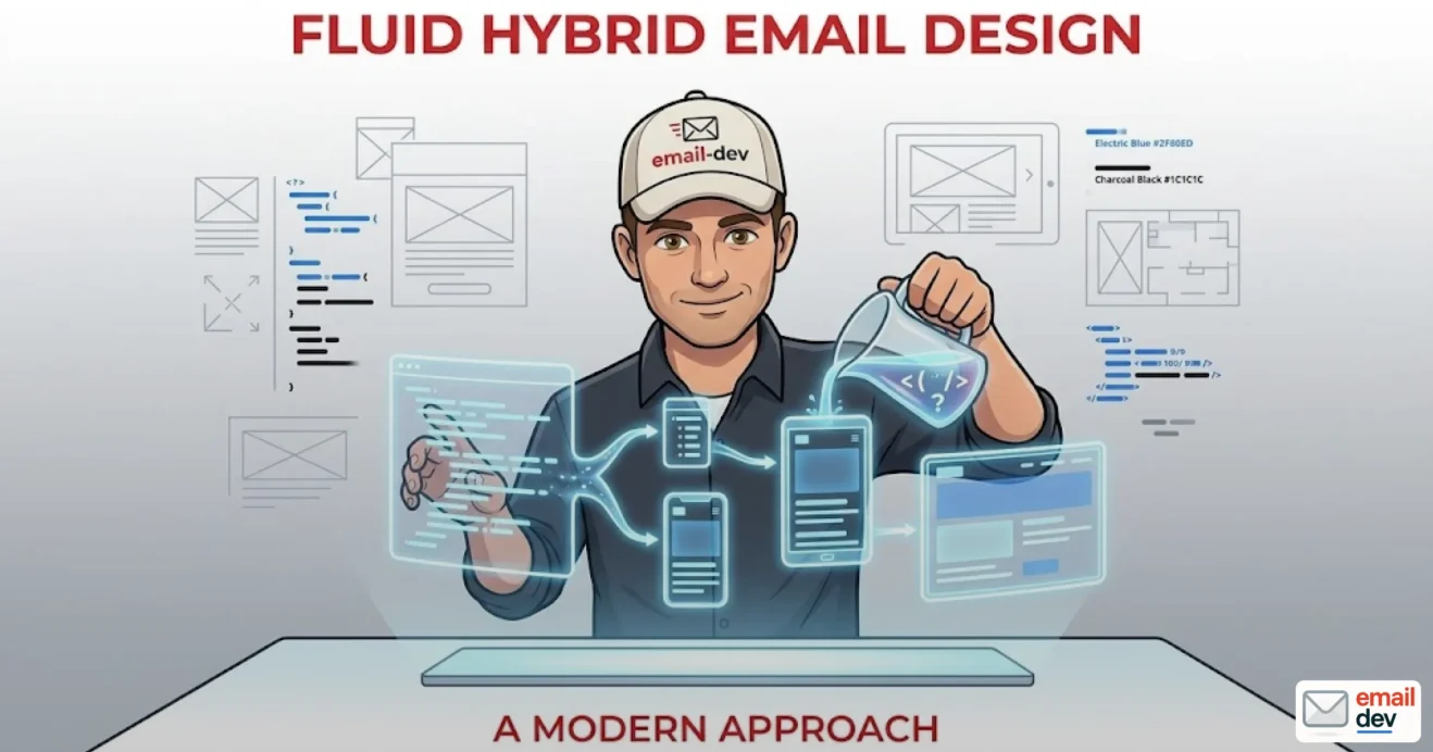
Quick answer: Fluid hybrid email design is a coding method for responsive HTML emails that combines percentage-based widths, max-width constraints, and Outlook-specific ghost tables to render reliably across every major email client – including the ones that strip CSS media queries from the
<head>. It remains the most dependable foundation for cross-client email layouts through at least 2028, even as the new Chromium-based Outlook gradually replaces the Word-engine version.
A designer hands you a beautiful two-column layout for a course launch sequence. The desktop mockup is clean, the mobile mockup is clean, the project manager is happy. You build it. You ship it. And then you go to lunch. By the time you’re back at your desk there’s a Slack message from the client with a screenshot from somebody’s Outlook 2019 install in a basement office somewhere in Birmingham and the email looks like it survived a tornado. The hero is stretched to 1400px. The columns are not stacking. The button is somewhere off-screen. This is the moment where most people discover fluid hybrid email design – which is the technique invented specifically so this stops happening to you on a regular Tuesday.
I’ve been building HTML emails professionally for years now, and I’ve watched fluid hybrid email design go from “the weird thing the Litmus blog wrote about” to the actual industry default for anyone who cares about Outlook. Which is most people. Even now in mid-2026, with Microsoft finally pushing the new Chromium-based Outlook as the default and the classic Word-engine builds quietly being managed out the back door, the technique is still relevant – just for slightly different reasons than it used to be.
This article is the explainer I wish I’d had when I started. We’ll cover what fluid hybrid email design actually is, how the code works, where it breaks, which ESPs love it and which ones quietly mangle it, and whether it’s worth learning at all given that classic Outlook is supposedly on its way out. (Spoiler: yes. For a few more years, definitely.) There’s a code walkthrough, an honest tools section, a chunk on the 2026-2030 outlook, and an FAQ at the bottom for the people who skip to the FAQ. You know who you are.
- What is fluid hybrid email design?
- Fluid hybrid vs scalable vs fluid vs responsive – the difference, briefly
- How we got here – a short, opinionated history
- How to build a fluid hybrid email design – step by step
- Step 1: the outer container
- Step 2: ghost tables for Outlook
- Step 3: column stacking without media queries
- Step 4: padding, gutters and the inner ghost table
- Step 5: layering media queries on top (optional, but useful)
- Where fluid hybrid email design shines (and where it gets ugly)
- Where it shines
- Where it gets ugly
- Does fluid hybrid email design still matter after the new Outlook transition?
- The facts as of mid-2026
- What this means for fluid hybrid email design
- The technique has a second life beyond Outlook
- My pragmatic recommendation for 2026-2030
- Fluid hybrid email design in real ESPs – what tends to break
- GetCourse
- Mailchimp
- Klaviyo
- Braze
- Salesforce Marketing Cloud
- HubSpot
- How to test fluid hybrid email layouts in 2026
- Litmus
- Mailgun Inspect (formerly Email on Acid)
- The real hardware test
- Other options worth knowing
- Fluid hybrid email design – modern variants worth knowing
- The Fab Four technique
- Flybrid
- Container queries (looking forward)
- CSS Grid in email
- Common fluid hybrid email design mistakes (and how to fix them)
- Forgetting mso-line-height-rule
- Setting max-width on the wrong element
- Missing role=”presentation” on layout tables
- Putting the ghost table outside the conditional comment
- Display: block instead of display: inline-block on column containers
- Forgetting that Outlook ignores padding on divs
- Skipping dark mode testing
- Background images without VML fallback
- Fluid hybrid email design – FAQ
- What is fluid hybrid email design in simple terms?
- Is fluid hybrid the same as spongy email design?
- Do I still need ghost tables now that the new Outlook is rolling out?
- Can I use fluid hybrid email design without any media queries at all?
- What’s the difference between fluid hybrid and the Fab Four technique?
- Does fluid hybrid email design work for multi-column emails?
- Will fluid hybrid emails work in dark mode?
- Is fluid hybrid email design better than responsive email design?
- What tools should I use to test fluid hybrid email layouts?
- Can a non-developer build a fluid hybrid email?
- Closing thoughts
What is fluid hybrid email design?
Quick definitional answer for the people who want a sentence they can paste into a brief:
Fluid hybrid email design is a layout technique that builds responsive HTML emails using percentage-based widths, max-width constraints, and Outlook-specific ghost tables – without depending on CSS media queries to do the heavy lifting. The result is an email that adapts to any screen, even in clients that strip out the
<head>element or ignore @media rules entirely.
The name gives away the recipe:
- Fluid – the widths are percentages. The content stretches to fill whatever container it lands in, with
max-widthkeeping it from blowing out to 1600px on a widescreen monitor. - Hybrid – those fluid widths get constrained by fixed-width “ghost tables” for the email clients that don’t understand
max-width. By “the email clients that don’t understand max-width” I mean classic Outlook for Windows. By “classic Outlook for Windows” I mean Outlook 2016 through Outlook 2024 plus the Microsoft 365 desktop builds that still use the Word rendering engine. So, you know, a lot of corporate inboxes.
The cleanest way to think about it: fluid hybrid email design is what you build when you can’t trust the email client to read your CSS properly. Which, depending on your audience, might be more often than you’d like.
Fluid hybrid vs scalable vs fluid vs responsive – the difference, briefly
People mix these terms up constantly, including in client briefs that say “we need responsive email” when they mean something else entirely. Here’s how I keep them straight:
| Approach | What it does | Uses media queries? | Outlook-friendly? |
|---|---|---|---|
| Scalable | Same layout, shrinks proportionally | No | Yes |
| Fluid | Stretches to fill viewport using % widths | No | Partially (no max-width support) |
| Responsive | Swaps layouts at breakpoints | Yes | Limited (only new Outlook, partial Outlook.com) |
| Fluid hybrid | % widths + ghost tables, optionally + media queries | Optional | Yes, fully |
The thing people miss is that fluid hybrid email design and responsive design aren’t mutually exclusive. The good emails I see in 2026 use fluid hybrid as the structural foundation and layer media queries on top for things like typography scaling, dark mode targeting, and hiding desktop-only elements on mobile. The media queries become a progressive enhancement, not the load-bearing wall.
The first time I built a “pure responsive” email – this was a course launch for a producer I won’t name, modest list of about 18,000 subs – I watched 38% of opens come through Outlook 2016 looking like a stretched-out 1990s fax machine output. That was the day I converted to hybrid. I haven’t gone back.
How we got here – a short, opinionated history
Fluid hybrid email design didn’t fall out of the sky. The technique has a lineage worth knowing if you want to sound credible in a discovery call. The shortlist of people who actually moved this forward:
- Fabio Carneiro at MailChimp (around 2014-2015) started experimenting with what he eventually called “spongy” development – emails built to flex and adapt without leaning on media queries. He gave a talk at TEDC15 (The Email Design Conference 2015) titled “Responsive Email Without Media Queries”, which became the technique’s foundational reference. His GitHub repo from that talk is still online.
- Nicole Merlin wrote what’s still the canonical tutorial on Envato Tuts+ – “Creating a Future-Proof Responsive Email Without Media Queries”. This is where the broader community actually learned how to build this stuff, and she’s the person who popularized the term “fluid hybrid” specifically.
- Mike Ragan at ActionRocket and a handful of others refined the ghost table patterns. Litmus’s own writeups credit Carneiro for pioneering it and Ragan and Merlin for popularizing it.
- Rémi Parmentier (HTeuMeuLeu) extended the approach in February 2016 with what he called the Fab Four technique, which uses
min-width,max-width,widthandcalc()to emulate flexbox behaviour in email – a real piece of CSS witchcraft.
The terminology never fully settled. “Spongy”, “fluid hybrid”, “hybrid coding” all refer to roughly the same thing with minor implementation differences. Industry usage gradually landed on “fluid hybrid email design” as the dominant term, which is what I’m using throughout this article because I have to pick one.
(I’m probably skipping somebody’s contribution here. The email dev community is small and intricate and I apologize in advance. If you invented part of this and I missed you, send me an email and I’ll update the post.)
How to build a fluid hybrid email design – step by step
This is the technical section. Code blocks included. I’m going to walk through building a basic single-column-with-two-column-feature-block layout, because that’s the shape of about 70% of the production emails I build.
Step 1: the outer container
Start with a 100%-width table that wraps everything. Inside that, the actual content container, with width="100%" as an HTML attribute and max-width: 600px as a CSS property.
<table role="presentation" width="100%" cellpadding="0" cellspacing="0" border="0">
  <tr>
    <td align="center">
      <table role="presentation" width="100%" style="max-width: 600px;" cellpadding="0" cellspacing="0" border="0">
        <!-- email content goes here -->
      </table>
    </td>
  </tr>
</table>
The outer table is the safety net for when the email gets embedded in a webmail container of unpredictable width. The inner table is the actual email – 100% wide on mobile, capped at 600px on anything bigger. Note the role="presentation" – this is non-negotiable for accessibility. Screen readers will otherwise try to read your layout tables as data tables and produce gibberish.
Step 2: ghost tables for Outlook
Classic Outlook on Windows ignores max-width. So if you stop at step 1, your email will be 100% wide in Outlook desktop, which is to say, blown out to whatever width the user has their reading pane set to. Which can be huge. Which is the original problem we’re trying to solve.
The fix is a ghost table – a fixed-width table that lives inside an MSO conditional comment, visible only to Word-rendering Outlook:
<!--[if mso]>
<table role="presentation" width="600" align="center" cellpadding="0" cellspacing="0" border="0">
  <tr>
    <td>
<![endif]-->

<table role="presentation" width="100%" style="max-width: 600px;" cellpadding="0" cellspacing="0" border="0">
  <!-- email content -->
</table>

<!--[if mso]>
    </td>
  </tr>
</table>
<![endif]-->
The <!--[if mso]> syntax is parsed by every Word-based Outlook build (2007 through 2024 and the Microsoft 365 desktop versions still using Word). Every other client treats it as a regular HTML comment and ignores everything inside. So the ghost table only exists for Outlook, and Outlook gets a clean 600px-wide container to render into.
You can narrow the targeting if you want – <!--[if mso 16]> targets the 2016/2019/2021 build specifically – but for most fluid hybrid email design work, plain [if mso] is fine.
Step 3: column stacking without media queries
Here’s the part that always feels slightly magical. To get two columns that sit side-by-side on desktop and stack to one column on mobile, without using a single @media rule:
<!--[if mso]>
<table role="presentation" width="600" cellpadding="0" cellspacing="0" border="0">
  <tr>
    <td width="300" valign="top">
<![endif]-->

<div style="display: inline-block; vertical-align: top; width: 100%; max-width: 300px;">
  <!-- left column content -->
</div>

<!--[if mso]>
    </td>
    <td width="300" valign="top">
<![endif]-->

<div style="display: inline-block; vertical-align: top; width: 100%; max-width: 300px;">
  <!-- right column content -->
</div>

<!--[if mso]>
    </td>
  </tr>
</table>
<![endif]-->
The wrapper around these divs needs text-align: center and font-size: 0 (the font-size hack is to kill the whitespace between inline-block elements that browsers love to insert). On screens wider than 600px, the two divs sit side-by-side at 300px each. On screens narrower than 600px, the divs hit their width: 100% and stack vertically. No media queries needed.
In Outlook, the ghost table forces the two-column layout regardless of what Outlook would otherwise do with the divs (which is: nothing useful).
Step 4: padding, gutters and the inner ghost table
If you want padding inside your columns – which you almost always do – put it on a nested table cell rather than a <div> style. Word-rendering Outlook will quietly ignore padding declared on a div but will respect it as a <td> attribute or as inline CSS on a <td>. This bites people constantly.
<div style="display: inline-block; vertical-align: top; width: 100%; max-width: 300px;">
  <table role="presentation" width="100%" cellpadding="0" cellspacing="0" border="0">
    <tr>
      <td style="padding: 20px;">
        <!-- column content with proper padding -->
      </td>
    </tr>
  </table>
</div>
Yes, it’s an extra layer of markup. Yes, it’s annoying. No, you can’t skip it if you want consistent padding across Outlook.
Step 5: layering media queries on top (optional, but useful)
Fluid hybrid email design never said “no media queries allowed”. The point was always “your email shouldn’t break if the media queries get stripped”. Once the fluid hybrid foundation is in place, you can layer media queries on top for:
- Scaling up button sizes and font sizes on mobile
- Hiding desktop-only elements (
<th class="hide-mobile">withdisplay: none !importantin a media query) - Showing mobile-only elements
- Adjusting padding or margins at specific breakpoints
- Dark mode targeting (
@media (prefers-color-scheme: dark))
The base layout still works without the media queries. The media queries are icing.
Where fluid hybrid email design shines (and where it gets ugly)
I owe you an honest take on this. Fluid hybrid email design isn’t a universal solution, and pretending it is would be the kind of marketing fluff that makes this industry exhausting to work in.
Where it shines
- Single-column emails with a hero, body content, button, footer. The bread-and-butter newsletter shape. Fluid hybrid handles this beautifully and reliably in every client I’ve ever tested.
- Two-column product blocks that stack on mobile. Standard ecommerce stuff. Course landing-page recaps. Webinar invites with a speaker photo next to a bio. All native fluid hybrid territory.
- Emails going into ESPs that mangle the
<head>– GetCourse, certain corporate Salesforce Marketing Cloud setups, the older Mailchimp template editor configurations that aggressively re-inline. If your media queries are getting stripped before send, fluid hybrid keeps the layout intact anyway. - Emails that get forwarded into Outlook desktop by the one VP at the client’s company who still uses it. You can’t predict where your email will end up. Fluid hybrid email design gives you a survival floor.
Where it gets ugly
- Three-column layouts get fragile fast. Doable. I’ve shipped plenty of them. But the ghost tables nest, the padding math gets harder, and one missing closing tag will eat the whole campaign in Outlook in a way that doesn’t show up in your local browser preview.
- Magazine-style asymmetric grids – if the design has a big feature block with smaller items wrapping around it, fluid hybrid isn’t going to be elegant. You’ll fight it. Sometimes you have to push back on the designer and say “this layout is fine for the website but it’s going to look like garbage in 30% of email clients no matter what I do”.
- Variable-height sidebar layouts – a tall main column next to a short sidebar that’s supposed to vertically align with something specific. The fluid hybrid vertical alignment trick (
vertical-align: topon the inline-block) has real limits. You’ll occasionally need to swallow the imperfection. - Wider desktop layouts (800px and up) – workable but the simplicity that made fluid hybrid appealing starts to fray. At that point you’re often better off going to a proper responsive layout with media queries and accepting that classic Outlook users get the desktop version regardless.
The Outlook hairline-border problem deserves its own complaint, by the way. Outlook 2019 in particular has a habit of adding a 1px gap or line on certain nested ghost tables under specific Windows DPI settings – I’ve spent literal hours chasing this down and still can’t reproduce it consistently. If you’ve solved this, please write me a long, smug email about it. I’d genuinely like to know.
Does fluid hybrid email design still matter after the new Outlook transition?
This is the part of the article I’m most interested in, and the part nobody else seems to be writing about with much honesty. So let me lay out what I know.
The facts as of mid-2026
The new Outlook for Windows uses a Chromium-based rendering engine (specifically Microsoft Edge WebView2), very similar to the way Outlook.com and the new Outlook on the web behave. Microsoft has been pushing it as the default for new installs throughout 2025, and the “opt-out phase” began in April 2026 – meaning users get the new Outlook automatically but can still revert to classic Outlook if they want.
Here’s the part the breathless blog posts get wrong: classic Outlook is not going away in October 2026. Microsoft’s official position is that classic Outlook for Windows will be supported “at least through 2029” for Microsoft 365 subscribers and perpetual-license holders (Office 2021, Office 2024, Office LTSC). The actual “cutover phase”, where classic Outlook becomes unavailable and the new Outlook is the only option, has not been given a public date. It’ll come, but probably 2028-2029 at the earliest for most users.
A separate timeline note worth knowing: Outlook 2016 and Outlook 2019 both reached end of mainstream support on October 14, 2025. They no longer receive any updates. But the people running those builds aren’t going to upgrade just because Microsoft told them to – this is corporate IT we’re talking about – so they’ll still be opening your emails. Just with no security patches.
What this means for HTML and CSS support in the new Outlook:
- CSS is much better. Flexbox works. Most modern properties work.
- Background images render properly.
- Padding and margin on divs behave normally.
- Media queries are fully supported.
- VML and MSO conditional comments are no longer needed – the new Outlook ignores them.
In other words, the new Outlook is finally a normal web rendering target, after nearly two decades of the Word engine making everyone’s life harder than it needed to be. But there’s a catch (because there’s always a catch): the new Outlook has its own post-processing layer that rewrites styles after the email loads. The border-radius bug is the famous one – set border-radius: 20px 20px 0 0; and the new Outlook silently converts it to border-radius: 20px; on all four corners. So “Chromium-based” doesn’t mean “behaves identically to a browser”. Test, always.
What this means for fluid hybrid email design
Here’s the thing. The transition is going to be slow. Enterprise rollouts always are. Large companies with managed IT environments will be running classic Outlook well into 2028, probably 2029. Banks, government departments, healthcare organizations, anybody with a strict change-management policy. Your B2B audience will be the last to migrate. Your B2C audience on Outlook.com and Apple Mail is already mostly on the new engine, or on something Chromium-based.
Realistic timeline, in my opinion (and I could be wrong, this is partly guesswork):
- 2026-2027 – fluid hybrid email design is still strictly necessary for any B2B sender or any list with significant corporate Outlook representation. The opt-out phase doesn’t force anyone off classic.
- 2027-2028 – the audience analysis starts mattering more than the default. If you’re sending to a 90% mobile course-creator audience, you can start being more aggressive about dropping legacy code. If you’re sending to enterprise B2B, you can’t.
- 2028-2030 – fluid hybrid email design becomes a “nice to have” rather than a “must have” for most senders. Ghost tables become a legacy fallback you maintain for the long tail.
- Beyond 2030 – assuming Microsoft doesn’t pivot again, the technique fades into the background. It’ll still work, but you won’t be teaching it in workshops.
The technique has a second life beyond Outlook
Here’s what I think most of the “is fluid hybrid email design dying” hot takes miss. The technique was always doing more than just fixing Outlook. It also handles:
- ESPs that strip or rewrite the
<head>element (GetCourse, some Salesforce configurations, certain corporate Mailchimp accounts with restrictive admin settings) - Email previews in messaging apps that don’t render external stylesheets
- Embedded HTML email in Slack, Teams and similar collaboration tools
- Email forwarding into clients you genuinely can’t predict
- Email being viewed in webmail apps that haven’t been updated since 2018 and never will be
So even after classic Outlook is finally laid to rest, there’s a real argument for building emails that don’t depend on @media rules being respected. The fluid hybrid email design approach is defensive engineering – it produces emails that work in environments you didn’t anticipate. That value doesn’t go away just because Microsoft fixed one of its products.
My pragmatic recommendation for 2026-2030
- Keep fluid hybrid email design as your base layer for any client with mixed or unknown audience
- Treat ghost tables as a fallback that you’ll gradually remove over the next 3-4 years
- Layer modern CSS (including @media, container queries when client support catches up, and selected use of div-based layouts) on top
- Audit your actual audience analytics quarterly – if your classic Outlook traffic drops below 5%, you can start dropping legacy code from new templates
- Don’t rip out fluid hybrid email design from working templates just because it feels old. If the email works, leave it alone.
Fluid hybrid email design in real ESPs – what tends to break
The theoretical technique is one thing. The technique surviving contact with whatever ESP your client insists on using is another. Some quick notes on the platforms I deal with regularly.
GetCourse
This one’s relevant for a lot of my course-creator clients. GetCourse is widely used in Russian-speaking markets and has a reputation for, let’s say, creative layout handling. The platform will sometimes truncate emails that exceed certain length thresholds, rewrite parts of your HTML during the template processing step, and occasionally introduce extra whitespace inside your tables. Fluid hybrid email design survives this better than fully responsive layouts because the percentage-based widths re-stabilize even after the platform’s intervention. Pro tip: avoid using web fonts loaded via <link> tags in GetCourse templates – the platform strips them inconsistently. Inline your fallback stack.
Mailchimp
Mailchimp’s classic template editor preserves fluid hybrid email design reasonably well, but the newer drag-and-drop builder re-inlines CSS aggressively, which can break the Fab Four technique specifically (because Fab Four relies on multiple width declarations on the same element, and the inliner sometimes keeps only the last one). If you’re hand-coding for Mailchimp, paste into the “code your own” template type rather than the visual editor.
Klaviyo
Generally cooperative with fluid hybrid. The drag-and-drop blocks insert their own wrapping tables, which can collide with custom ghost tables if you’re trying to mix custom HTML blocks with native blocks. Either go fully custom or fully native – mixing is where the bugs live.
Braze
Braze is fine. It mostly leaves your HTML alone. The Liquid templating layer can produce some interesting indentation that doesn’t affect rendering but makes debugging harder. Test thoroughly with realistic personalization tokens.
Salesforce Marketing Cloud
SFMC respects fluid hybrid email design well, but the Content Builder can introduce wrapping <table> elements depending on how you’ve structured your content blocks. If you’re building custom HTML, use the “HTML Paste” content block type rather than letting the platform compose around your code.
HubSpot
The HubSpot template editor strips MSO conditional comments under certain template configurations, specifically older “drag and drop” template types. Use the coded email tool instead. If your team is already on HubSpot and committed to the visual editor, you may need to compromise on the ghost table approach for those specific templates – which is a real cost.
How to test fluid hybrid email layouts in 2026
Testing is the boring half of the job that everyone underestimates. You can’t tell whether your fluid hybrid email design works by looking at it in your browser. You have to test it where it’ll actually be opened.
Litmus
Still the industry default for serious email QA, and I’m going to recommend it with a giant asterisk attached. Litmus Email Previews give you screenshots across roughly 100 client/device combinations, including all the Outlook versions you care about – classic 2016, 2019, 2021, 2024, new Outlook for Windows, Outlook for Mac, Outlook on the web, Outlook iOS, Outlook Android. The dark mode previews are essential post-2023 because Apple Mail’s dark mode inversion is aggressive enough to ruin a perfectly good design without warning.
What Litmus is genuinely good at: catching the version-specific quirks. The DPI-related hairlines I mentioned earlier, the way Outlook 2019 sometimes renders a slightly different line-height than Outlook 2021, the moment when Gmail iOS started clipping emails over a certain size threshold. You won’t find this stuff in a browser.
What Litmus isn’t perfect at: rendering the new Outlook for Windows exactly as it appears in production. There’s a known lag between when Microsoft ships rendering changes (including those weird post-processing rewrites I mentioned) and when Litmus catches up. So treat new Outlook previews as approximate.
Now, the asterisk. We need to talk about the price, because what happened in 2025 is genuinely outrageous and nobody is being honest about it in the email dev write-ups. Litmus was acquired by Validity in April 2025. In August 2025, they killed the Basic plan with effectively zero advance notice and forced everyone onto the new Core plan at $500/month. That gets you 2,000 previews, 5 user seats, plus a pile of Litmus Personalize impressions and analytics features that most small teams don’t need and didn’t ask for. Annual pricing is in the $6,000+/year zone. There’s no monthly Basic option anymore. There’s no “I’m one freelancer testing two emails a week” tier.
For an in-house enterprise team sending dozens of campaigns a month with a big marketing operation behind them, fine, the value’s still there. For a course creator running one launch sequence per quarter, or a small agency with three retainer clients, or a freelancer doing what I do – $500/month to look at screenshots is a joke. I’m still subscribed because my client mix justifies it, but I’ve stopped recommending it as the default. If your monthly send volume doesn’t justify $500/month, look at the alternatives below.
Mailgun Inspect (formerly Email on Acid)
Email on Acid is being migrated into Mailgun Inspect – the formal cutover for paying customers started in June 2026, with annual subscribers transitioning at renewal. The core testing functionality is largely the same plus some new accessibility checks aligned with WCAG 2.2 and the European Accessibility Act. Spam testing got reworked (you can no longer send spam tests from your own IPs – everything goes through Mailgun’s), and full in-app HTML editing is coming later in 2026.
Pricing-wise, this is now the sensible default for most small-to-mid teams since the Litmus price hike. Historically Email on Acid sat around half the price of Litmus for comparable rendering coverage, and the Mailgun Inspect plans have continued that positioning. If you were already on Email on Acid, you’ll need to plan the migration. If you’re shopping fresh and you don’t need Litmus’s analytics suite, this is where I’d start.
The real hardware test
Here’s the thing. Litmus and Mailgun Inspect run virtual machines. Virtual machines aren’t real devices. They’re close, but they’re not the same.
If you can keep one real Outlook desktop install on an old laptop, do it. Mine is a 2019 ThinkPad with Outlook 2019 on Windows 10. It catches things the virtual previews don’t. Same goes for a physical iPhone with the Gmail app installed – the iOS Gmail rendering occasionally disagrees with the simulator in ways that aren’t documented anywhere, and I don’t have time to lose to that argument.
Other options worth knowing
- Mailtrap – email testing in a sandboxed inbox, cheaper than Litmus, good for development workflows but less comprehensive on client previews
- HTMLemail.io – simple, free, useful for quick sanity checks
- Putsmail by Litmus – free way to send test emails to your own inboxes
- The real-inbox test – send to your own Gmail, Outlook, Apple Mail and Yahoo accounts before you send to production. Yes, even for “small” sends. Especially for small sends.
My personal QA workflow: build, Litmus, fix the Litmus issues, send-to-self across all four major inbox types, fix what looks wrong on actual devices, then send. It takes 30 minutes longer than skipping the QA, and it has saved me from at least three “we accidentally broke the launch email” client calls that I can specifically remember.
Fluid hybrid email design – modern variants worth knowing
Fluid hybrid isn’t frozen in time. A handful of variants and extensions have emerged that are worth being aware of.
The Fab Four technique
Rémi Parmentier introduced this in February 2016 and it remains a useful tool. The Fab Four uses min-width, max-width, width and calc() to emulate flexbox-like responsive behaviour without media queries. The math gets weird (width: calc((480px - 100%) * 480) is the kind of expression that makes you double-check your work), but the result is a true media-query-free responsive layout that survives in clients where media queries get stripped.
Downsides:
- Old Lotus Notes builds hate it
- The Mailchimp inliner sometimes breaks it
- The math is genuinely hard to read in source
If you’re using a preprocessor like Sass with a mixin, it becomes manageable.
Flybrid
A simplified approach by rkhleics on GitHub. Uses text-align: center and display: inline-block to handle stacking, without needing the math-heavy calc() expressions of the Fab Four. The tradeoff: Flybrid won’t shrink columns below their max-width on very small screens, which is a feature for some layouts and a problem for others. Worth a look for simpler designs.
Container queries (looking forward)
This is the bit I’m watching. Container queries are starting to appear in browser CSS support, and there’s early indication that some email clients will follow. The promise: layouts that respond to their container size rather than the viewport size, which would be huge for email components used across multiple template widths.
Production-ready in email? Not yet. Worth tracking? Definitely. I’d guess we’re 18-24 months out from this being safely usable as a progressive enhancement, longer for it to be a primary layout tool.
CSS Grid in email
Apple Mail handles CSS Grid. Outlook doesn’t. Gmail’s support is partial. We’re maybe 2-3 years out from this being usable as a primary layout method, and even then you’ll still want a fluid hybrid email design fallback for the long tail of clients that won’t catch up. For now, treat Grid as an experimental layer rather than a foundation.
Common fluid hybrid email design mistakes (and how to fix them)
Some of these I learned from doing them myself. Some I see in code reviews from other developers.
Forgetting mso-line-height-rule
If your line-height looks off in Outlook – tight where it should be loose, or vice versa – the culprit is almost always missing mso-line-height-rule: exactly; on the affected element. Add it before the line-height declaration:
mso-line-height-rule: exactly;
line-height: 24px;
Setting max-width on the wrong element
max-width needs to be on the element you want constrained. If you put it on the outer wrapper but not on the inner table that holds your actual content, your content will still blow out. Inheritance doesn’t work the way you’d hope here.
Missing role=”presentation” on layout tables
This is an accessibility failure waiting to happen. Without role="presentation", screen readers will try to read your layout tables as data tables and produce unintelligible output. Every layout table needs the attribute. Every. Single. One.
Putting the ghost table outside the conditional comment
Yes, this happens. Yes, I’ve done it at 11pm the night before a launch. The result is that your ghost table renders in every email client, not just Outlook, which means every email client gets the fixed-width version of your layout instead of the fluid one. Double-check your comment boundaries.
Display: block instead of display: inline-block on column containers
If your columns are stacking on desktop when they should be side-by-side, the culprit is usually a <div> set to display: block rather than display: inline-block. Block elements don’t sit next to each other by default. Inline-block does.
Forgetting that Outlook ignores padding on divs
The Word rendering engine drops padding declared on a <div>. If you need padding inside a fluid hybrid block, put it on a nested <td>, not on the div itself. This is the kind of thing that doesn’t show up in your local preview because your local preview is rendering in Chrome, which respects div padding just fine.
Skipping dark mode testing
Apple Mail’s dark mode aggressively inverts light palettes. If you have a logo with a white background, it’ll get inverted to dark in Apple Mail’s dark mode, and depending on the colors involved you can end up with unreadable text, weird color shifts, or button states that no longer make sense. Test in dark mode. Use the prefers-color-scheme media query to provide explicit dark variants where it matters.
Background images without VML fallback
If you’re using a CSS background image in a hero block, classic Outlook will ignore it and show whatever fallback background colour you’ve set. If you actually need the image to appear in Outlook, you need a VML fallback inside an MSO conditional comment. Not optional.
Fluid hybrid email design – FAQ
What is fluid hybrid email design in simple terms?
Fluid hybrid email design is a way of coding HTML emails so they automatically adapt to any screen size without relying on CSS media queries. The technique uses percentage-based widths and max-width constraints to make content flexible, plus invisible “ghost tables” that only appear in Microsoft Outlook to keep the layout intact in clients that don’t support modern CSS. The result is an email that looks consistent across every major email client, from a phone screen to a desktop monitor to a basement-office Outlook 2019 install.
Is fluid hybrid the same as spongy email design?
Effectively yes. “Spongy” was the original name coined by Fabio Carneiro at MailChimp around 2014-2015. “Fluid hybrid email design” became the more common term in industry usage over the following years, partly because it more clearly describes the two parts of the technique (fluid percentages + hybrid Outlook fallback). Different writers occasionally use one or the other to refer to slightly different implementations, but the underlying technique is the same.
Do I still need ghost tables now that the new Outlook is rolling out?
For now, yes. The new Outlook for Windows became the default in the opt-out phase that began in April 2026, but classic Outlook will continue to receive support through at least 2029 for Microsoft 365 subscribers and perpetual-license holders. Enterprise rollouts of the new Outlook will lag behind that anyway. Realistically, you’ll be supporting some flavour of classic Outlook through 2028 or 2029 for B2B audiences, and possibly later for very conservative corporate environments. Audit your audience analytics quarterly – once classic Outlook drops below about 5% of your opens, you can start removing ghost tables from new templates. Don’t rush it.
Can I use fluid hybrid email design without any media queries at all?
Yes, that was the original point. The technique was designed to produce responsive-looking emails in clients that strip media queries from the <head> element. A pure fluid hybrid layout uses zero @media rules. Most modern fluid hybrid email design implementations layer media queries on top as a progressive enhancement (for typography scaling, dark mode targeting, mobile-only hiding), but the base layout works without them.
What’s the difference between fluid hybrid and the Fab Four technique?
Fluid hybrid uses percentage widths plus max-width plus Outlook ghost tables. The Fab Four (Rémi Parmentier, 2016) uses min-width, max-width, width and calc() to emulate flexbox behaviour. Both achieve responsive layouts without media queries. Fluid hybrid is generally easier to read and debug; the Fab Four is more elegant for complex multi-column layouts but the calc() math gets gnarly. Most production emails use fluid hybrid with selected Fab Four blocks where appropriate.
Does fluid hybrid email design work for multi-column emails?
For two columns, beautifully. For three columns, yes but with more fragility – the nested ghost tables add complexity and one missing closing tag breaks the whole thing in Outlook. And for four or more columns, you’re better off with a different approach, or stacking smaller column groups inside a larger fluid hybrid container.
Will fluid hybrid emails work in dark mode?
The layout will, yes. Dark mode is a colour-rendering issue, not a layout issue. Fluid hybrid email design handles the structure; dark mode handling requires separate work – using prefers-color-scheme media queries, providing explicit dark variants for logos and key images, avoiding light-background containers that get inverted weirdly by Apple Mail. The two concerns are orthogonal but both need attention.
Is fluid hybrid email design better than responsive email design?
Neither is universally better. They solve different problems. Responsive design (with media queries) gives you finer control over breakpoint-specific layouts. Fluid hybrid gives you defensive resilience against clients that strip your CSS. The best production emails use both: fluid hybrid as the structural foundation, media queries as the progressive enhancement layer.
What tools should I use to test fluid hybrid email layouts?
For high-volume teams sending professionally, Litmus is still the industry default – but with a heavy caveat about the 2025 Validity acquisition and the $500/month Core plan that replaced the old Basic tier. For small teams, freelancers, and anyone whose send volume doesn’t justify $500/month, Mailgun Inspect (the successor to Email on Acid) is now the more sensible choice and typically lands around half the price. Both give you screenshot previews across most major clients. Pair platform testing with real-device testing on at least an iPhone and a physical Outlook desktop install for high-stakes sends. Mailtrap and HTMLemail.io are reasonable cheaper alternatives for development-stage testing.
Can a non-developer build a fluid hybrid email?
Not from scratch, realistically. Modifying an existing fluid hybrid template (swapping copy, images, links, colours) is doable for a careful marketer or producer. Building one from a blank file, or making structural changes to columns and layouts, needs someone who can read and write HTML and CSS confidently. If your team doesn’t have that capacity in-house, this is the kind of work it makes sense to hand to a contractor who specializes in email development.
Closing thoughts
Fluid hybrid email design isn’t glamorous. Nobody’s giving a keynote about it at the next industry conference. There are no influencer tweets celebrating the technique’s elegance. It’s a workmanlike piece of defensive engineering that exists because email clients are inconsistent and the industry hasn’t been able to standardize.
But the emails I build with it work. They work when ESPs rewrite the <head>. They work when a client forwards the campaign into Outlook desktop. Also they work in webmail apps I’ve never heard of. And they work in dark mode when I’ve done the dark mode work properly. They’ll keep working through the Outlook transition, and they’ll still be working in 2029 when half of this article’s predictions turn out to be wrong about which specific client did what when.
If you’re a course creator or producer reading this and wondering whether your developer knows what they’re doing – ask them about ghost tables. Ask them what mso-line-height-rule: exactly does. Ask them whether they test in real Outlook or just trust the Litmus screenshots. The answers will tell you a lot.
If you’re an in-house marketer trying to figure out why your emails keep breaking in Outlook, the technique I’ve walked through here is most likely your answer. Either learn it yourself (the code is genuinely accessible if you have basic HTML), or hire someone who already has it in muscle memory.
And if you need someone to build emails that actually work in Outlook for as long as Outlook is a thing – that’s what I do. Send me a brief. I’ll respond within the day, I won’t disappear mid-project, and I’ll show you the test results before you send.
I’ve got a couple of follow-up pieces in the works: one on container queries and how they’re going to change email layout work over the next two years, and one specifically on dark mode patterns in fluid hybrid layouts. They’ll be on the blog when they’re ready. Subscribe if you want them in your inbox.
A few notes on what I’m using when I build production emails: Litmus for QA, GetCourse and Mailchimp on the ESP side depending on the client, a 2019 ThinkPad running Outlook 2019 as my real-hardware reality check, and a deeply held grudge against Microsoft Word’s HTML rendering engine that I’ll be carrying into retirement. Happy coding.
