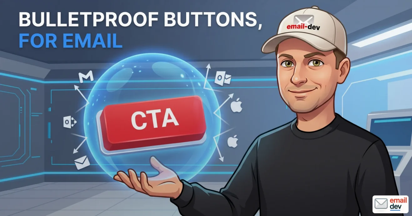
A designer sends you a CTA button. Soft rounded corners, a confident green, the kind of thing that looks like it belongs on a Stripe checkout page. You build it, you preview it in Chrome, it’s gorgeous, you ship the launch email. Two hours later there’s a screenshot in Slack – someone on the client’s team opened it in Outlook 2019 and your beautiful pill is a flat gray rectangle that looks like a placeholder nobody finished. And then the part that actually hurts: the click report comes back and Outlook shows zero clicks, even though the button rendered “fine” for everyone else. That’s the moment people go looking for bulletproof buttons for email, which is the umbrella term for coding a call-to-action that survives every major inbox instead of falling apart in the one place your highest-value subscribers happen to read their mail.
Quick answer: Bulletproof buttons for email are call-to-action buttons built entirely from HTML and CSS (no images), so they display in every major email client even when images are turned off. The classic pattern pairs a VML
<v:roundrect>inside an[if mso]conditional comment – which gives classic Outlook real rounded corners – with a modern<a>styled withborder-radiusfor everyone else. In 2026 there’s a wrinkle: the new Chromium-based Outlook ignores that VML entirely, so you’re effectively coding for two opposite Outlooks at the same time. This guide covers the full pattern, the no-VML alternative, and the five things that quietly break after the button renders.
I’ve been hand-coding email for long enough to have a real, lasting grudge against Microsoft Word’s rendering engine, and buttons are where that grudge lives. Most articles on bulletproof buttons for email do the same three things: explain why border-radius dies in Outlook, paste the VML snippet, point you at a generator, done. Fine. Useful, even. But they stop right at the point where the actual problems start – the tracking that silently breaks, the accessibility tax nobody mentions, dark mode turning your brand color into mud, and the fact that there are now two completely different Outlooks sitting in your list at the same time and they need opposite things from you.
So this is the longer, messier, more honest version. There’s code. A decision tree for when you can skip the hard part. There’s a testing section that won’t tell you to spend $500 a month if you don’t have to. And there’s an FAQ at the bottom for the people who scroll straight to the FAQ, which – let’s not pretend – is a lot of you.
- What is a bulletproof button in email?
- Why buttons break in Outlook (the short version)
- The thing nobody’s telling you in 2026 – there are now two Outlooks
- Classic Outlook (the Word engine)
- New Outlook for Windows (the Chromium engine)
- The bulletproof buttons for email pattern, line by line
- The [if mso] conditional
- The VML <v:roundrect>
- The modern <a> half
- The gotcha the generators bury
- The no-VML method (when you want simpler code)
- A decision tree – do you even need VML?
- Five things that break after the button “works”
- 1. Click tracking silently dies in Outlook
- 2. Dark mode wrecks your contrast
- 3. Accessibility – and yes, VML has its own problems
- 4. ESPs mangle your code
- 5. Gradients and shadows don’t fully cross over
- Responsive bulletproof buttons for email on mobile
- How to test bulletproof buttons for email (without burning 0 a month)
- Litmus
- Email on Acid / Mailgun Inspect
- Free and generator tools
- Common bulletproof button mistakes
- What the next five years look like for bulletproof buttons
- Bulletproof buttons for email – FAQ
- What is a bulletproof button in email?
- Do I still need VML now that the new Outlook is here?
- Why does my button have square corners in Outlook?
- Why aren’t my button’s Outlook clicks showing up in my ESP reports?
- Can I make a bulletproof button without VML?
- What’s the minimum size for a button on mobile?
- Do bulletproof buttons for email work in dark mode?
- Should the whole button be clickable, or just the text?
- What’s the best free bulletproof buttons for email generator?
- Will I still need bulletproof buttons for email in 2029?
- Bulletproof buttons for email – Closing thoughts
What is a bulletproof button in email?
Here’s the definition you can paste into a brief:
A bulletproof button is a call-to-action built from HTML and CSS instead of an image, coded so it renders correctly across every major email client – including the ones that strip modern CSS – and so it stays visible and clickable even when the recipient has images disabled.
That last bit is the whole point of the word “bulletproof.” A huge slice of people read email with images off by default, or their client blocks remote images until they click “download pictures.” If your call-to-action is a flat JPEG, those people see an empty box with maybe some alt text, and your campaign’s entire reason for existing – the click – just evaporated. Build the button from code and it shows up no matter what. You also get the bonus of being able to change the label, color, or link by editing text instead of firing up Photoshop, exporting a PNG, uploading it to a server, and swapping the URL. I’ve done the Photoshop version. I don’t miss it.
Now, the uncomfortable truth that Litmus has been saying for years and they’re not wrong about: the only button that looks pixel-identical in 100% of clients is an image. A real, flattened image. If absolute visual fidelity were the only thing that mattered, you’d use an image and accept the trade-offs. But you’d be trading away image-off display, accessibility, file weight, and easy edits – which for most senders is a terrible trade. So “bulletproof” in practice means “as close to bulletproof as code can get,” and that’s good enough for basically every email you’ll ever send.
A quick vocabulary note, because people use these interchangeably and it causes confusion: “bulletproof button,” “email CTA button HTML code,” and “code-based button” all point at the same thing. When someone searches for bulletproof buttons for email or asks for a “bulletproof button generator,” they want a tool that spits out this HTML-and-VML pattern so they don’t have to type it by hand.
Why buttons break in Outlook (the short version)
You already know this part if you’ve been burned, so I’ll keep it tight.
Classic Outlook for Windows renders HTML using Microsoft Word’s engine – and not a modern version of Word, the rendering core that traces back to Office 2007. Word was never built to lay out web pages, so it does a long list of things that make email developers age prematurely:
border-radiusis ignored, which is why your rounded button becomes a hard rectangle.paddingon an<a>tag is ignored, so an inline-block “button” collapses into a plain text link with no shape around it.- Background images need a VML workaround or they vanish.
@mediaqueries don’t apply, so your mobile styling never fires.:hoverdoes nothing.
This is the engine you’re fighting. Everything in the bulletproof pattern exists to route around one or more of these. And here’s the thing that makes 2026 specifically weird, which almost nobody is writing about clearly.
The thing nobody’s telling you in 2026 – there are now two Outlooks
For about fifteen years, “Outlook” meant one rendering nightmare you could plan around. That’s over. Right now your subscriber list contains two completely different Outlooks, and they want opposite things from your code.
Classic Outlook (the Word engine)
This is the one we’ve all been cursing at – Outlook 2016, 2019, 2021, 2024, and the Microsoft 365 desktop builds that still run the Word renderer. It needs VML, it needs conditional comments, it ignores border-radius. Outlook 2016 and 2019 both reached end of support on October 14, 2025 – no more updates, no security patches (mainstream support for those two had actually lapsed years earlier; October 2025 was the final cutoff) – but, and this matters, the people running those builds are corporate IT environments that do not upgrade software because Microsoft sent a memo. They’ll keep opening your email for years. Microsoft’s stated position is that classic Outlook stays supported for Microsoft 365 subscribers and perpetual-license holders through at least 2029.
New Outlook for Windows (the Chromium engine)
This is the rebuilt one, running on a Chromium/WebView2 core – basically the same engine as Outlook.com and the new Outlook on the web. Microsoft began auto-migrating business users to it back in January 2025 and has been pushing it as the default ever since. The good news for us:
border-radiusworks. Real rounded corners, no VML needed.- Flexbox works. Background images render. Web fonts mostly work.
- Media queries are fully supported.
But here’s the catch, and it’s the part that flips the whole mental model: the new Outlook ignores your conditional comments and your VML entirely.<!--[if mso]> blocks are treated as ordinary HTML comments and skipped. Your <v:roundrect> is invisible to it. Which sounds alarming until you realize it’s actually the cleanest possible outcome – the two Outlooks never see each other’s code. New Outlook reads only the modern <a> half of your bulletproof button; classic Outlook reads only the VML half. They don’t collide.
So the 2026 reality is this: you are shipping both halves of the button, every time, and your analytics will show a slowly shifting mix as more users get migrated off the Word engine. That’s why the right move now is to audit your Outlook-desktop share every quarter and watch the trend, rather than guessing.
One more landmine, because “Chromium” lulls people into thinking it behaves like a browser: the new Outlook runs a post-processing layer that rewrites some styles after the email loads. The notorious example is that it’ll take a border-radius: 20px 20px 0 0 and quietly flatten it to border-radius: 20px on all four corners. So even in the “modern” Outlook, test your buttons – don’t assume browser parity.
Bottom line for your audience: if you send to B2B lists, corporate buyers, or course customers who forward your email into their work inbox, classic Outlook is still very much alive in your audience and you cannot drop the VML yet. B2C and mobile-heavy lists have already largely moved to Chromium-based clients. Your audience analytics decide this, not the calendar.
The bulletproof buttons for email pattern, line by line
Okay, the code. This is the workhorse pattern – VML for classic Outlook, modern HTML for everyone else. Here it is in full, building a rounded green button:
<!--[if mso]>
<v:roundrect xmlns:v="urn:schemas-microsoft-com:vml"
             xmlns:w="urn:schemas-microsoft-com:office:word"
             href="https://example.com/get-started"
             style="height:48px; v-text-anchor:middle; width:220px;"
             arcsize="50%"
             stroke="f"
             fillcolor="#1f9d55">
  <w:anchorlock/>
  <center style="color:#ffffff; font-family:Arial,sans-serif;
                  font-size:16px; font-weight:bold;">
    Get started
  </center>
</v:roundrect>
<![endif]-->
<!--[if !mso]><!-- -->
<a href="https://example.com/get-started"
   style="background-color:#1f9d55; border-radius:999px; color:#ffffff;
          display:inline-block; font-family:Arial,sans-serif;
          font-size:16px; font-weight:bold; line-height:20px;
          padding:14px 36px; text-decoration:none; mso-hide:all;">
  Get started
</a>
<!--<![endif]-->
Let me walk through what each piece is doing, because if you understand it you can debug it, and if you only copy-paste it you’ll be helpless the first time it breaks.
The [if mso] conditional
Classic Outlook is the only client that “reads” conditional comments as live instructions. Everything inside <!--[if mso]>...<![endif]--> runs in Word-engine Outlook and is treated as a plain comment – and therefore ignored – by every other client on earth. So that first block is your Outlook-only zone. The [if !mso] block below it is the inverse: Outlook deliberately does not render it (the negative match), while everyone else treats it as normal HTML.
The VML <v:roundrect>
VML – Vector Markup Language – is Microsoft’s pre-SVG vector format from the late 1990s. It is genuinely ancient. It is also the only reliable way to draw a rounded rectangle in classic Outlook, because Outlook’s Word engine renders VML even though it refuses to render border-radius. A few attributes you need to know:
arcsize– the corner radius, expressed as a percentage of the shorter dimension, not as pixels.arcsize="50%"gives you a full pill.arcsize="10%"is a subtle round. Passing a pixel value here does nothing; VML doesn’t accept pixels for this. This trips people up constantly.fillcolor– the button background.stroke="f"– turns the border off (f= false).v-text-anchor:middle– vertically centers the label.<w:anchorlock/>– locks the text so the whole shape behaves as one clickable link.<center>– holds the styled label text.
The modern <a> half
This is just a well-styled anchor tag – the kind of button you’d write for any normal web page. display:inline-block, padding, border-radius, a background color, bold text. New Outlook, Apple Mail, Gmail, Yahoo, and Outlook.com all render this and ignore the VML above it. The mso-hide:all on the anchor is a belt-and-suspenders move: if any Outlook variant somehow tries to render both halves, this hides the duplicate so you don’t get two buttons stacked on top of each other.
The gotcha the generators bury
Notice the URL appears twice – once in the VML href, once in the <a href>. They have to match. And, critically, they both have to survive whatever your ESP does to links at send time (more on that disaster in a minute). If you update the link in one place and forget the other, classic Outlook users go to a different page than everyone else and you’ll never catch it in a browser preview because the browser doesn’t render the VML half. Check both. Every time.
The no-VML method (when you want simpler code)
The VML pattern is verbose and a little ugly, and for a lot of buttons you don’t strictly need it. There’s a leaner approach that uses Outlook-specific mso- CSS properties to fake the padding, popularized by Stig Morten Myre at Campaign Monitor and refined by others in the email dev community. The trick is to apply faux-padding using mso-padding-alt (and a same-color border via mso-border-alt to act as visual padding) so the button keeps its shape in Outlook without any VML at all.
A simplified version of the idea, applied at the table-cell level:
<table role="presentation" cellpadding="0" cellspacing="0" border="0">
  <tr>
    <td align="center" bgcolor="#1f9d55"
        style="border-radius:6px; mso-padding-alt:14px 36px;">
      <a href="https://example.com/get-started"
         style="display:inline-block; padding:14px 36px; color:#ffffff;
                font-family:Arial,sans-serif; font-size:16px;
                font-weight:bold; text-decoration:none;">
        Get started
      </a>
    </td>
  </tr>
</table>
This is cleaner, easier to maintain, and renders a perfectly serviceable button in Outlook. But there’s a real trade-off you have to be honest about: in classic Outlook, the padding lives on the <td>, not on the <a>, which means only the text itself is clickable, not the full button area. The colored padding around the text is dead space. Hover over the edge of the button in Outlook and nothing happens; click it and nothing happens. For a fingertip on a phone (where this rarely matters because mobile clients aren’t Word-engine) it’s fine, but for an Outlook desktop user with a mouse, you’ve shrunk the click target. That’s an accessibility cost and a conversion cost rolled into one.
And one more limitation: this method gives you square corners in classic Outlook. border-radius still doesn’t work there. If you genuinely need rounded corners in Outlook, you’re back to VML.
So my rule of thumb:
- Primary revenue CTA – the one button whose click is the entire point of the email – gets the full VML treatment so the whole thing is clickable and shaped correctly.
- Secondary “Read more” style links can use the no-VML method, or just degrade to a square in Outlook, because nobody’s launch depends on them.
A decision tree – do you even need VML?
Part of being the developer people trust instead of the one who gold-plates everything is telling clients when they don’t need the expensive version. Here’s how I actually decide:
| Situation | What to ship |
|---|---|
| Square button, no rounded corners | Skip VML. Classic Outlook renders a styled <a> with a bgcolor<td> just fine. |
| Audience is 95%+ Apple Mail / Gmail / mobile | Modern HTML alone is fine. The handful of Outlook-desktop users see a square; the cost is tiny. |
| Primary CTA and any B2B / corporate / forwarded-to-work audience | Full VML, no debate. This is the click that pays the bills. |
| You’re using MJML, Maizzle, or Foundation for Emails | The framework’s button component generates the bulletproof pattern for you – don’t hand-write it. |
| Secondary or in-body link | No-VML method, or graceful degradation to a square. |
The deciding logic underneath all of that is an asymmetry: including the VML when you didn’t strictly need it costs you six lines of HTML that literally nobody sees. Skipping the VML when you did need it costs you a visibly broken button for somewhere between 7% and 35% of your audience, depending on how corporate your list is. Those two mistakes are not the same size. So the safe default for bulletproof buttons for email is “include the VML on the primary CTA unless you have a specific reason not to,” and you’ll almost never regret it.
Five things that break after the button “works”
This is the part the snippet articles skip, and it’s the part that actually costs people money. You can get bulletproof buttons for email rendering perfectly in all twelve preview screenshots and still have a problem, because rendering correctly is only half of “working.”
1. Click tracking silently dies in Outlook
This is the one that makes me genuinely angry on people’s behalf. In the VML pattern, the clickable link in classic Outlook lives inside the <v:roundrect>href. Some ESPs – especially when they rewrite your URLs through a tracking redirect at send time – can’t reliably track clicks on that VML href. The result: your button works, your Outlook subscribers click it, they land on your page… and your campaign report shows zero clicks from Outlook. Your data lies to you. You think the button underperformed when it actually performed fine; you make the wrong decision about your next launch based on broken attribution.
I’ve watched a producer nearly kill a high-performing email because the analytics undercounted it this way. The fix isn’t glamorous: test your actual ESP with your actual tracking turned on, send a real click through a real Outlook install, and confirm it registers in your reports before you trust the numbers. Most modern ESPs handle this correctly now, but some older or self-hosted setups don’t, and you do not want to discover that during a launch.
2. Dark mode wrecks your contrast
Apple Mail and several other clients aggressively invert or shift colors in dark mode. A button that’s a crisp dark-text-on-light-background in normal mode can get flipped into something where the text and background have nearly the same luminance and the label becomes unreadable. White button backgrounds are especially prone to getting inverted into something off-brand and ugly.
The layout of a bulletproof button is unaffected by dark mode – this is purely a color problem – but you have to handle the color explicitly:
- Use
@media (prefers-color-scheme: dark)to define a dark-mode variant for your button where it matters. - Avoid pure-white button backgrounds that invert badly.
- Don’t rely on a light background container behind a light button; in dark mode they can both shift and the button disappears into the background.
- Test it in actual dark mode, not just by squinting.
3. Accessibility – and yes, VML has its own problems
Buttons are the revenue element, so it’s a little wild how often accessibility gets skipped on them. The basics:
- Descriptive link text. “Start the free course” beats “Click here.” Screen readers often read links out of context as a list, and a screen full of “Click here, Click here, Click here” is useless.
- 44 × 44 pixels minimum tap target. That’s Apple’s accessibility baseline. On mobile-heavy lists, go bigger – 48px+ height, sometimes full-width. Cramped buttons cause mis-taps and rage-taps on phones.
- 4.5:1 contrast minimum between text and button background (WCAG AA). Mid-gray text on a colored button fails this more often than you’d think, even when the two colors “look fine” together.
- Use a real
<a href>, not a styled<div>or a<button>(most clients strip<button>anyway).
And here’s the wrinkle specific to bulletproof buttons: VML introduces its own accessibility complications for screen readers. The no-VML table method, meanwhile, has the smaller-click-area problem from earlier, which is also an accessibility issue. There’s no perfect option – you’re choosing which compromise you can live with for a given button. That’s reality, not a failure on your part.
4. ESPs mangle your code
Your beautiful, correct HTML doesn’t go straight to the inbox – it goes through your ESP first, and some of them treat your code like a suggestion.
- GetCourse (huge in Russian-speaking course markets) is known for rewriting HTML during template processing, occasionally truncating long emails, and injecting whitespace into tables. Percentage-based widths survive this better than rigid layouts. Inline your font fallbacks – it strips
<link>-loaded web fonts inconsistently. - HubSpot’s drag-and-drop email editor strips MSO conditional comments under certain older template types, which quietly removes your VML and leaves Outlook users with a square (or worse). Use the coded-email tool, not the visual builder, when you need the conditional to survive.
- Mailchimp’s newer drag-and-drop builder re-inlines CSS aggressively, which can break techniques that rely on multiple
widthdeclarations on one element. Hand-code into the “code your own” template type. - Knak-style builders that use a VML background image for a section can disable VML for the button in that section – Outlook doesn’t nest VML elements well, and a VML button placed over a VML background loses its rounded corners – so your button goes square even though your code is correct. This one’s sneaky.
The lesson: it’s not enough to test your code. You have to test your code after your specific ESP has had its way with it, by sending a real test through the real platform.
5. Gradients and shadows don’t fully cross over
Designers love a gradient button with a soft drop shadow. Classic Outlook will give you exactly none of that. VML technically has a shadow element, but it only supports a single solid-color shadow – no gradient shadows – and the result rarely matches the design. There’s a workaround where you place a separately-shaped gradient shape underneath the button to fake a shadow, but it’s fiddly and it doesn’t always survive Outlook’s quirks. My honest advice: when a design leans hard on gradients and shadows for the CTA, have the conversation with the designer early. The button can look great in modern clients and acceptably plain in Outlook, and that’s usually the right call rather than burning a day chasing a shadow that 30% of your audience will never see anyway.
Responsive bulletproof buttons for email on mobile
Most of your opens are on a phone, so a button that looks balanced on desktop and cramped on mobile is a real problem. A few things that actually help:
- Go full-width on small screens. A button that’s
width: 100%(capped by the container) inside a media query gives thumbs a generous target. For the VML half, remember Outlook desktop isn’t responsive and doesn’t read your media queries anyway, so you only need to make the modern<a>responsive – the VML stays a fixed pixel width, which is fine because classic Outlook is a desktop client. - Bump the font size and padding at mobile breakpoints. 16px text minimum; padding generous enough to clear that 44px target.
- One primary CTA. Decision fatigue is real – the more competing buttons you stack, the lower each one converts. Pick the one action and make it unmissable.
This is also where you see why the new-Outlook-ignores-media-queries-but-old-Outlook-was-never-responsive situation is weirdly convenient: you’re really only writing responsive rules for the modern clients, and they all support media queries. The Word engine sits out of that fight entirely.
How to test bulletproof buttons for email (without burning $500 a month)
Here’s the rule I’d tattoo on every junior email dev if they’d let me: never assume an Outlook fix works until you’ve seen it render in real Outlook. Source code that looks correct routinely surprises you once Word has processed it. My own reality check is an aging ThinkPad running a real copy of Outlook 2019 – it catches things the virtual previews don’t, especially VML edge cases and DPI weirdness.
For broader coverage, here’s the honest tooling landscape in 2026:
Litmus
Still the industry default for serious cross-client QA, and I’ll recommend it with a giant asterisk. After Validity acquired Litmus in April 2025, the August 2025 pricing overhaul killed the old entry-level Basic plan (which used to run somewhere around $80-100/month) and made Litmus Core, at $500/month, the cheapest way in – that’s 2,000 previews and 5 user seats, billed monthly, which works out to about $6,000 a year (a little less if you prepay annually). For an in-house team running dozens of campaigns a month, the value’s still there. For a freelancer testing two emails a week, or a course creator running one launch a quarter, $500/month to look at screenshots is genuinely hard to justify. I’m still subscribed because my client mix pays for it, but I stopped recommending it as the automatic default.
Email on Acid / Mailgun Inspect
Email on Acid is being folded into Mailgun Inspect – the migration for paying customers begins in June 2026, with annual subscribers moving at renewal – and it’s historically sat at roughly half the price of Litmus for comparable rendering coverage. If you don’t need Litmus’s analytics suite, this is the sensible starting point for most small-to-mid teams now. Same core idea – screenshot previews across the Outlook versions, Apple Mail, Gmail, mobile – at a price that doesn’t make a solo developer wince. Worth knowing: Inspect dropped the standalone Analytics feature, reworked spam testing so tests now send from Mailgun’s IPs rather than your own, added WCAG 2.2 accessibility checks aligned with the European Accessibility Act, and full in-app HTML editing is slated to land later in 2026.
Free and generator tools
- buttons.cm (Campaign Monitor’s generator) – the long-running classic for generating VML button code without writing it by hand. Free.
- emailbtn.net – another generator from the same lineage, also free.
- The send-to-self test: before any real send, mail the campaign to your own Gmail, Outlook, Apple Mail, and Yahoo accounts and look at it on actual devices. Yes, even for “small” sends. Especially for small sends, because that’s when people get lazy and that’s when it bites.
My actual workflow, for what it’s worth: build it, run it through preview tooling, fix what’s broken, send to myself across the four major inbox types, click the button on a real phone and in real Outlook to confirm it and its tracking work, then send. It adds maybe half an hour. It has saved me from more than a few “we broke the launch email” phone calls that I can specifically remember.
Common bulletproof button mistakes
A scannable list of the ways these go wrong, most of which I’ve personally committed at 11pm before a launch:
- The two URLs don’t match. VML
hrefsays one thing, the<a href>says another. Outlook users go somewhere different and you never see it in a browser preview. - The VML sits outside the conditional comment. Now it renders in every client, not just Outlook, and everyone gets the fixed-width VML version.
- No centered table cell, so Outlook left-aligns the button. Classic Outlook ignores
text-align:centeron parent elements unless they’re a<td>. Wrap the button in<td align="center">. - Relying on
:hover. Dead in classic Outlook, Gmail mobile, and most Android clients. Use hover as a nice-to-have, never to convey anything required. - Whitespace inside the
<v:roundrect>. VML is whitespace-sensitive; stray newlines and tabs can add phantom padding. Keep the VML block compact. - Pixel values in
arcsize. It only takes a percentage. Pixels do nothing. - Using
<button>. Most email clients strip it. Always a styled<a>. - Forgetting
mso-line-height-rule: exactlywhen your label’s line-height looks wrong in Outlook. Add it before theline-heightdeclaration.
What the next five years look like for bulletproof buttons
Worth thinking about, because nobody wants to invest in learning a technique that’s about to evaporate. My read, and some of this is honest guesswork:
- 2026-2027 – bulletproof buttons for email are still strictly necessary for any sender with meaningful classic-Outlook traffic, which is most B2B and a lot of B2C. The new Outlook migration is rolling but enterprise IT moves at a glacial pace. Keep the VML.
- 2027-2028 – audience analysis starts mattering more than the calendar. If you send to a 90%-mobile course audience, you can start dropping legacy VML from new templates. If you send to banks, healthcare, government, or enterprise B2B, you can’t – those are the last holdouts.
- 2028-2029 – classic Outlook support winds down for M365 and perpetual-license holders. The technique shifts from “must have” to “nice to have, maintained for the long tail.” Ghost-table and VML knowledge becomes a legacy skill you keep sharp for the stubborn 5%.
- Beyond 2029 – assuming Microsoft doesn’t pivot again (never a safe assumption), VML buttons fade into the background. They’ll still work; you just won’t be teaching them in workshops.
But here’s the part the “is this technique dying” hot takes miss: bulletproof buttons were never only about Outlook. The defensive engineering value – building a button that survives ESPs rewriting your code, messaging apps that don’t render external CSS, email forwarded into clients you can’t predict, webmail apps that haven’t been updated since 2018 – that value doesn’t disappear when the Word engine finally dies. A code-based, image-off-resilient, accessibility-conscious button is just better engineering for an unpredictable medium. So even in a post-VML world, the mindset stays. Only the <v:roundrect> lines retire.
Bulletproof buttons for email – FAQ
What is a bulletproof button in email?
A bulletproof button is a call-to-action coded in HTML and CSS instead of being an image, so it displays in every major email client and stays visible even when images are turned off. The standard build pairs VML for classic Outlook with a modern styled <a> tag for all other clients, giving you a button that renders reliably and updates with a simple text edit.
Do I still need VML now that the new Outlook is here?
For most senders, yes – for now. The new Chromium-based Outlook supports border-radius and ignores VML, but classic Word-engine Outlook is still in your audience and still needs VML for rounded corners. Microsoft supports classic Outlook through at least 2029 for many users, and corporate environments migrate slowly. Audit your Outlook-desktop share each quarter; once it drops below roughly 5% of opens, you can start dropping VML from new templates.
Why does my button have square corners in Outlook?
Because classic Outlook uses Microsoft Word’s rendering engine, which ignores the border-radius CSS property entirely. The fix is to add a VML <v:roundrect> inside an [if mso] conditional comment – Outlook renders the VML shape with real rounded corners while every other client falls back to your border-radius-styled <a> tag.
Why aren’t my button’s Outlook clicks showing up in my ESP reports?
In the VML pattern, the clickable link in classic Outlook lives inside the <v:roundrect> tag, and some ESPs – particularly when rewriting URLs through tracking redirects – can’t reliably track clicks on that VML href. The button still works for the user; your analytics just undercount Outlook. Send a real test click through a real Outlook install with tracking enabled and confirm it registers before trusting your numbers.
Can I make a bulletproof button without VML?
Yes, using Outlook-specific mso-padding-alt and mso-border-alt properties on a table cell to fake the button’s padding. The trade-off: in classic Outlook only the text is clickable, not the full button area, which shrinks your click target, and you still get square corners. It’s a fine choice for secondary buttons; reserve full VML for your primary revenue CTA where the entire button needs to be clickable and shaped correctly.
What’s the minimum size for a button on mobile?
A minimum tap target of 44 × 44 pixels, which is Apple’s accessibility baseline. For mobile-heavy audiences, go larger – 48px+ height, often full-width – with generous padding so thumbs don’t mis-tap. Cramped buttons cause rage-taps and lost clicks on phones, where most of your opens happen.
Do bulletproof buttons for email work in dark mode?
The layout does – dark mode is a color problem, not a structural one. But colors can invert or shift badly, especially white backgrounds and low-contrast text-on-button combinations. Handle it explicitly with a @media (prefers-color-scheme: dark) variant for your button, avoid pure-white button backgrounds, and test in actual dark mode rather than assuming it’ll be fine.
Should the whole button be clickable, or just the text?
Ideally the whole button. The full VML method and a properly padded <a> (with display:inline-block) make the entire button area clickable in most clients. The no-VML table-cell method leaves only the text clickable in classic Outlook, which is a smaller target and a minor accessibility hit. For your primary CTA, make the whole thing clickable.
What’s the best free bulletproof buttons for email generator?
Campaign Monitor’s buttons.cm is the long-running standard – you set the color, size, label, and corner radius, and it outputs the full VML-plus-HTML pattern for free. emailbtn.net is another solid free option from the same lineage. Generators get you 90% of the way; always paste the output into a centered table cell and test the result in real Outlook before sending.
Will I still need bulletproof buttons for email in 2029?
Probably less than today, but not zero. Classic Outlook support winds down around 2028-2029, so VML’s relevance fades for most senders. But the broader value – buttons that survive images-off, ESP code rewrites, and unpredictable clients – outlasts Outlook itself. The <v:roundrect> lines may retire; the defensive, code-based, accessibility-minded approach to building bulletproof buttons for email won’t.
Bulletproof buttons for email – Closing thoughts
Bulletproof buttons for email aren’t glamorous. There’s no conference keynote about the elegance of <v:roundrect>, no influencer thread celebrating mso-padding-alt. It’s workmanlike defensive engineering that exists because email clients are inconsistent and the industry never managed to standardize. But the buttons I build this way work – they show up with images off, they survive GetCourse rewriting my HTML, they hold their shape when someone forwards the launch into Outlook desktop, and they still register their clicks so the analytics tell the truth.
If you’re a course creator or producer wondering whether your developer actually knows this stuff, ask them three things: what arcsize does, whether they test in real Outlook or just trust the screenshots, and how they confirm Outlook clicks are tracking. The answers will tell you a lot in about thirty seconds.
And if you’d rather just hand it to someone who already has this in muscle memory and won’t disappear mid-project – that’s the work I do. Send me a brief. I’ll show you the test results before you ever hit send.
I’ve got a couple of follow-ups coming: one on dark mode patterns for email buttons specifically, and a proper deep-dive on email click tracking and why Outlook attribution lies to you. They’ll be on the blog when they’re done.