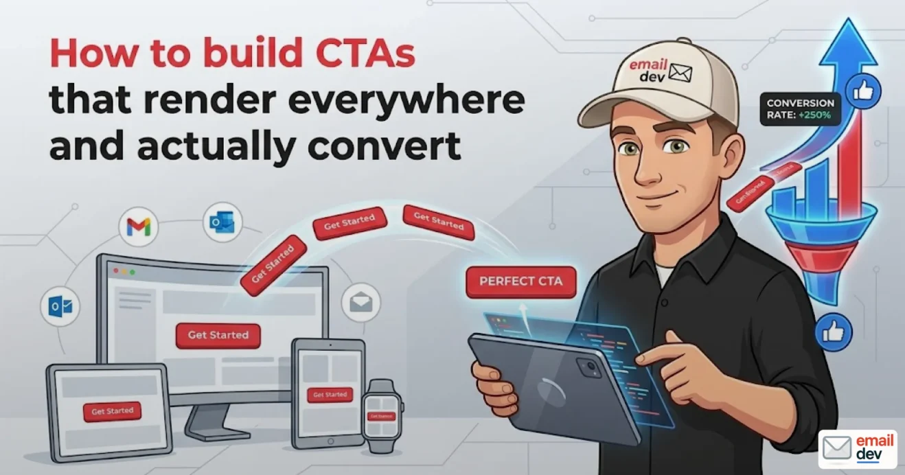
Quick answer: A compelling email call to action combines three things: short, action-driven copy (usually two to four words), a high-contrast button that passes WCAG AA contrast (4.5:1), and bulletproof HTML with a VML fallback so it renders in Outlook, dark mode, and on mobile. In Campaign Monitor’s own A/B tests, swapping a text link for a button lifted click-throughs by around 28%. Use one primary email call to action per email, make the tap target at least 44px tall, and test in Apple Mail, Gmail, and Outlook – in both light and dark mode – before you send.
The email looked perfect in the design tool. Sharp headline, clean spacing, and a coral button with rounded corners that the client approved on the first round. Then it hit an Outlook 2019 inbox and the button was a gray rectangle with hard square corners, and worse, only the text in the middle was clickable – the padding around it did nothing. Half the people who tried to tap it missed. If you’ve shipped email for any length of time, you’ve lived some version of that. And here’s what bugs me about almost every guide on email call to action design out there: they’re all about what to say. Verb choice, “Click here” vs “Get my guide,” forty-seven shades of button blue. Useful, sure. But they skip the part that actually breaks campaigns – whether the thing you designed survives the trip to the inbox.
This piece covers both halves. The copy and the code. With the rendering half up front, where it belongs, because that’s the part that’s costing you clicks you never even see in your reports.
- What makes an email call to action actually work
- The one rule that ties the layers together
- The rendering reality – why your email call to action breaks
- Outlook for Windows and the Word rendering engine
- Gmail strips half your CSS
- Apple Mail is the good one (which is its own problem)
- Why image-only buttons are a trap
- Building a bulletproof CTA button (with code)
- The hybrid approach: VML for Outlook, HTML/CSS for everyone else
- Padded button vs bordered button vs VML – when to use each
- Button generators – the good and the broken
- Email call to action design that survives dark mode
- How Outlook inverts your colors
- The ghosting problem
- How to actually fix it
- Mobile CTAs – tap targets, full-width, and rage taps
- The numbers that matter on mobile
- Above the fold, and again at the bottom
- Stacking two-column layouts
- Copy and placement that converts
- Write the verb first
- One primary CTA per email (usually)
- Placement and contrast
- Testing your CTA before you hit send
- The minimum viable test matrix
- Tools – and the Litmus elephant in the room
- What to actually check on the CTA
- What’s changing for email CTAs through 2030
- The Outlook engine transition
- Interactive and AMP CTAs
- Open rates are dying as a metric, which makes CTAs matter more
- Personalized and AI-generated CTAs
- Accessibility goes from nice-to-have to expected
- Common email call to action mistakes I see constantly
- Frequently asked questions
- What is a bulletproof email CTA button?
- Why does my CTA button look broken in Outlook?
- Should email CTAs be buttons or text links?
- How many CTAs should one email have?
- What size should a mobile CTA button be?
- How do I stop my CTA button from disappearing in dark mode?
- What’s the best color for an email CTA button?
- Do I need VML for my email buttons?
What makes an email call to action actually work
I think of every email call to action as three stacked layers, and the whole thing is only as strong as the weakest one.
- Copy – the words. What you’re asking someone to do.
- Design – contrast, whitespace, hierarchy. Whether the eye lands on it.
- Code – the HTML and fallbacks. Whether it renders and stays clickable across forty-odd email clients.
Most articles cover layer one, maybe brush against layer two, and pretend layer three doesn’t exist. That’s backwards. Perfect copy on a button that goes invisible in dark mode converts exactly nobody. A gorgeous gradient pill that collapses into an unclickable image in Outlook is worse than a plain text link, because at least the text link works.
So we’ll do all three. But I’m going to spend more time on design and code than on copy, partly because that’s my actual job, and partly because the copy advice is already everywhere and most of it is fine.
The one rule that ties the layers together
If you take nothing else from this section: a CTA has to win on whichever layer your reader’s email client is weakest. Apple Mail subscriber? They’ll see your gradient and your shadow, no problem. Outlook desktop subscriber? They’re getting the fallback, and the fallback is the experience for them. You design for the floor, not the ceiling.
The rendering reality – why your email call to action breaks
Email renders in something like 40 different clients, and every one of them decided to handle HTML its own way. This is the part nobody warns the designer about until something’s already broken in production.
Outlook for Windows and the Word rendering engine
Classic Outlook for Windows doesn’t use a browser engine to render email. It uses Microsoft Word’s engine – specifically the rendering layer that traces back to Word 2007. Yes, the thing you write documents in. That means it ignores border-radius, ignores box-shadow, struggles with background-image, and generally treats modern CSS like a suggestion it’s free to disregard.
So your rounded button? Square corners in Outlook. Your soft drop shadow? Gone. Your padding-as-tap-target trick? Outlook may only make the link text itself clickable unless you force the issue with extra markup.
There are now two versions of Outlook for Windows, which makes the situation messier and, eventually, better:
| Client | Rendering engine | Modern CSS support |
|---|---|---|
| Classic Outlook for Windows | Word (2007-era) | Poor – no border-radius, no box-shadow |
| New Outlook for Windows | Web-based, similar to Outlook.com | Much better, closer to a real browser |
Microsoft started moving small and medium business users onto the new Outlook back in January 2025, and it’s slowly winding down the classic Word-based desktop client. Good news long-term – eventually you’ll get something close to real CSS support. But don’t get excited and rip out your fallbacks yet, and here’s why: Microsoft has already pushed the enterprise opt-out phase back from April 2026 to March 2027, and it’s committed to supporting the classic client through at least 2029 for anyone on perpetual or subscription licensing. Legacy clients hang around in the wild for years, especially in corporate and enterprise shops where IT updates on its own glacial schedule. Plan for the Word engine to matter through the back half of this decade. I’m not exaggerating – 2029 is the official floor, not a worst-case guess.
Gmail strips half your CSS
Gmail does its own thing. It strips out a good chunk of CSS, has only partial support for media queries (usually enough for basic mobile adaptation, not for anything clever), and historically has been picky about <style> blocks in the head. For a CTA button specifically, the gotcha is that you can’t lean on fancy CSS to hold the button together – you need the structure baked into the HTML itself.
Apple Mail is the good one (which is its own problem)
Here’s a small irony. Among the commonly used clients, Apple Mail is the only one with full media query support and solid modern CSS. It’ll render your gradient, your shadow, your rounded corners, all of it. Which is great – until you remember that a big slice of your list isn’t on Apple Mail, and you’ve just designed a button that only looks right for the minority. Designing in Apple Mail and shipping is how broken Outlook buttons happen in the first place.
Why image-only buttons are a trap
Tempting shortcut: just export the button as a PNG and slap it in. Don’t. Three reasons, all of which I’ve watched bite real campaigns:
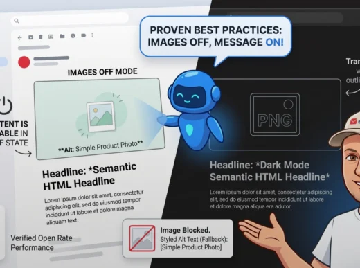
- Images-off. Plenty of clients still block images by default. Your CTA becomes a blank box with alt text, if you remembered alt text.
- Accessibility. Screen readers read the alt attribute, and “button_final_v3.png” is not a call to action. Live-text buttons are read properly and are an accessibility requirement, not a nicety.
- Dark mode and scaling. Image buttons don’t adapt. They pixelate when scaled and they don’t respond to dark-mode color shifts the way live text can.
Live text on a coded button beats an image button basically always. Build it in HTML.
Building a bulletproof CTA button (with code)
A bulletproof email call to actionbutton is one that renders and stays clickable across every client, image-on or image-off, because it’s built from HTML and CSS with live text – no image dependency. This is the practical heart of the whole thing, so let’s actually build one.
The hybrid approach: VML for Outlook, HTML/CSS for everyone else
The trick that’s held up for years is a hybrid. You write a normal HTML/CSS button for clients that understand CSS, and you wrap an Outlook-only fallback in a conditional comment so Outlook (and only Outlook) renders a VML shape instead.
VML – Vector Markup Language – is an old Microsoft format. It’s officially deprecated, it’s a pain to write by hand, and it is also the single reliable way to get a rounded, fully-clickable button into the Word rendering engine. Welcome to email development, where deprecated tech is load-bearing.
Here’s the pattern, annotated:
<!-- Outlook-only: VML rounded rectangle -->
<!--[if mso]>
<v:roundrect xmlns:v="urn:schemas-microsoft-com:vml"
  xmlns:w="urn:schemas-microsoft-com:office:word"
  href="https://example.com"
  style="height:48px;v-text-anchor:middle;width:240px;"
  arcsize="12%"
  strokecolor="#FF5A3C"
  fillcolor="#FF5A3C">
  <w:anchorlock/>
  <center style="color:#ffffff;font-family:Arial,sans-serif;font-size:16px;font-weight:bold;">
    Get my free guide
  </center>
</v:roundrect>
<![endif]-->

<!-- Everyone else: real HTML/CSS button -->
<!--[if !mso]><!-->
<a href="https://example.com"
   style="background-color:#FF5A3C;border-radius:6px;color:#ffffff;
          display:inline-block;font-family:Arial,sans-serif;font-size:16px;
          font-weight:bold;line-height:48px;text-align:center;
          text-decoration:none;width:240px;-webkit-text-size-adjust:none;">
  Get my free guide
</a>
<!--<![endif]-->
A few things worth calling out:
arcsize="12%"is how you fake rounded corners in VML. It won’t matchborder-radiuspixel-for-pixel, but it’s close enough that nobody notices.v-text-anchor:middleplus<center>vertically centers the label inside the VML shape, which Outlook otherwise won’t do.<w:anchorlock/>stops Outlook from letting users select/move the text. Small thing, prevents weird behavior.- The non-
msoblock usesline-heightto vertically center text instead of vertical padding, because padding-based centering gets unreliable across clients.
Padded button vs bordered button vs VML – when to use each
There’s more than one way to skin a bulletproof button, and they trade off differently:
| Method | How it works | Best for | Trade-off |
|---|---|---|---|
| VML hybrid | Conditional VML for Outlook, HTML for the rest | Widest client coverage, rounded corners everywhere | Most code, fiddly to maintain |
| Padded button | Padding on the <a> or table cell creates the tap area | Simple, large clickable zone | Outlook handles padding inconsistently |
| Bordered button | Thick borders on the link build the shape; padding via border | No VML needed, decent fallback | Square corners in Outlook, no way around it |
My honest take: for a primary email call to action that has to look polished across the board, use the VML hybrid. For secondary CTAs or internal sends where a square Outlook corner won’t get you fired, the bordered method is faster and there’s less to break. The bordered approach – popularized years back by developers at Campaign Monitor – is the one I reach for when I want bulletproof without babysitting VML.
Button generators – the good and the broken
You don’t have to hand-write this every time. A couple of generators are genuinely solid, and at least one well-known one had a real bug.
- buttons.cm (the old Campaign Monitor generator) was the community default for ages, but it’s been documented to produce code that makes Outlook render two buttons in certain cases. Double-button bug. Check the output if you use it.
- CloudAnalysts’ generator was built specifically to fix that, using progressively-enhanced VML, CSS, and HTML. It’s a reasonable default now.
Whatever you generate, run it through a real test before you trust it. Generators are a starting point, not a guarantee.
Email call to action design that survives dark mode
This is the section almost nobody writes, and it’s the one costing the most clicks right now. By Litmus’s tracking, somewhere around 35% of email opens happen in dark mode, and on certain lists – developer-heavy or younger audiences especially – it climbs higher. If your email call to action only works in light mode, you’ve broken it for roughly a third of your audience and your analytics won’t tell you why.
How Outlook inverts your colors
When Outlook (and Outlook.com, and Windows Mail) renders in dark mode, it doesn’t just flip a switch – it actively rewrites your colors and injects attributes onto your elements: data-ogsc (Outlook group style color) and data-ogsb (Outlook group style background). It decides, on your behalf, what your brand colors should become in the dark. The results range from “fine” to “why is my coral button now a sad hospital-waiting-room brown.”
The ghosting problem
The classic dark-mode CTA failure: a button with white or light text on a transparent or near-white background. In light mode it’s a clean ghost button. In dark mode the background goes dark, the white text sits on top, and the button edge vanishes – so you’ve got floating white text with no visible button shape. People don’t recognize it as something to tap.
How to actually fix it
Rule of thumb I live by: never let a CTA’s visibility depend on the background color staying what you set it to. Give the button its own structure that survives inversion.
Concretely:
- Solid fills, not transparency. A button with a solid background color holds its shape through inversion far better than a transparent ghost button.
- Add a border. Even a 1-2px border in a color that contrasts in both modes keeps the button’s edge readable no matter what the client does to the fill.
- Use mid-tone backgrounds. Avoid pure black on pure white or vice versa – extreme contrast can create halos and harsh edges after inversion.
- Add the meta tags. Put
<meta name="color-scheme" content="light dark">and<meta name="supported-color-schemes" content="light dark">in the head so clients that respect them know you’ve handled both. - Use
prefers-color-schemefor the clients that honor it. Apple Mail and a few others let you define real dark-mode overrides:
@media (prefers-color-scheme: dark) {
  .cta-button {
    background-color: #ffffff !important;
    color: #111111 !important;
  }
}
- Target Outlook’s attributes with
[data-ogsc]selectors when you need to wrestle a specific color back.
The !important matters here because email clients won’t let you override inline styles otherwise. Inline your light-mode styles on every element, then layer dark-mode overrides in the <style> block.
Mobile CTAs – tap targets, full-width, and rage taps
More than half of all email opens happen on a phone, and on some lists it’s pushing 80%. If your email call to action is a tidy 200px button floating in the middle of a 375px screen, you’ve built a small target for a thumb, and small targets cause what I think of as rage taps – the user jabs three times, misses twice, gives up.
The numbers that matter on mobile
- 44px minimum. Make the tappable area at least 44px tall (Apple’s longstanding guidance, and a sane floor generally). Bigger is fine.
- Generous padding. Cramped buttons read as afterthoughts and are hard to hit. Give the label room.
- Full-width on mobile. Let the button stretch to most of the screen width on small viewports instead of staying a fixed narrow pill. A wide button is a forgiving target.
Above the fold, and again at the bottom
Put the primary CTA where a thumb can reach it without scrolling – above the fold. And for any email longer than a screen or two, repeat it at the bottom. Someone who reads all the way through shouldn’t have to scroll back up to find the button. This isn’t “more CTAs,” it’s the same CTA, twice, so you catch people at both decision points.
Stacking two-column layouts
If your email has a two-column block with a CTA, build it so the columns stack to one column on mobile, and make sure the button doesn’t end up squished or with its label wrapping to two lines (wrapped button text looks broken and breaks vertical centering). The reliable way to do this across clients is the hybrid/spongy approach – base layout in percentage and max-width widths so it works at any width, with media queries layered on top for the clients that support them. You manage it with tables and conditional widths, and you test it in about a dozen places. Tedious, but it’s the difference between a button that works and one that doesn’t.
Copy and placement that converts
Right, the copy layer. I’ll keep this tight because it’s the well-covered part – but well-covered doesn’t mean everyone does it right.
Write the verb first
Lead with an action verb and make it about the reader. Short – two to four words is the sweet spot, because attention spans in the inbox are brutal.
- Weak: “Learn more” / “Submit” / “Click here”
- Better: “Get my free guide” / “Start my trial” / “Claim my spot”
First-person framing (“my,” “me”) tends to outperform second-person because it feels like the reader’s own decision. And benefit-loaded beats generic: “Start your 14-day free trial” tells the reader exactly what happens and what it costs (nothing). “Learn more” tells them nothing.
One primary CTA per email (usually)
There’s solid evidence that focusing on a single primary action lifts clicks hard – documented case tests have shown one focused CTA dramatically outperforming multiple competing ones, because every extra equal-weight choice you add is a reason to choose none of them. Decision paralysis is real.
The moment you give a reader two equally-weighted choices, you’ve handed them a reason to pick neither.
That said – and most guides won’t admit this – one CTA isn’t a universal law. E-commerce browse emails and content newsletters legitimately carry several links. The rule isn’t “never more than one.” It’s “one primary, visually dominant action, with anything else clearly secondary.” A newsletter with five article links is fine. A sales email with five equal buttons is a mess.
Placement and contrast
Put the primary email call to action above the fold. Surround it with whitespace so it pops – a cramped button buried in a wall of text disappears. And use a color that contrasts with the background; the specific hex doesn’t matter nearly as much as whether it stands out. Buttons stand out when people scan; text links vanish into paragraphs, which is a big part of why buttons pull meaningfully higher click-through. Campaign Monitor’s own split tests put the lift at roughly 28% when they swapped a text link for a button, and they got similar numbers on repeat runs – not a fluke.
Testing your CTA before you hit send
This is the step people skip when they’re behind schedule, and it’s the step that saves launches. You designed it, you coded it, now prove it works before it goes to the whole list.
The minimum viable test matrix
You don’t need every client on earth. You need the big three, in both modes:
| Client | Why it’s on the list |
|---|---|
| Apple Mail / iOS Mail | Huge share of opens; full CSS so it shows your “best case” |
| Gmail (web + app) | Massive reach; strips CSS so it shows your “stripped” case |
| Outlook (desktop) | The Word engine; shows your “worst case” / fallback |
Check each one in light and dark mode. That’s six previews and it catches the overwhelming majority of CTA disasters.
Tools – and the Litmus elephant in the room
The two long-standing preview platforms are Litmus and Email on Acid. Both let you see your email across 100+ client/device combinations without owning every phone.
One thing you need to know before you reach for Litmus: in August 2025 Litmus blew up its pricing. On August 1, 2025 it quietly overhauled its plans, eliminated the affordable tiers entirely, and the cheapest plan – now called Core – jumped to $500/month (up from $199 for the old Plus plan, a ~151% hike, with the old ~$79-99 Basic tier killed off completely). It happened with essentially no announcement, after parent company Validity had run layoffs. For freelancers and small teams, that priced the tool out overnight.
So your practical options now:
- Email on Acid – comparable preview coverage, starts around $74/month on annual billing. For most independent developers and small teams, this is the obvious move post-Litmus-hike.
- Testi@ and similar – lighter-weight preview tools worth a look for occasional checks.
- Real device + real inbox – never skip this. Send yourself a real test and open it on an actual phone. Tools approximate; a real device tells the truth.
What to actually check on the CTA
A short pre-send checklist you can save:
- [ ] Button renders in all six previews (3 clients × 2 modes)
- [ ] Button is fully clickable, not just the text label
- [ ] Tap target is 44px+ on mobile
- [ ] Text passes WCAG AA contrast (4.5:1) against the button fill
- [ ] Button doesn’t ghost out or change to an off-brand color in dark mode
- [ ] Label doesn’t wrap to two lines on a 375px screen
- [ ] CTA works with images OFF (it’s live text, right?)
- [ ] Link is correct and tracked (you’d be amazed)
- [ ] Primary CTA is above the fold; repeated at the bottom if the email’s long
What’s changing for email CTAs through 2030
Email isn’t standing still, and a few shifts are going to reshape how you build calls to action over the next five years. Worth designing with these in mind now.
The Outlook engine transition
The move from the Word-based classic Outlook to the new web-engine Outlook is the big structural change. Microsoft kicked it off with SMB users in January 2025, then quietly pushed the enterprise opt-out from April 2026 to March 2027 – so the timeline is already slipping. Over the next few years, as the classic desktop client fades, you’ll gradually be able to lean on more real CSS – better border-radius, shadows, maybe even retiring some VML. Gradually is the operative word. Don’t strip fallbacks early; classic Outlook is supported through at least 2029, and enterprise environments will keep it alive far longer than any rollout slide suggests. My bet: VML stays relevant deep into 2028, easily, for any list with meaningful corporate readership.
Interactive and AMP CTAs
Interactive email – AMP for email, and CSS-based interactivity – keeps inching toward the mainstream, and it’s gaining traction especially with younger audiences who expect to do things inside the inbox rather than click out. Think CTAs that expand, carousels, in-email forms. The catch, same as always: support is uneven, AMP requires sender registration with each provider, and it has hard fallbacks. Treat interactive CTAs as enhancement, never as the only path. The bulletproof button isn’t going anywhere.
Open rates are dying as a metric, which makes CTAs matter more
Apple’s Mail Privacy Protection now accounts for a big share of opens and inflates open-rate data by a wide margin, making it close to useless as a quality signal. The industry has shifted to click-through rate and click-to-open rate as the metrics that actually tell you whether your content worked. Translation: the email call to action is now one of the few things you can honestly measure – which makes getting it right more important, not less. Cross-industry campaign CTR sits around 2% (most 2025 benchmark reports land between roughly 2% and 2.6%); automated, behavior-triggered flows run far higher, often 6%+. Clear ~2.5% on campaigns and you’re beating the median.
Personalized and AI-generated CTAs
Personalized CTAs – copy or offer tailored to the individual’s behavior – have been reported to convert dramatically better than static ones, and AI tooling is making dynamic CTA blocks easier to generate and test at scale. Expect more emails where the button copy itself adapts to what the reader did last. The design principle stays the same, though: personalized or not, the button still has to render and stay readable in dark-mode Outlook.
Accessibility goes from nice-to-have to expected
Contrast, live text, descriptive labels, sensible tap targets – accessibility is shifting from “good practice” toward “expected, and in some jurisdictions, required.” Build accessible CTAs now and you’re ahead of where the requirements are heading anyway. WCAG AA contrast on your button isn’t a checkbox; it’s table stakes.
Common email call to action mistakes I see constantly
Quick-fire, because I’ve seen every one of these in real sends more times than I’d like:
- Image-only buttons. Images off, alt text missing, CTA gone.
- “Click here.” Tells the reader nothing, reads terribly to screen readers.
- Low contrast. Pale button on a pale background. Looks elegant in Figma, invisible in the inbox.
- Five competing CTAs. All the same size, all shouting. Reader picks none.
- Untested dark mode. The single most common silent failure right now.
- Tiny mobile tap targets. Sub-44px buttons that thumbs can’t hit.
- Wrapping button text. Label too long, wraps to two lines, breaks the centering, looks broken.
- Padding-only Outlook buttons. No VML fallback, so only the text is clickable in Outlook.
None of these are exotic. They’re all preventable with the checklist above. Which is sort of the point – most broken CTAs aren’t broken because the problem was hard, they’re broken because nobody tested the one client where it falls apart.
Frequently asked questions
What is a bulletproof email CTA button?
A bulletproof email CTA button is a call-to-action built from live HTML and CSS text – not an image – with fallbacks (usually VML) so it renders and stays clickable across every email client, including Outlook, and whether or not images are enabled. It’s the standard for any CTA you actually want to convert.
Why does my CTA button look broken in Outlook?
Classic Outlook for Windows renders email with Microsoft Word’s engine, which ignores border-radius, box-shadow, and a lot of modern CSS. Your rounded, shadowed button gets squared off, and padding-based tap areas may not be clickable. The fix is a VML fallback wrapped in an Outlook-only conditional comment.
Should email CTAs be buttons or text links?
Buttons, for your primary action. In Campaign Monitor’s A/B testing, swapping a text link for a button lifted click-throughs by around 28%, because buttons stand out when people scan while text links blend into paragraphs. Use text links only for secondary, lower-priority actions.
How many CTAs should one email have?
Generally one primary, visually dominant call to action, since extra equal-weight choices cause decision paralysis and depress clicks. Secondary links are fine as long as they’re clearly less prominent. Newsletters and e-commerce browse emails are the legitimate exceptions where multiple links make sense.
What size should a mobile CTA button be?
At least 44px tall for the tappable area, with generous padding, and ideally full-width or near-full-width on small screens. Smaller targets cause missed taps. Keep the label short enough that it never wraps to a second line on a roughly 375px-wide phone screen.
How do I stop my CTA button from disappearing in dark mode?
Use a solid background fill instead of a transparent ghost button, add a border so the edge survives color inversion, include the color-scheme and supported-color-schemes meta tags, and add prefers-color-scheme overrides plus [data-ogsc] targeting for Outlook. Then test the button in dark mode before sending.
What’s the best color for an email CTA button?
There’s no single best color – what matters is contrast. The button should stand out clearly against the surrounding background and the text should pass WCAG AA contrast (4.5:1) against the button fill. Pick a color that pops in both light and dark mode, and keep it consistent across your campaigns.
Do I need VML for my email buttons?
You need VML if you want rounded corners and a fully-clickable button in classic Outlook for Windows, which still uses the Word rendering engine. As Microsoft transitions users to the new web-based Outlook, VML’s importance will fade – but legacy Outlook lingers in corporate environments, so keep the fallback for any list with business readers for the next few years.
The prettiest button in your design tool is worth nothing until it’s been through Outlook and dark mode and come out the other side still clickable. That’s the whole job, really – not making it look good once, but making it work everywhere. The developers whose launches don’t blow up are just the ones who tested the boring clients before they hit send. If that’s the kind of email work you’d rather hand to someone who actually sweats the VML, that’s what I do.