Quick answer: Responsive HTML email media queries make your email adapt to screen width by applying CSS at specific breakpoints – but only some clients actually run them. Apple Mail honors them fully, mobile Gmail and the new Outlook partially, while classic Outlook desktop and Gmail’s webmail mostly ignore them. So the move that works in 2026 is to build a fluid base that holds up with zero CSS support first, then layer media queries on top as enhancement. Build it the other way around and you’ll ship broken emails to roughly a third of your list without knowing it.
Let me start with the email that taught me about responsive HTML email media queries the hard way, mostly because I think it will save you a couple of bad afternoons.
A few launches back I built a two – column promo for a course producer – hero image left, headline and a fat orange button right, the usual. It looked gorgeous in my Litmus previews. It stacked beautifully on mobile, the button was thumb – sized, and the spacing breathed. I sent it off feeling pretty good about myself. Then the client forwarded a screenshot from her head of sales: the two columns were welded together at full width, the button was floating somewhere off to the right doing absolutely nothing, and the headline was sitting on top of the image like a ransom note. Classic Outlook on Windows. The media query that did all my pretty stacking? It never ran. Not once. Outlook’s rendering engine looked at it, shrugged, and rendered the desktop layout into a phone – shaped void.
That is the whole problem with this setup. Everyone teaches media queries like they are a switch you flip – drop in a @media block, your email is now responsive, go have lunch. That is just not how any of this works once a real subscriber list hits it. Media queries are a layer. A nice layer, a layer I use on basically every build, but a layer that a big chunk of your audience will never see fire. If you build it backwards, you will ship broken layout files to roughly a third of your list without even knowing it.
This is the guide I wish someone had handed me years ago. We are going to cover which clients actually honor your styles, how to build so it doesn’t matter when they don’t, the breakpoints that earn their keep, where dark mode and accessibility law fit in now, and how to test the whole thing without burning a day. There is a fair bit of code ahead. There is also some hard – won opinion, and I will flag where I am being opinionated versus where I am telling you how the underlying engines actually behave.
- What a responsive html email media queries approach does inside an email
- Here is the anatomy, stripped down to its bare bones:
- The uncomfortable truth: who actually sees your responsive html email media queries
- Let us look at the actual support picture:
- The two – outlooks problem (and the date everyone is getting wrong)
- But Outlook is now a brand stretched across completely separate rendering engines:
- About that “october 2026 cliff”
- Why media – query – first coding is backwards
- The hybrid / spongy thing, explained without the jargon
- The honest tradeoff
- How to layer responsive html email media queries over a hybrid layout
- Step 1: the fluid base wrapper
- Step 5: run the deletion test
- The media query patterns that actually earn their keep
- Stacking columns
- Bumping up body text
- Hiding and showing blocks
- Tightening padding
- Breakpoints: what to actually use and why
- Min – width versus max – width: mostly a workflow thing
- Dark mode and the accessibility angle (the part that’s now law)
- Dark mode, the honest version
- Accessibility is now a line you can’t cross
- How this breaks in the wild (and how to fix it)
- Columns won’t stack on mobile.
- Media query does literally nothing.
- The whole CSS block gets ignored, even in Gmail mobile.
- Layout is fine in your tool, broken after the ESP sends it.
- Buttons disappear or look wrong on mobile.
- Background images don’t load.
- Email looks fine, then gets clipped with a “message clipped” link.
- Testing without losing a day
- Use a preview suite for breadth
- Then send to real inboxes
- The minimum 2026 test matrix
- Where responsive email is heading: the next five years
- Faq
- Do responsive HTML email media queries work in all email clients?
- Why don’t my media queries work in Gmail?
- Does Outlook support media queries?
- What is the best breakpoint for responsive emails?
- Can you make a responsive email without media queries?
- Do I still need media queries in 2026?
- Are responsive emails an accessibility requirement now?
- Why does my email look fine in testing but break after sending?
What a responsive html email media queries approach does inside an email
A media query is a block of CSS that only applies when a condition – usually the screen width – is met. In an email it lives inside a <style> block in the document head, and because email forces you to write inline styles everywhere else, your media query overrides almost always need !important to win.
Here is the anatomy, stripped down to its bare bones:
CSS
@media only screen and (max-width: 600px) {
  .column {
    width: 100% !important;
    display: block !important;
  }
}
Three pieces matter here:
@media: The at – rule that opens the whole thing. Non – negotiable.only screen and (max-width: 600px): The condition. The “only screen” part keeps these styles off print layouts and a couple of legacy media types, whilemax-width: 600pxis the breakpoint, meaning “apply this when the viewport is 600 pixels or narrower.”- The rules inside the braces: What changes when the condition evaluates to true.
When you write responsive HTML email media queries, you are essentially opening a stylesheet that waits for the display environment to change before shouting overrides down to the rest of the file.
In standard web work, you inline nothing. In email, you inline almost everything – style="width:300px;..." directly on the table cell – because so many clients strip out <style> blocks entirely if the file size gets heavy. An inline style sits high up in the cascade. Your media query, sitting up in the head block, is naturally lower. So when the breakpoint fires and you tell .column to go full width, the inline width:300px on that same element will win unless you slam an !important on the media query rule. Since email developers add inline styles to HTML elements, styles in media queries must use the !important property to override them. It is not optional politeness. It is load – bearing infrastructure.
I am probably oversimplifying the cascade here for anyone who lives in CSS specificity all day, but for email work, that mental model – inline beats head, so head needs !important to fight back – will keep you out of trouble 95% of the time. The complexity isn’t in writing the query itself. It is in the fact that the thing reading your email might completely ignore it.
The uncomfortable truth: who actually sees your responsive html email media queries
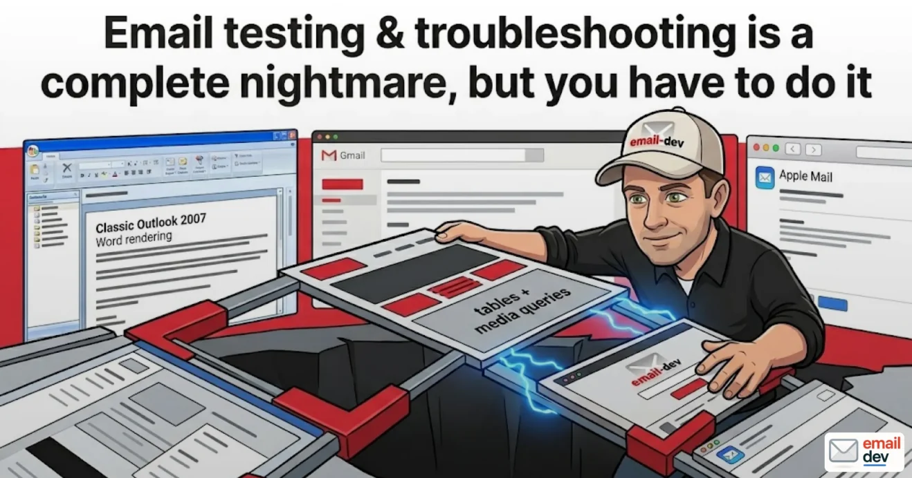
Not everyone. Roughly one in four media – query – based responsive emails reaches an inbox that ignores the query entirely – mainly classic Outlook on Windows and Gmail’s desktop webmail client. Across all common email clients, media query support sits somewhere around 75%, which sounds fine until you realize the gaps are concentrated in applications people actually use all day at work.
The core issue with relying blindly on responsive HTML email media queries is that support is distributed unevenly across your typical subscriber list. This is the section that separates a build that survives from one that looks great in your internal staging tool but falls apart in the wild.
Let us look at the actual support picture:
| Email client | Media queries support | What you need to know |
| Apple Mail / iOS Mail | Full | The gold standard. WebKit engine, modern CSS, your queries just work. |
| Gmail mobile app (iOS/Android) | Partial | Enough for basic stacking and font bumps. Fussy about minor CSS errors. |
| Gmail webmail (desktop browser) | Partial | Supports media queries partially, usually sufficient for basic adaptation for mobile devices. |
| Outlook classic (Windows) | Ignored | Word rendering engine. No media queries, full stop. |
| Outlook (new, Windows) | Supported | Chromium engine – but it completely ignores MSO conditional comments. |
| Outlook.com / Outlook mobile | Partial | Supports queries with caveats; strips some custom class selectors. |
| Yahoo, Samsung, Proton, Thunderbird | Varies | Check each against “Can I email” documentation per specific layout feature. |
Two things jump out at me every time I look at this reality. First, the two clients that throw the worst curveballs are, predictably, Outlook and Gmail. It is always them. WebKit – based clients behave like grown – ups; the enterprise giants misbehave.
Second, look at where the “ignored” rows land. Classic Outlook desktop. That is the big catch. These are not fringe clients used by three developers running Linux setups. These are the default work configurations for a massive slice of corporate and prosumer audiences. If your prospect is running classic Outlook, your media query did nothing.
Weigh that against where the opens actually come from. Litmus analytics from February 2026, based on 1.1 billion real opens, put Apple Mail at roughly 52%, Gmail at 27%, and Outlook variants scraping the bottom near 4% to 5% – those three together still dominate the market share. Apple Mail’s near – half share is why “it works in Apple Mail” feels reassuring during a quick test. But “works in Apple Mail” and “works everywhere” are completely different sentences. That Gmail 27% is split between the mobile app (where queries usually run) and webmail, and you generally cannot tell which one your subscriber used until after they complain.
My rule after years of this: assume your media queries will not run, build a layout that functions anyway, and treat every query that does fire as a pure visual bonus, not a structural foundation.
On raw feature numbers, community support trackers log media query support at around 75% client compatibility, while internal style blocks sit at around 85%. That is firmly in “use but do not depend on exclusively” territory. Keep that tab open constantly. Check support per feature before you commit to anything clever. It saves you from shipping highly confident mistakes.
The two – outlooks problem (and the date everyone is getting wrong)
There are now effectively four distinct Outlook rendering engines, not one, and the one that breaks your layout – classic Windows Outlook – is not dying nearly as fast as the internet keeps claiming. Microsoft has pushed the retirement timeline more than once, meaning you still need to code for the old Word engine and the new Chromium engine at the same time.
For about fifteen years, “Outlook” meant one painful thing to email developers: the desktop client on Windows that renders HTML using Microsoft Word’s engine – a design choice Microsoft made back in 2007. We have all been writing table – based layouts because of it ever since. Word. The document app. Rendering your HTML. It does not do media queries, it does not do max-width, it does not do a lot of things, and it scales pixels weirdly when Windows display scaling goes above 100%. That client is exactly what mangled my two – column promo layout.
But Outlook is now a brand stretched across completely separate rendering engines:
- Classic Outlook for Windows: The Word engine. The original villain. Ignores media queries entirely.
- New Outlook for Windows: A Chromium – based engine, essentially the same as Outlook.com, supporting flexbox, media queries, background images, border – radius, and web fonts.
- Outlook for Mac, iOS, Android: WebKit – ish under the hood, generally fine with queries.
- Outlook.com: Webmail, partial support, strips out certain complex selectors.
The massive catch that hooks even experienced developers is that the new Outlook does NOT support MSO conditional comments. They are treated as regular comments and ignored. This means your ghost – table and VML workarounds for classic Outlook are harmlessly invisible there. Read that twice. The trick you use to save classic Outlook (the ghost tables) does not break new Outlook – it just does nothing there. That is fine, as long as your base layout does not depend on those ghost tables to look right on a modern browser engine. It means you are effectively coding for two completely opposite Outlook environments inside a single file: one that needs old Microsoft hacks and one that ignores them.
About that “october 2026 cliff”
Here’s where I get to be the accurate one for a change. You have probably read – maybe in a brief, maybe in a competitor’s blog post that is still sitting on page one of Google – that Microsoft is killing classic Outlook in October 2026, and that the Word – engine nightmare is over. I had that exact date in my own notes.
Microsoft is officially ending support for the classic desktop versions that use the Word rendering engine in October 2026, and the transition timeline started rolling out to business users in January 2025. It means you are running out of time to build a robust system that handles both.
So plan for it. Don’t let a stale blog post convince you it’s safe to drop your ghost tables yet. The honest answer is that it is complicated and you need to build for reality, not promises. If anyone tells you Outlook is completely fixed without testing the legacy versions, they are setting you up for a catastrophic launch day.
Why media – query – first coding is backwards
Build the fluid base that works with zero CSS support first, then add media queries as enhancement. The base that does this is called fluid or hybrid – sometimes “spongy” – and it uses percentage widths plus max-width so the layout adapts on its own, without waiting for a stylesheet query to fire.
The generic approach goes: code a fixed 600px desktop layout, then write a media query that re – jiggers it for mobile screens. That is media – query – first. It works beautifully right up until it lands somewhere the query doesn’t run, at which point a mobile phone is trying to display a rigid 600px layout and your subscriber is pinch – zooming, squinting, and hitting unsubscribe.
If you follow generic web tutorials and build with media queries first, you are preparing to fail in classic Outlook. The better approach flips it on its head. You build a layout that is fluid by default – it adapts to whatever width it is given because it is built on percentages and maximum widths, not fixed pixels – and you only use your media queries to refine typography and padding in the clients that support them.
The hybrid / spongy thing, explained without the jargon
The fluid – hybrid approach has a real lineage worth knowing, mostly because it signals you are learning from the right people. It was pioneered by MailChimp’s Fabio Carneiro and popularized by devs like Mike Ragan and Nicole Merlin. Hybrid coding uses fluid tables and images that expand by default. Instead of using media queries to trigger those fluid states on smaller screens, it favors Microsoft conditional comments to restrain those fluid tables on larger screens.
Normally your content wants to fill 100% of whatever container it is sitting in. On a phone, great – it fills the phone. On a desktop screen, that is a problem, because your email stretches into some ugly 1200px – wide mess. So:
- You set your main content blocks to
width: 100%with amax-width: 600pxinline style. On phones they naturally fill the screen; on big screens they cap at 600 and center. No query needed. Larger screens show a centered 600px column, while tablets and phones show the content filling the screen perfectly. - The catch: classic desktop Outlook for Windows doesn’t need media queries because it is not responsive at all, it just renders at whatever width you set. And it doesn’t support max-width either, so an email built only this way blows out to the full width of the viewing pane.
- To fix that, you wrap the fluid stuff in an MSO ghost table – a table structure that only classic Outlook sees – that pins the width to a hard 600px just for Outlook. Another ghost table inside helps make sure inner fluid columns work properly without collapsing.
The honest tradeoff
I am not going to sell you hybrid layout methods as pure magic, because it isn’t. Hybrid gets incredibly complicated on complex visual designs. Two, three, and four – column layouts are much harder to implement and far more fragile than the corresponding target – classes – and – override approach of traditional responsive emails. A clean single – column newsletter in hybrid style? Lovely. A four – column product grid with nested gutters in hybrid? You will be debugging ghost tables until you hate your codebase a little.
My actual workflow on real client jobs looks like this:
Use a hybrid fluid base for the structure so it survives everywhere. Layer your media queries on top for the polish in the clients that run them. The base is your seatbelt; the media queries are the heated seats.
That is also roughly what major testing shops settled on. Email on Acid uses hybrid coding for the layout foundation and then progressively enhances the design with media queries for the clients that support them. When the teams who test emails for a living build it that way, I am perfectly comfortable building it that way too.
How to layer responsive html email media queries over a hybrid layout
Start with a fluid base table, cage it for Outlook with a ghost table, inline every layout – critical style, add classes to the elements you will target, then write your media query block last. If you could delete the entire media query block and the email would still be completely readable, you built it right.
Here is the skeleton structure I start from. This is not a copy – paste – and – forget template – it is the literal architecture so you can see how the layout pieces fit together.
Step 1: the fluid base wrapper
HTML
<table role="presentation" width="100%" cellpadding="0" cellspacing="0" border="0">
  <tr>
    <td align="center">
      <table role="presentation" width="100%" cellpadding="0" cellspacing="0" border="0"
             style="max-width:600px; margin:0 auto;">
        <tr>
          <td class="content-padding" style="padding: 20px;">
            </td>
        </tr>
      </table>
      </td>
  </tr>
</table>
That `
And up in your document head, inside the <style> block, you write the rules that handle modern mobile clients:
HTML
<style>
  @media only screen and (max-width: 600px) {
    .column {
      width: 100% !important;
      max-width: 100% !important;
      display: block !important;
    }
    .content-padding {
      padding: 15px !important;
    }
    .mobile-text {
      font-size: 16px !important;
      line-height: 24px !important;
    }
  }
</style>
This ensures that on small screens, the inline – block divs expand to full width and turn into block elements, breaking cleanly into a single – column layout. On classic Outlook desktop, the ghost table maintains the rigid 300px side – by – side column layout perfectly.
Step 5: run the deletion test
Here is my one non – negotiable sanity check, and it has saved me more times than any automated tool:
Mentally delete the entire style block. Is the email still readable, navigable, and clickable? If yes, you built it right – the media queries are enhancement. If no – if the email collapses into absolute nonsense without them – you built it backwards, and a quarter of your list is about to see that nonsense. Go back to the hybrid base.
That test is the whole philosophy of this article compressed into one question. If you take nothing else away, take that.
The media query patterns that actually earn their keep
Four patterns cover most real responsive email needs – stacking columns, bumping body text up for mobile readability, hiding or swapping blocks, and tightening padding. Everything fancier than this is usually where emails start breaking.
Stacking columns
The bread and butter. Two cells sit side by side on desktop, stack into one column on mobile. Default desktop behavior is that table cells sit next to each other sharing the row width; the target mobile state is to make them behave like blocks that break onto their own lines and fill the screen. That is the entire mechanism. width:100% plus display:block plus !important.
One real – world wrinkle: if you have got a spacer cell creating a gutter between two product blocks, that gutter will also stack and leave you with a weird empty gap. Set the gutter to width: 0 !important; display: none !important in the media query so the stacked blocks sit flush, then add margin to the content block itself if you want breathing room. Last week I spent four hours debugging this exact issue on a launch campaign for an e – commerce client, and it turned out to be a phantom spacer column pushing layout blocks out of alignment.
Bumping up body text
Desktop text that is fine at 14px becomes a squint – fest on a phone. For desktop, 14px text is fine, but on a smaller screen it makes readers squint, which is why 16px is recommended for mobile. This one is nearly free and it matters more than people think – it is a readability win and, as we will get to, increasingly an accessibility one.
Hiding and showing blocks
You can hide a desktop – only block on mobile, or reveal a mobile – only one:
CSS
@media only screen and (max-width: 600px) {
  .desktop-only { display: none !important; }
  .mobile-only { display: block !important; max-height: none !important; }
}
Here is my opinionated take, and you can disagree: show/hide content swaps are overused and usually a smell. People reach for them to serve a totally different mobile experience, and then they are maintaining two versions of the truth in one file, and inevitably the two drift. There is also a privacy wrinkle – content you hide with display:none is still in the HTML, still downloaded, and can resurface when someone forwards the email or views it in a client that ignores your query. Don’t put anything in a hidden block you’d be embarrassed to have show up. I use hide/show sparingly, mostly for swapping a wide hero image for a taller mobile – cropped one, and that is about it.
Tightening padding
Desktop padding eats your whole screen on mobile. Small, boring, constant. You will write this on basically every email. Spacing and padding adjustments are among the most common things media queries handle in email, alongside font size and layout.
Breakpoints: what to actually use and why
When configuring breakpoints for your responsive HTML email media queries, the standard choice is usually around 480px or 600px depending on layout complexity. Do not overcomplicate this by adding six separate breakpoints for every single iPhone and Android screen variant on the market. It is a fool’s errand. One clean mobile breakpoint at 600px covers almost everything you need.
The two conventional values:
- 600px: The classic. Your email’s max content width is usually 600px, so anything narrower than that is, functionally, a phone or a small window. This is my default.
- 480px: Tighter, targets phones more specifically and leaves small tablets/windows on the desktop layout.
There is also a fussy – precision trick worth knowing: some developers use 599.98px instead of 600px and 399.98px instead of 400px, similar to popular responsive frameworks like Bootstrap, to dodge edge cases where a viewport sits exactly on the boundary. The responsive templates at responsivehtmlemail.com use two width – based breakpoints, 600px and 400px, for each template. If your design has a genuinely different mid – size state, fine, use two. Most don’t.
Min – width versus max – width: mostly a workflow thing
You will see endless debate about mobile – first (min-width) versus desktop – first (max-width). Designing for the narrowest screen first is mobile – first, using min – width to target screens moving up in size; the max – width approach lets you design the full – width template first and then make a few changes for smaller screens.
Honestly? For email, I am a max-width / desktop – first guy, same as the responsivehtmlemail folks who call it their preferred method – design the full – width template first, then worry about a few changes for smaller widths. It maps better to how email designs usually arrive (someone hands you a desktop mockup) and how the hybrid base works. But this is preference, not correctness. If mobile – first fits your brain better, go for it. Nobody’s email broke because they chose the wrong one of these two. Plenty broke because they forgot !important.
Dark mode and the accessibility angle (the part that’s now law)
Testing your responsive HTML email media queries across forty different clients manually is a great way to lose your mind before the weekend. You cannot just send test emails to your personal iPhone and assume the campaign is ready to deploy to a list of 50,000 corporate subscribers. Dark mode is another beast entirely.
Dark mode, the honest version
The mechanism is its own media query:
CSS
@media (prefers-color-scheme: dark) {
  .body-bg { background-color: #1a1a1a !important; }
  .body-text { color: #f0f0f0 !important; }
}
Dark mode in HTML email uses a media query to apply dark – mode – specific CSS, the same way width – based queries apply width – specific styling. Sounds clean. It is not clean.
The reality is three – tiered and messy:
- Apple Mail / iOS: Respects
prefers-color-schemereasonably well. You can actually design a dark variant. - Gmail: Poor support for
prefers-color-scheme. You can use min – width and max – width for responsiveness, but not prefers – color – scheme for dark mode. Gmail tends to do its own forced color adjustments instead, on its own logic, which you don’t fully control. - Outlook (some versions): Forces full color inversion whether you like it or not, which is how you get the “why is my logo now glowing and my dark text invisible on a dark background” problem your clients keep screenshotting at you.
So dark mode in email isn’t “write a query, done.” It’s “write the query for the clients that honor it, then defend against the clients that force inversion on you” – using things like transparent PNGs with the right backgrounds, careful color choices that survive inversion, and a lot of testing. For now: it’s a media query, support is uneven, and the forced – inversion clients are the real fight.
Accessibility is now a line you can’t cross
Here is the thing that changed the stakes, and a lot of senders still haven’t caught up. The European Accessibility Act took effect June 28, 2025, making accessible email design a legal requirement, not a nice – to – have, aligned to WCAG 2.1 Level AA. It applies to EU businesses with more than ten employees and to any business selling to EU consumers, covering emails, websites and apps.
And the current state of email accessibility is, frankly, a disgrace. According to the Email Markup Consortium’s 2026 accessibility report released just last week, an astonishing 99.88% of email campaigns contain serious or critical accessibility issues – out of 376,348 emails analyzed, a tiny fraction actually passed all automated checks. That’s not a typo.
What compliance actually asks for overlaps heavily with good responsive practice:
- Legible fonts, 14px or larger, with high color contrast – which is exactly why that mobile font – size bump from 14px to 16px isn’t just polish anymore.
- Proper heading tags for screen readers and clear, logical content hierarchy.
- Descriptive alt text for all meaningful images.
- Dark text on light backgrounds meeting contrast ratio guidelines.
The penalties aren’t trivial either – non – compliance can run anywhere from a €100,000 cap per violation in Germany up to a massive €1,000,000 in Spain, entirely depending on where your subscribers are opening your mail. For a course producer or a small shop selling into the EU, that’s not a “we’ll get to it” risk.
The connective tissue: responsive text sizing via media queries, semantic structure, and proper contrast are now part of staying compliant, not just looking good. The media query that bumps your mobile text to 16px is doing double duty. I find that genuinely motivating, actually – the accessible thing and the responsive thing are mostly the same thing.
How this breaks in the wild (and how to fix it)
Most responsive email failures trace back to a handful of causes – missing !important, stripped head styles, a client that ignores queries, or an ESP that mangles your code. Here’s the field guide. This is the section I’d have killed for early on, so here’s a no – fluff list of the failures I actually see, with cause and fix.
Columns won’t stack on mobile.
Cause: usually a missing !important, so your inline width is beating the media query. Sometimes the head got stripped entirely. Fix: add !important to the stacking rule; confirm the <style> block is surviving by checking the source in the rendered email.
Media query does literally nothing.
Cause: you’re testing in classic Outlook, which ignores queries. This is working as designed, infuriatingly. Fix: there’s no fix for the client – that’s the point of the hybrid base. Make sure the email is fine without the query, and test in a client that does run queries (Apple Mail, Gmail mobile app) to confirm the query itself is correct.
The whole CSS block gets ignored, even in Gmail mobile.
Cause: Gmail is especially strict with CSS, and one misplaced curly bracket can cause the whole lot to be ignored. Fix: validate your CSS. A CSS validator such as the official w3.org validator will catch obvious mistakes. One stray brace and Gmail throws out everything. Brutal but consistent.
Layout is fine in your tool, broken after the ESP sends it.
Cause: the platform – GetCourse, Mailchimp, Braze, whatever – rewrote or truncated your head styles or stripped something on send. Fix: never trust the preview; send a real test through the actual ESP to a real inbox and inspect that, not the builder preview. ESPs mangle code in ways no simulator shows.
Buttons disappear or look wrong on mobile.
Cause: usually a background – image or VML button that the mobile client doesn’t render, or a width that collapsed. Fix: build bulletproof buttons with padded <td> and background color (not just an image), so there’s always a tappable, visible thing even when the image fails.
Background images don’t load.
Cause: classic Outlook needs VML for background images; mobile clients sometimes block them. Fix: always set a solid background color behind any background image so the block isn’t empty when the image fails, and use the VML fallback for Outlook.
Email looks fine, then gets clipped with a “message clipped” link.
Cause: you blew past Gmail’s 102KB HTML limit. Fix: trim the code. Often it’s bloated inline styles or a giant nested table structure. Get under 102KB.
Notice how many of these aren’t really media query problems at all – they’re “the client did something to your code” problems. That’s email. The media query is the easy part. The clients are the war.
Testing without losing a day
Tools like Litmus and Email on Acid render your responsive HTML email media queries across dozens of client, OS, and dark mode combinations in one shot. A serious release process replicates the real client mix – Apple Mail, Gmail, Outlook variants – across 100+ combinations of operating system, browser shell and dark – mode setting.
Use a preview suite for breadth
This is where you catch the “oh god it’s broken in classic Outlook” stuff before a client does. I lean on Litmus for this and have for years; it’s a real line item but it pays for itself the first time it catches an Outlook break before send. Both Litmus and Email on Acid are solid, and which fits depends on your volume and budget.
Then send to real inboxes
This is the rule people skip and regret: send a real test to your own inbox, not just the preview, because real rendering differs from previews in ways that matter. Simulators are screenshots of a moment; they don’t always catch ESP mangling, image – blocking defaults, or the exact way a forwarded email degrades. Set up your own test addresses – a real Gmail, a real Outlook.com, an iPhone you can actually look at – and send to them.
The minimum 2026 test matrix
You don’t need to test 40 clients. You need to test the ones that carry your opens and the ones most likely to break:
- Apple Mail (desktop + iOS) – your biggest share, your gold standard.
- Gmail – both the mobile app and webmail, because they behave differently on your queries.
- Outlook – both classic Windows and new Outlook, because they’re two different engines.
- One dark mode pass – at least Apple Mail dark, ideally Gmail and Outlook dark too.
If your email survives both Apple Mail and Outlook desktop, it’ll survive almost anything – Outlook desktop is the worst renderer alive, so use it as your stress test. And a sober reminder from the testing world that has nothing to do with code: a pixel – perfect email that bounces is worse than an ugly email that arrives, so test your rendering and then clean your recipient list before you hit send. Deliverability eats design for breakfast.
Where responsive email is heading: the next five years
I’ll put my neck out with some predictions. The point of predictions is that some of them are wrong, so take these as informed bets, not gospel.
Classic Outlook retirement is a strict line. We already walked through why the transition is actively moving forward. The Word engine’s grip is finally loosening, but the dual – Outlook tax is a feature of right now. You cannot drop your guard yet.
New Outlook quietly fixes things – and breaks others. As the Chromium new Outlook spreads, more of your audience gets real media query and modern CSS support, which is genuinely good. But remember it ignores MSO conditional comments, so the transition period – which is right now and for a while yet – is the awkward middle where you code for both at once.
Accessibility goes from EU – specific to baseline – everywhere. The EAA is the leading edge, not the whole wave. I’d bet accessibility requirements spread and tighten – more jurisdictions, stricter enforcement, more tooling that flags violations automatically. Building accessible – by – default now isn’t compliance theater; it’s getting ahead of where everyone’s headed. And given that 99.88% failure rate, the bar to stand out is hilariously low right now.
AI floods inboxes – which is your opening. Here’s the one I actually feel strongly about. Anyone can now generate a passable – looking email template in thirty seconds. Inboxes are about to fill with generic, AI – spun, untested mail that looks fine in the preview and falls apart in classic Outlook because the model that wrote it doesn’t actually open emails in classic Outlook. Which means hand – tuned, properly tested, genuinely accessible, hybrid – built email becomes a differentiator. The craft gets more valuable as the commodity version gets cheaper. I’m betting on the craft.
That last one isn’t really a prediction so much as the reason I still find this work interesting after all these years of swearing at Outlook.
Faq
Do responsive HTML email media queries work in all email clients?
No. They work fully in Apple Mail, partially in the Gmail mobile app and the new Outlook, and not at all in classic Outlook desktop. Across all common clients, support sits around 75%, so you should build a fluid base that works without them and treat media queries as enhancement.
Why don’t my media queries work in Gmail?
Gmail can be highly strict about CSS code formatting. First, make sure you are targeting the mobile application environment since desktop web views have mixed support structures. Second, Gmail is extremely strict about CSS, and a single misplaced bracket or invalid rule can make it discard your entire style block. Validate your CSS and test in the Gmail mobile app specifically.
Does Outlook support media queries?
It depends which Outlook. Classic Outlook for Windows uses Microsoft’s Word rendering engine and ignores media queries entirely. The new Outlook for Windows uses a Chromium engine and does support them – but it ignores MSO conditional comments, so your classic – Outlook workarounds don’t apply there. You’re effectively coding for two different Outlooks at once.
What is the best breakpoint for responsive emails?
For most emails, a single breakpoint at 600px or 480px is all you need. The 600px value works well because it usually matches your email’s maximum content width, so anything narrower is effectively a phone. Some developers use 599.98px to avoid edge cases. You rarely need multiple breakpoints in email the way you might on the web.
Can you make a responsive email without media queries?
Yes. The fluid or hybrid (“spongy”) approach uses percentage widths and max-width so the layout adapts on its own, plus MSO ghost tables to cage the width for classic Outlook. This is actually the recommended foundation because it works even in clients that ignore media queries, like Gmail webmail. You then add media queries on top for extra polish where they’re supported.
Do I still need media queries in 2026?
Yes, but as a second layer, not the foundation. A hybrid fluid base handles the clients that ignore queries, and media queries refine the experience in the clients that honor them – mainly Apple Mail, the Gmail mobile app, and the new Outlook. Used together, you get reliability everywhere plus polish where it’s available.
Are responsive emails an accessibility requirement now?
In effect, yes, in many markets. The European Accessibility Act, effective June 28, 2025, requires accessible email design aligned to WCAG 2.1 AA for businesses operating in or selling to the EU. Responsive practices like legible 16px mobile text, strong contrast, semantic headings and descriptive alt text all overlap with compliance, so responsive and accessible have become largely the same job.
Why does my email look fine in testing but break after sending?
Almost always because your email service provider rewrote or truncated your code on send, or because a preview tool doesn’t replicate real – world image blocking and ESP processing. Previews are useful for breadth, but they can lie. Always send a real test through your actual ESP to real inboxes and inspect those before shipping.
The short version, if you scrolled to the bottom: responsive HTML email media queries are an enhancement layer, not a foundation, so build the fluid base first, run the deletion test, and test in a real classic outlook before you ever hit send.
If you’re staring at a launch and the emails are breaking in ways this didn’t cover, or you just want a tested hybrid base template you can build on instead of fighting ghost tables yourself – that’s literally the work I do. Reach out. I respond fast, I tell you what’s actually wrong instead of dressing it up, and I’ll never pretend Outlook is fixed when it isn’t.
