

Quick answer: A/B testing email design elements means changing one visual variable – a CTA button, a layout, a hero image, a headline treatment – then sending two versions to comparable halves of your list and measuring the gap. In 2026 there is a catch most guides skip. Open-rate-based testing is unreliable, because Apple Mail Privacy Protection and bot traffic inflate opens. And any design test is worthless if one version renders differently across email clients. So test on clicks and conversions, change one thing at a time, and confirm both versions render identically before you trust a single number.
I watched a client roll out a green button to their whole list once. They were convinced it beat the blue one. The “test” that proved it ran on maybe 400 people, over a long holiday weekend, and – this is the good part – the green version was also broken in Outlook. So their winning variant was really just “the version a few hundred bored people happened to click on a Sunday.” The next campaign tanked. They blamed the copy. It wasn’t the copy. That is the whole problem with A/B testing email design elements as most people do it. The advice out there is written by marketers who have never once opened the HTML. It’s optimizing for a metric that has been dying since 2021. And it never, ever mentions the thing that actually wrecks design tests, which is rendering. I write and debug HTML email for a living, so I’m going to talk about A/B testing email design elements the way it works when you’re the one who has to make the email survive forty clients. Not the Figma version. The shipped version.
Let’s get into it.
What “A/B testing email design elements” actually means
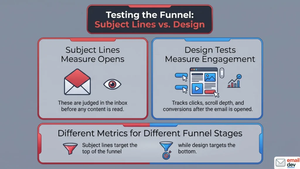
Short version: You take two versions of an email, change exactly one visual thing, send each to a comparable slice of your audience, and measure which performs better on a metric that matches the element. That’s it. The discipline is in the “exactly one thing” and “a metric that matches.”
A/B testing – split testing, same thing – is just a controlled experiment. Version A is your control. Version B changes one variable. You split the audience randomly so the two groups look the same. Then you measure the difference and, if it’s real, you keep the winner.
Simple in theory. People still wreck it constantly.
Here’s the distinction that the generic guides blur, and it matters more for design than for anything else. A subject line test measures opens. It’s judged out in the inbox, before anyone’s read a word. But a design test – a button, a layout, a hero image – measures what happens after the open. Clicks. Scroll depth. Conversions. Different element, different part of the funnel, different metric entirely.
So the single most common silent failure in A/B testing email design elements isn’t picking the wrong design. It’s picking the wrong metric for the design you’re testing.
If you test two CTA button styles and then judge the winner by open rate, you’ve learned nothing. The button has zero effect on whether someone opens. None. I see this in audits more than I’d like. Someone tested a design element, measured the wrong number, drew a confident conclusion, and built six months of “best practices” on sand.
Pick the element. Then pick the metric that the element can actually move. We’ll get specific about which metric goes with which element later, because it’s not always obvious.
The uncomfortable 2026 reality: your open rate is mostly machines now
This is the part I have to drop right at the front, because if you skip it, half of what follows won’t make sense. The metric the entire legacy A/B testing playbook is built on – the open rate – is broken. Not “a little soft.” Broken.
What Apple did to open rates
In September 2021 Apple shipped Mail Privacy Protection (MPP) with iOS 15. When an email lands in an Apple Mail inbox, Apple’s proxy servers pre-fetch everything – images, tracking pixels, the lot – whether or not a human ever looks at the message.
The result is brutal for tracking. Every email delivered to an MPP user registers as “opened.” The open rate for those users is effectively 100%, which tells you precisely nothing.
How big is that slice? Apple MPP now accounts for somewhere around 49% of all email opens. MPP is on by default, opt-out not opt-in, so adoption among Apple Mail users sits north of 95%. Roughly half your “opens” are a proxy server, not a person.
Jeanne Jennings, who has been optimizing email programs for 20+ years, has been blunt for a while now: opens aren’t a reliable way to pick A/B test winners or build segments anymore. The data backs her up – per Litmus’s 2025 State of Email reporting, only about 15% of marketers still lean on open rate as a primary success metric.
And now the bots are clicking too
Here’s the newer, nastier wrinkle. It’s not just opens anymore. Security scanners at Gmail, Outlook and the rest now click links in your email before the human sees them, to check for threats. That inflates click data.
Then, in early 2025, user-agent strings tied to AI tools started showing up in click tracking. By mid-March 2025 this peaked at more than 3 million bot clicks in a single day across monitored platforms.
Think about what that does to a test. Your “winning” variant might just be the one the bots happened to prefer. On a small list, a handful of phantom clicks can flip the result entirely.
What this means for A/B testing email design elements
The good news: if you’re testing a design element, you should already be measuring clicks and conversions, not opens. So you’re partly insulated. But you still have to:
- Strip Apple Mail opens out of any metric with opens in the denominator, like click-to-open rate. Some ESPs do this filtering natively. Check yours.
- Watch click data skeptically on small lists, where bot noise swings results hardest.
- Lean on conversions as the tiebreaker whenever you can, because bots don’t buy things or fill out forms.
Rule of thumb: test design elements on clicks and conversions. Use opens for exactly two things – spotting a deliverability cliff, and rough same-day comparison between two sends. Nothing else.
That’s the metric foundation. Now the part nobody warned you about.
The rendering trap that invalidates half of all design tests
This is my home turf, and it’s the section that makes A/B testing email design elements genuinely different when a developer runs it. Buckle up, because this one is invisible until it has already ruined your data.
The hidden assumption inside every A/B test
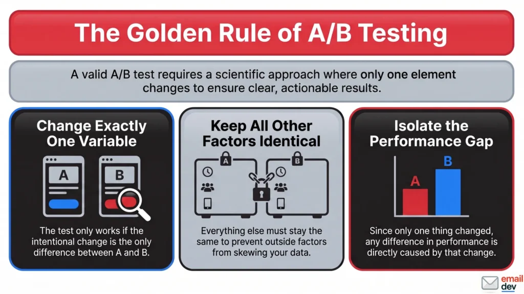
An A/B test only works if the only difference between A and B is the variable you changed on purpose. That’s the entire logic. Everything else stays identical, so any performance gap must come from your one change.
Now here’s the trap. In email, you don’t control the rendering. Forty-ish clients, each with its own opinions, each free to mangle your code. So when you build version B with, say, a fancy gradient button or a two-column layout, you are quietly assuming every recipient sees that version the way you designed it.
They don’t. And when they don’t, your test is no longer measuring design. It’s measuring a rendering bug wearing a design-choice costume.
What this looks like in the wild
Let me make it concrete, because this is the stuff I catch in real audits.
- You test a two-column layout against one column. But the two-column version stacks wrong in classic Outlook, so a chunk of your list sees a broken mess. Your “winner” is just the version that didn’t fall apart.
- You test a gradient CTA. The gradient renders fine in Apple Mail, then dies in Outlook’s Word engine and falls back to nothing – or worse, an unstyled link. Half your audience never saw the thing you were testing.
- You test a dark-mode color treatment without previewing dark mode, so a big slice of your Apple users sees inverted colors you never approved. You’re testing two designs and a third one you didn’t know existed.
In every case the numbers come back, you pick a winner, and the winner is noise. You learned nothing about design. You learned that your QA has holes.
The rule: before you trust any design A/B test, confirm both variants render identically across your top clients. Same render first. Then test. Otherwise you’re A/B testing your own bugs.
The dual-Outlook mess makes this worse right now
It gets more annoying before it gets better. There are two different Outlooks for Windows in the wild as I write this. The classic desktop version still runs Microsoft Word’s rendering engine – yes, Word, the 2007 build, technology old enough to vote. The new Outlook for Windows runs on a Chromium web engine, basically Outlook.com.
They render the same code differently. The new one even ignores the old MSO conditional comments entirely, so your ghost-table hacks just sit there invisible to it. That means a single design variant can render three ways: classic Outlook, new Outlook, everything else.
There is relief on the calendar. Microsoft ends support for the classic Word rendering engine on October 13, 2026, the same day Office 2021 support ends. Nineteen years of coding like it’s 1999, winding down. But classic Outlook lingers in cautious enterprise setups through roughly 2029. So 2026 to 2028 is peak dual-Outlook pain, and your design tests carry that risk the whole time.
If you want the deeper layout-survival mechanics, I went long on that in my piece on email visual hierarchy, and on the image side in email image best practices. For A/B testing email design elements, the takeaway is short: a test result is only as trustworthy as the QA underneath it.
What’s actually worth testing: A/B testing email design elements ranked by payoff
Okay. Metric problem handled, rendering trap flagged. Now the fun part – what to actually test. I’m ranking these by leverage, highest first, because your time is finite and some tests pay back far more than others.
A quick note before the list. For each element I’ll give you the thing to test, the metric that matches it, and the developer caveat that the marketing guides leave out.
1. The CTA button – your highest-leverage design element
If you test one design thing, test this. The call to action is the top of your conversion hierarchy. It cannot afford to be wrong, and small changes here move real numbers.
What’s worth testing on the button:
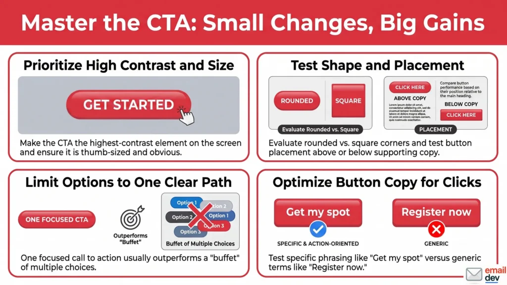
- Color and contrast. Make it the highest-contrast element on the screen, then test which high-contrast option wins.
- Shape. Rounded versus square corners. Sounds trivial. Sometimes isn’t.
- Size and padding. Thumb-sized and obvious versus tasteful and small.
- Placement. Above the fold versus below, before the supporting copy versus after.
- Single versus multiple CTAs. One clear path usually beats a buffet of choices.
- Button copy. “Get my spot” versus “Register now” versus “Join the waitlist.”
Metric: click rate, then conversion.
Developer caveat: test a bulletproof HTML-plus-VML button against another bulletproof button. Never test an image button. An image button dies when images are off, vanishes in some dark-mode setups, and is invisible to the AI summary now reading your email. If your CTA depends on a loaded image, you’re testing fragility.
2. Layout – single column versus multi-column
Layout is a big swing. It changes how the eye travels and where clicks land.
| Layout | Best for | What to watch |
|---|---|---|
| Single column | Mobile-first, one offer | Stacks cleanly, hard to break |
| Two column | Newsletters, product grids | Stacking order on mobile, Outlook breakage |
| Hybrid (header + columns) | Mixed content | Easy to overload, test hard |
Metric: click rate and click distribution (where in the email people click).
Developer caveat: the real test is the mobile stack. Most opens happen on a phone. A two-column layout that looks balanced on desktop can stack in the wrong order on a phone and bury your CTA. Always know what your layout collapses into before you test it.
3. Visual hierarchy and focal point
This is the squint test in action. One dominant element that the eye lands on first, versus a layout where two or three things fight for attention.
Metric: click rate, plus a click map if your ESP shows one.
Developer caveat: if your “hierarchy” lives only in color, dark mode can flatten it. Pair contrast with size and position so the hierarchy survives inversion. Then test the surviving version.
4. Hero image: live text overlay versus baked-in text
Here’s a test that’s quietly become one of the most important, and it’s the kind of thing only a developer thinks to run. Do you put your headline as live HTML text layered over a decorative image? Or do you bake the words into the JPEG?
Metric: clicks, conversions, and – this is new – AI-summary legibility.
Developer caveat: baked-in text loses on every front that matters in 2026. Dark mode can’t adjust it. Screen readers can’t read it. Images-off readers see nothing. And the AI summary – more on that soon – can’t lift your offer into the preview. Live text wins almost every time. Test it if you doubt me, but I already know how it goes.
5. Image-heavy versus text-forward
The classic. A visual-led email versus a copy-led, near-plain-text one.
Metric: clicks and conversions.
Reality check: adding images does not automatically help. There are well-documented cases on both sides – plenty of senders have watched a heavier, more visual email actually lose to a leaner, copy-led version, and others have seen the opposite. The famous Marketing Experiments and VWO tests on “image vs. text” land all over the map depending on the audience. The lesson isn’t “images bad.” It’s “test it, because your gut is often wrong, and which way it breaks depends on your list.”
6. Whitespace and density
Airy and spacious versus packed and dense. Whitespace isolates the CTA and groups related things. Density crams in more content.
Metric: click rate, scroll depth if available.
Developer caveat: cramped emails read as cheap, which hurts trust before anyone clicks. But some audiences genuinely want the dense, scannable digest. So this one actually earns a test rather than a rule.
7. Dark-mode treatment – the test almost nobody runs
This is your chance to own a test the competition doesn’t even know exists. Serve a dark-mode-optimized variant – transparent PNG logos, off-white instead of pure white, a stroke around dark elements – and measure clicks among your dark-mode segment against the default.
Metric: clicks within dark-mode opens.
Developer caveat: drive it with a prefers-color-scheme: dark media query, plus the [data-ogsc] attribute selector to reach Outlook’s dark mode. It won’t work everywhere – the Gmail app ignores it – so treat the swap as an enhancement, not a guarantee.
Lower-leverage tests (worth knowing, not worth obsessing over)
For completeness, because A/B testing email design elements isn’t only the big swings:
- Font choices. Web font versus system font fallback. Small effect, real rendering risk.
- Divider and section styling. Hard separators versus seamless flow.
- GIF versus static. Animation can lift engagement, but Outlook desktop freezes on the first frame. So your first frame must carry the full message and the CTA on its own.
The one-variable rule (and why it bites harder for design)
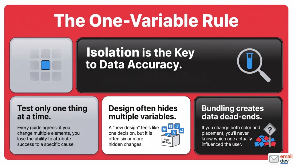
Every guide says “test one thing at a time.” They’re right, and it’s worth repeating because design tempts you to bundle.
If you change the button color and its placement in the same test, and B wins, you have no idea which change did it. Was it the color? The placement? Both together? You’re stuck. With design elements this is sneaky, because a “new design” feels like one decision when it’s actually six.
If you must test multiple elements at once, that’s multivariate testing, and it needs a much larger audience to work. For most senders, and certainly for smaller lists, careful one-variable A/B testing is the saner path.
How to run a design A/B test that isn’t lying to you
Here’s the actual process I work through. Not a generic five-step listicle – the order that keeps A/B testing email design elements honest, including the step every other guide skips.
Step 1: write one hypothesis, as an if/then
Don’t test for the sake of testing. Start with a real guess, framed as an if/then statement. Borrow the structure the Litmus folks use:
“If we make the CTA a solid high-contrast block instead of an outlined button, then clicks will rise, because it survives the squint test and dark mode.”
That sentence names the change, the expected outcome, and the reasoning. Without it, even a winning test teaches you nothing about why.
Step 2: pick the metric that matches the element
Design element? Clicks and conversions. Not opens. We covered why at length. This is where most tests quietly die, so don’t skip it.
Step 3: QA both variants across clients – before you send
This is the step nobody else writes down. Render both A and B in your top clients – Apple Mail, Gmail, classic Outlook, new Outlook, mobile, dark mode. Confirm the only visible difference is the variable you’re testing.
If version B looks broken anywhere, fix it first. Otherwise you’re testing rendering, not design, and your result is garbage. Same render, then test. I cannot say this enough.
Step 4: split the audience randomly and comparably
Both groups should look alike. Don’t load new subscribers into A and loyal customers into B. Mixed audiences skew everything. Most decent ESPs randomize the split for you – confirm yours does.
Step 5: size the test honestly
This deserves its own section, and it’s coming next. Short version: you need enough people per variation for the result to mean something, and most small senders don’t have it. Plan for that reality instead of pretending it away.
Step 6: run it long enough
A subject-line test can wrap in 4 to 24 hours, because most opens happen fast. A design test needs longer – usually 48 to 72 hours – because clicks and conversions land deeper in the funnel and later in the day. Rushing a click-based test gives you data that doesn’t represent how your audience actually behaves.
Step 7: check significance, then practical significance
Two checks, not one. First, did the result reach statistical significance, ideally at a 95% confidence level? Second, and this is the one people forget: does the winner beat your baseline?
If version A converts at 1.3% and B at 3.2%, B won the test. But if your normal baseline is 4.5%, neither version is actually doing well. You found a “winner” that still loses to your usual performance. That’s not a win worth shipping.
Step 8: document it and turn it into a rule
A test you don’t write down is a test you’ll run again by accident. Log what you tested, why, and what happened. Over time that becomes your own playbook – not generic best practices, but what works for your list.
The small-list problem (the part most of you actually live in)
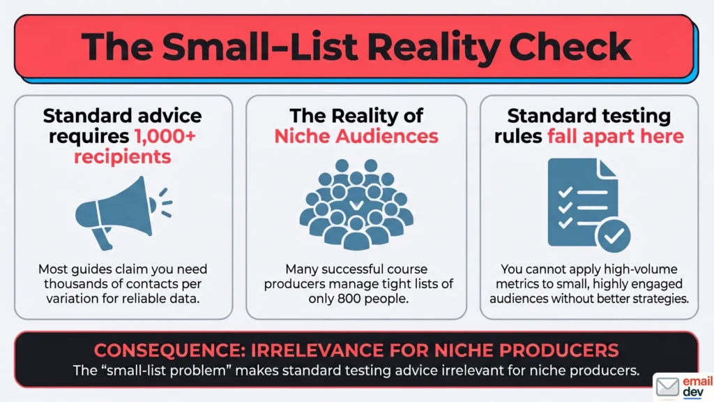
Now the honest section. Every guide cheerfully tells you to get “at least 1,000 recipients per variation” or “a few thousand for reliable results.” Cool. What if your entire list is 800 people? What if you’re a course producer with a tight, engaged audience and no interest in buying 50,000 cold contacts?
This is where the standard advice falls apart, and where I’m going to be straighter with you than the competition.
Say the quiet part out loud
Under roughly 5,000 contacts, most single-campaign A/B tests will never reach statistical significance. The numbers just aren’t there. And on a small list, a couple of bot clicks can manufacture a fake winner that vanishes next time.
Even the tool vendors admit this between the lines. One put it plainly: under 5,000 contacts you probably don’t need a sophisticated split-testing tool, because most tests won’t hit significance anyway. I’d rather you hear that now than waste months chasing a number you can’t reach.
So what do you actually do? You don’t give up. You change the game.
What works on a small list
- Test big, structural changes – not micro-tweaks. A whole layout versus another whole layout. A button versus a text link. Live text versus a baked-in hero. These have large enough effects to show up even with small numbers. Testing two near-identical shades of blue on 600 people is a waste of everyone’s time.
- Pool results over time. Run the same element test across several sends and look for a directional pattern. One test is noise. Five tests pointing the same way is a signal.
- Test on your engaged segment. Your most active subscribers click more, so you get usable signal faster and cleaner.
- Use the test-cell method. Send the control to most of your list and to a small cell A. Send version B to a small cell B, at the same time. Compare the two cells. You protect your campaign while still gathering data.
- Spend your effort on QA and best-practice design instead. For a small sender, getting the email to render cleanly everywhere and follow sound hierarchy is a far bigger ROI than chasing significance you’ll never reach. Honestly, this is where most of your gains live.
A word on testing tools and what they cost now
Cross-client previewing used to be cheap. It isn’t anymore, and small teams got burned by the shift.
Litmus was the default for years. Then Validity acquired it in April 2025, and that August the pricing changed hard. The cheap entry-level Basic plan disappeared entirely, and what used to be the ~$199 Plus plan got repositioned as “Core” at a much steeper rate. As of 2026, that Litmus Core plan starts at around $500 per month, covering roughly 2,000 previews and five users. That’s a brutal jump from the old ~$99 Basic entry point, and it priced a lot of freelancers and small shops right out. Putsmail, Litmus’s old free test-send tool, is gone too, so that quick free option no longer exists.
If $500 a month isn’t happening for you, Email on Acid (now part of Sinch) tends to land friendlier for solo developers and small teams. Leaner previewer tools keep popping up as well.
Frankly, for a lot of small senders, a disciplined manual routine covers most of the risk. Real devices, a couple of real inboxes, dark mode on, images off, both variants checked side by side. I’d rather a freelancer test by hand on three real phones than skip testing because the fancy tool costs more than their rent.
On the ESP side, if your list is small and you want built-in A/B testing without enterprise pricing, tools like ActiveCampaign and MailerLite handle basic splits at sane prices. Just remember the same rule: make them report on clicks, not opens. If your tool only crowns open-rate winners, it’s flying blind in 2026.
A worked example, quickly
Let me make this real, because abstract advice is easy to nod at and hard to use.
Say you’re a course producer launching a cohort. Your list is maybe 1,200 engaged people. The job of the email is simple: get clicks on “join the waitlist.” That’s the one action.
Here’s the wrong move: testing two button hex shades. At 1,200 people, you’ll never see a real difference between #E5484D and #DC2626. You’d be reading tea leaves.
Here’s the right move. Test a big, structural difference. Version A is the original – an outlined “Learn more” button buried below a tall hero image. Version B is a solid, high-contrast HTML button reading “Join the waitlist,” placed above the fold, right under a one-line promise.
Before sending, you QA both in Apple Mail, Gmail, classic Outlook, new Outlook, and dark mode. You confirm the only difference is the button treatment and its placement – and yes, that’s technically two changes, so you treat the result as directional rather than gospel, because you’d rather learn something big than nothing precise.
You send to your engaged segment, split evenly, and measure clicks over 72 hours. The structural gap is large enough to see even on a small list. Version B wins clearly.
The lesson generalizes: test the thing big enough to see, on the metric that’s real, after you’ve ruled out rendering noise. That’s A/B testing email design elements doing its actual job for a sender who doesn’t have a million subscribers.
Where A/B testing email design elements is heading (2026 to 2030)
I can’t see five years out perfectly. Email changes slower than the hype and faster than the laggards expect. But the signals are clear enough to plan around, and they all point the same direction.
Opens keep dying; clicks, conversions and replies take over
The trend is one-way. Apple MPP isn’t going anywhere, bot traffic is growing, and the industry has mostly accepted that opens are a directional signal at best. Design tests will increasingly be judged on downstream revenue, not inbox vanity metrics. Build your testing habits around clicks and conversions now, and you’re future-proof. Keep leaning on opens, and your data gets worse every year.
The AI inbox reshapes what you even test
This is the genuinely fresh shift. Gmail now folds Gemini into the inbox and can drop an AI summary card at the top of an email. Apple Mail generates its own AI preview, quietly replacing the preheader marketers spent years tuning.
Here’s the catch. These summaries read live text and clean HTML. They can’t read words baked into your hero image.
The AI reads your email before your customer does. It grabs whatever live text it can parse, then hands the reader a three-line version of your email. If your offer was trapped in a graphic, that summary sells nothing.
So a brand-new test variable is emerging: does summary-friendly structure – real semantic headings, live-text offers near the top – lift engagement? Designing for the summary is becoming a normal step. The accessibility crowd argued for live text on principle for years. Now the AI inbox is making the same argument, louder, and it affects everyone.
AI-assisted testing and predictive scoring
Tools now predict variant performance before you split the list. Some subject-line optimizers score language patterns against your audience without burning a test send – which is genuinely useful precisely for small lists that can’t afford to split.
One caution every honest source repeats, and I’ll repeat it too: don’t let the AI auto-pick your winner. Validate its suggestions with real testing where you can, keep a human-written control so you can spot when the AI drifts off-brand, and remember the model is optimizing for patterns, not for your specific reputation. Use it for 80% of the first draft. Own the 20% that needs your judgment.
The new Outlook unlocks modern CSS – and cleaner tests
Here’s the part I’m actually excited about. Once the Word engine fully sunsets, flexbox, grid and real modern CSS become usable in email. Fewer rendering variables polluting your tests. Less ghost-table gymnastics. The rendering trap I spent a whole section warning you about? It shrinks as classic Outlook fades toward its ~2029 long tail.
That means A/B testing email design elements gets cleaner over time. More of your test results will reflect actual design preference instead of QA gaps. I’m not throwing out my VML and conditional comments yet – both Outlooks are live, the dual-render pain is real through 2028 – but the trajectory is set, and it’s good.
What stays true no matter what
Through all of it, the fundamentals don’t move. One variable per test. A metric the element can actually move. A comparable, randomized audience. QA both variants before you trust the numbers. Tools change, engines change, the AI inbox rewrites the rules around the edges. The core discipline of A/B testing email design elements is the same as it ever was.
Common A/B testing mistakes I flag on repeat
Quick hits. These are the ones I catch over and over when I audit other people’s testing setups.
- Picking the winner on open rate. In 2026 that’s optimizing against machine noise.
- Testing two variables at once. Color and placement together means you learn nothing about either.
- Calling a winner on 300 people. That’s not a test. That’s a coin flip with extra steps.
- Testing micro-tweaks a small list can’t resolve. Two shades of blue on 600 subscribers is wishful thinking.
- Not QA-ing both variants. Measuring a render bug and calling it a design preference.
- Ignoring dark mode in the variant. You’re secretly running a three-way test you didn’t design.
- Acting on a winner that still loses to baseline. A “win” below your usual rate isn’t a win.
- An image-only variant. The AI summary and images-off readers never see it, so half your test group is judging a blank.
- Letting an AI tool auto-select the winner with no human check. Fast, confident, and occasionally very wrong.
None of these are exotic. They’re the boring, repeated mistakes that quietly cost clicks and waste sends. Fixing them is usually faster than people expect.
FAQ
What email design elements should I A/B test first?
Start with the highest-leverage element: the CTA button. Test its color, shape, size, copy, and placement, because it sits at the top of your conversion funnel. After that, move to layout and visual hierarchy, then images. Test high-impact elements before fiddling with fonts or dividers.
What metric should I use for a design A/B test?
Use clicks and conversions, not opens. A design element like a button or layout affects what happens after the open, so open rate can’t measure it. In 2026 opens are also unreliable because Apple Mail Privacy Protection inflates them. Conversions are the strongest signal, since bots don’t buy or fill out forms.
Why are my email A/B test results unreliable in 2026?
Three reasons usually. Apple Mail Privacy Protection auto-opens emails, so open-based tests are corrupted. Bot and security-scanner clicks inflate click data, peaking at over 3 million a day in early 2025. And if your two design variants render differently across email clients, your test is measuring a rendering bug, not a design choice.
How big does my list need to be to A/B test an email?
For statistical significance, most tests want at least 1,000 recipients per variation, run over 3 to 7 days. Under roughly 5,000 total contacts, most single-campaign tests won’t reach significance. At that size, test large structural changes, pool results across several sends, or focus on clean rendering and sound design instead.
Can I A/B test on a small email list?
Yes, but change your approach. Don’t test tiny tweaks like button shades – they need numbers you don’t have. Test big, structural differences such as a whole layout swap or a button versus a text link, where the effect is large enough to see. Treat the results as directional, and confirm patterns across multiple sends.
Should I test my CTA as a button or a text link?
It’s worth testing, since some audiences click plain links more in certain contexts. But if you use a button, build it as bulletproof HTML with VML for Outlook, never as an image. An image button disappears when images are off, can break in dark mode, and is invisible to AI inbox summaries.
How long should a design A/B test run?
Run a design test for about 48 to 72 hours. Design elements are judged on clicks and conversions, which happen later than opens and can trickle in over a day or two. A subject-line test can wrap in 4 to 24 hours, but rushing a click-based test gives you data that doesn’t reflect real behavior.
Do I need to test both variants in dark mode and Outlook before running the A/B test?
Yes. If your two variants render differently in any major client, you’re no longer testing design – you’re testing rendering. Confirm both versions look identical except for the one variable you’re testing, across Apple Mail, Gmail, both Outlooks, and dark mode. Same render first, then run the test.
What is multivariate testing, and do I need it?
Multivariate testing changes several elements at once – say a subject line, a hero image, and a CTA together – to see how combinations perform. It needs a much larger audience than a simple A/B test. For most senders, and nearly all small lists, single-variable A/B testing is simpler, faster, and gives clearer answers.
The one-line takeaway
An A/B test that’s measuring a rendering bug, or being judged on a metric that’s mostly machines, isn’t data. It’s a more expensive guess with a confident face. Test one real thing, on a metric that still means something in 2026, after you’ve confirmed both versions actually look the same to a human eye. Then you’ve got a result worth shipping. That’s what A/B testing email design elements is supposed to do, and it’s most of what separates a list that grows from one that just gets sent to.
If your emails keep falling apart in Gmail or Outlook, or some platform like GetCourse keeps mangling your layout, or you just want one letter built right – the kind nobody else wants to touch – that’s the work I do. Send it over. I’ll tell you straight what’s wrong and what it takes to fix it.