Every “interactive email” guide online shows you the same slick carousel GIF. It throws a “73% higher click-to-open” stat at you, then calls the inbox a mini-app. Most of those pieces were written by people who never shipped one. And never had to debug it late at night. Here’s the part they skip: the interactive bit is usually the easy twenty minutes. Making it degrade for the 40 to 60% of your list who will never see it – that’s the four hours. That gap is what interactive email design actually is. Not how much you can make move and tap and reveal. It’s deciding whether the interaction earns its keep. Which of two very different technologies you even mean. And what everyone else gets instead. That’s the whole job of interactive email design. This is the Design & Creative take – the calls you make upfront. The deep code lives in the HTML Email Development piece on interactive email HTML/CSS. The checkbox hack, WebKit targeting, punch-card coding. All over there. Right, on with it.
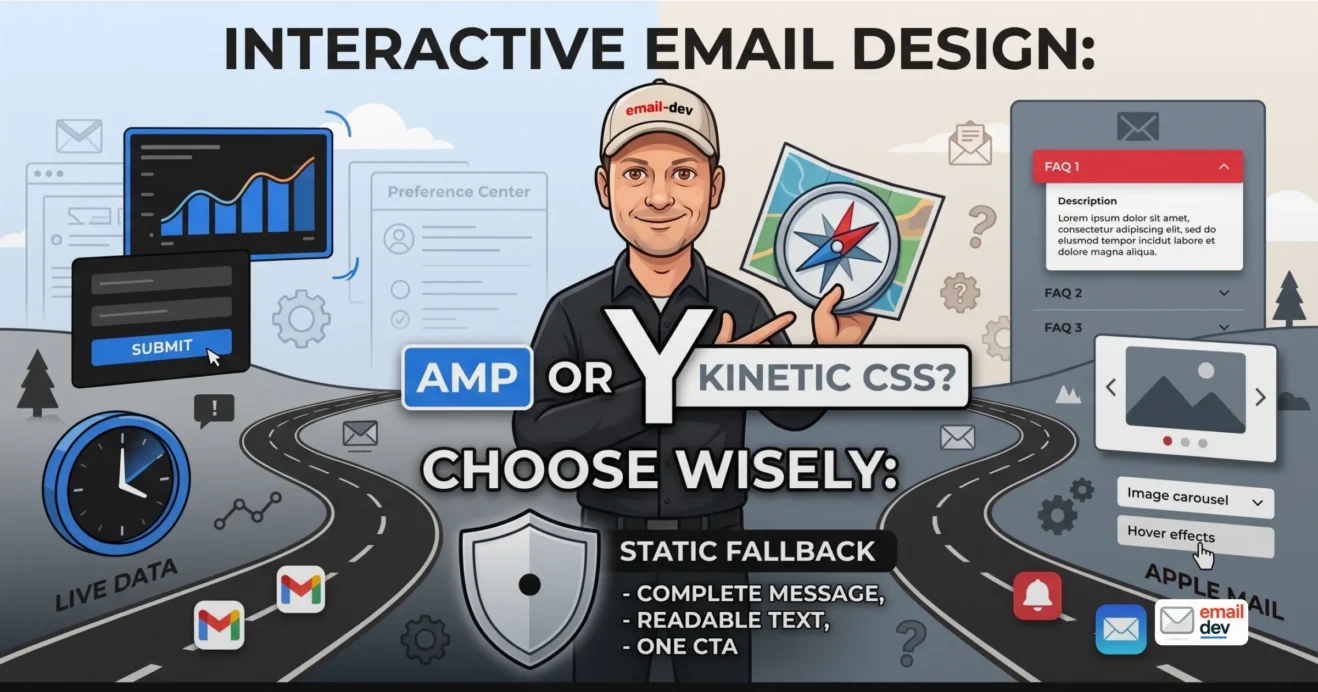
Quick answer. Interactive email design is building emails the reader can act inside. Instead of clicking to a website, they reveal, swipe a carousel, answer a quiz, submit a form. In 2026 it splits two ways. AMP for email handles live data and forms, but only in Gmail, Yahoo, and Mail.ru. Kinetic CSS interactivity works mainly in Apple Mail and gets stripped by Gmail. Both need a solid static fallback, because most of your list never sees the interactive version.
- What interactive email design actually means (and what it doesn’t)
- The spectrum, so you have a map
- The two roads nobody separates: AMP vs kinetic CSS interactivity
- AMP for email – powerful, dynamic, and high-friction
- Kinetic CSS interactivity – lower friction, Apple-Mail-shaped
- Should this email even be interactive? (the decision the hype skips)
- When interactivity genuinely earns its place
- When it’s just theatre
- The interactive email design toolkit – what you can actually build
- A little more depth on the families that matter.
- Fallback is the design, not the safety net
- The three fallback questions
- Interactive email design meets the four judges
- Mobile – where hover dies and thumbs fumble
- Dark mode – state changes that vanish on inversion
- Accessibility and regulation – the fresh 2026 constraint
- The fifth client is an AI – and it can’t tap your carousel
- The build-and-test reality – where interactive email design gets expensive
- Tooling and cost
- The interactive email design mistakes I flag on repeat
- Where interactive email design is heading (2026-2030)
- AMP adoption
- Kinetic gets a little safer as engines converge
- The AI inbox is the real wildcard
- Accessibility regulation tightens
- Vendor stats keep contradicting themselves
- FAQ
- What is interactive email design?
- What’s the difference between AMP and kinetic email?
- Does interactive email work in Outlook?
- Does interactive email work in Gmail?
- Is AMP for email worth it in 2026?
- Do interactive emails actually increase engagement?
- What happens if an email client doesn’t support the interactive version?
- Is interactive email accessible?
- How do AI inbox summaries affect interactive emails?
- What’s the easiest interactive element to add to an email?
- The one thing to take away
What interactive email design actually means (and what it doesn’t)
Short version. It means giving readers something to do inside the email – reveal, browse, answer, submit. It comes in two flavors that solve different problems, and it is not the same thing as a moving GIF.
Let me draw two lines the hype articles leave blurry.
First line. Interactive email design is not the code tutorial. The markup is execution. The :checked selector, the punch-card builds, the WebKit media queries – that all lives in the dev article. This page is the decision layer. What you settle before a single label element gets written.
Second line, and this one bugs me. A GIF is not interactive. The reader doesn’t do anything. Motion is decoration; interactivity is a response to an action. Half the “interactive email” galleries out there are just animated GIFs with a proud caption. That’s not a small nitpick. It changes what you build, what you test, and what breaks. (For the GIF and animation mechanics, see email image best practices.)
The spectrum, so you have a map
Here’s the mental map for the rest of this article. Three rough tiers.
- Pseudo-interactive / motion. Hover states, animated GIFs, CSS animation. Low effort, low risk, low payoff. Barely counts.
- Kinetic (CSS/HTML). Click-to-reveal, tabs, accordions, carousels, quizzes, add-to-cart menus. State changes driven by the checkbox/radio hack and
:checked. Real interactivity, no server, no registration. - AMP for email. Live and dynamic content, real forms, preference centers, in-email purchase. Powered by a separate MIME part and a Google- or Yahoo-approved sender.
Direct answer: interactive email design means giving readers something to do inside the email. Reveal, browse, answer, submit. And it comes in two flavors that solve different problems: kinetic CSS and AMP for email.
Quick gut check you can run right now. Open your last “interactive” email. Strip the interaction out in your head. Is there still a complete email underneath, with a message and a CTA? If not, you built a toy. Not an email.
The two roads nobody separates: AMP vs kinetic CSS interactivity
Short version. AMP and kinetic aren’t two flavors of one thing. They’re two different technologies, with different costs and different client support. Choosing between them is the design decision. This is the spine of the whole article.
Almost every guide lumps “AMP” and “CSS interactivity” into one bucket. Then it wonders why the results are all over the place. They’re not the same beast. Not even close.
Here they are side by side.
| AMP for email | Kinetic (CSS/HTML) | |
|---|---|---|
| What it’s for | Live data, real forms, submitting back to your system | In-email presentation: reveal, browse, tab, swipe |
| How it works | Separate text/x-amp-html MIME part | The checkbox/radio hack plus :checked |
| Where it renders | Gmail, Yahoo, Mail.ru (approved senders) | Mainly Apple Mail and iOS Mail |
| Where it falls back | Apple Mail, Outlook, Fastmail, Proton – your HTML part | Gmail (strips it), most non-WebKit clients |
| Sender setup | Register with Google + Yahoo, DKIM/DMARC/SPF | None. Ship it in your normal template |
| Best at | Forms, live inventory, preference centers | FAQs, product looks, click-to-reveal delight |
| Biggest catch | Roughly a quarter to a third of opens; heavy registration tax | Presentation only; can’t write data back |
Notice the flip. AMP works where kinetic dies (Gmail). Kinetic works where AMP dies (Apple Mail). That’s not a coincidence you can design around later. It’s the first fork in the road.
AMP for email – powerful, dynamic, and high-friction
AMP is the one that earns the “email as a mini web app” pitch. And here it’s actually true. Live data that’s current at open time, not send time. Real forms. Preference centers. RSVP. Browse-and-add-to-cart. Surveys that write answers back to your system.
The mechanics, plainly: you send three MIME parts in one message – text/plain, text/html, and text/x-amp-html. Supporting clients render the AMP part. Everyone else gets your HTML part.
Now the support reality, because this is where articles lie by omission. AMP renders in Gmail (web and mobile, when the sender’s approved), Yahoo Mail, and Mail.ru. AOL Mail too, since it sits on Yahoo’s platform, plus the Android client FairEmail. It is not supported in Apple Mail, on any platform. Not in Outlook – classic, new, or web. Not Fastmail, not Proton. Microsoft ran an AMP developer preview in 2019 and ended it in September 2020. They went with Exchange-only Actionable Messages instead.
So how much reach is AMP?
Caniemail puts estimated support at 16.28% of clients. Opens are the number that matters more, and there the math runs off Gmail: Litmus Email Analytics has had Gmail around 24 to 27% of global opens through the first half of 2026, with Yahoo and Mail.ru adding a couple of points. Call it a quarter to a third of opens, and don’t quote it tighter than that, because it moves monthly. For plenty of lists, 40 to 60% of the audience will never see AMP at all. They get your HTML fallback. Which means the fallback is the real email. More on that later.
The friction tax. You register your sending domain with Google and Yahoo. Pass DKIM, DMARC, SPF. Submit a sample and wait – Google reviews manually, and in my experience it’s a few days at best, longer if they come back with questions. Mail.ru is stricter still: it wants a real site on the domain, a blocking DMARC policy, and a sending history of at least three months at 5,000+ emails a month before it’ll even look at you. Then, even after all that, dynamic content can silently fall back to HTML. Wrong account type, an auth failure, whatever. Gmail literally ships a fallback-debugging banner for exactly this situation. Which tells you how often it happens.
Plenty of deliverability people will tell you: unless you have a specific, measurable use case, skip AMP. For most senders the effort outruns the benefit. I don’t fully agree – AMP is genuinely great for a preference center or a real-time block. But as a default posture, “skip it unless you have a reason” is correct.
Kinetic CSS interactivity – lower friction, Apple-Mail-shaped
Kinetic is the other road. Presentation interactivity that needs no server and no registration. Click-to-reveal. Tabs. Accordions. Carousels. Image galleries. Hotspots. Simple quizzes and games. It lives inside a normal HTML email.
The design-level mechanics, and the actual code routes to the dev article. You use the :checked pseudo-class, plus hidden checkboxes or radio buttons and labels. You isolate it to WebKit with a -webkit-min-device-pixel-ratio media query. That way non-supporting clients never see the broken half.
Support reality: primarily Apple Mail and iOS Mail, which are WebKit. Plus Samsung Mail, some Android clients, Thunderbird. Gmail generally strips the checkbox hack. So kinetic is, bluntly, an Apple Mail play. Which is not nothing – Apple is the single biggest bucket in Litmus’s open data, running anywhere from about 45% to 65% depending on the month and how Mail Privacy Protection lands. That swing is real, by the way. Don’t build a business case on one month’s screenshot. But if your list is Gmail-heavy, kinetic mostly evaporates.
The upside over AMP is real: no gatekeeper. No Google approval or separate MIME part. No auth theatre. You ship it in your normal template and it enhances where supported.
The catch: it’s presentation only. It can’t pull live data. It can’t write a form back to your system. A kinetic “quiz” doesn’t record anything – unless the final state is a link out to a landing page. Worth knowing before you promise a client in-email data capture.
Direct answer: choose AMP when you need live data or real form submission on a Gmail or Yahoo-heavy list. Choose kinetic CSS when you want in-email delight or browsing on an Apple Mail-heavy list. If your list skews Outlook, build a great static email and skip both.
Should this email even be interactive? (the decision the hype skips)
Short version. Interactivity is a cost, not a free upgrade. It multiplies your QA, adds failure modes, and most of your list won’t see it anyway. Decide whether the interaction earns all that before you pick a technique.
This is the honest bit the genre won’t say out loud. The whole “interactive email” content industry exists to sell you on interactivity. So of course nobody in it tells you to skip it. I will.
Every interactive element multiplies your QA surface. Every state, times every client in your matrix, times dark mode, times mobile and desktop. One accordion with three panels isn’t one thing to test. It’s a grid. And it adds a fresh failure mode on top of everything email already breaks. That cost has to buy something real.
When interactivity genuinely earns its place
- It removes a real step of friction. Preference center, RSVP, add-to-cart, survey that writes back. AMP territory.
- It compresses a lot of content into a small space the reader controls. Accordion FAQ, tabbed product specs, a carousel of looks. Kinetic territory.
- It captures zero-party data the reader volunteers. A quiz, a poll. Either technique, depending on whether you need the answer written back.
When it’s just theatre
Say it plainly. Interactivity for its own sake. A carousel that buries your one CTA behind a swipe. A “game” that adds three taps before the offer even shows up. Motion that fights the hierarchy instead of serving it. One focal point still wins – that rule didn’t change because you added a tab bar. (See email visual hierarchy.)
And tie the whole thing to your audience data. This is where the cross-client email design coverage matrix does the work. An Apple-heavy creator list makes kinetic viable. A Gmail-heavy list that needs form submissions makes AMP maybe worth it. A corporate, Outlook-heavy list? Don’t bother. Build static. Spend the saved effort on rendering and hierarchy instead.
How to decide whether to make an email interactive
- Name the one job of the email. Same discipline as always – one action.
- Ask if interactivity removes a real step toward that job, or just decorates it. If it decorates, stop. Build static.
- Pull your client share from the last 90 days. Apple-heavy points to kinetic. Gmail or Yahoo-heavy with a form need points to AMP. Outlook-heavy points to static.
- Confirm you have the time and tooling to QA every interactive state across your matrix. If not, static.
- Design the static fallback first regardless. The interactive layer is the enhancement, never the load-bearing wall.
Direct answer: make an email interactive only when three things line up. The interaction removes real friction toward the email’s one job. Your audience uses a client that supports your chosen technique. And you can afford to QA every state. Otherwise a clean static email wins.
The interactive email design toolkit – what you can actually build
Short version. Here’s the realistic menu, tagged by technique and where it survives. Not a fantasy list. Design-level only – the markup for each lives in the dev article.
| Element | Type | Where it works | Best use | Watch out for |
|---|---|---|---|---|
| Click-to-reveal / accordion | Kinetic | Apple Mail, iOS Mail | FAQs, long content reader controls | Collapsed view must stand alone |
| Tabs | Kinetic | Apple Mail | Product specs, comparisons | Know what it stacks into on mobile |
| Image carousel / gallery | Kinetic | Apple Mail | Product looks, before/after | Fallback = one clean stacked image |
| Hover effects | Motion | Desktop clients only | Small desktop bonus | Useless on touch (most opens) |
| Quiz / poll / survey | Kinetic or AMP | Depends on technique | Zero-party data | Kinetic can’t record; AMP can |
| Gamification (spin-to-win) | Kinetic | Apple Mail mostly | Promo delight | Accessibility flags hit hard here |
| Forms / preference center | AMP | Gmail, Yahoo, Mail.ru | Friction removal | Registration tax, HTML fallback |
| Live / real-time content | AMP | Gmail, Yahoo, Mail.ru | Live inventory, open-time personalization | Silent fallback to HTML |
A little more depth on the families that matter.
Click-to-reveal, accordions, tabs (kinetic). The workhorses. Great for FAQs, product specs, any long content the reader controls. Apple Mail land. Design the collapsed state as a complete section, because everyone else sees only that.
Image carousels and galleries (kinetic). Product looks, before-and-after, lookbooks. The fallback is a single stacked image or a clean grid. Never a blank frame where the swipe should be.
Hover effects (motion). Desktop-only by definition. Useless on touch, which is most opens now. Treat it as a small desktop bonus. Never load-bearing. (See mobile-first email design.)
Quizzes, polls, surveys. Kinetic for in-email delight, AMP if you need the answer written back to your system. This is the big zero-party-data angle for 2026, and it’s a legitimately good reason to reach for interactivity.
Gamification. Spin-to-win, scratch-off, gift reveal, the punch-card “whack” builds. Fun, high effort, easy to overdo. Take the vendor lift numbers with a fistful of salt. And the accessibility flags below apply to this category hard.
Forms, preference centers, add-to-cart, RSVP (AMP). The genuinely useful, friction-killing stuff. All gated behind AMP’s support and registration.
One honorable mention people miscategorize constantly: the countdown timer. That’s usually a server-rendered animated image. Not true interactivity. The reader isn’t doing anything – a pixel is just counting down. Nice tool, wrong bucket.
Fallback is the design, not the safety net
Short version. The majority of your list sees the non-interactive version. So that version is the real email. Design it first, make it complete, and layer interactivity on top as progressive enhancement – never the load-bearing layer.
This is the philosophy from the cross-client pillar, pointed straight at interactivity. Your resilient baseline has to fully work with zero interaction. Live text. One clear CTA. Legible with images off. A bulletproof button. The carousel, the quiz, the form – that’s gravy. Not the meal.
The rule that keeps you honest is simple. Whatever the reader sees before they touch anything must carry the message and the CTA. A carousel’s first slide. An accordion’s collapsed view. A quiz’s intro screen. Each one has to stand alone as a complete message. It’s the same principle as the GIF first-frame rule in email image best practices. Assume the moving part never moves.
The three fallback questions
Design against all three, every time:
- What does an Apple Mail user see if this is AMP?
- What does a Gmail user see if this is kinetic?
- What does anyone see with images off?
If any one of those three is a blank, or a broken mess, the fallback isn’t done. And “isn’t done” means the majority of your audience gets a broken email. Not a minor edge case. The main event.
Direct answer: in interactive email design, design the static version as the real email first. Complete message, complete CTA. Then add interactivity as an enhancement. Most of your audience will only ever see the fallback anyway.
Interactive email design meets the four judges
Short version. Interactivity has to survive the same four readers the rest of your design does. Mobile, dark mode, accessibility, and now the AI summary. And it’s more fragile in front of each one. Here’s what each does to it.
Mobile – where hover dies and thumbs fumble
Hover is meaningless on touch. Anything hover-dependent is desktop-only, full stop. And most opens are mobile. So a hover-triggered reveal isn’t “interactive” for most of your list – it’s invisible. (Deeper on this in mobile-first email design.)
Tap targets for interactive controls – reveal buttons, carousel arrows, quiz options – need the same minimum as any button. Apple’s guidance is 44x44pt, Google’s Material spec says 48x48dp, and WCAG’s own target-size criteria sit under both. Take the larger number and leave 8 to 12px between targets. Skimp on that and you get rage-taps on the wrong option. Then the reader blames you, not their thumb.
And always know what the interaction collapses into on a single-column stack. A tabbed layout that stacks wrong buries half the content below the fold.
Dark mode – state changes that vanish on inversion
Here’s a nasty one. Say your interactive states are signaled only by color. Selected tab is blue, unselected is grey. Inversion can flatten that difference. The reader loses track of which tab is active. Pair state with weight, a border, or position. Never color alone. (See the dark-mode sections in email image best practices and cross-client email design.)
Test every interactive state in dark mode. Not just the default. A revealed panel or an active tab can invert into unreadable soup even when the collapsed view looked completely fine. I’ve watched a clean light-mode accordion turn into grey-on-grey mush the second dark mode hit the expanded state.
Accessibility and regulation – the fresh 2026 constraint
This is the section the listicles don’t have. Interactive and animated email now carries real inclusion weight – and, increasingly, legal weight.
The WCAG criteria to design against, with their actual conformance levels, because the levels matter when someone’s auditing you:
| Criterion | Level | What it means for interactive email |
|---|---|---|
| 2.3.1 Three Flashes or Below Threshold | A | Nothing flashes more than three times a second. Baseline. Non-negotiable. |
| 2.3.3 Animation from Interactions | AAA | Motion triggered by a tap or hover can be disabled. Not required for AA, but it’s the one your spin-to-win wheel trips. |
| 1.4.3 Contrast (Minimum) | AA | 4.5:1 for body text – across all states, not just the default one. |
| 1.4.11 Non-text Contrast | AA | 3:1 for UI components and state indicators. |
| 1.4.1 Use of Color | A | State is never communicated by color alone. Same rule as dark mode, different reason. |
Worth being precise about 2.3.3: it’s a Level AAA criterion, so it isn’t a hard legal requirement under most regimes. I still treat it as one, because motion-sick readers don’t care what letter grade the spec assigned it.
Regulatory nudge
The regulatory nudge is real now. The European Accessibility Act (Directive (EU) 2019/882) has applied since 28 June 2025, and it covers any business offering products or services to EU consumers, not just EU-based companies. The technical yardstick is EN 301 549, which currently incorporates WCAG 2.1 Level AA – not 2.2, whatever the trade press keeps saying. WCAG 2.2 is expected in a future revision of the harmonized standard, but as of this writing 2.1 AA is what’s operative. So gratuitous motion and inaccessible interaction have quietly become a compliance risk. Not just a taste problem.
The Email Markup Consortium’s 2026 accessibility report tested 376,348 emails sent between May 2025 and May 2026. 99.88% carried “serious” or “critical” issues – eight emails passed, from three brands. Basically unchanged from 2025’s 99.89%. They call the ecosystem a “technical standstill.” Most of the failures are dull and cheap to fix: 95.66% missing a body-level
lang, 83.78% with layout tables lackingrole="presentation", 47.88% with images and no alt text. New this year, they audited 10,566 emails built on Substack, Shopify, and Beehiiv. None passed.
Read that last line again. If your builder generates the markup, you may be non-compliant by default. Check your priorities before you add a spin-to-win wheel.
The design move: interactivity must never trap the message or the CTA. Not behind an action a screen-reader or motion-sensitive user can’t take. There is always a linear, no-interaction path to the offer. Always.
The fifth client is an AI – and it can’t tap your carousel
This is the genuinely new tension in interactive email design. It ties to the running “fifth client” theme across the cluster. (See cross-client email design and email visual hierarchy.)
Gmail announced what Google calls its “Gemini era” on 8 January 2026. Gemini 3 across the inbox. AI Overviews that summarize threads. A new AI Inbox view that reshapes email around what matters instead of individual messages – that one started with select testers and has been widening since. In June 2026 the conversation summaries went global to free users across Android, iOS and web, in eight languages, and they’re opt-out rather than opt-in. Apple Intelligence does its own version – an AI-written summary under the subject line, no action from the reader.
So here’s the rub. An interactive email’s whole payoff is a tap that happens inside the inbox. But the summarizer can’t perform that tap. And usually can’t see the interactive layer at all. It reads your live text – your fallback. A quiz, a carousel, an AMP form adds almost nothing to that summary. It barely touches what the AI tells your reader the email is “about.”
That’s the uncomfortable implication. The more of your message you invest in the interaction, the more you bet against the inbox’s direction. The AI pre-reads. The human reads the AI. Your swipe-to-reveal never enters the conversation.
Direct answer: the AI summary can’t perform or read your in-email interaction. So keep your core message and offer in live text near the top. Interactivity should reward the reader who taps. It should never carry the message the summary needs.
The build-and-test reality – where interactive email design gets expensive
Short version. Interactivity multiplies your QA surface and drags in platform limits and tooling costs. This is the part the ideas listicles never mention. And it’s usually what actually decides whether interactivity is worth it.
Let’s talk money and hours, because that’s where these decisions really get made.
The QA multiplication. Every interactive state, times every client in your matrix, times dark mode, times mobile and desktop. That accordion with three panels? Not one test. A grid of them. Each panel, collapsed and expanded, light and dark, phone and desktop. The math gets ugly fast.
AMP-specific friction. Sender registration with Google and Yahoo. DKIM, DMARC, SPF. The approval wait. And dynamic content that can silently fall back for reasons you didn’t cause – account type, auth. Plan the HTML fallback as the real deliverable, and the AMP version as the bonus.
Platform and ESP limits. This one hits producers and marketers directly. Most ESPs still don’t handle the AMP MIME part at all – the list that does is short, and it’s the usual suspects: SendGrid, SparkPost, Amazon SES, Mailmodo and a handful of others. Some builders strip or mangle kinetic CSS on export. GetCourse and tools like it rewrite and re-compress your layout. Mailchimp, Braze, Salesforce – each has its own gaps. So test the real export from the real platform. Not just a design-tool previewer. The previewer has no idea what GetCourse is about to do to your code.
Tooling and cost
This is the honest part, and where affiliate value actually sits, so no fluff. And this section moves fast, so here’s where things stood when I last checked in July 2026.
| Tool | Where it stands now | What it means for you |
|---|---|---|
| Litmus (Validity) | Acquired by Validity on 10 April 2025. Pricing quietly revised 1 August 2025: Basic and Plus scrapped, replaced by “Core” at $500/month for 5 users and 2,000 previews. Since then the public pricing page has dropped self-serve entirely and routes everything to a sales form. | The $500 figure is the last published number, not a live one. Assume “talk to sales,” and assume $500 is the floor. Freelancers and small agencies got priced out. |
| Email on Acid (Sinch) | Sinch acquired it in 2021. Still publishes tiers – entry sits around $99/month for a single user with unlimited previews, mid-tier around $179. | The realistic option for solo devs and small teams who lost Litmus. Accessibility checking is on the higher tier. |
| Putsmail | Litmus’s old free test-send tool. Gone. | Don’t send people there. It’s still all over old blog posts and it’s dead. |
Prices move and both vendors have form for changing packaging without a blog post, so verify before you commit. That’s not a disclaimer, that’s the actual lesson from the last eighteen months.
And for interactive specifically? Nothing replaces tapping through every single state on a couple of real devices. A previewer shows you a snapshot. It doesn’t fumble the carousel with a thumb in dark mode on a cracked iPhone. You do. When you’re deciding what actually lifts numbers, trust your own tests. (See A/B testing email design elements.)
Direct answer: budget for interactive email design honestly. Every state multiplies your testing. AMP adds registration overhead, and your ESP may strip it on export. Then test the real send on real devices. A previewer won’t catch what the platform breaks.
The interactive email design mistakes I flag on repeat
Same style as the other mistakes sections across the cluster. Short, blunt, from patterns I see constantly.
- Building the interactive version first, bolting the fallback on later. So the fallback is an afterthought – and the afterthought is what the majority actually sees.
- Treating AMP and kinetic as interchangeable. Then wondering why the Apple Mail half got nothing (AMP) or the Gmail half got nothing (kinetic).
- Burying the one CTA behind a swipe, a tab, or three quiz steps. The AI summary can’t reach it, and neither can a hurried reader.
- Signaling interactive state with color only. Gone the moment dark mode inverts it.
- Hover-dependent interaction on an email most people open with a thumb. You built a desktop feature for a mobile audience.
- Gratuitous motion with no way to stop it. An accessibility fail. And, increasingly, a compliance one.
- Chasing a vendor “73% lift” stat into a build your audience’s clients can’t even render. The stat came from someone selling you the tool.
- Never testing the actual ESP export. Only the design tool. The platform breaks things the previewer will swear are fine.
- Investing your core message in the interaction the AI summary can’t read. You’re writing for a reader who now often reads a robot first.
Where interactive email design is heading (2026-2030)
Short version. Email changes slower than the hype and faster than the laggards expect. AMP stays capped, kinetic slowly gets safer, and the AI inbox quietly rewrites what in-email interaction is even worth.
Predictions. Some of these I could be wrong about. That’s fine – I’d rather commit to a call than hedge into mush.
AMP adoption
AMP: not dead, not mainstream, capped. Adoption grew modestly, and drag-and-drop builders lowered the barrier so you don’t need deep expertise anymore. But the Apple Mail and Outlook absence hard-caps reach at roughly a third of opens. Expect steady niche use – surveys, real-time blocks, e-commerce. Not universal adoption. And please, can we retire the annual “this is AMP’s year” line? It’s been AMP’s year, every year, since 2019.
Kinetic gets a little safer as engines converge
New Outlook on Chromium, and general WebKit and Chromium convergence, widen where CSS interactivity survives. But Gmail stripping the checkbox hack is the holdout that keeps kinetic an Apple-Mail-first play. Meanwhile the classic Word-engine Outlook keeps thinning out. Office 2021 and Office LTSC 2021 both hit end of support on 13 October 2026, with no extended security updates. Classic Outlook itself lingers on via Microsoft 365 and Office 2024, which Microsoft says it’ll support until at least 2029. That thinning helps your static baseline more than it helps interactivity, honestly.
The AI inbox is the real wildcard
As summaries and AI Overviews become the default first read, the value of in-inbox interaction gets ambiguous. Some of it never reaches the human the same way anymore. Watch whether providers start surfacing or “playing” interactive content inside AI views. Until they do, bet on live text. This is the trend to design around hardest.
Accessibility regulation tightens
The European Accessibility Act and WCAG motion criteria push accessible, disable-able, non-flashing interaction from best practice toward baseline. And EN 301 549 is due a revision that pulls in WCAG 2.2, which will quietly raise the floor again. Gamification and animation now carry a compliance dimension, not just a taste one.
Vendor stats keep contradicting themselves
In 2026 you’ll see “17% of marketers use interactive” next to “97% used it in 2025.” You’ll see “73% higher click-to-open” next to “4x CTR” next to “5x clicks.” All floating around at once, all from people selling builders. Use the contradiction as a point, not as data. Trust your own A/B tests. And remember opens are half machine now anyway – Apple’s Mail Privacy Protection pre-fetches, the AI auto-opens to summarize, and both inflate the number.
What stays true no matter what. Design the resilient static baseline first. One focal point. Live text for what matters. Interactivity as enhancement, never as the message. Test on real devices. Engines change. The eye and the thumb don’t.
FAQ
What is interactive email design?
Interactive email design is designing emails readers can act inside – reveal, browse, answer, submit – rather than only click through. It comes in two forms: AMP for email (live data and forms) and kinetic CSS interactivity (in-email presentation effects). Each has different client support and needs a static fallback.
What’s the difference between AMP and kinetic email?
AMP for email uses a separate MIME part for live, dynamic content and real forms. But it only renders in Gmail, Yahoo, and Mail.ru. Kinetic email uses CSS – the checkbox hack – for presentation interactivity. It works mainly in Apple Mail and gets stripped by Gmail. Different technologies, different jobs.
Does interactive email work in Outlook?
Mostly no. Classic and new Outlook don’t support AMP – Microsoft ended its developer preview in September 2020. And the Word-engine classic Outlook can’t run kinetic CSS. Outlook users should get a clean static fallback, with the full message and CTA fully intact.
Does interactive email work in Gmail?
Partly. Gmail supports AMP for email, with sender registration, but generally strips the kinetic checkbox hack. So Gmail is good for AMP interactivity and poor for CSS interactivity. That’s the exact opposite of Apple Mail, which is why audience data matters.
Is AMP for email worth it in 2026?
Only for specific use cases – forms, preference centers, live content – on a Gmail or Yahoo-heavy list. And only if you can handle sender registration plus a solid HTML fallback. For most senders the effort outweighs the benefit, and a well-built static email performs perfectly fine.
Do interactive emails actually increase engagement?
Vendor stats claim big lifts, from “73% higher click-to-open” to “4x click-through.” But they contradict each other and usually come from sellers. Interactivity can help when it removes friction. Test it against your own audience on clicks and conversions, not on a headline number.
What happens if an email client doesn’t support the interactive version?
It renders your fallback. For AMP, that’s the HTML part. For kinetic, it’s the default non-interactive state. That’s why the static version must be a complete email on its own. If your fallback is broken or blank, most of your audience gets nothing.
Is interactive email accessible?
It can be, but it needs care. Follow WCAG. Let interaction-triggered motion be disabled, avoid flashing, keep contrast across states. Never signal state by color alone. Always leave a linear path to the offer for screen-reader and motion-sensitive users. The European Accessibility Act, in force since June 2025, makes this increasingly obligatory.
How do AI inbox summaries affect interactive emails?
The AI summary reads live text and can’t perform, or usually even see, your in-email interaction. So a quiz or carousel adds little to the summary. Keep your core message and offer in live text near the top. Let interactivity reward readers who tap, not carry the message.
What’s the easiest interactive element to add to an email?
A CSS click-to-reveal or accordion is the lowest-friction start. No sender registration, and it degrades to a plain visible block where unsupported. It mainly works in Apple Mail, so design the collapsed view as a complete section for everyone else.
The one thing to take away
An interactive email whose message only exists when it’s tapped isn’t a design. It’s a gamble on a client feature most of your list doesn’t have. Build the static email first. Make it a complete, resilient, one-focal-point email that works with zero interaction. Then let interactivity reward the people who reach it.
Interactive email design comes down to that one call. If your emails keep falling apart across Gmail, Outlook, or Apple Mail, that’s the work I do. Or you want an interactive letter that still works for the people who never see the interactive part. The kind of build nobody else wants to touch. Send it over. I’ll tell you straight what’s worth making interactive and what isn’t.