Quick answer: Interactive email HTML CSS means building state changes into an email using HTML form inputs and CSS pseudo-classes. No JavaScript, ever. The workhorse is the
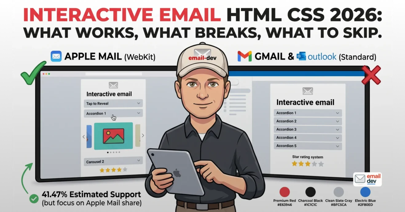
:checkedpseudo-class. Caniemail rates it at 41.47% estimated support (31.71% full, 9.76% partial) – and read that number carefully, because it is a share of the email clients caniemail tests, not a share of your subscribers. Almost all of the working support sits inside Apple Mail. Gmail does not support:checkedon any platform. Treat interactive email HTML CSS as progressive enhancement: build the static version first, layer interaction on top, and assume a large chunk of your list only ever sees the fallback.
The question I ask before any interactive build is boring, and it decides everything. What share of this list opens in Apple Mail? Nobody ever knows offhand. They know the open rate. They can quote revenue per send to two decimal places. The client breakdown sits in the ESP dashboard, unloved, two clicks away, and it is the only number that matters here. That number is the whole article. Interactive email HTML CSS lives or dies on it.
Here’s the shape of things, and I’d rather put it up front than bury it under pretty carousels. Interactivity in email means a state change triggered by :hover, :active, :focus or :checked. That’s it. There has never been JavaScript and there isn’t going to be.
I still build these. I like building them. But I build them so that the people who can’t see the interaction never learn they missed anything, and that constraint shapes the code from line one.
Short version: interactive email HTML CSS is an Apple Mail feature with good manners. Design accordingly.
- What counts as an interactive email (and what is just a GIF)
- The tiers, cheapest first
- What is not interactive, whatever the vendor says
- The interactive email HTML CSS support math nobody reads properly
- Now the audience data, which is the part that changes your budget
- The caveat that should make you trust me slightly more
- The checkbox hack, explained properly
- A minimal click-to-reveal
- Why every weird bit is there
- Hiding the input without breaking things
- The Samsung problem, and the two lines that fix it
- Fallback first, or do not ship it
- Two strategies, plainly
- The self-testing trick worth stealing
- The byte budget, which everybody forgets
- Three interactive email HTML CSS builds worth actually shipping
- The hover button (thirty minutes, zero risk)
- The accordion / FAQ toggle (half a day, and my favourite thing on this list)
- The carousel (two to three days, and I will argue with you about it)
- AMP for email in 2026 – the honest status report
- Accessibility, or how to build a beautiful email nobody can use
- The fixes
- Testing interactive email HTML CSS, and why it costs more than you think
- The workflow that actually catches things
- The money, current as of July 2026
- What to tell your client, or your boss
- Where this goes next – interactivity in an inbox that reads itself
- AI summaries are the elephant
- Agentic email
- Apple isn’t going anywhere
- Outlook’s Word engine is finally on the way out
- The prediction I’ll stand behind
- A short checklist before you build anything
- Frequently asked questions
- Can you build interactive emails without JavaScript?
- Do interactive emails work in Gmail?
- What percentage of email clients support interactive email?
- What is the checkbox hack in email?
- Is AMP for email still supported in 2026?
- How do you test an interactive email?
- How much do email testing tools cost in 2026?
- Are interactive emails accessible?
- Do interactive emails hurt deliverability?
- Does the new Outlook support the checkbox hack?
What counts as an interactive email (and what is just a GIF)
An interactive email is one where an action taken inside the message changes the message itself. No browser trip. No page load. You tap, something moves, and you’re still in the inbox. That’s roughly Mark Robbins’ definition and it remains the cleanest one going.
Four pseudo-classes do the work. Three of them are fleeting.
| Pseudo-class | What it does | Holds state? |
|---|---|---|
:hover | Reacts while the cursor sits on an element | No |
:active | Reacts during the press | No |
:focus | Reacts while an element is focused | Sort of, briefly |
:checked | Reads whether an input is toggled | Yes |
:checked is the only one that remembers anything. Every serious interactive email HTML CSS technique is built on top of it. The rest is decoration.
The tiers, cheapest first
- Tier 1, near free. Hover states on buttons, hover swaps on product images, CSS transitions. They fail invisibly. Put them in your templates this week.
- Tier 2, moderate. Accordions and FAQ toggles, tabs, hamburger navigation, click-to-reveal. This is where the work gets interesting and still stays sane.
- Tier 3, heavy. Carousels, galleries, quizzes, star ratings, add-to-cart, small games. Days of work. Days of testing.
- Tier 4, a different animal entirely. AMP for email. Real forms, live data, its own MIME part, its own approval process. More on that below.
What is not interactive, whatever the vendor says
Animated GIFs. Countdown timers (a server is generating those frames and handing you an image). Live or dynamic image content. Video with a static fallback. All useful. All fine. None of them interactive, because nothing about the email changes in response to you.
One note on vocabulary. “Kinetic email” is the marketing word, “interactive email” is the developer word, and they mean the same thing roughly 90% of the time. The other 10% is somebody being loose in a trends deck.
The interactive email HTML CSS support math nobody reads properly
Right. Numbers. And a correction I have to make to about half the articles on this topic, including, if I’m honest, an earlier draft of this one.
Caniemail rates CSS :checked at 31.71% full support plus 9.76% partial, so 41.47% estimated support. That figure gets quoted everywhere as though it means “41% of your subscribers.” It does not.
Caniemail’s estimated support has not been market-share weighted since July 2021. It is the share of the email clients caniemail tests. If a feature works in six of ten tested clients, it shows 60%. Client popularity does not enter into it.
So the honest reading of 41.47% is: fewer than half the clients we test can do this. It says nothing about your list. Your list is a separate question with a separate number, and you have to go get it.
Here’s how the support splits by client.
| Client | :checked support | What it means in practice |
|---|---|---|
| Apple Mail (macOS, iOS) | Yes | The whole party. Nearly everything works. |
| Gmail (web, iOS, Android, mobile webmail) | No | Form inputs get stripped. Not a bug you can hack around. |
| Outlook.com, new Outlook for Windows, Outlook macOS, Outlook iOS and Android | Partial | Type selectors only. Class-based :checked rules fail. |
| Outlook classic for Windows (Word engine) | No | Ignores form tags. Fallback only. |
| Yahoo Mail, AOL | Yes | Quietly capable. |
| Samsung Email (Android) | Yes | With quirks. See #MessageViewBody below. |
| Thunderbird, Fastmail, HEY, ProtonMail, GMX, WEB.DE, 1&1 | Yes | Small share, works fine. |
| Orange (FR) | No | Rewrites <input> into <noinput>. A hell of a design choice. |
That partial rating on the Microsoft column matters more than it looks, and it catches people out because new Outlook is Chromium underneath, so they assume browser behaviour. It is not browser behaviour. input:checked ~ div works. .cbox:checked ~ .panel does not. Type selectors only. The day I worked that out was not a good day.
Now the audience data, which is the part that changes your budget
Litmus Email Analytics, May 2026, calculated from over a billion opens:
| Client | Share of opens |
|---|---|
| Apple | 64.66% |
| Gmail | 24.11% |
| Outlook (desktop) | 6.49% |
| Yahoo Mail | 2.57% |
| Google Android | 1.38% |
| Outlook.com | 0.38% |
| Thunderbird | 0.21% |
| Orange.fr | 0.09% |
| Samsung Mail | 0.02% |
And here is where I have to be annoying about my own favourite statistic.
That 64.66% is not 64.66% of humans. Litmus’s Apple bucket includes opens from Mail Privacy Protection, and Litmus says outright that MPP opens are not considered reliable opens – MPP prefetches images whether or not a person ever looked. Litmus’s own summary puts MPP’s footprint at roughly 55-60% of all opens. Some meaningful portion of that beautiful Apple number is a machine loading a tracking pixel in a data centre.
I am not going to pretend I can hand you a clean corrected figure, because nobody can. What I will say:
Apple is genuinely dominant, genuinely the interactive audience, and genuinely overstated by open-based reporting. All three at once.
Which still leaves the strategic conclusion mostly intact, just held less tightly:
If you sell B2B into Outlook-heavy accounts, interactivity is a rounding error. Spend the budget on segmentation, on copy, on a faster landing page. Anything else.
If you sell DTC to consumers reading on iPhones, there is real attention on the table. Not two thirds of your list. But a lot.
The caveat that should make you trust me slightly more
Caniemail’s :checked entry was last tested on 10 March 2020. Over six years ago. The data is directionally right and I’ve re-tested a good chunk of it myself, but treat every support table as a hypothesis. Mine very much included.
Clients change silently and tell nobody. Gmail quietly altered how it handles background images and left everyone to work it out from broken sends – I wrote about that mess in background images in HTML email, and the same “test it, don’t trust it” lesson applies here.
Small good-news item, since the doom is getting thick. Caniemail’s July 2025 refresh shows SFR and LaPoste.net behaving themselves at last. They no longer mangle <input> into <noinput>. Orange still does. But things occasionally improve.
Your action item, two minutes. Open your ESP or your analytics. Pull your own client breakdown. Do it before you write a single line of interactive email HTML CSS.
The checkbox hack, explained properly
There’s no JavaScript and no server round trip, so the only place to store state is the document itself. A checked input is your variable. CSS reads it through :checked and a sibling combinator, then shows or hides content accordingly.
That’s the whole trick. Everything below is elaboration.
A minimal click-to-reveal
<!-- state lives here, at the very top of <body> -->
<input type="checkbox" id="reveal-1" class="cbox">

<table role="presentation" width="100%" cellpadding="0" cellspacing="0" border="0">
  <tr>
    <td>
      <label for="reveal-1" class="clickme">
        <img src="scratch.png" width="600" alt="Tap to reveal your code" style="display:block;">
      </label>
      <div class="reveal">Your code: SPRING20</div>
    </td>
  </tr>
</table>
And the CSS, which goes in a <style> block in the head:
@media screen and (-webkit-min-device-pixel-ratio:0) {
  .reveal { display: none; }
  #reveal-1:checked ~ * .reveal  { display: block !important; }
  #reveal-1:checked ~ * .clickme { display: none  !important; }
}
Nine lines. Working interactive email HTML CSS component, and the pattern scales to almost everything else.
Why every weird bit is there
Why the input sits at the top of <body>. Sibling combinators only look forward. An input buried inside a table cell cannot reach anything outside that cell. So you punch all your state bits in a row at the top of the document, and ~ * lets the selector reach down into your layout tables. Mark Robbins named this punched card coding, and the name is good enough that it stuck.
Why label[for] and not a wrapping label. The for attribute is more reliable across clients. Yahoo has historically preferred the wrap, so some builds do both. Yes, that’s annoying.
Why !important on everything. You’re fighting your own inline styles. Email inlines are a war you started yourself, and this is you losing it politely.
Why the WebKit media query gate.@media screen and (-webkit-min-device-pixel-ratio:0) is a crude “are you WebKit” test. Honest assessment: it’s a 2016-era hack, it leaks, and AOL plus a couple of ISP webmails trigger it too. So, even though I don’t like it, I still use it. I check the rendered result rather than trusting the query.
Hiding the input without breaking things
Never use display:none on the input itself. It kills the toggle in several clients and you won’t notice until it’s live.
.cbox {
  opacity: 0;
  width: 0;
  height: 0;
  margin: 0 0 0 -9999px;
  float: left;
  position: absolute;
  -webkit-appearance: none;
}
The Samsung problem, and the two lines that fix it
Samsung Email wraps message content in #MessageViewBody and applies its own rules on top. That can leave you rendering the interactive layer and the fallback simultaneously. Stacked. Looking like a bug report. Zimbra and Comcast do something similar with body.MsgBody.
I put the blockers in the boilerplate now, before I write anything else:
/* Samsung */
#MessageViewBody .cbox + .fallback { display: block !important; }
#MessageViewBody .interactive       { display: none  !important; }

/* Zimbra / Comcast */
body.MsgBody .interactive { display: none !important; }
Boring code. Saves entire afternoons.
Fallback first, or do not ship it
The rule, and I will not be talked out of this one:
Write the static version first. In full. Then wrap the interactive version around it.
Not the other way round. Build the interaction first and bolt on a fallback afterwards, and the fallback becomes an afterthought and it shows. Given that Gmail and classic Outlook alone are a third of tracked opens, and that’s before you count anyone in the partial-support Microsoft column whose class selectors quietly fail, the fallback is not an edge case. For plenty of senders it is the majority experience.
Two strategies, plainly
1. Two versions, one shown. Sometimes called the lightswitch. The static block sits first in the source. The interactive block follows. CSS swaps them where support exists. Simple, sturdy, costs you bytes.
2. One set of content, two layouts. Same blocks. Stacked vertically in non-supporting clients, arranged as a carousel where absolute positioning works. Leaner. Considerably fussier to build. Worth it when the content is heavy.
The self-testing trick worth stealing
Put a pre-checked checkbox above your wrapper. Then use :checked itself to prove :checked works.
<input type="checkbox" id="supported" checked class="cbox">
@media screen and (-webkit-min-device-pixel-ratio:0) {
  #supported:checked ~ * .fallback    { display: none  !important; }
  #supported:checked ~ * .interactive { display: block !important; }
}
If the client can’t read the selector, it can’t hide the fallback, so the fallback stays. The CSS tests for its own support. It’s elegant, and it took me embarrassingly long to properly appreciate it.
Same progressive-enhancement logic drives layout, incidentally. See fluid hybrid email design for the structural version of the argument.
The byte budget, which everybody forgets
Gmail clips messages at roughly 102KB on desktop. Two things people miss:
- Your ESP inflates the file after you finish. Tracking links, redirect wrappers, pixels. Aim for under about 80KB in your source and you’ve bought yourself room.
- The Gmail iOS app clips far lower – reports put it around 20KB, applied inconsistently, which is a fun combination of words to type.
Interactive markup is verbose by nature, because you’re shipping two versions of everything. A heavy carousel can absolutely push you past the threshold. When Gmail truncates, it truncates the bottom, which is exactly where the unsubscribe link lives. That’s not a rendering bug, that’s a compliance problem, and it ends up in a legal email rather than a Slack message.
So: fallback before the interactive markup in the source order. If something gets clipped, let it be the fancy part.
Compress your images while you’re in there. Image optimization for email buys you the headroom.
Three interactive email HTML CSS builds worth actually shipping
The hover button (thirty minutes, zero risk)
:hover on the <a>, declared in the head, plus a colour transition.
a.btn { background: #1f6feb; transition: background-color .2s ease; }
a.btn:hover { background: #0b4fb8 !important; }
It fails to nothing. Non-supporting clients show a normal button. Ship it in every template you own and stop thinking about it.
One catch, and it’s real. This lives in the <style> block. If your ESP or your course platform strips the head, you get nothing, and you get nothing silently. GetCourse in particular has opinions about your markup. Test the sent version, not the local file. Always the sent version.
Bonus move: hover-swap product imagery with a background-image change rather than two stacked <img> tags. Stacking costs bytes and Gmail is unpredictable about layering.
The accordion / FAQ toggle (half a day, and my favourite thing on this list)
Best return on complexity of anything in interactive email HTML CSS. Long FAQ emails, onboarding sequences, terms, shipping info, event schedules. All of it collapses into a scannable list of headers.
Here’s the key insight, and the reason I push this one so hard. The fallback for an accordion is just a long email. Every panel ships open. Nobody is harmed. Nobody even knows. Safest interactive pattern there is.
<input type="checkbox" id="q1" class="cbox">
<input type="checkbox" id="q2" class="cbox">
<table role="presentation" width="100%" cellpadding="0" cellspacing="0">
<tr>
<td>
<label for="q1" class="q-head">Where is my order? <span class="chev">▼</span></label>
<div class="panel" id="p1">
<p>Orders ship within two working days. You'll get tracking by email.</p>
</div>
</td>
</tr>
</table>
@media screen and (-webkit-min-device-pixel-ratio:0) {
  .panel { display: none; }
  #q1:checked ~ * #p1 { display: block !important; }
  #q1:checked ~ * .q-head .chev { transform: rotate(180deg); }
}
The chevron rotation fails to a static chevron. Fine. Nobody has ever complained about a chevron pointing the wrong way.
The build order. Follow it in sequence:
- Write the long version. All answers visible. Make it good on its own.
- Wrap each answer in
.panel. - Add the inputs at the top of
<body>, one per row. - Add the WebKit-gated CSS that hides the panels and reveals them on
:checked. - Add the Samsung and Zimbra blockers.
- Test on a real iPhone. An actual one. In your actual hand.
The carousel (two to three days, and I will argue with you about it)
Absolute positioning, radio buttons for the dots, ~ selectors reaching sideways across the document, the whole circus. Works beautifully in Apple Mail. Genuinely satisfying to build.
What it costs: bytes, testing hours, and a real chance that people expect to swipe. Your dots are not a swipe. They tap once, nothing feels the way they expected, they leave.
My take, and it’s a take rather than a fact. For most senders a carousel is a stacked grid with extra steps. If the product story truly needs sequence – a lookbook, a “how it works” in three beats – build it and build it properly. If you just have four products, put four products in the email.
I’ve talked more clients out of carousels than into them. None have come back unhappy about it.
AMP for email in 2026 – the honest status report
AMP is a third MIME part, text/x-amp-html, riding alongside plain text and HTML. Real forms. Live data. Server round trips from inside the inbox. Genuinely powerful, and genuinely a different technology from everything above.
Where it works, seven years on: Gmail, Yahoo Mail, Mail.ru, and the open-source FairEmail client. That’s the list. Outlook ran a developer preview and killed it in September 2020. Apple Mail has never supported it and has shown no sign of caring.
The tax you pay:
- SPF, DKIM and DMARC on the sending domain
- Register your sender with Google, then separately with Yahoo, then wait for approval (Google’s review can take five days or more)
- Host
action-xhrendpoints with AMP-aware CORS headers - Maintain a full HTML fallback anyway
- Have an ESP that supports the AMP MIME part, and most of the ones my clients use do not
The verdict I’ll put my name on: AMP isn’t dead. It’s niche. It suits high-volume senders with an engineering team and a Gmail-heavy list. The kind of company that books flights and hotels.
Now think about a course producer, a shop, a five-person marketing team. For them the interactive email HTML CSS techniques above deliver most of the perceived magic at a fraction of the cost. Build AMP when somebody shows you the revenue model. Not because it turned up in a trends deck.
Where I could be wrong: if Google folds AMP-style interactivity into Gmail’s Gemini surfaces, the maths changes overnight. I doubt it. I’ve been wrong before and I’ll be wrong again.
Accessibility, or how to build a beautiful email nobody can use
Here’s the problem in one sentence. You’ve just constructed a user interface out of hidden form controls, and a screen reader will happily announce every last one of them as “checkbox, unchecked” unless you tell it otherwise.
Almost no article on interactive email covers this. That’s a bit of an indictment.
The fixes
Keep the inputs out of the reading order.aria-hidden on the input, or handle it structurally. There’s real tension between “hidden from assistive tech” and “still functional”. Anybody telling you this is a solved problem is not testing it.
Give keyboard users a visible focus ring.
input:focus-visible ~ * .clickme {
  outline: 2px solid Highlight;
  outline-offset: 2px;
}
Tap targets: 44 by 44 pixels, minimum. A hotspot that needs a stylus is a decorative failure.
Respect prefers-reduced-motion on anything that animates. Vestibular disorders are not an edge case, they’re a large number of quiet people.
@media (prefers-reduced-motion: reduce) {
  .chev, .slide { transition: none !important; }
}
Your fallback is not the lesser version. For screen reader users it’s frequently the only version. One more reason to write it first and write it like it matters.
The uncomfortable question I ask before every interactive build: if the value lives inside the interaction, and part of my audience cannot reach it, what have I built? An email, or an exclusion?
Deeper on this in accessible HTML emails and WCAG. And since interactive components love dark backgrounds, coding dark mode emails will save you from the inversion surprises.
Testing interactive email HTML CSS, and why it costs more than you think
The hard truth first, because it reframes the entire budget.
Screenshot tools cannot test interactivity.
Litmus, Mailgun Inspect, all of them. They fire your interactive email HTML CSS into a rendering farm and hand back a still image. A still image of a carousel is a picture of slide one. You’re verifying that nothing exploded, not that anything works.
The workflow that actually catches things
1. Screenshots first. Catch the fallback breaking in Outlook and Gmail. Cheap relative to the alternative, fast, non-negotiable.
2. Real devices second. An actual iPhone, an actual Mac, an actual Samsung handset. Send it to yourself. Tap it with your thumb. There’s no substitute and there never has been one.
3. The ESP round trip, last and always. Send it through the platform you’ll really send from. GetCourse, HubSpot and Mailchimp’s newer builders will cheerfully rewrite or strip your <style> block. Your entire interaction lives in that block.
The money, current as of July 2026
The testing market has moved a lot in the last eighteen months, so if you’re reading this later, verify before you quote it.
| Tool | Cost | Notes |
|---|---|---|
| Litmus | Custom, contact sales | Validity acquired Litmus on 10 April 2025. As of this audit the public pricing page lists a single Enterprise plan – no self-serve tier, no published number. Previews are advertised as unlimited on that plan. |
| Mailgun Inspect (formerly Email on Acid) | $99/mo Basic (1,000 previews), $199/mo Premium (2,000 previews), $0.15 per preview overage | Sinch is retiring the Email on Acid brand into Mailgun Inspect. Existing subscribers start migrating from June 2026; annual plans move at term end. Previews don’t transfer. |
| A cheap device lab | One-off | An old iPhone, an Android handset, a Mac, a Windows box. Pays for itself the first time it prevents a bad send. |
| PutsMail | Gone | Retired. If a tutorial still recommends it, that tutorial is stale, and be suspicious of the rest of it. |
The preview-budget arithmetic, because the number surprises people
A “preview” is one screenshot on one client. Litmus’s own documentation gives the example: checking six Outlook versions and three Apple Mail versions, on both mobile and desktop, burns 18 previews for a single email.
Run that against Mailgun Inspect Premium’s 2,000 previews a month and you get roughly 111 tests. Across a busy month, with revisions, 111 is not many. And every revision of an interactive build is a full re-test, because you changed the CSS that everything hangs off.
What to tell your client, or your boss
The build is not the expensive part. The verification is the expensive part.
That’s why “just add a carousel” is never a small ask. And why anybody quoting a carousel at the price of a static email is not testing it properly. Possibly not testing it at all.
Where this goes next – interactivity in an inbox that reads itself
This is the bit nobody in the interactive email space wants to talk about, and I think it’s the most important thing here.
AI summaries are the elephant
Three different AI layers are now reading your email before, or instead of, your subscriber. They do not behave the same way, and the difference matters enormously for interactive builds.
| Summary layer | When it fires | What it reads |
|---|---|---|
| Apple Intelligence (Apple Mail) | Pre-open and post-open. The pre-open summary replaces your preheader in the inbox list. | Live text only. Ignores images, alt text and emoji. |
| Gemini (Gmail) | Post-open only | Full content scan – live text, text inside images, alt text, emoji |
| Copilot (Outlook) | Post-open only, user clicks to trigger | Full content scan, including image text and alt text |
Two caveats before anyone panics. Apple Intelligence only runs where the user has switched it on, on recent hardware – it is not silently active on every iPhone in existence. And testing suggests all three lean heavily on roughly the first 150 to 200 characters of your email.
Now. A summary engine cannot tap your accordion.
It sees hidden <div>s and collapsed panels, and it may or may not decide to include them. Which produces the practical consequence almost nobody is discussing:
Content hidden behind an interaction may be invisible to the machine that decides whether your email is worth opening.
Keep the core message and the CTA in visible live text. Put the delight behind the tap. Never the offer.
Note the Apple-specific sting, too: the client with the best interactivity support is also the one summariser that ignores images and alt text entirely. Build an image-heavy interactive email for an Apple-heavy list and the summary engine reads your footer. I have seen that happen. It is not a good look in an inbox preview.
Agentic email
As assistants start triaging, summarising and acting on mail, the semantics of your HTML matter more than its cleverness. Semantic headings. Real links. Live text. Proper structure.
The accessibility work and the AI-readability work turn out to be the same work. That’s a genuinely nice thing to be able to say for once, and I’ll take the win.
Apple isn’t going anywhere
Apple leads the open share by a distance, inflated as that number is by privacy prefetching. So interactivity stays roughly where it is: a capability of the dominant client, with a long tail that will never see it. Design for that reality and stop waiting for Gmail to come round. Gmail is not coming round.
Outlook’s Word engine is finally on the way out
Classic Outlook is supported until at least 2029. The opt-out phase – where new Outlook becomes the default and users have to actively switch back – began in April 2026, though Microsoft has pushed the enterprise-managed timeline out further. No cutover date has been announced.
When the Word rendering engine finally goes, the layout problem eases considerably. The interactivity problem does not. New Outlook is Chromium and still only handles :checked on type selectors. Don’t plan a party.
The prediction I’ll stand behind
By 2030, the winning email is not the most interactive one. It’s the one that reads perfectly as text, renders perfectly as HTML, and rewards a tap with something small and good.
Everything else is a demo.
A short checklist before you build anything
Five questions. If any answer is bad, don’t build it.
- Audience check. What share of your list actually opens in Apple Mail? Pull the number. Don’t guess, and don’t use a caniemail percentage as a proxy for it.
- Value check. Does the interaction hold the offer, or the delight? If it holds the offer, redesign it.
- Fallback check. Have you written the static version, in full, first? Would you be happy sending just that?
- Testing check. Do you have a real iPhone, a real Android, and a real ESP send in the plan? Budgeted? Preview allowance checked?
- Byte check. Are you under ~80KB in source, with the fallback ahead of the interactive markup?
Five yeses and you have a build. Four and you have a conversation to have with somebody.
Frequently asked questions
Can you build interactive emails without JavaScript?
Yes, and you have no choice. No mainstream email client executes JavaScript, for obvious security reasons. Interactive email HTML CSS is built from HTML form inputs plus CSS pseudo-classes – :hover, :active, :focus, and above all :checked. Sibling selectors then show and hide content based on which inputs are toggled. The technique is known as the checkbox hack, or punched card coding.
Do interactive emails work in Gmail?
Mostly no. Gmail does not support the CSS :checked selector on any platform, so checkbox-hack interactivity fails there and Gmail users see your static fallback. Gmail does support AMP for email, which is an entirely separate format with its own MIME part. Hover effects do work in Gmail’s web client. Plan for Gmail to receive the static version and build accordingly.
What percentage of email clients support interactive email?
Caniemail rates CSS :checked at 41.47% estimated support – 31.71% full plus 9.76% partial. Read that carefully: since July 2021 caniemail’s estimated support is the share of email clients it tests, not the share of email opens or of your subscribers. In practice, working support is concentrated in Apple Mail. Gmail and classic Outlook don’t support it at all. To know what it means for you, pull your own client breakdown from your ESP or analytics.
What is the checkbox hack in email?
The checkbox hack uses a hidden HTML checkbox or radio input as a state variable. A <label> linked to that input by its for attribute becomes your clickable button. CSS then combines :checked with a sibling combinator to show or hide content when the input toggles. It is the only way to hold state inside an email without JavaScript.
Is AMP for email still supported in 2026?
Yes, but narrowly. AMP for email works in Gmail, Yahoo Mail, Mail.ru and FairEmail. Outlook’s developer preview ended in September 2020, and Apple Mail has never supported it. Sending AMP requires SPF, DKIM and DMARC, plus sender registration with Google and separately with Yahoo. You also need an AMP-capable ESP and a complete HTML fallback regardless.
How do you test an interactive email?
Screenshot tools return static images, so they cannot test interaction – use them to verify the fallback renders correctly. Then test the interaction on real devices: an iPhone, a Mac, an Android handset. Finally, send through your actual ESP, since many platforms strip or rewrite the <style> block your interaction depends on. Budget for it: one email across six Outlook versions and three Apple Mail builds consumes eighteen previews.
How much do email testing tools cost in 2026?
It has changed. Litmus, acquired by Validity in April 2025, no longer publishes a self-serve price – the pricing page lists a single Enterprise plan with custom pricing and unlimited previews. Email on Acid is being folded into Mailgun Inspect, with existing subscribers migrating from June 2026; that runs $99/month for 1,000 previews or $199/month for 2,000, with $0.15 per preview over the allowance. PutsMail has been retired entirely.
Are interactive emails accessible?
Only if you build them that way. Hidden inputs get announced by screen readers unless you handle them. Keyboard focus needs a visible outline. Tap targets need to be at least 44×44 pixels. Animation should respect prefers-reduced-motion. Crucially, your static fallback is the only version many assistive-technology users will ever receive. Write it first and write it well.
Do interactive emails hurt deliverability?
Not directly. The code itself isn’t a spam signal. The real risk is size. Gmail clips desktop messages over roughly 102KB, and far lower in its iOS app. Interactive markup is verbose because you ship two versions of everything, so a heavy carousel can push you past the clip point and cut off your footer and unsubscribe link. Keep the fallback first in the source order and aim to stay under about 80KB before your ESP inflates it.
Does the new Outlook support the checkbox hack?
Partially, and the detail matters. New Outlook for Windows and Outlook.com support :checked on type selectors only, so input:checked ~ div works while .cbox:checked ~ .panel fails silently. Outlook on macOS, iOS and Android behave the same way. Classic Outlook for Windows still uses the Word rendering engine, is supported until at least 2029, ignores form inputs entirely, and shows only your fallback.