There’s a brand in a February 2026 portfolio report – real numbers, anonymized – running on Klaviyo, where the campaign click rate sits at 0.46%, and the platform flags it “Poor” in small, polite text right next to the number. Meanwhile, that same brand’s email program generated $619K in attributed revenue that month and was responsible for roughly 25% of total store revenue. Poor. The dashboard literally called it poor. So either Klaviyo’s benchmark engine is wrong, or click rate is wrong, or the whole way we’ve been reading these numbers is a little broken, and the answer is probably some combination of all three.
That tension – between what the top engagement metrics say and what the business is actually doing – is what this article is about. Not a fresh take on “open rate is dead” (everyone’s written that piece, I’ve read most of them, none of them told me what to do on Monday morning), but a working guide to which engagement signals are still pointing at something real in 2026, after Apple MPP, after Gmail’s Gemini layer, after bot clicks started contaminating click data the same way machine opens contaminated open data. What belongs on the dashboard, what belongs in the trash, how to instrument the email so the signals actually fire, and what the next few years are probably going to do to all of this.
I report on these metrics for clients regularly. The order below is roughly the order I’d defend to a CFO who gives me fifteen minutes and wants to know if the email program is working.
- What “engagement” even means in 2026
- The top engagement metrics, ranked by what they actually tell you
- Click rate (unique clicks / delivered × 100)
- Click-to-open rate (CTOR) – and why I still track it, cautiously
- Conversion rate
- Revenue per email (RPE) and revenue per recipient (RPR)
- Reply rate
- Unsubscribe rate – the most honest metric on the list
- Disaffection index
- Effective inbox placement
- How to actually instrument these metrics so the numbers mean something
- Build the email so the click signal is unambiguous
- Make replies easy to capture
- Segment your reporting by mailbox provider
- Track UTM hygiene like it’s part of the build
- Account for bot clicks
- Reading the numbers without being lied to (or lying to your client)
- Never show one metric in isolation
- Lead the dashboard with what the business actually cares about
- Build a metric translation guide for clients who still ask about open rate
- Be honest about the dispersion in benchmarks
- A one-page dashboard that doesn’t lie
- Top row: what the business cares about
- Middle row: engagement health
- Bottom row: list and deliverability health
- A practical note on tool selection for this dashboard
- The affiliate note I’m supposed to include somewhere reasonable
- What the next 3 to 5 years will probably do to the top engagement metrics
- Likely (high confidence)
- Possible (lower confidence)
- Coin flips
- The summary point for this section
- A 7-day plan to fix your top engagement metrics reporting
- Day 1: audit what you’re currently leading with
- Day 2: rebuild your default reporting view
- Day 3: confirm what your click metrics are actually counting
- Day 4: UTM audit
- Day 5: flow vs. campaign RPR comparison
- Day 6: add a reply prompt to your welcome flow
- Day 7: build the one-page report template
- FAQ
- What’s the difference between unique clicks and total clicks, and which one should I report?
- Is open rate completely useless in 2026?
- What’s a good click rate for email marketing in 2026?
- How do I track reply rate when my ESP doesn’t surface it natively?
- What’s the disaffection index?
- Should I be tracking scroll depth or read time inside email?
- Closing
What “engagement” even means in 2026
The vocabulary hasn’t caught up with reality, and that’s causing a lot of confusion. “Engagement” in email used to mean opens – someone opened your email, they engaged with it, done. That model stopped being accurate in September 2021 when Apple rolled out MPP, and it’s gotten less accurate every year since. But the word “engagement” stuck around, which means clients still ask about engagement rates, ESP dashboards still label things as engagement metrics, and everyone quietly means slightly different things.
Here’s what’s actually happening now: mailbox providers – Gmail, Outlook, Yahoo – are using engagement signals as a deliverability input, not just a campaign reporting input. This matters more than most coverage lets on. When your subscribers reply to your emails, archive them without deleting, click through to your site, or even just leave them in the inbox instead of hitting spam, those behaviors feed into a reputation score that affects whether your next email reaches the inbox at all. Deliverability and campaign performance are no longer separate problems.
Gmail’s Gemini layer, which started rolling out in early 2026, added another wrinkle. Folderly’s research on this found that up to 40% of emails that technically land in the inbox are getting deprioritized by Gmail’s AI – visually buried below other senders, below AI-summarized content, below whatever Google has decided the user is more likely to want to see first. So “delivered to inbox” and “seen by the recipient” are now two different things, and most ESP dashboards don’t distinguish between them.
What this means practically: the top engagement metrics worth tracking in 2026 are doing two jobs simultaneously. They’re telling you whether the campaign worked – did people click, buy, reply, unsubscribe – and they’re shaping whether the next campaign even gets delivered properly. A metric that captures only one of those two jobs is less useful than it used to be.
The list that follows is the one I’d build a dashboard around. Not because it’s perfect – some of these numbers lie in specific ways I’ll flag – but because it’s the set that survives privacy updates, bot activity, and AI inboxes better than the alternatives.
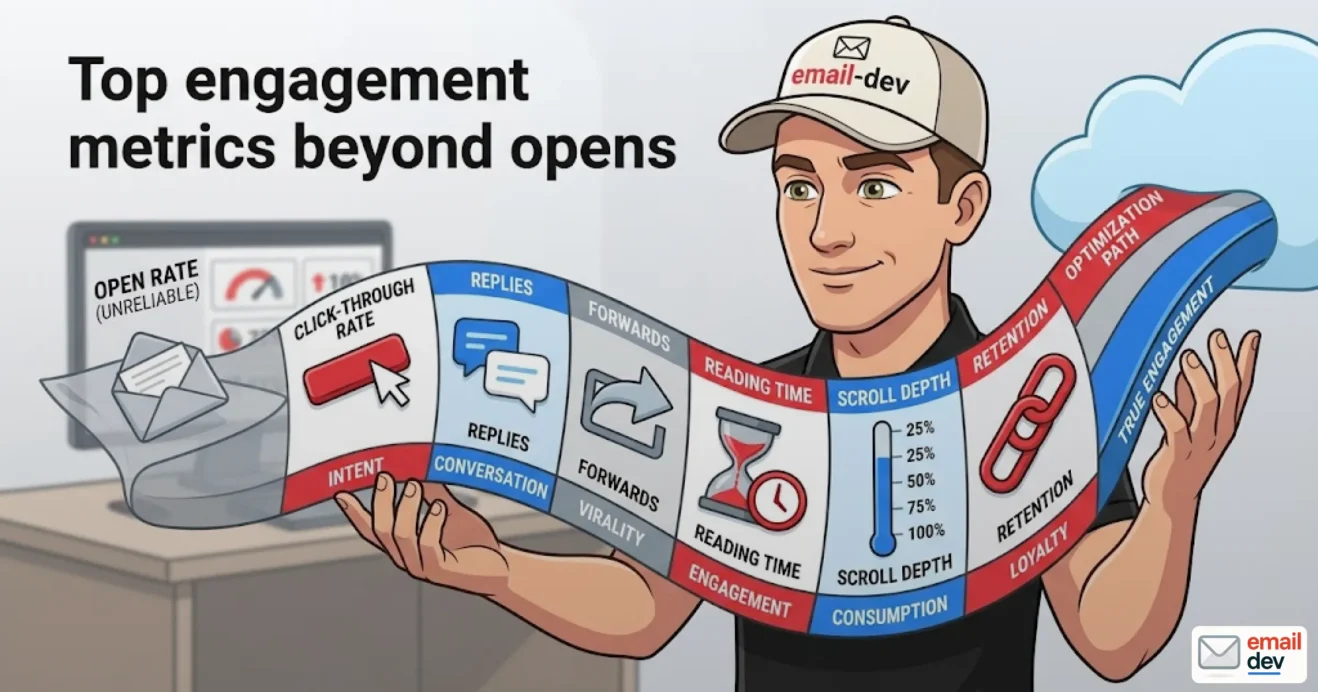
The top engagement metrics, ranked by what they actually tell you
A note before the list: I’m including formulas for each metric because ESP dashboards are inconsistent enough that you genuinely cannot assume you’re looking at the same calculation across platforms. Some of these discrepancies are labeled. Most aren’t. A click rate in Klaviyo and a click rate in Mailchimp can mean different things by default, and the difference matters when you’re trying to spot a trend.
Click rate (unique clicks / delivered × 100)
This is the first real engagement signal that survived MPP intact, and it’s where I start almost every client reporting conversation now. The formula is straightforward – unique clicks divided by delivered, times a hundred – but the word “unique” is doing a lot of work there and not every platform treats it the same way.
Unique clicks means one click per subscriber per email, regardless of how many times they actually clicked. Total clicks counts every tap, every re-open, every “let me click that button again to make sure it worked.” Klaviyo shows unique clicks by default in its main campaign view. Mailchimp surfaces both but labels them clearly. ActiveCampaign defaults to total unless you dig into the report settings, which is the kind of thing you only discover when a number looks suspiciously high and you start pulling at the thread.
The reason unique matters: a single enthusiastic subscriber clicking the same link six times looks like six engaged people if your platform is reporting total clicks, and it inflates your rate in a way that’s genuinely misleading when you’re trying to make decisions about content or frequency.
2026 benchmarks from MailerLite and ActiveCampaign put the cross-industry median somewhere around 2.0 – 3.5%. Top decile e-commerce flows hit 10% or above per Klaviyo’s 2026 benchmark data. Those numbers are wide for a reason – industry, list quality, send frequency, and whether you’re measuring campaigns or automated flows all move the number significantly, and I’ll get to the flows vs. campaigns gap later because it’s bigger than most people realize.
Where click rate lies: bot clicks. Corporate security gateways – Mimecast, Proofpoint, Barracuda – follow every link in an incoming email before the recipient sees it, scanning for malware. The ESP records those as clicks. It’s the same problem MPP created on the open side, just smaller in scale. Some platforms have started flagging “machine clicks” the same way they flag MPP opens – Klaviyo does, Omnisend does in some plans – but it’s not universal yet, and if your list skews toward corporate email addresses, this is worth investigating before you trust your click rate trend.
Click-to-open rate (CTOR) – and why I still track it, cautiously
Formula: unique clicks divided by unique opens, times 100. The idea behind CTOR is that it measures how compelling the email content was for the people who actually opened it – it strips out the “did it reach them” question and focuses on “did it convert the people who saw it.” That’s a good idea in theory.
The problem is the denominator. Unique opens now includes every Apple MPP pre-fetch, which means CTOR is artificially deflated for any list with significant Apple Mail share. If Apple Mail accounts for something like half your opens (roughly the industry average per Litmus, though it varies a lot by audience), your CTOR denominator is stuffed with machine opens, and your CTOR reads lower than reality. You look worse than you are, which is the opposite of the open rate problem but equally misleading.
MailerLite’s 2026 benchmark shows a global median around 6.8% for CTOR, with wild variation by industry – manufacturing sits around 14.8%, restaurants around 3.3%, which tells you something about how differently audiences engage with email depending on what they’re being sent.
My current approach: I track CTOR on the non-MPP segment of a list, not on the full list. Klaviyo lets you build a custom report that excludes MPP openers. Litmus Email Analytics surfaces something similar. It’s a bit of extra setup work, but the resulting number is actually interpretable. A blended CTOR that mixes real opens with machine opens isn’t measuring anything coherent.
Conversion rate
Formula: conversions divided by delivered, times 100. “Conversions” means whatever the email was asking for – a purchase, a booking, a form submission, a module started, a call scheduled. This is the metric that connects email performance to business outcomes, which is why it’s the one the CFO actually cares about and the one that’s most vulnerable to broken measurement infrastructure.
2026 benchmarks from Omnisend: e-commerce sits around 1 – 4% per delivered email, with abandoned cart flows pushing 3.3% on average and top performers at 7.7%. Those flow numbers are significantly higher than campaign numbers, which tracks – a well-timed abandoned cart email is doing completely different work than a broadcast promotional campaign.
For B2B, course producers, subscription businesses, the conversion event is whatever you defined it as. Sales call booked. Trial started. Enrollment attributed. The formula is the same, the benchmark is meaningless unless it’s from the same business model.
Where conversion rate lies: attribution. If your UTM parameters are inconsistent – different team members using different naming conventions, utm_source sometimes “email” and sometimes “klaviyo” and sometimes whoever was in a hurry that day – your GA4 or whatever analytics tool you’re using will split the attribution across multiple sources and your email conversion rate will look lower than it is. If your cross-domain tracking is broken and the click goes from the email to the landing page to the checkout on a different subdomain without maintaining the session, you lose the attribution entirely. Fix the measurement before you report the metric. I’ve seen conversion rates look genuinely terrible on dashboards where the actual email performance was fine – the tracking setup was just a mess that nobody had audited in eighteen months.
GetCourse specifically, for the course producers in the audience: it has a habit of mangling UTM parameters in specific situations, and I’ve spent more time than I’d like debugging attribution from campaigns sent through it. Worth testing your tracking chain end-to-end before you trust what the dashboard says.
Revenue per email (RPE) and revenue per recipient (RPR)
The formula
Total attributed revenue divided by emails delivered. RPE and RPR get used almost interchangeably in practice, despite platforms occasionally implying they’re different calculations – in most ESP reporting environments, they’re the same number with different labels.
Why this metric matters more than most
RPE is the number the CFO understands without a glossary. It doesn’t care about Apple MPP or get inflated by bot clicks, and it doesn’t need a footnote explaining why the denominator’s corrupted. It just measures money in, per email out.
If I have one number to show a client at the end of a reporting period, it’s this one.
2026 benchmarks – and the gap that should make you rethink your automation program
Klaviyo’s 2026 benchmark data, pulled across 183,000+ brands, shows:
- Campaign RPR: $0.11 average
- Flow RPR: $1.94 average
That’s roughly an 18x difference per send. The BS&Co March 2026 portfolio report widens that gap further:
- Campaign RPR: $0.06
- Flow RPR: $1.58
A 28x spread between what a broadcast campaign earns per recipient versus what an automated flow earns. That number sits in the back of my head every time a client wants to spend three weeks on a campaign redesign while their welcome flow is still a single email from 2022.
“If your flows aren’t outperforming campaigns by at least 5x on a per-recipient basis, the automation program needs investment before the campaign program does.”
That’s not a hot take, it’s just the math.
Reply rate
What it measures and why 2026 is the year it finally gets taken seriously
A reply is unambiguous human behavior. Not a pixel pre-fetch, not a security scanner following a link, not an AI agent inferring interest – an actual person typed something and hit send back to you. That kind of signal is increasingly rare and increasingly valuable.
The Validity 2026 report flagged reply rate as one of three emerging metrics worth tracking alongside disaffection and trust signals. Even a 1% reply rate means real subscribers who cared enough to write back.
The deliverability angle that most people miss
Gmail weights replies heavily as a positive sender reputation signal. Multiple 2026 deliverability reports make this point explicitly – a recipient replying to your email is one of the strongest positive inbox placement signals you can earn, stronger than clicks and considerably stronger than opens.
For B2B senders, reply rate has been a standard metric for years. For e-commerce and course producers, it’s almost entirely unused, which is a waste. A welcome flow that asks “hit reply and tell us what you’re shopping for” costs nothing to add and builds a signal that actually feeds back into deliverability.
Practical barriers worth knowing about
Some ESP configurations route replies into a void:
- Default Klaviyo setups often send from addresses that technically accept replies but route them nowhere useful
- Some Mailchimp configurations use no-reply addresses by default
- GetCourse has its own set of reply routing quirks depending on how the sending domain is configured
If you want reply rate as a real metric, you need a real reply-handling process – at minimum, forwarding to an inbox a human checks.
Unsubscribe rate – the most honest metric on the list
Formula and benchmarks
Unsubs divided by delivered, times 100.
MailerLite’s 2026 data shows a median of 0.22%, which is notably higher than their 2024 figure of 0.08%. That jump is real and not a measurement artifact – it’s probably tied to one-click unsubscribe becoming mandatory under the Gmail/Yahoo bulk sender rules from February 2024, which made it easier to leave and removed some of the friction that was previously suppressing the number.
General guidance:
- Under 0.2% per send: healthy
- 0.2% – 0.5%: worth watching
- Above 0.5%: something’s wrong with frequency, targeting, or expectations
The thing most dashboards hide from you
A low unsubscribe rate is not automatically good news. If your complaint rate is climbing while your unsub rate stays flat, your audience has stopped bothering with the unsubscribe link and is hitting “this is spam” instead – which is significantly worse for deliverability than a clean unsub. Inbox providers weight spam complaints heavily.
Always read unsubscribe rate next to complaint rate. One without the other is incomplete.
Disaffection index
What it is
This one comes from Validity’s 2026 deliverability report, and it’s not in most ESP dashboards yet. The concept: rather than tracking unsubscribes, complaints, and bounces as three separate trend lines, you combine them into a single composite metric and watch the trend together.
The argument for doing this:
- All three signals point in the same direction – audience disengagement, list fatigue, delivery health deterioration
- Watching them separately means you might miss the early warning that becomes obvious when you see all three moving at once
- The composite trend catches list rot faster than any individual metric does
How to build it without native ESP support
Most platforms don’t surface this natively yet. You can approximate it in:
- Looker Studio, by pulling the three metrics via API or manual export and plotting them on a shared axis
- A Notion database with weekly manual inputs if your list is small enough that automation isn’t worth the setup
- A simple spreadsheet with a weighted index if you want to get fancy about it
Worth building, especially for clients who send weekly and have lists large enough that small movements in complaint rate matter for deliverability.
Effective inbox placement
A newer concept that deserves attention
Folderly introduced “effective inbox placement” in their early 2026 deliverability work to describe the difference between:
- The email reached the inbox (traditional inbox placement rate)
- The email reached a position in the inbox where the recipient is likely to actually see it
Those are not the same thing anymore. Gmail’s Gemini AI layer is actively prioritizing certain senders over others within the inbox itself – not filtering to spam, just burying. Folderly’s data suggests up to 40% of technically-delivered emails are getting deprioritized this way.
What you can actually do with this information right now
Honestly, not much in terms of direct measurement – most ESPs don’t surface this yet. Postmark has started moving in this direction, and a few others are experimenting with it.
What you can do:
- Monitor engagement trends by Gmail segment specifically, looking for declining click rates from Gmail recipients even when deliverability looks clean
- Watch Google Postmaster Tools for domain reputation signals, which are a proxy for how Gmail is treating your sends
- Ask your ESP directly whether they’re working on effective inbox placement reporting – it’s a useful pressure to apply
This is the metric to start asking about over the next 12 months. It’s going to matter, and the platforms that surface it first will have an advantage in client retention if nothing else.
How to actually instrument these metrics so the numbers mean something
This is the section nobody else writes, because most email marketing content is written by marketers, not developers. The metrics above are only as good as the infrastructure underneath them – and the infrastructure is the email itself, plus the tracking setup, plus the reporting layer. All three have failure points that are easy to miss and annoying to fix after the fact.
Build the email so the click signal is unambiguous
Layout and rendering fundamentals
The click only becomes a metric when the clickable element actually renders correctly across the clients your audience is using. That sounds obvious. It is not always practiced.
The hybrid layout approach – percentage widths on the main containers, max-width on the wrapper, media queries layered on top for the clients that support them – is the current best practice for a reason. It means:
- The email doesn’t break at arbitrary widths in clients that ignore your media queries
- The structure holds at 320px on a narrow Android screen and at 1400px in a desktop webmail client
- The media query refinements that Apple Mail and Gmail mobile support still fire and improve the experience for those users
On top of that structure, every interactive element needs to work in the problem clients:
- Bulletproof buttons for Outlook desktop: VML fallback, table-based construction, hardcoded background color. If the button doesn’t render in classic Outlook for Windows, you’re losing your most important click signal from a segment that’s the least contaminated by bot activity. Classic Outlook is mid-transition right now – Microsoft started rolling out the new Outlook to business users in January 2025, with full support ending for the Word-engine version in October 2026 – but it’s not gone yet, and emails still need to work there.
- Every text link tracked: “Read more,” product names, article titles, even “view in browser” links. Each one is a tracked click opportunity. More tracked links per email means higher per-recipient click density without adding visual noise, and it gives you data about which content areas are drawing attention.
- No image-only emails: Beyond the dark mode disaster – blank rectangles where your beautifully designed layout used to be – image-only emails are nearly invisible to engagement metrics. No link variety, no scroll signal, nothing for Gmail’s Gemini summary layer to read. You’re essentially sending a black box and hoping for the best.
The Outlook rendering situation is genuinely transitional right now
Worth flagging clearly: there are now two meaningfully different versions of Outlook for Windows with completely different rendering engines. The classic desktop version uses the Word 2007 engine – the same engine that’s been the source of most Outlook rendering nightmares for fifteen years. The new Outlook for Windows uses a web-based rendering engine similar to Outlook.com, which is considerably more capable and supports a much wider range of CSS.
The problem is that business users are in the middle of this transition, which means your corporate recipients may be on either version, and you can’t reliably know which one. The safe approach until October 2026 is still to build for the Word engine and treat new Outlook support as progressive enhancement.
Make replies easy to capture
The basics that are still routinely ignored
If you want reply rate as a real metric – and after the deliverability angle described in the previous section, there are real reasons to want it – the email needs to be set up so replies actually go somewhere useful.
Specific things to fix:
- Don’t send from a no-reply@ address. This one seems like a rule from 2015, but it’s still common enough that it’s worth stating. A no-reply address signals to both recipients and mailbox providers that engagement isn’t wanted.
- Don’t bury the sender behind a generic alias. “[email protected]” is fine for some brands, but it’s less likely to generate replies than a named sender. The welcome flow in particular benefits from a real person’s name in the From field.
- Add an explicit reply prompt to at least one email in every flow. It doesn’t need to be elaborate. “Hit reply and tell me what you’re working on” is enough. The ask has to exist for the behavior to happen.
ESP-specific reply routing issues
Several common setups create reply black holes that are easy to miss until you actually try replying to one of your own emails:
- Klaviyo’s default configuration often routes replies to the sending domain’s catch-all, which may or may not be monitored
- Some Mailchimp setups use addresses that accept replies but don’t forward them anywhere a human sees
- Braze gives you more control over reply-to configuration but requires intentional setup
The fix in all cases: set a reply-to address that routes to an inbox a real person checks. Even if you’re sending at volume, you don’t need to respond to every reply – but they need to land somewhere, and the fact of receiving them needs to be countable.
Segment your reporting by mailbox provider
This is the move that separates a properly built reporting view from the default dashboard, and it’s available in most major ESPs if you know where to look.
Why it matters
Each major mailbox provider has a different data quality profile:
| Provider | Open data | Click data | Notes |
|---|---|---|---|
| Apple Mail | Corrupted by MPP | Clean | Machine opens inflate every open metric |
| Gmail | Partially clean | Mostly clean | Gemini AI layer affecting click behavior in 2026 |
| Outlook (classic) | Relatively clean | Clean | Word rendering engine breaks emails before clicks happen |
| Yahoo/others | Relatively clean | Clean | Smaller share, lower priority but worth watching |
Reading your click rate as a blended number across all providers is like reading an average of four different measurements with four different error rates. The blended number isn’t wrong exactly, it’s just imprecise in ways that make troubleshooting harder.
How to build this in practice
- Klaviyo: Build custom segments by predicted email client or domain, then pull click rate and conversion rate per segment. It takes about 20 minutes to set up and pays off immediately.
- Mailchimp: The “Email domain performance” section of the report view surfaces some of this natively post-June 2024.
- Braze: Fully supports segmentation by email client with some configuration.
- Omnisend: Possible with manual segment setup, not surfaced natively.
Once you have this view, Apple Mail click data becomes useful again – it’s clean even when the open data is garbage. And you can read Gmail click trends separately, which matters as the Gemini layer starts affecting engagement behavior in ways that won’t show up in blended metrics.
Track UTM hygiene like it’s part of the build
First, the thing everyone gets wrong about Apple and UTMs
Apple’s Link Tracking Protection shipped with iOS 17 in September 2023, and it strips known tracking parameters from URLs in Mail and Messages (and in Safari, but only in Private Browsing by default – there’s an opt-in toggle to extend it to all browsing, and most people never touch it). Here’s the part that gets misreported in basically every “iOS 17 broke your tracking” post: LTP works off a static list of known tracking parameters – the click IDs like gclid, fbclid, dclid, and mkt_tok. It does not strip standard UTM parameters. utm_source, utm_medium, and utm_campaign survive intact. Klaviyo’s own team confirmed this publicly, and it’s held up in testing since.
So if your email attribution runs on UTMs – which it should – LTP isn’t the thing breaking it. If you’ve been leaning on a Google or Facebook click ID to categorize email traffic, that’s the parameter getting wiped, and you need a different approach anyway.
The reason I’m hammering this: I’ve watched people rebuild their entire tracking setup in a panic over LTP when their actual attribution problem was something boring and fixable, like inconsistent UTM naming. Diagnose before you demolish.
The problem that actually ruins conversion rate reporting
It’s almost never Apple. It’s UTM drift – the slow entropy of a team where three different people build campaigns and nobody agreed on a convention:
- utm_source is “email” in one campaign, “klaviyo” in the next, “newsletter” when someone’s in a hurry
- Conversion events that depend on consistent UTM values get split across multiple “sources” in GA4, so your email conversion rate looks lower than it is and the revenue scatters across three rows
- Cross-domain tracking breaks somewhere between the email click, the landing page, and a checkout on a different subdomain, and the session gets dropped entirely
What to actually do about it
A few practices that make this substantially less painful:
- Route all clicks through your ESP’s redirect domain. The click gets recorded server-side regardless of what happens to parameters downstream – which is what you want both for click counting and for surviving aggressive corporate link-scanning. This is usually the default, but worth confirming, because some template setups or third-party link builders bypass the ESP’s redirect.
- Standardize your UTM structure and document it somewhere the whole team uses. A Notion page, a shared spreadsheet, even a JSON config file that gets referenced during campaign setup. The specific format matters less than consistency. utm_source should always be the same string for email traffic – pick one and enforce it.
- Use a custom sending domain for click tracking. This matters for deliverability and for attribution survival. A shared ESP subdomain is more likely to get filtered or rate-limited than a custom domain with a real sender reputation.
- Audit quarterly. UTM hygiene deteriorates over time, especially in teams where multiple people are building campaigns. A 15-minute audit every three months catches drift before it becomes a reporting problem.
Account for bot clicks
The same problem that hit open rates is now affecting click rates, just smaller
Security gateways follow every link in an incoming email before it reaches the recipient. Mimecast, Proofpoint, Barracuda are the common ones in corporate environments. The ESP records each followed link as a click. If your email has eight links and the gateway follows all of them, that’s eight clicks attributed to one “recipient” who hasn’t seen the email yet.
The patterns that distinguish bot clicks from human clicks:
- Clicks that happen within 2 – 3 seconds of delivery, before a human could have opened the email
- Clicks that hit every single link in the email in rapid sequence
- User agent strings like “Mozilla/5.0” with no device or browser specifics
- Click patterns with no subsequent conversion activity – the click fires but nothing happens after
What ESPs are doing about it
Platform support for machine click filtering varies:
- Klaviyo: Has bot filtering in its click reporting, similar to MPP filtering for opens
- Omnisend: Available in some plans
- ActiveCampaign: Improved machine click detection in their newer reporting interface
- Mailchimp: Limited native filtering, requires manual pattern analysis for now
Where your ESP doesn’t filter automatically, you can at least flag the issue when diagnosing anomalies. A click rate spike on a send to a heavily corporate list that doesn’t correlate with any conversion activity is almost always bot clicks, not a suddenly enthusiastic audience.
Reading the numbers without being lied to (or lying to your client)
There’s a particular kind of dashboard meeting that happens in email marketing where everyone in the room is technically looking at accurate numbers and somehow still drawing completely wrong conclusions from them. Open rate is up, click rate is down, revenue is flat, and three different people have three different theories about why, all of which are probably wrong because nobody checked whether they’re comparing the same metric calculated the same way across two different time periods.
The metrics themselves aren’t the problem. The framing is.
Never show one metric in isolation
This is the most basic thing and the most frequently violated. Some pairings that actually belong together:
- Click rate next to conversion rate. High click rate, low conversion rate means something’s wrong after the click – landing page, offer mismatch, broken tracking. Low click rate, reasonable conversion rate means your email is filtering effectively for intent, which is sometimes fine.
- Unsubscribe rate next to complaint rate. As covered earlier – you need both to know whether disengagement is happening cleanly or messily.
- Open rate next to MPP-adjusted open rate. If you’re still showing raw open rate, show it next to the filtered version so the gap is visible. Mailchimp has had an MPP exclusion toggle for sends after June 22, 2024. Klaviyo lets you build a custom report excluding MPP openers. Use these features – they exist for this reason.
- Flow RPR next to campaign RPR. The gap between these two numbers is one of the most useful diagnostic signals in an email program. A 5x or lower difference means the automation program is underbuilt. A 20x+ difference means the campaign program might be oversized relative to what it’s contributing.
Lead the dashboard with what the business actually cares about
Different business models, different leading metrics:
E-commerce:
- Total email-attributed revenue for the period, first
- RPE for campaigns and flows separately
- The flow-to-campaign multiplier (current 2026 portfolio data puts 18x as roughly average – below 5x means the flow program needs work)
- A well-optimized Shopify store should see email driving somewhere around 25 – 35% of total revenue per multiple 2026 benchmarks, with 28% as a reasonable median
B2B and service businesses:
- Reply rate
- Meeting-booked or call-scheduled rate attributed to email
- Conversion rate on whatever the sequence was asking for
Course producers and membership businesses:
- Enrollment or module-start rate attributed to email sequences
- Conversion rate on launch sequences specifically
- RPE on the launch window
The point isn’t that open rate disappears from the view entirely. It’s that it shouldn’t be leading. Put it in a “trend monitoring” section with bounce rate and complaint rate – the signals you watch for sudden drops and spikes, not the signals you use to evaluate whether a campaign worked.
Build a metric translation guide for clients who still ask about open rate
This is a practical thing that takes about an hour to build and saves several hours of conversation per year. A one-page document (or a slide, or a Notion page, whatever the client actually uses) that explains:
- What open rate now measures: roughly, “the proportion of sends where either a human opened the email or a mailbox provider pre-fetched the tracking pixel, and we can’t reliably tell which”
- What it doesn’t measure: interest, intent, attention, or anything you’d want to optimize for
- What to ask about instead: click rate, conversion rate, RPE, reply rate depending on the business model
- Why open rate is still on the dashboard at all: deliverability monitoring – a sudden drop in open rate across all clients, including the non-MPP segment, can flag a deliverability problem before it shows up in bounce rate
Clients who understand this framing stop demanding open rate improvements and start asking better questions. The translation guide does that work once, in writing, so you’re not re-explaining it in every monthly call.
Be honest about the dispersion in benchmarks
The 2026 Klaviyo benchmark report shows top 10% flow RPR at $7.79. The average is $1.94. That’s a 4x gap between average and top decile within the same platform, same metric, same type of send.
Benchmarks from vendor blogs tend to lead with top-decile numbers because they’re more impressive. “Email flows can generate $7.79 per recipient” sounds better in a marketing piece than “the average email flow generates $1.94 per recipient, and half of all senders are below that.” Both are true. The second one is more useful for setting realistic expectations.
When reporting to clients:
- Use the median benchmark for expectation-setting, not the top decile
- Compare to the same program last quarter before comparing to an industry benchmark
- Flag that most industry benchmarks aggregate across business sizes, list qualities, and sending frequencies that probably don’t match the client’s situation
Directional improvement quarter-over-quarter is a more meaningful signal than distance from a vendor benchmark for most programs. A click rate that improved from 1.8% to 2.3% over three months is real progress even if the “industry average” is 2.7% and someone’s blog says top performers hit 8%.
A one-page dashboard that doesn’t lie
The layout below is roughly what I’d build for a recurring e-commerce client. It’s not a universal template – a B2B SaaS company would swap some of these – but it illustrates the principle of organizing metrics by what they’re actually measuring rather than by what’s easiest to pull from the ESP default view.
Top row: what the business cares about
These numbers answer the question “is the email program contributing to revenue.”
- Total email-attributed revenue for the period (campaign + flow combined)
- Campaign RPE (the per-send revenue for broadcast sends)
- Flow RPE (the per-send revenue for automated sequences)
- Flow-to-campaign multiplier (flow RPE divided by campaign RPE – current 2026 average around 18x, anything below 5x means automation is underbuilt)
This row leads every monthly report. It’s the row the CFO reads. Everything below it is supporting evidence.
Middle row: engagement health
These numbers answer “are the right people clicking and buying.”
- Unique click rate (confirmed as unique, not total – check your platform default)
- Conversion rate (with a note if UTM attribution has known gaps)
- Reply rate (where the program has reply tracking set up)
- Disaffection index trend (manually calculated composite of unsubs + complaints + bounces if not available natively)
The disaffection index trend is the early warning system. A single bad send shows up as a spike. A slow drift upward over six weeks shows up as a trend line that’s harder to see if you’re watching three separate metrics independently.
Bottom row: list and deliverability health
These numbers answer “will the next email get delivered, and to whom.”
- Unsubscribe rate (per send, and as a rolling 30-day average)
- Complaint rate (always next to unsubscribe rate)
- Bounce rate (hard and soft separated if the ESP shows them)
- Effective inbox placement (where the platform reports it – mostly not yet, but worth having the slot ready)
- Open rate – yes, it’s still here, at the bottom, doing one job: flagging deliverability problems through sudden unexplained drops
“If your dashboard leads with open rate, you’re starting from a number that hasn’t been honest in five years. It belongs at the bottom, watching for emergencies, not at the top, pretending to measure engagement.”
A practical note on tool selection for this dashboard
Building this view natively in most ESP dashboards is possible but limited. Where I’ve ended up for clients who want something cleaner:
- Klaviyo’s custom reports: flexible enough to build most of this natively if you’re willing to set up the segments
- Looker Studio connected to the ESP via API or a connector: more work upfront, considerably more flexible for combining flow and campaign data in one view
- A simple Notion database with weekly manual inputs: sounds low-tech, but for smaller programs it’s faster to maintain than keeping a Looker Studio dashboard connected to multiple data sources
The specific tool matters less than the structure. The structure is: revenue at the top, engagement in the middle, deliverability at the bottom, open rate demoted to monitoring.
The affiliate note I’m supposed to include somewhere reasonable
If you want a testing and rendering layer on top of this – because a metric only means something if the email actually rendered correctly in the first place – Litmus is what I use for client work. The Email Analytics product in particular surfaces the mailbox provider breakdown that makes the segmented reporting approach above actually possible. Email on Acid is the main alternative and does the rendering side well, though the analytics depth is different. Neither is cheap, and for smaller programs the cost-benefit calculation isn’t always obvious. But if you’re running a program where a broken button in Outlook costs you meaningful revenue per send, the testing cost is not the expensive part of that equation.
What the next 3 to 5 years will probably do to the top engagement metrics
I want to be upfront about the epistemic situation here: predictions about email are notoriously bad, including from people who’ve been in the industry long enough to know better. The “email is dying” prediction has been made approximately once per year since 2010 and has been wrong every time. The “AI will replace email” prediction is on its third or fourth lap now. So take the following with appropriate skepticism, including from me.
That said, some things are clearly in motion, and pretending otherwise doesn’t help anyone plan.
Likely (high confidence)
Mobile-first becomes mandatory at the metric level
62.6% of e-commerce email opens are already on mobile per IRP’s March 2026 data. Almcorp’s analysis projects that reaching 70% by 2030, which feels conservative if anything given current trajectory.
What this means for metrics specifically – not just for design, which is the more common discussion:
- Click rate benchmarks need to be read as mobile-dominant numbers, because most of the clicks are happening on touch screens with varying screen sizes and varying levels of patience
- Conversion rate on mobile is structurally lower in many categories because checkout flows are harder on mobile, which means your email conversion rate and your desktop conversion rate are measuring somewhat different things and probably shouldn’t be averaged together
- “Click rate by device” is going to become a standard reporting dimension the same way “click rate by mailbox provider” is becoming one now
If your current reporting doesn’t separate mobile from desktop engagement, that’s the next segmentation layer worth building.
AI-optimized sending becomes a reportable dimension
Klaviyo, Omnisend, Braze, and ActiveCampaign all have versions of AI-driven send time optimization and content personalization running in 2026. The performance gap between AI-personalized sends and straight broadcast sends is widening in the data, and at some point “did the AI engine touch this send” becomes a variable you need to control for when reading your metrics.
A click rate of 3.2% on a manually-scheduled broadcast and a click rate of 3.2% on an AI-optimized send aren’t the same data point if the AI selected the optimal send time, subject line variant, and content block order. One of those represents better underlying content, the other represents better optimization infrastructure. Worth knowing which.
Reply rate moves from B2B niche to mainstream metric
The deliverability signal argument is going to force this. Gmail and Yahoo are using reply behavior as a sender reputation input, and as that becomes more widely understood – it’s already in the 2026 deliverability reports, it’ll be in mainstream email marketing content within 12 – 18 months – more senders will start actively soliciting replies and tracking the rate.
For e-commerce this will feel weird at first. Reply prompts in promotional emails, reply-to addresses that actually work, reply handling processes that weren’t necessary before. It’s a real operational change, not just a reporting change.
Disaffection index shows up natively in major ESP dashboards
The concept is already in circulation – Validity’s 2026 work put it in front of enough people that platforms are going to start building it. My rough guess: two years before it’s in at least one major ESP’s default reporting view, three to four years before it’s common across platforms. Right now building it manually is a competitive advantage for anyone doing it; eventually it’ll just be another dashboard widget everyone has.
Bot click filtering becomes default
The trajectory here is clear. MPP filtering went from “technically possible if you configure it” to “on by default in major platforms” between roughly 2022 and 2024. Machine click filtering is following the same path, just a couple years behind. By 2028 it’ll probably be on by default in Klaviyo, Omnisend, Mailchimp, and the rest, the same way MPP filtering is now.
The implication: click rates are going to look slightly lower across the board once filtering is default, the same way open rates dropped when MPP filtering became standard. If your current click rate is partly inflated by bot activity – and for corporate-skewing lists, it probably is – the filtered number will be the real one.
Possible (lower confidence)
Open rate quietly disappears from default ESP dashboards
Some platforms are already discussing this internally, from what I’ve heard. The argument: open rate is now primarily a deliverability signal, not a campaign performance signal, and putting it at the top of the default campaign report misleads more users than it helps.
The counter-argument: open rate is the number clients and executives know and ask for, and removing it from the default view creates support burden and confusion. That tension probably keeps it in default dashboards longer than it deserves, but it’s not permanent.
Agentic email changes what “engagement” means at a fundamental level
Almcorp projects agentic email – where a subscriber’s AI assistant reads, filters, summarizes, and sometimes responds to email on their behalf – becoming mainstream by around 2028. If that timeline is roughly right, within the five-year window of this article’s predictions, a meaningful portion of your “engaged” subscribers might be AI agents rather than humans.
What that does to metrics:
- A “click” on a link in an email summarized and acted on by an AI agent – is that engagement? By whose definition?
- A “reply” generated by an AI assistant on behalf of a human who never read the email – is that the deliverability signal Gmail intends it to be?
- “Conversion” remains real if the purchase happens, but the attribution chain gets considerably murkier
I don’t have confident answers to any of these. The honest position is that agentic email is real enough to plan for and close enough that ignoring it seems unwise, but the specific implications for metric definitions are still genuinely unclear.
BIMI, Apple Branded Mail, and Gmail brand indicators converge on a single standard
These three systems are doing roughly the same thing – displaying a verified brand logo in the inbox to increase recognition and trust – through completely different technical implementations and verification processes. Industry bodies like M3AAWG have been pushing toward convergence for a while.
If that convergence happens, “logo display rate” or “verified brand impression rate” becomes a trackable metric with deliverability and engagement implications. Brands with strong inbox branding consistently show better click rates, and measuring that relationship properly requires a metric that doesn’t currently exist in standard form.
Server-side click tracking faces its own privacy challenge
This is the one I genuinely don’t know what to make of. Tracking pixels went through a privacy reckoning starting with Apple MPP. Client-side link parameters are being stripped by Apple’s Link Tracking Protection. The next logical target is the server-side redirect that ESPs use to record clicks before passing users through to the destination URL.
There’s no concrete regulatory framework targeting this yet, but the trajectory of privacy legislation in the EU and the pattern of Apple’s incremental privacy features suggests it’s not permanently safe. If server-side click tracking gets challenged – either by regulation or by a major platform deciding to route around it – click rate becomes as unreliable as open rate is now, and we’re back to having conversion rate and reply rate as our primary reliable signals.
Coin flips
Scroll depth and read time inside email
This would be genuinely useful. Knowing that recipients spent 45 seconds reading your email before clicking is a different signal than knowing they clicked immediately, and the difference matters for content strategy. But tracking this reliably across email clients is currently close to impossible – the sandboxed environment of email HTML doesn’t expose scroll events the way a webpage does, and the clients that might theoretically support it don’t do so consistently.
Suped’s 2025 research on this is the most thorough treatment I’ve seen, and their conclusion is basically “not yet, and not soon.” It could change if a major client decides to support it and others follow, but there’s no sign of that happening.
AMP for Email finally getting meaningful adoption
AMP for Email – interactive, real-time content inside the email itself, carousels, forms, live data – has been technically available for years. Gmail supports it. Yahoo supports it. Apple Mail doesn’t. Outlook doesn’t. And the development overhead is significant enough that most senders haven’t prioritized it.
If adoption tips past some threshold and the major holdout clients add support, it unlocks a category of in-email engagement metrics that don’t currently exist: form completions inside the email, poll responses, interactive clicks that don’t require leaving to a browser. That would genuinely change what “engagement rate” means.
I’ve been mildly optimistic about AMP for Email’s prospects every year for about four years now and been wrong each time, so take my current mild optimism accordingly.
Whether ePrivacy in the EU bans tracking pixels outright
The ePrivacy Regulation has been “almost finalized” for long enough that the joke writes itself. If it passes in a form that treats tracking pixels as requiring explicit consent – which the CNIL ruling in France already suggested is the direction of travel under current GDPR interpretation – it would force a significant rebuild of how engagement is measured for EU audiences.
The companies that have been investing in zero-party data collection and reply-based engagement would be relatively well-positioned. Everyone else would be scrambling.
The summary point for this section
The top engagement metrics that survive the next five years are the ones tied to real, deliberate behavior – clicking, replying, converting, unsubscribing, complaining. The metrics tied to inferred or passive behavior – opens, “engagement scores” built on top of opens, anything that requires a proxy server to pre-fetch content on a recipient’s behalf – keep getting eroded. Not necessarily to zero, but toward the bottom of the dashboard where they belong.
Build your measurement infrastructure around the durable signals. The ones that require an actual human to do something. When the next privacy update comes – and there will be one – those metrics will still be pointing at something real.
A 7-day plan to fix your top engagement metrics reporting
This isn’t a transformation program. It’s a week of focused tooling work that pays off across every campaign that comes after it. Most of the tasks below take an hour or less. A couple take longer if your setup is messy, which it probably is in at least one of these areas – everyone’s is.
Day 1: audit what you’re currently leading with
Pull the last 90 days of campaign and flow data from your ESP. Don’t analyze it yet – just look at what your default dashboard is showing you first, before you do anything else.
Specifically:
- What metric is in the top-left corner of your default campaign report?
- Is it open rate? Click rate? Something called “engagement rate” that you’ve never fully understood how the platform calculates it?
- Is your platform showing unique or total clicks by default? (Check the tooltip or the help docs if you’re not sure – don’t assume.)
- Is there any MPP filtering applied, or is the open rate raw?
Write down what you find. This is your baseline. Everything this week is measured against it.
Day 2: rebuild your default reporting view
Switch your primary reporting view to lead with unique click rate, conversion rate, and RPE or RPR – whichever term your ESP uses. If your platform lets you customize the default dashboard view, do that now. If it doesn’t, build a saved report that you’ll open instead of the default.
Demote open rate. Not delete – demote. Move it to whatever “trend monitoring” section you’re going to build, alongside bounce rate and complaint rate. It’s still doing a job. That job is just not “tell me if this campaign worked.”
If your ESP has an MPP filtering option and you haven’t turned it on, turn it on now. Klaviyo custom reports let you exclude MPP openers. Mailchimp has the toggle for sends after June 22, 2024. Check your platform’s documentation if you’re on something else.
Day 3: confirm what your click metrics are actually counting
This is the step people skip and then wonder why their numbers don’t make sense six months later.
- Confirm whether your ESP reports unique clicks or total clicks by default in the main view
- Check whether machine click or bot filtering is available in your plan and turn it on if it is
- Send a test email to a corporate email address if you have access to one, then look at what gets recorded in your click report – you may be surprised
If your platform defaults to total clicks and you can’t change it, at minimum add a note to your reporting template so anyone reading the numbers knows what they’re looking at.
Day 4: UTM audit
Pull five recent campaigns and check the UTM parameters on the links. Specifically:
- Is utm_source consistent? “email” vs “klaviyo” vs “newsletter” vs nothing at all are all different things in GA4
- Is utm_medium consistent? Should be “email” universally
- Is utm_campaign populated and named in a way that’s actually useful when you see it in an analytics report three months later?
- Are clicks from these campaigns showing up correctly in GA4 or whatever analytics tool you’re using, attributed to email rather than direct?
If the audit finds inconsistencies – and it usually does – document the correct standard somewhere the whole team can find it, fix the live campaigns, and build a checklist into the campaign launch process so it doesn’t drift again.
Day 5: flow vs. campaign RPR comparison
Pull the RPR or RPE for your automated flows separately from your broadcast campaigns. Calculate the multiplier – flow RPR divided by campaign RPR.
Then look at that number honestly:
- Below 5x: the automation program is significantly underbuilt relative to its potential. Before spending more on campaign creative or send frequency, extend the flows.
- 5x – 15x: reasonable, with room to improve. Look at which flows are underperforming and why.
- 15x and above: the flows are working. The broadcast campaign program is probably where the relative underperformance is, or the list has room to grow.
The 2026 Klaviyo benchmark puts the average multiplier around 18x across their platform. The BS&Co portfolio data shows it at 28x for their client set. Both numbers suggest the same thing: if you’re spending more time on campaign optimization than flow optimization, the priorities are probably inverted.
Day 6: add a reply prompt to your welcome flow
Find the welcome email in your main automated flow – the first email a new subscriber receives. Add one line somewhere in the body, in a place that fits the voice of the email, that explicitly invites a reply.
It doesn’t need to be elaborate:
“Hit reply and tell me what you’re working on – I read every one.”
Or for e-commerce:
“Hit reply if you have questions about anything – real person on the other end.”
Then check where replies to that email actually go. Log in to the sending account, reply to a test version of the email, and confirm the reply lands somewhere a human will see it. If it doesn’t, fix the reply-to routing before you add the prompt.
One reply prompt in one email is enough to start generating data. You can expand from there once you know the infrastructure is working.
Day 7: build the one-page report template
Create a report template – a saved view in your ESP, a Looker Studio dashboard, a Notion page, a slide, whatever format the client or executive you report to will actually use – that follows the structure from the dashboard section:
- Top: total email-attributed revenue, campaign RPE, flow RPE, flow-to-campaign multiplier
- Middle: unique click rate, conversion rate, reply rate where available, disaffection trend
- Bottom: unsubscribe rate, complaint rate, bounce rate, effective inbox placement where available, open rate as trend monitoring
If you’re reporting to a client who still asks about open rate, add a small footnote explaining what it now measures and what to pay attention to instead. Do this once, in writing, so you’re not explaining it verbally every month.
That’s the week. Not glamorous work. Mostly tooling and configuration and documentation. But the campaigns and flows that come after it are measured against something that’s actually pointing at reality, which changes what decisions you make and how you defend them.
FAQ
What’s the difference between unique clicks and total clicks, and which one should I report?
Unique clicks counts one click per subscriber per email, regardless of how many times they actually clicked. Total clicks counts every click event, including multiple clicks from the same person on the same link in the same email.
Report unique clicks as your primary metric. Total clicks is useful for spotting anomalies – if total clicks is dramatically higher than unique clicks on a specific send, something unusual is happening, either a very engaged segment, or bot activity following every link in sequence, or a recipient who genuinely clicked the button fourteen times trying to make something work.
The problem with leading with total clicks is that one corporate security scanner following eight links in an email looks identical in the data to eight separate people each clicking once. Unique clicks doesn’t solve the bot problem entirely, but it’s less susceptible to that specific distortion.
Is open rate completely useless in 2026?
No, but it’s been demoted to a specific, limited job. The one thing open rate still does reliably is flag deliverability emergencies – a sudden, unexplained drop in open rate across all client segments, including the non-MPP segment, is a signal worth investigating even if the absolute number is meaningless.
What open rate cannot do anymore: tell you whether a specific campaign performed well, measure subscriber interest, support subject line testing conclusions, or justify send frequency decisions. Those uses require a metric that hasn’t been contaminated by machine pre-fetches, and open rate hasn’t been that metric since September 2021.
Keep it on the dashboard. Keep it at the bottom, in the monitoring section. Stop leading with it.
What’s a good click rate for email marketing in 2026?
The honest answer is that “good” depends heavily on what you’re sending, to whom, and whether you’re measuring campaigns or flows.
Some reference points from 2026 data:
- Cross-industry median for campaigns: roughly 2.0 – 3.5% per MailerLite and ActiveCampaign benchmarks
- Top decile e-commerce flows: 10%+ per Klaviyo’s 2026 benchmark data
- B2B sequences with strong targeting: 4 – 6% is achievable
The more useful question is whether your click rate is improving quarter-over-quarter and whether it correlates with conversion rate in the way you’d expect. A 2% click rate that drives consistent revenue is more valuable than a 5% click rate that drives no conversions – though the second scenario is also a signal that something’s broken between the click and the checkout.
How do I track reply rate when my ESP doesn’t surface it natively?
For smaller lists, the lowest-friction approach is manual: set up a real reply-to address, check it regularly, and count replies per campaign in a spreadsheet. Tedious, but it works, and for lists under a few thousand subscribers it’s entirely manageable.
For larger programs, a few options:
- Gmail or Outlook search filters on the reply-to inbox, filtered by date range and campaign send dates, give you a rough count without custom tooling
- Some ESPs surface this via custom reports – Klaviyo has a reply rate metric available in some report configurations, though it’s not in the default view
- Dedicated reply management tools like Intercom or Help Scout, if your program is generating enough volume to warrant the overhead
The most important step is making sure replies are going somewhere at all, which is more often broken than people realize. Fix the routing before you worry about the measurement.
What’s the disaffection index?
A composite metric from Validity’s 2026 deliverability research that combines unsubscribe rate, complaint rate, and bounce rate into a single trend line rather than three separate ones.
The rationale: all three signals indicate the same underlying condition – audience disengagement and list health deterioration – and watching them together catches the trend earlier than any individual metric does. A small uptick in complaints alongside a small uptick in unsubs alongside a slight increase in soft bounces is easy to miss when you’re looking at three separate charts. On a single composite index, the pattern is more obvious.
It’s not in most ESP dashboards natively yet. You can build an approximation manually in Looker Studio, a spreadsheet, or a Notion database by pulling the three numbers weekly and plotting them together. Worth doing for any program that sends frequently enough that deliverability health is an ongoing concern rather than a periodic one.
Should I be tracking scroll depth or read time inside email?
Mostly not yet, and probably not for a while.
The email rendering environment doesn’t expose scroll events the way a webpage does – the sandboxed HTML inside an email client doesn’t have access to the scroll APIs that web analytics tools rely on. A few specialized tools have experimented with approximations, but the client support is inconsistent enough that the resulting data would be unreliable across a mixed audience.
The practical alternative: track behavior on the landing page after the click. Time on page, scroll depth on the destination URL, pages visited after arrival – all of these are trackable with standard web analytics and tell you something real about how engaged the reader was with the content they clicked through to see.
Inside the email itself, focus on what’s actually measurable: click density (which links got clicks, in what proportion), reply rate, and whether the click led to a conversion. That’s the picture you can actually build with current tooling.
Closing
The email programs that came through the post-MPP years in reasonable shape were mostly the ones that treated the privacy update as a forcing function rather than a complaint to make. The open rate got corrupted, they rebuilt their dashboards around click rate and RPE and conversion rate, and then they just kept running the program. Not a crisis. A recalibration.
The next five years are going to deliver a few more recalibrations – Gmail’s Gemini layer changing what “inbox placement” means, mobile dominance reshaping what click rates are even possible, agentic email arriving in some form that nobody has quite nailed down yet. Each one will break something on the current dashboard and require an adjustment.
The top engagement metrics that survive these shifts are the ones tied to deliberate behavior. A click. A reply. A purchase. An unsubscribe. Real actions that real people – or eventually, real people’s AI agents making decisions on their behalf – chose to take. The metrics built on inferred behavior, on proxy signals, on passive data collection that requires a server to pre-fetch something before the recipient ever sees it – those keep getting eroded, one privacy update at a time.
Build the dashboard around the durable signals. Keep the others in the monitoring section where they can still do their limited jobs without misleading anyone. Then close the laptop and go ship something.