
You’ve spent six hours on this email campaign. The design looks perfect in your browser. Your copy converts. The CTA button is the exact shade of blue your brand guidelines demanded after three rounds of revisions.
You hit send to 50,000 subscribers.
Half of them open it in Gmail on their phones and see… something that looks like a drunk toddler arranged your layout with refrigerator magnets. The other half are on Outlook Desktop, where your carefully crafted gradient background has been replaced by a solid gray box that makes your brand look like it’s stuck in 2003.
This keeps happening because CSS in email doesn’t work like CSS on the web. Not even close.
Most developers learn this the hard way. They inline everything, or they inline nothing, or they spend hours manually copying styles into every single <td> tag until they want to throw their laptop out a window. And they still end up with emails that break in at least three clients.
The problem isn’t that CSS inlining is complicated. The problem is that nobody explains which properties actually need to be inlined, which ones don’t, and why Outlook Desktop is still rendering HTML using Microsoft Word’s engine from 2007 – yes, the same Word you use to write documents, and no, that’s not a joke.
- Table of Contents
- Understanding CSS Inlining in Email Development
- What is CSS inlining
- The technical reality
- The business impact
- The Current State of CSS Support in Email Clients
- 2025 Email Client Landscape
- Critical CSS Properties for Inlining
- Mistake #1: Over-relying on embedded CSS without strategic inlining
- The Problem: assuming modern support everywhere
- The Solution: Hybrid CSS Strategy
- Implementation Guidelines
- Mistake #2: inlining every single CSS property
- The Problem: bloated HTML and maintenance nightmares
- The Solution: strategic property prioritization
- Priority-Based Inlining Framework
- Mistake #3: ignoring email client-specific CSS requirements
- The Problem: one-size-fits-all approach
- The Solution: client-aware CSS inlining
- Client-Specific Inlining Strategies
- Mistake #4: poor media query management in inlined styles
- The Problem: breaking responsive behavior
- The Solution: responsive-aware inlining strategy
- Best Practices for Responsive CSS Inlining
- Mistake #5: manual inlining without automation tools
- The Problem: Human Error and Inefficiency
- The Solution: automated CSS inlining pipeline
- Top CSS Inlining Tools for 2025
- Advanced Automation Strategies
- The Strategic CSS Inlining Framework for 2026
- The CRISP Method for CSS Inlining
- Decision Matrix for CSS Properties
- Implementation Workflow
- Essential CSS Inlining Tools and Technologies
- Professional Email Development Platforms
- Open Source and Free Tools
- Build System Integration
- Testing and Quality Assurance for Inlined CSS
- Comprehensive Testing Strategy
- Email Client Testing Priorities
- Automated Testing Implementation
- Performance Testing
- Advanced CSS Inlining Techniques for Professional Developers
- Conditional Inlining Strategies
- Dynamic CSS Inlining
- CSS Property Prioritization Algorithm
- Performance-Optimized Inlining
- Future-Proofing Your CSS Inlining Strategy
- Emerging Trends in Email Client Development
- 2025 CSS Inlining Best Practices
- Technology Recommendations
- Skills Development Roadmap
- Mastering CSS Inlining for Email Success
- Take action: implement your CSS inlining strategy today
Table of Contents
- Understanding CSS Inlining in Email Development
- The Current State of CSS Support in Email Clients
- Mistake #1: Over-Relying on Embedded CSS Without Strategic Inlining
- Mistake #2: Inlining Every Single CSS Property (The Overkill Trap)
- Mistake #3: Ignoring Email Client-Specific CSS Requirements
- Mistake #4: Poor Media Query Management in Inlined Styles
- Mistake #5: Manual Inlining Without Automation Tools
- The Strategic CSS Inlining Framework for 2025
- Essential CSS Inlining Tools and Technologies
- Testing and Quality Assurance for Inlined CSS
- Advanced CSS Inlining Techniques for Professional Developers
- Future-Proofing Your CSS Inlining Strategy
Understanding CSS Inlining in Email Development
What is CSS inlining
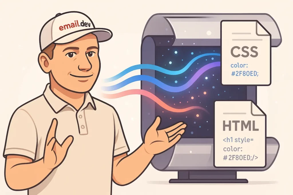
CSS inlining means taking styles from your <style> block or external stylesheet and jamming them directly into the style="" attribute of your HTML elements.
Instead of this:
<style>
  .header {
    background-color: #0066cc;
    font-size: 24px;
  }
</style>
<div class="header">Welcome!</div>
You end up with this:
<div style="background-color: #0066cc; font-size: 24px;">Welcome!</div>
Why? Because Gmail strips out your <head> section. Because Outlook ignores half your CSS. Because some email clients treat your carefully structured stylesheet like a security threat and delete it entirely.
Email clients don’t trust you. They assume you’re trying to break their interface or steal user data, so they strip out anything that looks remotely dangerous. Sometimes they strip out things that aren’t dangerous at all, just because they feel like it.
This is why web developers who try email development for the first time usually look confused and slightly betrayed after their first test send.
The technical reality
Outlook Desktop uses Word 2007’s rendering engine. I need you to sit with that for a second. Microsoft Word. The thing you use to write cover letters and passive-aggressive office memos. That’s what renders your HTML email.
This means Outlook doesn’t support:
- Background images (without VML hacks)
- Float properties
- Most of CSS3
- Your sanity
Gmail on mobile strips CSS selectors it doesn’t like. Apple Mail is actually pretty good with CSS, which makes it the exception that proves the rule. And then you’ve got international clients—regional email services in Asia, Europe, Latin America—that have CSS support ranging from “surprisingly decent” to “did they even try?”
Your subscribers use all of these. According to Litmus’s 2024 data, mobile clients account for about 42% of email opens, webmail is around 40%, and desktop clients make up the rest. But those numbers shift depending on your audience. B2B senders see more Outlook Desktop. Consumer brands see more Gmail mobile. Everyone sees more iPhone Mail than they expect.
You can’t just pick one client and optimize for it. You have to make your email work everywhere, which means understanding what breaks and where.
The business impact
Broken emails kill engagement. Not in a metaphorical way—in a “your click-through rate drops by 40% because people can’t find the button” way.
When someone opens your email and sees a layout that looks like it went through a blender, they don’t think “oh, this must be a rendering issue with my email client.” They think “this company doesn’t have their shit together” and they delete it.
Mobile is worse. If your email doesn’t work on mobile, you’ve lost nearly half your audience before they even scroll. And “doesn’t work on mobile” doesn’t always mean completely broken—sometimes it just means the text is too small to read without zooming, or the CTA button is cut off at the edge of the screen, or there’s weird horizontal scrolling that makes people give up.
None of this shows up in your metrics as “rendering failure.” It just shows up as lower opens-to-clicks, higher deletes, worse conversions. You’ll never know exactly how many sales you lost because someone on Gmail Android saw your email render incorrectly. But it’s more than you think.
The Current State of CSS Support in Email Clients

2025 Email Client Landscape
The email client ecosystem continues to evolve, with significant implications for CSS inlining strategies. About 3 in 5 consumers check their email on the go (mobile) and 75% say they use their smartphones most often to check email.
Current market share data reveals:
- Mobile clients: 41.6% of opens
- Webmail: 40.6% of opens
- Desktop clients: 16.2% of opens
This mobile-first reality means that CSS inlining decisions must prioritize mobile email client compatibility above all else.
Critical CSS Properties for Inlining
Based on extensive testing across email clients, certain CSS properties require inlining for reliable cross-client compatibility:
Always Inline These Properties:
colorandbackground-colorfont-family,font-size,font-weighttext-alignandline-heightpaddingandmargin(where supported)widthandheightfor layout-critical elementsborderproperties for Outlook compatibility
Safe to Keep in <style> Tags:
- Media queries for responsive behavior
- Hover states and pseudo-selectors
- Complex selectors that don’t work inline anyway
Never Inline These Properties:
@mediarules (impossible to inline):hover,:focus, and other pseudo-classes- Complex selectors like
.class > .child
Mistake #1: Over-relying on embedded CSS without strategic inlining

The Problem: assuming modern support everywhere
After Gmail started supporting embedded CSS back in 2016, a lot of developers got excited and stopped inlining as much. They figured if Gmail works and Apple Mail works, that covers most people, right?
Wrong.
First, not everyone uses the latest version of their email client. Corporate IT departments are still running Outlook 2016 in some places. People keep old phones. Regional email clients in countries outside the US don’t update as fast.
Second, when someone forwards your email, all bets are off. The forwarding client might strip styles that the original client preserved. Your email might look perfect when you send it and completely broken when someone forwards it to their boss.
Third, accessibility tools and screen readers sometimes ignore embedded styles. If you’re only putting your color contrast rules in a <style> tag, users with visual impairments might not get readable text.
The “modern clients support embedded CSS” argument falls apart the moment you test your email in more than four clients.
The Solution: Hybrid CSS Strategy
Implement a strategic approach that combines both embedded and inline CSS:
<!DOCTYPE html>
<html>
<head>
    <style>
        /* Responsive and hover styles stay embedded */
        @media screen and (max-width: 600px) {
            .mobile-full { width: 100% !important; }
        }

        .button:hover { background-color: #darkblue !important; }
    </style>
</head>
<body>
    <!-- Critical styles are inlined -->
    <table style="width: 600px; background-color: #ffffff; font-family: Arial, sans-serif;">
        <tr>
            <td style="padding: 20px; color: #333333; font-size: 16px;">
                <a href="#" class="button" style="display: inline-block; padding: 12px 24px; background-color: #0066cc; color: #ffffff; text-decoration: none; border-radius: 4px;">
                    Click Here
                </a>
            </td>
        </tr>
    </table>
</body>
</html>
This hybrid approach ensures that:
- Critical styling works in all clients via inline CSS
- Enhanced features (responsive design, hover effects) work in supporting clients
- Fallback behavior is acceptable in limited clients
Implementation Guidelines
Inline These CSS Properties:
- Base typography (font-family, font-size, color)
- Layout-critical dimensions (width, height for tables)
- Background colors for visual hierarchy
- Padding for spacing (margin is unreliable in email)
Keep These in <style> Tags:
- Media queries for responsive behavior
- Hover and focus states
- Complex selectors
- CSS that doesn’t work when inlined
Mistake #2: inlining every single CSS property
The Problem: bloated HTML and maintenance nightmares
Some developers panic and inline every single CSS property they can think of. Every padding value gets its own declaration. Every margin (even though margin barely works in email anyway). Every border property expanded into border-top, border-right, border-bottom, border-left.
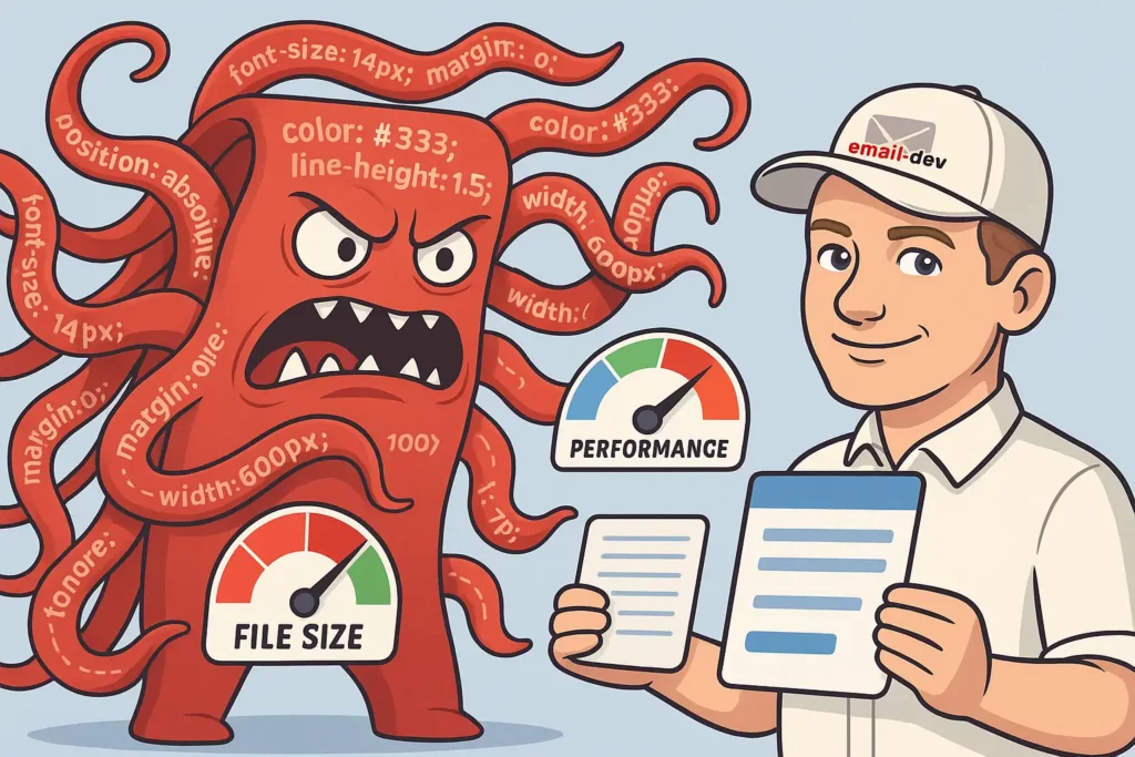
Your HTML file balloons to 300KB for what should be a simple promotional email.
Now you’ve got three new problems:
- Spam filters hate large emails. They don’t explicitly say “we penalize emails over 102KB,” but deliverability drops when your file size gets bloated with redundant inline styles.
- Nobody can maintain this. When your boss asks you to change the button color from blue to green, you have to find and replace that color in 47 different places. You will miss at least three of them.
- Mobile users on slow connections wait forever. A 300KB email on a 3G connection takes actual seconds to download. Most people don’t wait. They see a loading spinner and bail.
The worst part? Most of those inlined properties aren’t even doing anything. You’ve added margin: 0; to elements that don’t have margin. You’ve specified border: none; on things that don’t have borders. It’s like packing for a trip by bringing your entire closet just in case.
The Solution: strategic property prioritization
Focus your inlining efforts on properties that truly require it for cross-client compatibility:
<!-- BAD: Over-inlined -->
<td style="width: 300px; max-width: 300px; min-width: 300px; height: auto; min-height: 50px; max-height: none; padding: 15px 20px 15px 20px; padding-top: 15px; padding-right: 20px; padding-bottom: 15px; padding-left: 20px; margin: 0; margin-top: 0; margin-right: 0; margin-bottom: 0; margin-left: 0; border: none; border-top: none; border-right: none; border-bottom: none; border-left: none; background-color: #ffffff; background-image: none; background-repeat: no-repeat; background-position: top left; color: #333333; font-family: Arial, sans-serif; font-size: 16px; font-weight: normal; font-style: normal; text-align: left; text-decoration: none; line-height: 1.5; letter-spacing: normal; word-spacing: normal;">
    Content here
</td>

<!-- GOOD: Strategically inlined -->
<td style="padding: 15px 20px; background-color: #ffffff; color: #333333; font-family: Arial, sans-serif; font-size: 16px;">
    Content here
</td>
Priority-Based Inlining Framework
High Priority (Always Inline):
colorandbackground-colorfont-familyandfont-sizepadding(but notmargin)text-alignwidthfor table cells
Medium Priority (Inline for Problem Clients):
font-weightandline-heightborderpropertiesvertical-alignfor table cells
Low Priority (Usually Keep in <style>):
marginproperties (unreliable anyway)text-decorationletter-spacing- Default values that don’t need overriding
Mistake #3: ignoring email client-specific CSS requirements

The Problem: one-size-fits-all approach
Many developers apply the same CSS inlining strategy across all email clients, ignoring the unique requirements and limitations of specific platforms. This oversight leads to:
- Outlook rendering failures due to VML requirements
- Gmail mobile app layout breaks from unsupported properties
- Apple Mail dark mode issues from insufficient color scheme handling
- International client problems from advanced CSS features
The Solution: client-aware CSS inlining
Implement conditional CSS strategies that account for client-specific requirements:
<!--[if mso]>
<!-- Outlook-specific inlined styles -->
<td style="background-color: #f0f0f0; padding: 20px; font-family: Arial, sans-serif; font-size: 16px; color: #333333;">
<![endif]-->

<!--[if !mso]><!-->
<!-- Modern client styles with less aggressive inlining -->
<td style="background-color: #f0f0f0; padding: 20px;" class="modern-cell">
<!--<![endif]-->
    Content that works everywhere
<!--[if mso]>
</td>
<![endif]-->

<!--[if !mso]><!-->
</td>
<!--<![endif]-->
Client-Specific Inlining Strategies
For Outlook Desktop:
- Inline all background colors (background images require VML)
- Always inline font properties
- Inline table dimensions explicitly
- Use conditional comments for complex layouts
For Gmail (Web and Mobile):
- Inline critical layout properties
- Keep complex selectors in
<style>tags - Inline color properties for text and backgrounds
- Be conservative with advanced CSS features
For Apple Mail:
- Less aggressive inlining is acceptable
- Focus on dark mode color handling
- Inline properties that affect mobile rendering
- Leverage better CSS support for responsive features
For International/Legacy Clients:
- Maximum inlining approach
- Avoid any advanced CSS features
- Inline all typography and color properties
- Simplify layouts to basic table structures
Mistake #4: poor media query management in inlined styles

The Problem: breaking responsive behavior
Media queries can’t be inlined. This is a technical limitation, not a suggestion. Media queries only work inside <style> tags.
So when developers inline their base styles without thinking about responsive overrides, they create situations where the mobile media query tries to change width: 600px; to width: 100%; but can’t, because that 600px is stuck in an inline style attribute and inline styles have higher specificity than anything in a style tag.
Unless you add !important to your media query, which works but feels dirty and makes your CSS harder to debug later.
The other mistake is inlining properties that should only exist in media queries. Your mobile font size adjustment doesn’t need to be inlined. Your mobile padding override doesn’t need to be inlined. These are responsive-specific styles that only trigger at certain screen widths.
What you end up with is emails that look fine on desktop and broken on mobile, or vice versa. Sometimes both at the same time, which is almost impressive.
The Solution: responsive-aware inlining strategy
Develop a systematic approach that preserves responsive functionality while ensuring base compatibility:
<head>
    <style>
        /* Media queries must stay in style tags */
        @media screen and (max-width: 600px) {
            .responsive-table { width: 100% !important; }
            .mobile-padding { padding: 10px !important; }
            .mobile-text { font-size: 18px !important; }
        }
    </style>
</head>
<body>
    <!-- Base styles inlined, responsive overrides in media queries -->
    <table class="responsive-table" style="width: 600px; background-color: #ffffff;" role="presentation">
        <tr>
            <td class="mobile-padding mobile-text" style="padding: 20px; font-size: 16px; color: #333333;">
                Content adapts to screen size
            </td>
        </tr>
    </table>
</body>
Best Practices for Responsive CSS Inlining
Do Inline These for Mobile:
- Base font sizes (with mobile overrides in media queries)
- Default padding values (with responsive adjustments)
- Base table widths (with percentage overrides)
- Default text alignment
Don’t Inline These (Keep in Media Queries):
- Responsive width percentages
- Mobile-specific padding adjustments
- Font size changes for mobile
- Display property changes
Use !important Strategically:
<style>
    @media screen and (max-width: 600px) {
        .mobile-override {
            width: 100% !important;
            font-size: 18px !important;
        }
    }
</style>
The !important declaration ensures that media query styles override inlined properties when needed.
Mistake #5: manual inlining without automation tools

The Problem: Human Error and Inefficiency
Stop inlining CSS by hand. I know you’re probably doing it because it feels more controlled, or because you don’t want to learn a new tool, or because your workflow doesn’t have a build process yet.
Do it anyway.
Manual inlining is where mistakes hide. You’ll miss a property. You’ll typo a hex color. You’ll inline the wrong value and not notice until someone tests it in Outlook three days later. Every single email you hand-inline is a chance to mess something up, and you will eventually mess something up.
Automated inlining tools do the same thing every time. They don’t get tired. They don’t skip steps. They don’t decide that “this property probably doesn’t need to be inlined” based on a gut feeling.
Use Premailer if you want something open-source and customizable. Use Mailchimp’s CSS Inliner if you just need to paste and go. Use Litmus Builder if you’re working on a team and need the full professional setup with testing and collaboration.
The tool doesn’t matter as much as having a tool. Pick one and integrate it into your workflow so that inlining happens automatically before you send anything.
Your build process should be: write email with external CSS → run through inliner → test output → deploy. Not: write email → manually copy styles one by one → forget three styles → send → realize you forgot them when someone complains.
The Solution: automated CSS inlining pipeline
Implement a robust automation strategy using proven tools and workflows:
// Example using Gulp and Premailer
const gulp = require('gulp');
const premailer = require('gulp-premailer');

gulp.task('inline-css', function() {
    return gulp.src('templates/*.html')
        .pipe(premailer({
            baseUrl: 'https://your-domain.com',
            removeClasses: false,
            preserveMediaQueries: true,
            removeComments: true,
            stripImportant: false
        }))
        .pipe(gulp.dest('dist/'));
});
Top CSS Inlining Tools for 2025
Professional-Grade Tools:
- Litmus Builder – Industry-leading platform with automated inlining
- Real-time preview across 90+ email clients
- One-click CSS inlining with intelligent property selection
- ESP sync for seamless deployment
- Premailer – Open-source solution with extensive customization
- Preserves media queries automatically
- Configurable inlining rules
- Integration with major build systems
- Mailchimp CSS Inliner – Free tool that automatically inline your email’s CSS
- Simple paste-and-convert interface
- Preserves responsive media queries
- No registration required
Build System Integration:
// package.json example
{
  "scripts": {
    "build": "gulp inline-css && gulp test-emails",
    "dev": "gulp watch-templates"
  },
  "devDependencies": {
    "gulp": "^4.0.2",
    "gulp-premailer": "^0.1.0",
    "gulp-email-builder": "^3.0.0"
  }
}
Advanced Automation Strategies
Template-Based Workflow:
- Develop emails with external CSS during design phase
- Use automated inlining during build process
- Test inlined output across target email clients
- Deploy with confidence in cross-client compatibility
Quality Assurance Integration:
# Example GitHub Actions workflow
name: Email Build and Test
on: [push]
jobs:
  build:
    runs-on: ubuntu-latest
    steps:
      - uses: actions/checkout@v2
      - name: Install dependencies
        run: npm install
      - name: InlineCSS
        run: npm run inline-css
      - name: Test email rendering
        run: npm run test-litmus
The Strategic CSS Inlining Framework for 2026
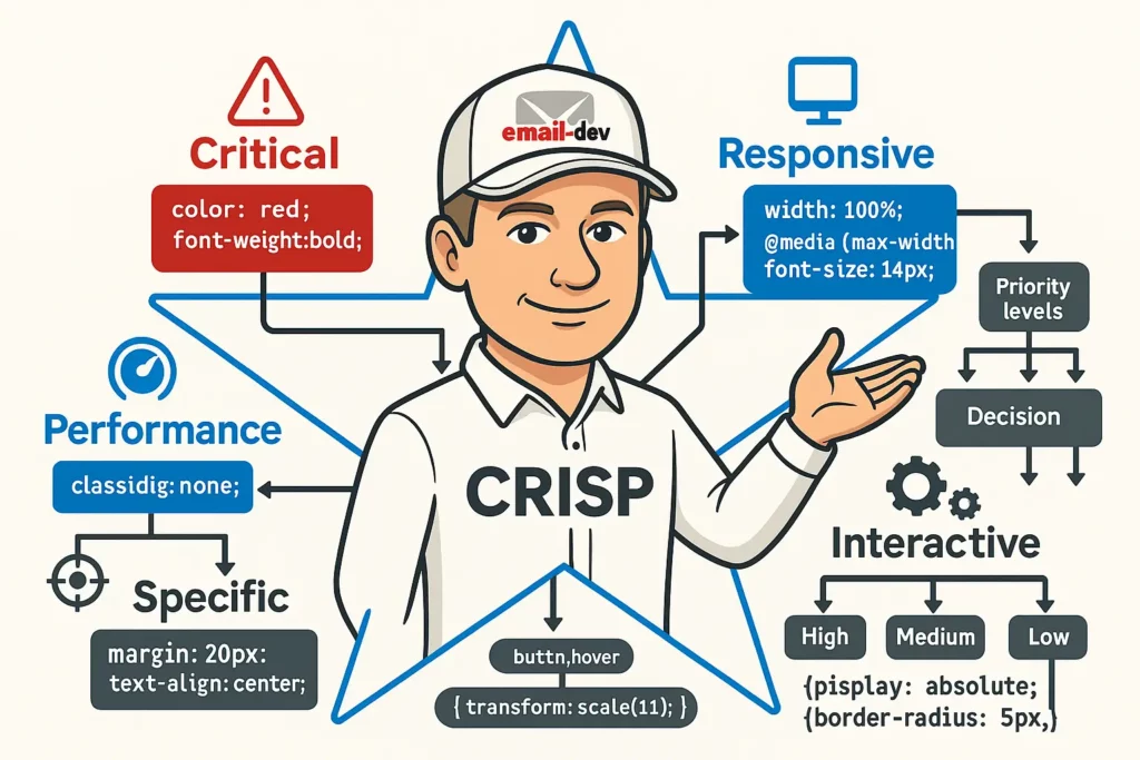
The CRISP Method for CSS Inlining
Implement the CRISP framework for systematic CSS inlining decisions:
C – Critical: Always inline properties essential for basic functionality R – Responsive: Keep responsive styles in media queries with inline base values I – Interactive: Preserve hover/focus states in style tags S – Specific: Use client-specific conditional inlining where needed P – Performance: Balance file size with compatibility requirements
Decision Matrix for CSS Properties
| Property | Inline Priority | Reasoning |
|---|---|---|
color | High | Essential for readability, widely stripped from style tags |
background-color | High | Critical for visual hierarchy, often stripped |
font-family | High | Typography fallbacks essential for brand consistency |
font-size | Medium | Important but can be overridden by media queries |
padding | Medium | Layout critical, but margin is unreliable anyway |
width (tables) | High | Essential for layout structure in email |
border | Medium | Important for Outlook compatibility |
text-align | Medium | Layout critical but well-supported in style tags |
line-height | Low | Good fallback support, can stay in style tags |
margin | Never | Unreliable in email, use padding instead |
Implementation Workflow
Phase 1: Analysis
- Audit your subscriber base for email client usage
- Identify the 3-5 most critical clients for your audience
- Document specific requirements for priority clients
Phase 2: Strategy
<!-- Base template with strategic inlining -->
<table style="width: 600px; background-color: #ffffff; font-family: Arial, sans-serif;" class="main-table">
    <tr>
        <td style="padding: 20px; color: #333333; font-size: 16px;" class="content-cell">
            <h1 style="color: #0066cc; font-size: 28px; margin: 0 0 20px 0;">Strategic Inlining</h1>
            <p style="line-height: 1.6; margin: 0 0 15px 0;">Content with optimal inlining balance.</p>
        </td>
    </tr>
</table>
Phase 3: Testing and Optimization
- Use automated testing to validate rendering
- Measure file size impact of inlining decisions
- A/B test engagement rates with different inlining strategies
Essential CSS Inlining Tools and Technologies

Professional Email Development Platforms
Litmus Builder: The gold standard for professional email development
- Automated CSS inlining with intelligent property detection
- Real-time testing across 90+ email clients
- ESP integration for streamlined deployment
- Collaborative features for team-based development
Email on Acid: Comprehensive testing and development suite
- CSS inlining capabilities integrated with testing
- Accessibility checking and dark mode validation
- Advanced analytics for email performance tracking
Open Source and Free Tools
Premailer: Robust open-source CSS inlining engine
# Command-line usage
premailer input.html --mode html --base-url https://example.com
Juice: Node.js library for CSS inlining
const juice = require('juice');
const inlined = juice(htmlString, {
    preserveMediaQueries: true,
    removeStyleTags: false
});
MailChimp CSS Inliner: Simple web-based tool
- Paste HTML, get inlined output
- Preserves media queries automatically
- No account required for basic usage
Build System Integration
Webpack Configuration:
// webpack.config.js
const HtmlWebpackPlugin = require('html-webpack-plugin');
const PremailerWebpackPlugin = require('premailer-webpack-plugin');

module.exports = {
  plugins: [
    new HtmlWebpackPlugin({
      template: 'src/email-template.html'
    }),
    new PremailerWebpackPlugin({
      baseUrl: 'https://your-cdn.com'
    })
  ]
};
Gulp Workflow:
const gulp = require('gulp');
const inlineCss = require('gulp-inline-css');

gulp.task('emails', function() {
    return gulp.src('src/*.html')
        .pipe(inlineCss({
            applyStyleTags: true,
            applyLinkTags: true,
            removeStyleTags: false,
            preserveMediaQueries: true
        }))
        .pipe(gulp.dest('dist/'));
});
Testing and Quality Assurance for Inlined CSS
Comprehensive Testing Strategy
Pre-Send Testing Checklist:
- [ ] Critical styles render correctly in Outlook 2016/2019
- [ ] Mobile layout functions properly in Gmail mobile app
- [ ] Dark mode appearance is acceptable in Apple Mail
- [ ] Text remains readable in high contrast mode
- [ ] File size is under 100KB for optimal deliverability
Email Client Testing Priorities
Based on current email client market share, focus testing efforts on:
- Gmail (Mobile App) – 30%+ of opens
- Apple Mail (iOS) – 25%+ of opens
- Outlook Desktop – 15%+ of opens
- Gmail (Web) – 10%+ of opens
- Apple Mail (Desktop) – 8%+ of opens
Automated Testing Implementation
// Example testing pipeline
const EmailTester = require('email-testing-suite');

async function testInlinedEmails() {
    const templates = await loadTemplates('dist/*.html');

    for (const template of templates) {
        const results = await EmailTester.test(template, {
            clients: ['gmail', 'outlook2019', 'apple-mail', 'outlook-mobile'],
            checks: ['css-support', 'responsive', 'accessibility']
        });

        console.log(`Template ${template.name}: ${results.score}/100`);
    }
}
Performance Testing
File Size Optimization:
# Measure impact of inlining decisions
du -h original-template.html inlined-template.html

# Target: Keep under 100KB for optimal deliverability
Load Time Analysis:
- Test email loading speed on 3G connections
- Measure rendering time in various email clients
- Optimize image sizes and CSS complexity accordingly
Advanced CSS Inlining Techniques for Professional Developers
Conditional Inlining Strategies
Client-Specific Property Handling:
<!--[if mso]>
<td style="background-color: #f0f0f0; padding: 20px; font-family: Arial, sans-serif;">
<![endif]-->

<!--[if !mso]><!-->
<td style="background: linear-gradient(to bottom, #f0f0f0, #e0e0e0); padding: 20px;" class="gradient-bg">
<!--<![endif]-->
    Content with different styling for different clients
<!--[if mso]>
</td>
<![endif]-->

<!--[if !mso]><!-->
</td>
<!--<![endif]-->
Dynamic CSS Inlining
Template-Based Approach:
// Advanced inlining with template variables
const inlineTemplate = (template, options) => {
    const criticalProperties = options.clientType === 'outlook'
        ? ['background-color', 'font-family', 'font-size', 'color', 'padding', 'width']
        : ['background-color', 'font-family', 'color'];

    return inlineCss(template, {
        inlineProperties: criticalProperties,
        preserveMediaQueries: true
    });
};
CSS Property Prioritization Algorithm
// Intelligent property selection based on client support
const prioritizeInlining = (property, clientSupport) => {
    const priorities = {
        'color': 1,                    // Always inline
        'background-color': 1,         // Always inline
        'font-family': 1,              // Always inline
        'font-size': 2,                // Usually inline
        'padding': 2,                  // Usually inline
        'line-height': 3,              // Sometimes inline
        'text-decoration': 4,          // Rarely inline
        'margin': 5                    // Never inline
    };

    const supportScore = clientSupport[property] || 0;
    return priorities[property] * supportScore;
};
Performance-Optimized Inlining
Selective Property Inlining:
<!-- Inline only what's necessary for each element -->
<table style="width: 600px; background-color: #ffffff;">
    <tr>
        <td style="padding: 20px; color: #333333;">
            <h1 style="color: #0066cc; font-size: 28px;">Title</h1>
            <p style="line-height: 1.6;">Content with minimal inlining</p>
        </td>
    </tr>
</table>
Future-Proofing Your CSS Inlining Strategy

Emerging Trends in Email Client Development
Improved CSS Support: Email clients are gradually adopting better CSS support, but the transition is slow and uneven. Future strategies should account for:
- Progressive Enhancement: Build base functionality with inlined CSS, enhance with embedded styles
- Client Detection: Implement smart inlining based on subscriber client data
- Responsive-First Design: Prioritize mobile experience in all inlining decisions
2025 CSS Inlining Best Practices
Hybrid Approach Dominance: The future belongs to intelligent hybrid strategies that combine the reliability of inline CSS with the efficiency of embedded styles.
Automation Integration: Manual CSS inlining will become obsolete as build processes and AI-assisted tools handle optimization automatically.
Performance Focus: With email file size becoming increasingly important for deliverability, strategic inlining will balance compatibility with performance.
Technology Recommendations
Development Stack for 2025:
{
  "css-inlining": {
    "primary": "premailer-api",
    "fallback": "juice",
    "testing": "litmus-api"
  },
  "build-process": {
    "bundler": "webpack",
    "task-runner": "gulp",
    "testing": "jest + puppeteer"
  },
  "quality-assurance": {
    "rendering": "email-on-acid-api",
    "accessibility": "axe-core",
    "performance": "lighthouse"
  }
}
Skills Development Roadmap
Essential Competencies for Email Developers:
- CSS Specificity Mastery: Understanding how inline styles interact with embedded CSS
- Email Client Architecture: Deep knowledge of rendering engines and their limitations
- Automation Tools: Proficiency with build systems and CSS processing tools
- Testing Methodologies: Systematic approaches to cross-client validation
- Performance Optimization: Balancing functionality with file size and load speed
Mastering CSS Inlining for Email Success

CSS inlining remains one of the most critical yet misunderstood aspects of professional email development. The five mistakes outlined in this guide — over-relying on embedded CSS, inlining everything, ignoring client-specific requirements, breaking responsive behavior, and manual processing — are collectively costing the email marketing industry millions in lost conversions and damaged brand relationships.
The solution isn’t to abandon CSS inlining or to go to the opposite extreme of inlining everything. Instead, successful email developers in 2025 will master the art of strategic, intelligent CSS inlining that:
Prioritizes Critical Properties: Focus inlining efforts on CSS properties that truly require it for cross-client compatibility, such as colors, typography, and layout-critical dimensions.
Embraces Automation: Leverage professional tools and build processes to eliminate human error and improve consistency across email campaigns.
Accounts for Client Diversity: Implement conditional strategies that address the unique requirements of different email clients without sacrificing overall efficiency.
Preserves Responsive Functionality: Maintain mobile optimization through careful coordination between inlined base styles and media query overrides.
Balances Performance and Compatibility: Make informed decisions about what to inline based on your specific audience and their email client usage patterns.
As email continues to deliver the highest ROI of any digital marketing channel, the technical quality of your email rendering becomes increasingly important. With mobile clients accounting for 41.6% of email opens and 42.3% of users deleting emails that aren’t optimized for mobile devices, mastering CSS inlining isn’t just a technical nicety — it’s a business imperative.
The most successful email marketers in 2025 will be those who understand that CSS inlining is not a binary choice between “inline everything” or “inline nothing.” Instead, it’s a nuanced discipline that requires understanding your audience, leveraging the right tools, and implementing systematic processes that ensure consistent, professional results across all email clients.
By avoiding the five critical mistakes outlined in this guide and implementing the strategic frameworks provided, you’ll not only improve your email rendering quality but also streamline your development process, reduce maintenance overhead, and ultimately drive better engagement and conversion rates from your email campaigns.
Remember: every broken email that reaches a subscriber’s inbox is a missed opportunity to build trust, drive revenue, and strengthen your brand relationship. In a world where consumers receive hundreds of emails per week, the brands that invest in technical excellence will be the ones that stand out, engage effectively, and win in the inbox.
Take action: implement your CSS inlining strategy today
CSS inlining in email is weird because email itself is weird. You’re writing HTML that renders in 40+ different environments, none of which agree on what CSS properties they should support, and some of which are actively hostile to modern web standards.
Inline your colors. Inline your typography. Inline your layout widths. Keep your media queries in style tags. Don’t inline everything just to be safe. Don’t assume embedded CSS works everywhere just because it works in Gmail.
Test your emails in at least five clients before you send them to anyone. Use automated tools so you’re not doing this manually every single time. And when something breaks in a client you’ve never heard of, don’t be surprised—just figure out what property caused it and adjust.
Email development is not like web development. The rules are different, the constraints are tighter, and the clients are less forgiving. But once you understand which properties need inlining and which ones don’t, you can build emails that work everywhere without losing your mind in the process.
Most email developers learn this through trial and error. You just learned it faster.
About the Author: This comprehensive guide represents extensive research into current email development best practices, drawing from industry reports by Litmus, Email on Acid, Campaign Monitor, and other leading email technology providers. The strategies outlined here are based on real-world testing across hundreds of email campaigns and dozens of email clients.
Additional Resources:
