
If you have ever opened an email on your phone and watched the layout fall apart – text the size of a stamp, a button cut in half, a hero image stretched into a smear – you have already experienced why HTML email coding is its own discipline. Not “web development for email.” Its own thing. With its own rules, its own broken parts, and its own quietly furious community of developers keeping the whole channel upright.
The numbers, briefly, because they justify the effort. Email still pulls roughly $36 in return for every $1 spent according to Litmus, which is a figure most other channels would mortgage a kidney for. Statista puts daily email users at around 4.5 billion. And inside that channel, the thing that actually decides whether your campaign reads as “professional” or “what year is this” is the HTML email itself – the markup, the inline styles, the table-within-a-table-within-a-table that somehow has to look identical in Gmail web, Outlook 2019 desktop, Apple Mail on iOS, and that one stubborn user still on Outlook for Mac 2016.
This guide is the one I wish I had when I started. It is also the one I keep tabs open to now, because I forget the VML syntax for buttons more often than I would like to admit.
- Why HTML email coding still matters (more than it should, frankly)
- What “broken HTML email” actually costs you
- Essential HTML email coding foundations
- The skeleton you start every HTML email with
- How HTML email is different from web development
- The HTML email development toolkit
- Code editors
- Testing platforms
- Frameworks – which to use, and when not to
- A step-by-step HTML email tutorial
- Step 1 – the basic structure
- Step 2 – the header
- Step 3 – the main content + a button that survives Outlook
- Step 4 – the footer
- Cross-client compatibility: the ugly parts
- Outlook (classic) – specific fixes
- VML for Outlook backgrounds
- The Gmail mobile fix
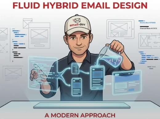
- Responsive design for HTML email
- Mobile-first base styles
- Media queries that actually do work
- Fluid images
- Stacking columns on mobile
- Troubleshooting common HTML email rendering issues
- Images aren’t showing up
- Text rendering looks different across clients
- Spacing is inconsistent
- Dark mode optimization for HTML email
- Meta tags
- Dark mode media queries
- Logos in dark mode
- Advanced HTML email coding techniques
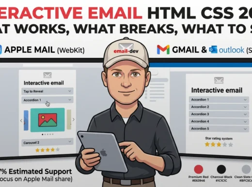
- Interactive emails using only CSS
- AMP for email (where it’s supported)
- CSS animation in HTML email
- HTML email accessibility – and yes, it matters
- Semantic structure
- Alt text that does work
- Link text
- Color contrast
- Testing and QA – the part everyone underdoes
- A workable testing flow
- What to actually verify
- Per-client trouble spots
- HTML email resources, templates, and where to get help
- Frameworks worth knowing
- Starter templates
- Community
- Future-proofing your HTML email skills
- A note before you ship
Why HTML email coding still matters (more than it should, frankly)

Here is what makes HTML email development a different sport than building websites.
Browsers, for all their differences, broadly converged on web standards. Chrome, Safari, Firefox, Edge – they argue at the margins, but a <div> with flexbox in 2026 will behave largely the same across them. Email clients did not get that memo. There are dozens in active use, and each one has decided what to do with your code based on its own internal rules, its parent company’s priorities, and in some cases technology that is older than several of my colleagues.
The biggest offender, predictably, is classic Outlook for Windows. It uses Microsoft Word as its rendering engine. Word. The thing you type letters in. This dates back to Outlook 2007, which means we are working with rendering tech that is approaching its 20th birthday. No flexbox. No grid. Background images? Sort of, if you wrap them in VML, which is a Microsoft markup language so deprecated it has cobwebs. CSS that other clients chew through without breathing – things like border-radius, padding on a <div>, modern selectors – either gets ignored or rendered into something nobody asked for.
Now, the good news. Microsoft is sunsetting support for Word-engine Outlook desktop in October 2026, and the new Outlook for Windows – which is Chromium-based, similar to Outlook.com under the hood – has been rolling out automatically to Microsoft 365 Business Standard and Premium customers since January 6, 2025. Enterprise users are scheduled to follow by April 2026. Classic Outlook is officially supported through 2029 for those who pause the migration, so the overlap is real and it is going to last a few years.
Translation: 2025 and 2026 are peak dual-Outlook pain. You are coding for both engines simultaneously. The conditional comments and ghost tables and VML buttons that look ridiculous still need to be in your templates because a meaningful chunk of your audience is on classic Outlook. Meanwhile, those same workarounds are essentially harmless legacy scaffolding inside the new Outlook, which does not even read MSO conditional comments. Two emails in one file. We do this for fun, apparently.
What “broken HTML email” actually costs you
People underestimate this until it happens to them. A few things that have measurable business consequences:
- Around half of users will delete an email outright if it does not render well on mobile (the figure floats between 42% and 50% depending on which year’s survey you look at – the point is, it is a lot).
- Reputation damage is fuzzier to measure but real. Your subscriber list does not forget receiving a campaign that looked like a Geocities accident.
- Rendering bugs eat conversion. A misaligned button on iOS Mail is functionally a button that does not exist. You don’t need a stat for that.
I once spent a Tuesday afternoon debugging a sales-launch email that looked fine in Gmail web, fine in Apple Mail, and in classic Outlook had decided that the entire CTA section was now floating off to the right of the email canvas. Four hours. Turned out it was a single empty <td> deep inside a nested table. Email development is, in part, the practice of being humbled by things you would never accept in a real codebase.
Essential HTML email coding foundations

Right – let’s get into the actual structure. An HTML email is closer to a fossil than a modern web page, structurally. We use tables for layout. Yes, tables. The thing you were told never to use in CSS class fifteen years ago. Get comfortable with it.
The skeleton you start every HTML email with
<!DOCTYPE html>
<html lang="en" xmlns="http://www.w3.org/1999/xhtml" xmlns:v="urn:schemas-microsoft-com:vml" xmlns:o="urn:schemas-microsoft-com:office:office">
<head>
    <meta charset="utf-8">
    <meta name="viewport" content="width=device-width, initial-scale=1.0">
    <meta http-equiv="X-UA-Compatible" content="IE=edge">
    <meta name="format-detection" content="telephone=no, date=no, address=no, email=no">
    <meta name="x-apple-disable-message-reformatting">
    <meta name="color-scheme" content="light dark">
    <meta name="supported-color-schemes" content="light dark">
    <title>Your email title</title>
    <!--[if mso]>
    <xml>
        <o:OfficeDocumentSettings>
            <o:AllowPNG/>
            <o:PixelsPerInch>96</o:PixelsPerInch>
        </o:OfficeDocumentSettings>
    </xml>
    <style>
        table {border-collapse:collapse;border-spacing:0;border:none;margin:0;}
        div, td {padding:0;}
        div {margin:0 !important;}
    </style>
    <noscript>
    <![endif]-->
    <style>
        body {
            margin: 0;
            padding: 0;
            width: 100% !important;
            -webkit-text-size-adjust: 100%;
            -ms-text-size-adjust: 100%;
        }
        @media screen and (max-width: 600px) {
            .responsive-table { width: 100% !important; }
            .mobile-padding { padding: 10px 5% !important; }
        }
    </style>
</head>
<body style="margin: 0; padding: 0; background-color: #f6f6f6; font-family: Arial, sans-serif;">
    <div style="display: none; max-height: 0; overflow: hidden;">
        Preheader text - around 85-100 characters works best
    </div>
    <table border="0" cellpadding="0" cellspacing="0" width="100%" role="presentation">
        <tr>
            <td align="center" bgcolor="#f6f6f6" style="padding: 20px 0;">
                <table class="responsive-table" border="0" cellpadding="0" cellspacing="0" width="600" role="presentation">
                    <!-- content rows go here -->
                </table>
            </td>
        </tr>
    </table>
</body>
</html>
A few things that boilerplate is doing, in case you are tempted to delete the bits you don’t recognize (don’t):
- The XML namespaces in
<html>are there so Outlook understands the VML you’ll feed it later for buttons and background images. - The
msoconditional comments give Outlook its own little side-room to behave in. Other clients ignore the contents entirely. x-apple-disable-message-reformattingstops iOS Mail from auto-zooming your email in ways you did not approve.- The preheader
<div>is hidden visually but shows up in inbox previews, which has a non-trivial effect on open rates. Use it. Don’t waste it on “View this email in your browser.”
How HTML email is different from web development
| Web | HTML email |
|---|---|
| Semantic HTML5 | Tables, mostly |
| External CSS | Inline styles (most clients ignore <style> blocks or strip them) |
| JavaScript | None. Pretend it does not exist |
| Flexbox / Grid | Absolutely not – in classic Outlook, anyway |
| Modern CSS properties | Wildly inconsistent support |
| Media queries | Apple Mail fully, others partially, classic Outlook desktop not at all |
That last row is the one that bites people. Classic Outlook for Windows does not need media queries because it is not responsive at all – it just renders at whatever fixed width you set. So your strategy has to be hybrid: build a base layout that already works at any reasonable width using percentage widths and max-width, then layer media queries on top for the clients (Apple Mail fully; Gmail, Outlook for Mac, Outlook for iOS/Android, Outlook.com partially) that will use them. A two-column block that stacks on mobile? Totally doable. You just orchestrate it with conditional tables and stack-on-mobile patterns and test it in roughly twelve places.
The HTML email development toolkit

You can technically do this in Notepad. Please don’t.
Code editors
VS Code is the practical default. Useful extensions:
- Email Boilerplate – drops in starter templates so you stop pasting from your last project.
- HTML Email Preview – quick sanity check before you upload anywhere.
- Emmet – already built into VS Code; saves you from typing
<table><tr><td>two thousand times a week. - Prettier – because email HTML gets ugly fast and you’ll want it consistent.
Sublime Text and similar editors work fine too. Whichever lets you type quickly without fighting auto-format on conditional comments.
Testing platforms
This is where I am going to be opinionated.
- Litmus – industry standard. Renders across 100+ clients. Spam testing, accessibility checks, the works. Expensive. Worth it if email is your job.
- Email on Acid (now Sinch) – close competitor, broadly comparable feature set, sometimes a better deal.
- Mailtrap, Testi@ – cheaper options for solo developers and small teams. Fewer client previews, but enough to catch the obvious horrors.
Real talk: previewing your email by sending it to your own Gmail is not testing. It tells you how it looks in your Gmail. That’s it. If you send commercial campaigns, get a real testing tool. The afternoon you save the first time something fails will pay for the subscription.
Frameworks – which to use, and when not to
- MJML – the most popular abstraction layer. You write higher-level tags, it compiles to bulletproof HTML email. Saves time. Great for projects with lots of templates.
- Foundation for Emails – Zurb’s framework, more “responsive grid for email” in style. Solid, mature, slightly more verbose.
- Maizzle – Tailwind-flavored email framework. If you already think in utility classes, this will feel natural.
Frameworks are not magic. They generate code, and that code still needs testing. I have seen MJML produce output that broke in a specific Outlook version because of a recent change to one of its components. Don’t outsource the QA step to the abstraction.
A step-by-step HTML email tutorial
Building a small but production-defensible template, piece by piece.
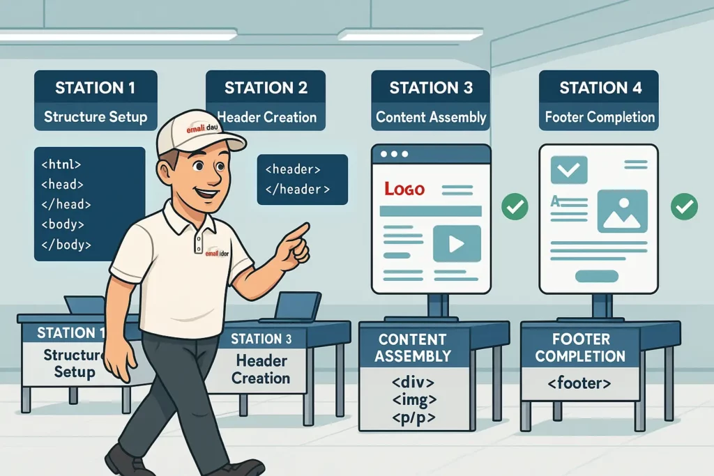
Step 1 – the basic structure
Same as the boilerplate above. Save it as index.html. Set the title to something meaningful – it shows up in some preview contexts.
Step 2 – the header
<!-- Header -->
<tr>
    <td bgcolor="#ffffff" style="padding: 24px 30px; border-radius: 8px 8px 0 0;">
        <table border="0" cellpadding="0" cellspacing="0" width="100%" role="presentation">
            <tr>
                <td align="center">
                    <img src="https://your-cdn.com/logo.png" alt="Company name" width="180" style="display: block; border: 0; height: auto;" />
                </td>
            </tr>
        </table>
    </td>
</tr>
Note the display: block on the image. Without it, some clients add a few mystery pixels of whitespace under inline images. It will haunt you.
Step 3 – the main content + a button that survives Outlook
<!-- Main content -->
<tr>
    <td bgcolor="#ffffff" style="padding: 24px 30px;">
        <table border="0" cellpadding="0" cellspacing="0" width="100%" role="presentation">
            <tr>
                <td class="mobile-text" style="font-family: Arial, sans-serif; font-size: 18px; color: #333333; padding-bottom: 16px;">
                    Hello there,
                </td>
            </tr>
            <tr>
                <td class="mobile-text" style="font-family: Arial, sans-serif; font-size: 16px; line-height: 24px; color: #555555; padding-bottom: 24px;">
                    Welcome to a small but reasonably bulletproof HTML email template. Keep your message focused. One CTA per email is almost always the right call.
                </td>
            </tr>
            <tr>
                <td align="center" style="padding: 8px 0 24px;">
                    <table border="0" cellpadding="0" cellspacing="0" role="presentation">
                        <tr>
                            <td align="center" bgcolor="#2563eb" style="border-radius: 4px;">
                                <!--[if mso]>
                                <v:roundrect xmlns:v="urn:schemas-microsoft-com:vml" xmlns:w="urn:schemas-microsoft-com:office:word" href="https://example.com" style="height:44px;v-text-anchor:middle;width:220px;" arcsize="9%" stroke="f" fillcolor="#2563eb">
                                <w:anchorlock/>
                                <center style="color:#ffffff;font-family:Arial,sans-serif;font-size:16px;font-weight:bold;">
                                <![endif]-->
                                <a href="https://example.com" target="_blank" style="display: inline-block; padding: 12px 24px; font-family: Arial, sans-serif; font-size: 16px; color: #ffffff; text-decoration: none; border-radius: 4px; background-color: #2563eb; font-weight: bold;">Click me</a>
                                <!--[if mso]>
                                </center>
                                </v:roundrect>
                                <![endif]-->
                            </td>
                        </tr>
                    </table>
                </td>
            </tr>
        </table>
    </td>
</tr>
That <v:roundrect> block is VML – the Office-specific markup that classic Outlook actually understands. Without it, Outlook strips your border-radius and gives you a flat rectangle, which, fine, but the bigger problem is that styled <a> tags don’t always render the full clickable area in classic Outlook. The VML version gives Outlook a real button. Other clients ignore the entire MSO block.
Step 4 – the footer
<!-- Footer -->
<tr>
<td bgcolor="#f0f0f0" style="padding: 20px 30px; border-radius: 0 0 8px 8px;">
<table border="0" cellpadding="0" cellspacing="0" width="100%" role="presentation">
<tr>
<td style="font-family: Arial, sans-serif; font-size: 13px; color: #888888; text-align: center; line-height: 20px;">
© 2026 Your Company. All rights reserved.<br><br>
<a href="https://example.com/unsubscribe" style="color: #888888; text-decoration: underline;">Unsubscribe</a>
</td>
</tr>
</table>
</td>
</tr>
Functional unsubscribe link, copyright, done. Keep the footer light. This is not the place to add a sixth call-to-action.
Cross-client compatibility: the ugly parts

This is the section where I get genuinely irritated, and you should let me have it.
Outlook (classic) – specific fixes
The conditional table wrapper, for layouts that use modern CSS while still giving Outlook something to render:
<!--[if mso]>
<table border="0" cellpadding="0" cellspacing="0" width="100%">
<tr>
<td width="600">
<![endif]-->

<div style="max-width: 600px; margin: 0 auto;">
    <!-- content -->
</div>

<!--[if mso]>
</td>
</tr>
</table>
<![endif]-->
Other clients see the <div>. Outlook sees the table. Everyone leaves the room satisfied.
VML for Outlook backgrounds
Want a hero section with a background image? In every modern client, that is one CSS line. In classic Outlook, you need this:
<!--[if mso]>
<v:rect xmlns:v="urn:schemas-microsoft-com:vml" fill="true" stroke="false" style="width:600px;height:400px;">
<v:fill type="tile" src="https://your-cdn.com/background.jpg" color="#333333" />
<v:textbox inset="0,0,0,0">
<![endif]-->

<div style="background-image: url('https://your-cdn.com/background.jpg'); background-position: center; background-repeat: no-repeat; background-size: cover; height: 400px;">
    <!-- content -->
</div>

<!--[if mso]>
</v:textbox>
</v:rect>
<![endif]-->
Yes, you’re declaring the dimensions twice. The VML version requires fixed pixel widths. And yes, it is annoying. Welcome to email.
One thing worth saying out loud: the new Outlook for Windows ignores MSO conditional comments entirely. So this VML scaffolding is invisible to it – which is great, the new Outlook will use the modern CSS version – but it also means you cannot rely on the [if mso] block to target only “Outlook.” During the 2025-2026 overlap period, that block specifically targets classic Outlook. Test both versions separately.
The Gmail mobile fix
Gmail’s mobile app sometimes collapses tables on narrow viewports in a way that wrecks layouts. The fix is one of those snippets that looks insane and works:
<div style="display: none; white-space: nowrap; font: 15px courier; line-height: 0;"> </div>
It does not show and it’s not for the user. It is a hint to Gmail’s renderer. I do not love that this is a thing, but it works.
Responsive design for HTML email

Responsive emails get better engagement than non-responsive ones. The exact uplift depends on whose study you read, but the direction is uncontroversial – mobile reads dominate, mobile reads need mobile layouts, and broken mobile layouts get deleted. Litmus has reported lifts in the 25-30% range on click-throughs after responsive optimization, which sounds high until you remember that the alternative is people pinch-zooming.
Mobile-first base styles
<style>
    .container {
        width: 100%;
        max-width: 375px;
    }
    @media screen and (min-width: 600px) {
        .container { max-width: 600px; }
    }
</style>
Media queries that actually do work
<style>
    @media screen and (max-width: 600px) {
        .mobile-full-width { width: 100% !important; max-width: 100% !important; }
        .mobile-padding { padding: 10px !important; }
        .mobile-center { text-align: center !important; }
        .mobile-hide { display: none !important; }
        .mobile-show {
            display: block !important;
            width: auto !important;
            max-height: inherit !important;
            overflow: visible !important;
        }
        .mobile-text { font-size: 16px !important; line-height: 24px !important; }
    }
</style>
The !important flags are not a code-smell here – they are necessary to override the inline styles that you are required to use everywhere else in the email. Email development inverts a lot of normal CSS hygiene. Let it.
Fluid images
<img src="https://your-cdn.com/hero.jpg" width="600" style="width: 100%; max-width: 600px; height: auto; display: block; border: 0;" alt="Descriptive text" />
Stacking columns on mobile
<!--[if mso]>
<table role="presentation" width="100%">
<tr>
<td width="50%" valign="top">
<![endif]-->
<div style="display: inline-block; width: 100%; max-width: 300px; vertical-align: top;">
    <!-- column 1 -->
</div>
<!--[if mso]>
</td>
<td width="50%" valign="top">
<![endif]-->
<div style="display: inline-block; width: 100%; max-width: 300px; vertical-align: top;">
    <!-- column 2 -->
</div>
<!--[if mso]>
</td>
</tr>
</table>
<![endif]-->
The inline-block approach lets the columns wrap automatically when the container shrinks. Outlook gets its fixed table. Everyone else gets the fluid version.
Troubleshooting common HTML email rendering issues

Images aren’t showing up
A few causes, in rough order of how often I see them:
- The image is hosted somewhere that blocks hotlinking, or behind authentication, or on
localhostbecause someone forgot to swap URLs before sending. Use a real CDN. - No
alttext, so when images are blocked (Outlook blocks by default until the user opts in), the user sees nothing instead of a placeholder. - Missing
widthandheightattributes, which Outlook handles especially badly. - Layout-killing whitespace because
display: blockwas forgotten.
<img src="https://your-cdn.com/image.jpg" width="600" height="300" style="display: block; border: 0; width: 100%; max-width: 600px; height: auto;" alt="Specific, descriptive alt text" />
Text rendering looks different across clients
<p style="font-family: Arial, 'Helvetica Neue', Helvetica, sans-serif; font-size: 16px; line-height: 1.5; color: #333333; margin: 0;">Your text</p>
Stick to web-safe fonts as the primary stack. Web fonts work in Apple Mail, mostly in iOS and Android Mail, partially in Gmail (depending on context), and not at all in classic Outlook. Use a careful fallback chain. Don’t skip line-height – some clients will assign their own otherwise, and it will not be the line-height you wanted.
Spacing is inconsistent
<table border="0" cellpadding="0" cellspacing="0" width="100%" role="presentation">
    <tr>
        <td style="padding: 20px 30px;">Content</td>
    </tr>
</table>
Use padding on <td> cells. Avoid margin – support is a coin flip in older clients. If you absolutely need vertical breathing room between blocks, use spacer rows with explicit heights. Tedious, reliable.
Dark mode optimization for HTML email

Dark mode is no longer a niche concern. Roughly half of users have it on at least sometimes, and Apple Mail, iOS Mail, and Outlook all do their own automatic color shifts when they think a section needs it. That “automatic” part is the problem – clients sometimes invert colors you wanted to stay put, especially logos.
Meta tags
<meta name="color-scheme" content="light dark">
<meta name="supported-color-schemes" content="light dark">
Dark mode media queries
<style>
    :root {
        color-scheme: light dark;
        supported-color-schemes: light dark;
    }
    @media (prefers-color-scheme: dark) {
        .dark-mode-bg { background-color: #1a1a1a !important; }
        .dark-mode-text { color: #f1f1f1 !important; }
        .dark-mode-invert { filter: invert(1) !important; }
    }
</style>
Apple Mail and iOS Mail respect prefers-color-scheme. Gmail does its own thing. Outlook desktop does its own thing too, often shifting dark backgrounds toward gray and ignoring your preferences entirely. There is no clean fix. Test, accept some imperfection, move on.
Logos in dark mode
The classic dark-mode bug: your dark logo on a white background gets auto-inverted into a white logo on a dark background, except the inversion mangles your brand color or makes the wordmark look wrong. The fix is to swap logos based on color scheme:
<div style="display: block; width: 100%; max-width: 200px; margin: 0 auto;">
    <!--[if !mso]><!-->
    <div class="dark-mode-hide" style="display: block;">
        <img src="https://your-cdn.com/logo-light.png" width="200" style="width: 100%; max-width: 200px; height: auto; display: block; border: 0;" alt="Logo" />
    </div>
    <div class="dark-mode-show" style="display: none;">
        <img src="https://your-cdn.com/logo-dark.png" width="200" style="width: 100%; max-width: 200px; height: auto; display: block; border: 0;" alt="Logo" />
    </div>
    <!--<![endif]-->
    <!--[if mso]>
    <img src="https://your-cdn.com/logo-light.png" width="200" style="width:200px;height:auto;display:block;border:0;" alt="Logo" />
    <![endif]-->
</div>
Then in your <style>:
@media (prefers-color-scheme: dark) {
    .dark-mode-hide { display: none !important; }
    .dark-mode-show { display: block !important; }
}
Caveat: this technique is most reliable in Apple Mail and iOS Mail. Gmail and Outlook desktop will likely do their own auto-conversion regardless. Sometimes you accept that your logo will be slightly off in some inboxes. Choose your battles.
Advanced HTML email coding techniques

Interactive emails using only CSS
JavaScript is dead on arrival in email. CSS pseudo-classes can fake interactivity in clients that support them – mostly Apple Mail and iOS Mail.
<style>
    .accordion-content {
        max-height: 0;
        overflow: hidden;
        transition: max-height 0.3s ease-out;
    }
    .accordion-trigger:active + .accordion-content,
    .accordion-trigger:focus + .accordion-content {
        max-height: 200px;
    }
</style>

<div class="accordion">
    <a href="#" class="accordion-trigger" style="display: block; text-decoration: none; padding: 15px; background-color: #f9f9f9; color: #333333; font-weight: bold;">Click to expand</a>
    <div class="accordion-content" style="background-color: #ffffff; padding: 0 15px;">
        <p style="font-family: Arial, sans-serif; font-size: 14px; line-height: 1.5;">Content appears in supported clients.</p>
    </div>
</div>
In clients that don’t support it, the content just sits there. Plan the fallback so the email still makes sense without the interaction. This is non-negotiable.
AMP for email (where it’s supported)
AMP for email lets you embed real interactive components – carousels, forms, live data – directly inside the email. Gmail supports it. Yahoo Mail supports it. Mail.ru supports it. Apple Mail does not. Outlook does not. So AMP is an enhancement layer, not a foundation. You always send the HTML fallback alongside.
<!doctype html>
<html ⚡4email>
<head>
    <meta charset="utf-8">
    <script async src="https://cdn.ampproject.org/v0.js"></script>
    <style amp4email-boilerplate>body{visibility:hidden}</style>
</head>
<body>
    <amp-carousel width="600" height="400" layout="responsive" type="slides">
        <amp-img src="image1.jpg" width="600" height="400" layout="responsive" alt="Image 1"></amp-img>
        <amp-img src="image2.jpg" width="600" height="400" layout="responsive" alt="Image 2"></amp-img>
    </amp-carousel>
</body>
</html>
You also have to register your sending domain with Google before AMP emails are accepted. Worth it for high-volume senders, overkill for most.
CSS animation in HTML email
<style>
    @keyframes pulse {
        0% { transform: scale(1); }
        50% { transform: scale(1.05); }
        100% { transform: scale(1); }
    }
    .animate-pulse { animation: pulse 2s infinite ease-in-out; }
</style>

<a href="https://example.com" class="animate-pulse" style="display: inline-block; padding: 12px 24px; background-color: #2563eb; color: #ffffff; text-decoration: none; border-radius: 4px;">Shop now</a>
Animations work in Apple Mail and iOS Mail, partially in Outlook for Mac, and basically nowhere in classic Outlook desktop or Gmail. Use them for delight, not for anything functional. A pulsing button is fine; a button that is only visible because of animation is not.
HTML email accessibility – and yes, it matters

Accessibility in email is sometimes treated as nice-to-have. It is not. Beyond ethics, several jurisdictions have legal requirements for accessible commercial communication, and the trend is more enforcement, not less. The Email Markup Consortium’s 2025 audit found roughly 99% of HTML emails contain accessibility issues classified “serious” or “critical.” That is a damning number, and most of the fixes are not hard.
Semantic structure
Emails don’t always render real <h1> elements consistently across clients, but ARIA roles travel well:
<div role="heading" aria-level="1" style="font-size: 24px; font-weight: bold; color: #333333;">Headline</div>
<div role="heading" aria-level="2" style="font-size: 20px; font-weight: bold; color: #333333;">Subhead</div>
Alt text that does work
<img src="https://your-cdn.com/banner.jpg" alt="Summer sale - 30% off all products until July 31" width="600" style="width: 100%; max-width: 600px; height: auto; display: block; border: 0;" />
If the image is purely decorative, use alt="" and role="presentation" so screen readers skip it. If it carries information – the offer, the deadline, the brand – put that information in alt text. “Image” is not alt text. “Logo” barely is.
Link text
<!-- Bad -->
<a href="https://example.com">Click here</a>

<!-- Good -->
<a href="https://example.com">View our summer collection</a>
Screen readers can pull a list of all links in an email out of context. “Click here, click here, click here” is useless. Descriptive link text is also better for plain readability.
Color contrast
WCAG 2.1 AA requires minimum 4.5:1 contrast for normal text and 3:1 for large text (18pt+). Run your colors through a contrast checker before signing off. Brand grays often fail, especially in dark mode where automatic color shifts can make things worse.
Testing and QA – the part everyone underdoes

A workable testing flow
- Write and visually preview in a modern browser to catch obvious structural issues.
- Send to a testing tool – Litmus, Email on Acid, whatever you have.
- Specifically look at: classic Outlook (desktop, 2016/2019/2021), the new Outlook for Windows, Gmail web, Gmail mobile (Android and iOS – they differ), Apple Mail desktop, iPhone Mail, Outlook.com, and Yahoo Mail. Yes, that is a long list. Yes, you skip it at your own risk.
- Fix what’s broken. Specifically. Don’t fix in a way that breaks something else. Test again.
- Run a spam check before going live. Authentication, link reputation, image-to-text ratio, the works.
What to actually verify
- Typography rendering (font fallbacks, line heights)
- All images displaying with proper alt text fallbacks
- Every link is clickable and goes to the right URL
- Layout integrity at 320px, 375px, 600px, and full desktop widths
- Dark mode appearance, especially logos and CTAs
- Total file size and load time (most clients clip emails over ~102KB – Gmail is the strictest here)
- Plain-text version of the email (yes, you should have one – many ESPs auto-generate, but auto-generated is often awful)
Per-client trouble spots
| Client | What breaks most often |
|---|---|
| Classic Outlook desktop | Background images, button rendering, padding on divs, gaps between cells at certain Windows DPI settings |
| New Outlook for Windows | Behaves like Outlook.com, so different bugs – flexbox sometimes works, MSO comments are ignored |
| Gmail web | CSS stripping in <head>, promotions tab placement, image caching |
| Apple Mail | Fewest issues; mostly dark mode quirks |
| iPhone Mail | Tap target sizing, zoom-on-load, link auto-detection on phone numbers |
| Outlook.com | Inconsistent CSS support; close to but not identical to new Outlook for Windows |
That last point trips people up. “New Outlook for Windows is similar to Outlook.com” is a useful starting point and an unreliable conclusion. Test both.
HTML email resources, templates, and where to get help

Frameworks worth knowing
- MJML (mjml.io) – the most-used abstraction. Compiles to bulletproof HTML email. Worth learning if you build templates regularly.
- Foundation for Emails – Zurb’s framework. More verbose, very mature.
- Maizzle – Tailwind-style. Modern, scriptable, good for dev teams that already use Tailwind elsewhere.
Starter templates
- Cerberus (tedgoas.github.io/Cerberus) – tested responsive patterns. The “canonical” beginner-friendly templates. Free.
- Really Good Emails – inspiration plus their own resources. Good for studying what other brands ship.
- Litmus templates – production-ready, paid if you’re already a Litmus subscriber.
Community
- #EmailGeeks Slack – active, friendly, surprisingly responsive. The community where most working email developers actually hang out.
- r/emaildevelopment on Reddit – useful for troubleshooting weirdness.
- Stack Overflow with the
email-htmltag – the answers are sometimes outdated, so check dates carefully.
Future-proofing your HTML email skills

A few directions worth tracking, ranked by how likely they are to actually matter to your day job:
- The new Outlook transition. This is the biggest single thing happening in the field through 2027. The Word-engine sunset in October 2026 ends a 19-year era. Classic Outlook will linger in conservative enterprise environments through 2028-2029. Plan for both.
- Email accessibility expertise. Increasingly required, both legally and reputationally. Specializing here is genuinely a career edge.
- Interactive email – cautiously. AMP for email and CSS-driven interactivity will continue to grow. Don’t invest before clients catch up. But know how it works.
- Privacy and tracking changes. Apple’s Mail Privacy Protection has already gutted open-rate tracking for a big chunk of audiences. Open rates as a metric are increasingly unreliable. Click-through rates and conversion are what to focus on.
- AI-generated email code. Plenty of tools claim to generate HTML email from prompts. Some are decent; most produce code that needs serious cleanup before it survives Outlook. Use AI as a starter, not a finisher. Your debugging skills are not going obsolete.
A note before you ship

HTML email development looks intimidating from the outside because it asks you to use techniques that look outdated and to memorize a long list of client-specific quirks. It is more pattern-matching than artistry once you get going. Build a small library of snippets that you trust. Test obsessively. Trust nothing in preview that you haven’t seen in a real Outlook 2019 client.
If your first few emails look slightly off in some clients, that’s fine – so do mine, sometimes, and I have been doing this for years. Working email development is mostly about reducing the number of broken things, not eliminating them.
The channel still works. The discipline still rewards specialization. And every email developer I know who treats this seriously ends up with a steady stream of work, because every team eventually meets an email problem they cannot solve in-house.
That, frankly, is the whole pitch.
