

Quick Answer: To code responsive HTML emails that render perfectly across all devices, use a fluid hybrid layout combining percentage-based widths with max-width constraints. Supplement this with CSS media queries for modern clients, and wrap elements in Outlook-specific MSO conditional tables for desktop rendering. Alternatively, use a framework like MJML to compile clean, cross-client responsive code automatically.
Opening an email on your phone and finding text the size of a postage stamp, columns sitting on top of each other, a CTA button somewhere off to the right where your thumb can’t reach it – this is a solved problem, mostly, except that it keeps happening because building responsive emails is genuinely more complicated than it looks from the outside.
Part of the reason is that email clients are not browsers, and they don’t behave like browsers. Outlook for Windows – specifically the classic desktop version still widely used in enterprise environments – renders HTML using the Word 2007 engine. Not Internet Explorer. Word. The document editor. Gmail strips styles out of your <head> in various situations depending on which version of Gmail you’re talking about and what device it’s running on. Apple Mail is actually reasonable with CSS support, which is almost disorienting. Samsung Mail does whatever Samsung Mail feels like doing that day.
This guide is a practical walkthrough of how to build responsive emails that hold together in this environment – the HTML/CSS structure, the media query approach, the hybrid fallback for clients that ignore media queries entirely, the Outlook-specific workarounds, and a testing process that gives you real information rather than false confidence. If some of the intermediate sections are more detailed than you need, skip ahead – the table of contents is there for a reason.
Understanding responsive emails: what the term actually means

“Responsive” in web development usually means CSS media queries, flexbox, and grid rearranging a layout based on viewport width. In email development, it means the same goal – a layout that works at both 375px and 1400px – but the path to get there is different because the client landscape doesn’t uniformly support the tools you’d reach for on the web.
Here’s where things actually stand across major email clients:
- Apple Mail (Mac and iOS): full media query support, solid CSS support generally
- Gmail: partial media query support, usually sufficient for basic column stacking on mobile
- Outlook.com: partial media query support
- Outlook for Mac, Outlook for iOS, Outlook for Android: partial media query support
- Classic Outlook for Windows (2016, 2019, 2021): uses the Word 2007 rendering engine, does not support media queries at all
- New Outlook for Windows: uses a web-based rendering engine similar to Outlook.com; different behavior from classic Outlook, currently rolling out to business users since January 2025
That last distinction matters more than it used to. Microsoft announced they’re ending support for the Word-based rendering engine in classic Outlook for Windows in October 2026, which will significantly change what email developers need to handle. But the transition is still in progress, plenty of enterprise inboxes are still on classic Outlook, and you can’t ignore it yet.
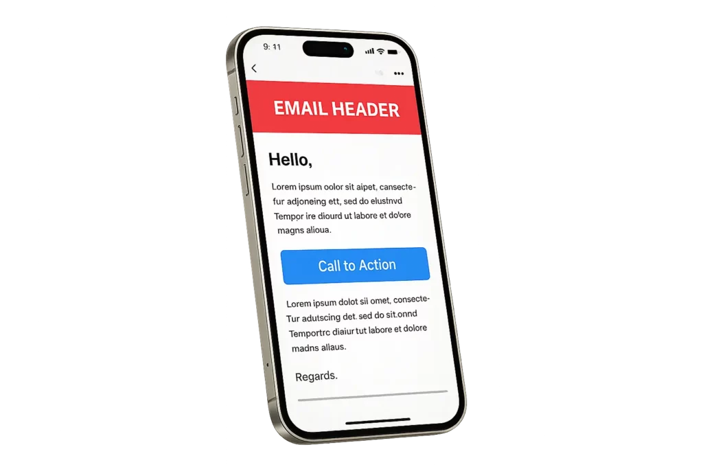
So the practical architecture for responsive emails is a two-layer approach: a fluid base layout that degrades gracefully in clients that don’t support media queries, plus media query adjustments layered on top for clients that do.
Why responsive emails matter for your campaigns

I’ll skip inflating this with statistics – the numbers vary enough across sources that citing a specific percentage feels like theater. What’s actually happening: somewhere between 40% and 60% of email opens occur on mobile, depending on your audience, industry, and send time. For consumer-facing lists, it can be higher. For B2B tools aimed at developers who live in desktop Outlook all day, maybe lower.
The point is that a substantial portion of your subscribers are reading your emails on phones, and if your layout breaks on a phone, those subscribers aren’t going to laboriously zoom and scroll to read your message. They close it. They might delete it. Some of them hit unsubscribe because a broken email reads as “this organization doesn’t care much about details.” None of that is dramatic – it just quietly costs you engagement and deliverability over time.
The accessibility dimension is also real: proper heading structure, sufficient text size, adequate touch target dimensions, and descriptive alt text on images aren’t just mobile optimizations. They make your emails usable for people with visual or motor impairments, and they affect how screen readers navigate the content. Building responsive emails with accessibility in mind means building them properly, which tends to benefit everyone.
Key elements of a responsive email layout

Before any code, let’s establish what a responsive email needs structurally.
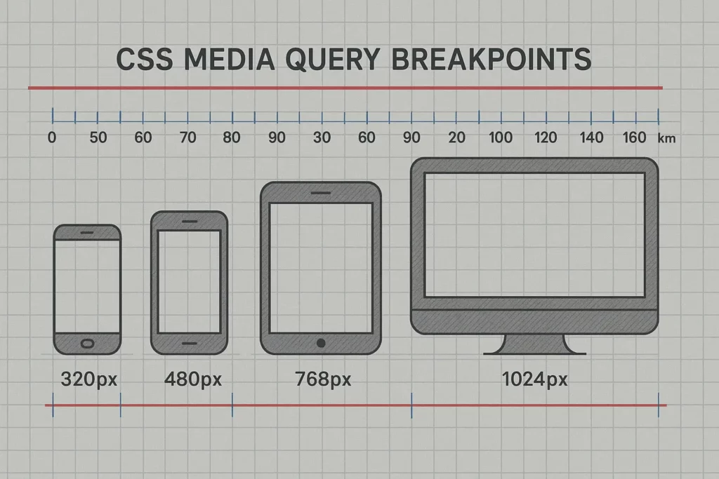
A fluid container with max-width constraints. The standard desktop email width is 600px. The outer container should use width: 100% with a max-width: 600px so it fills narrow screens fully but doesn’t stretch to absurd widths on large monitors.
Percentage-based inner widths. Any column inside the container should use percentage widths rather than fixed pixel values, so they resize proportionally as the container narrows.
Font sizes that are readable on mobile without zooming. 12-13px body text is fine on a large desktop monitor and genuinely difficult to read on a phone screen. Minimum 14px for body copy; 16px is safer. Headlines should scale proportionally, somewhere around 20-28px depending on your design.
Touch-friendly buttons. Apple’s Human Interface Guidelines recommend a minimum touch target of 44×44 points. In practice for email buttons, this means at least 44px height with generous padding around the text inside the button.
Fallback behavior for Outlook. Because classic Outlook ignores CSS that the rest of the world handles normally, any responsive email needs explicit Outlook-specific handling for things like background images and certain layout structures.
How to code responsive emails: the structure

The document shell
<!DOCTYPE html>
<html lang="en">
<head>
  <meta charset="UTF-8">
  <meta name="viewport" content="width=device-width, initial-scale=1.0">
  <title>Email title</title>
  <style>
    /* Your styles here */
  </style>
</head>
<body>
  <!-- Email content -->
</body>
</html>
The viewport meta tag tells mobile email clients to render at the actual device width rather than zooming out to fit a 600px email onto a 375px screen. Without it, some mobile clients will render your email as if the screen were 600px wide and then scale the whole thing down – readable only with magnification.
The outer wrapper and container
<table role="presentation" width="100%" cellpadding="0" cellspacing="0" border="0">
  <tr>
    <td align="center">
      <table role="presentation" width="600" cellpadding="0" cellspacing="0" border="0"
        style="max-width: 600px; width: 100%;">
        <!-- Content goes here -->
      </table>
    </td>
  </tr>
</table>
Tables for layout are an objectively archaic thing to be writing in 2025, and the fact that email still requires them is one of those industry realities that everyone complains about and nobody has successfully changed. role="presentation" is an accessibility attribute that tells screen readers these tables are layout structures, not data.
Two-column layout with stacking
<table role="presentation" width="100%" cellpadding="0" cellspacing="0" border="0">
  <tr>
    <td class="column"
      style="width: 50%; display: inline-block; vertical-align: top; max-width: 300px; box-sizing: border-box;">
      <!-- Left column content -->
    </td>
    <td class="column"
      style="width: 50%; display: inline-block; vertical-align: top; max-width: 300px; box-sizing: border-box;">
      <!-- Right column content -->
    </td>
  </tr>
</table>
Media queries for layout shifts
@media screen and (max-width: 480px) {
  .container {
    width: 100% !important;
  }
  .column {
    display: block !important;
    width: 100% !important;
    max-width: 100% !important;
  }
}
The !important declarations are necessary because email clients can apply their own inline styles that would otherwise override your media query rules. Not ideal from a CSS specificity standpoint, but that’s email development.
This makes columns stack vertically on narrow screens in clients that support media queries. For clients that don’t, see the hybrid approach below.
Inline CSS
Many email clients – notably some Gmail configurations and certain mobile clients – strip styles out of the <head> entirely. Inline styles survive this stripping. Any style that’s critical to your layout should exist both in the <style> block (for clients that support embedded styles) and inline on the element itself.
Writing inline CSS by hand is tedious. Tools like Premailer, Juice, or the inlining built into MJML automate it.
Handling email client quirks in responsive emails

This is where debugging time actually goes.
Classic Outlook for Windows
The Word 2007 rendering engine ignores a large portion of modern CSS, including all media queries. The workarounds:
Conditional comments let you target Outlook specifically and inject Outlook-only code:
<!--[if mso]>
<table role="presentation" width="600"><tr><td>
<![endif]-->
<div style="max-width: 600px; margin: 0 auto;">Your content here</div>
<!--[if mso]>
</td></tr></table>
<![endif]-->
The <!--[if mso]> block is processed only by Outlook; every other client reads it as an HTML comment and ignores it. This lets you write Outlook-specific table structure that holds your layout together without affecting rendering elsewhere.
VML for background images – Outlook doesn’t support CSS background images at all, so if you need a background image behind text or other content, VML (Vector Markup Language) is the approach:
<!--[if gte mso 9]>
<v:rect xmlns:v="urn:schemas-microsoft-com:vml" fill="true" stroke="false"
  style="width:600px; height:400px;">
  <v:fill type="frame" src="https://yourdomain.com/background.jpg" color="#ffffff" />
  <v:textbox inset="0,0,0,0">
<![endif]-->
<div style="background-image: url('https://yourdomain.com/background.jpg');
  background-size: cover; background-position: center;">
  Your content here
</div>
<!--[if gte mso 9]>
  </v:textbox>
</v:rect>
<![endif]-->
Note on the type attribute in <v:fill>: type="frame" scales the image to fill the rectangle as a single frame – this is what you want for a background image. type="tile" repeats the image across the rectangle like a pattern tile, which is useful for texture backgrounds but not for a hero image. The distinction matters.
Gmail
Gmail’s CSS support varies by version and context. In some configurations, particularly the Gmail Android app and certain webmail versions, it strips <head> styles. Inline styles are the reliable fallback.
Gmail also clips emails whose HTML exceeds approximately 102KB in size – it shows the beginning of the email and then a “View entire message” link. If you’re heavily inlining CSS or building complex templates, the HTML can reach this limit faster than expected. Keep your HTML lean.
Dark mode
Apple Mail applies automatic color inversion in dark mode unless you handle it explicitly. Gmail on iOS applies its own dark mode interpretation. Outlook for iOS does the same. If you have light-colored text on a white background, dark mode on some clients will make it invisible.
@media (prefers-color-scheme: dark) lets you define explicit dark mode styles, giving you control over what happens rather than leaving it to the client’s interpretation:
@media (prefers-color-scheme: dark) {
  .email-body {
    background-color: #1a1a1a !important;
    color: #e0e0e0 !important;
  }
  .email-container {
    background-color: #2d2d2d !important;
  }
}
Dark mode handling is a topic large enough for its own article, but at minimum: test your emails with dark mode enabled before sending.
The hybrid (spongy) approach to responsive emails
When media queries aren’t supported – classic Outlook being the primary example – the hybrid approach builds responsive behavior directly into the base layout using CSS properties that don’t require a media query:
<td style="width: 50%; min-width: 200px; max-width: 300px;
  display: inline-block; vertical-align: top; box-sizing: border-box;">
What happens: display: inline-block makes the cells flow inline. width: 50% sets proportional sizing. But once the container narrows to the point where two cells with min-width: 200px won’t fit side by side, the second cell wraps to the next line automatically – without a media query triggering anything. This is the fluid fallback.
The hybrid approach combined with media queries handles the vast majority of responsive email scenarios across clients. Use fluid widths as your base, then override with media queries for the finer layout control that clients like Apple Mail and Gmail will respect.
Testing responsive emails across clients

The preview inside your ESP is not a substitute for real testing. It’s a rough approximation. Rendering differences between clients are specific enough that you need to actually see what your email looks like in the environments where your subscribers will open it.
Litmus renders previews across roughly 100 client and device combinations. It’s the most widely used tool for this in the industry, and for good reason – the coverage is comprehensive and the interface is reasonably fast. It’s not cheap, but for anyone sending regular campaigns, the time saved debugging individual client issues justifies the cost.
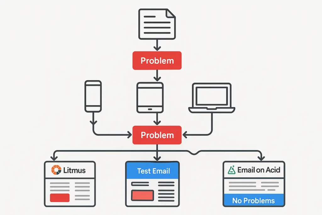
Email on Acid covers similar ground with somewhat different client coverage. Worth comparing against Litmus if pricing is a consideration – the two tools are close in capability.
Both tools are useful for catching rendering issues, but neither completely replaces physical device testing. Send actual test emails to a real iPhone in dark mode, to a real Outlook installation on Windows, to a real Gmail account. Rendering tools are good; they’re not perfect.
Specific things to check during testing:
- Column stacking on mobile – scroll through the email on an actual phone, don’t just look at a screenshot
- Dark mode rendering – enable dark mode on your test device before opening the email
- Images-off view – disable image loading and confirm the email still communicates something useful
- Gmail clipping – if your HTML is close to 102KB, check whether Gmail is cutting it off
- Button and link tap targets – can you tap the CTA reliably without hitting surrounding elements?
- Classic Outlook rendering – especially for background images, multi-column layouts, and anything with conditional comments
Best practices and common mistakes

Don’t use srcset in emails. srcset is well-supported in browsers for responsive images. Email client support for it is essentially nonexistent. Use max-width: 100% in CSS to make images scale to their containers, and optimize your image files to begin with.
Don’t nest tables more than necessary. Every nested table adds to your HTML file size and introduces potential rendering quirks. Keep the structure as flat as the design will allow.
Always test with images disabled. Many email clients block images by default until the recipient explicitly enables them. If critical information is baked into an image rather than HTML text, those subscribers see nothing. Alt text on every image is not optional.
Keep your HTML under 102KB. Gmail clips emails beyond this threshold. Inlining a lot of CSS adds up quickly – be aware of your file size as you build.
Don’t rely on web fonts for critical content. Web font support in email clients is limited to Apple Mail, Outlook for Mac, some versions of iOS Mail, and a handful of others. For everything else, you need a system font fallback stack. Design with the fallback in mind, not just the beautiful custom font rendering in Apple Mail.
Handle dark mode explicitly. It’s not an edge case. Build in the prefers-color-scheme media query and test in dark mode before sending.
FAQ

Why does responsive email design matter?
A broken layout on mobile means people close the email without reading it. They don’t click. Over campaigns and months, unoptimized responsive emails quietly drain engagement metrics and deliverability. There’s also the accessibility side: proper structure, readable font sizes, and touch-friendly elements make emails usable for people relying on assistive technology.
What are the core components of a responsive email?
A proper DOCTYPE declaration, a viewport meta tag, a table-based layout using percentage widths, inline CSS for the styles that matter most to your layout, and media queries for clients that support them. Layer the hybrid/spongy approach underneath as a fallback for clients that don’t.
How should I handle images in responsive emails?
Set max-width: 100% in CSS so images scale within their containers. Include explicit width and height attributes on <img> elements to prevent layout shifts during load. Write descriptive alt text on every image. Keep file sizes reasonable – under 200KB is a reasonable target. Do not use srcset; it’s not supported in email clients.
Why does my email break in Outlook?
Classic Outlook for Windows uses the Word 2007 rendering engine, which doesn’t support CSS the way a browser does. Background images need VML workarounds. Multi-column layouts often need conditional comment-based table structure to hold together. Test specifically in classic Outlook using Litmus or an actual Outlook installation.
Worth noting for planning purposes: Microsoft is ending support for the Word-based rendering engine in classic Outlook for Windows in October 2026. The new Outlook for Windows, which uses a web-based renderer, has been rolling out to business users since early 2025. The landscape is shifting, but classic Outlook is still present in enough inboxes that you need to handle it now.
What tools help with responsive email development?
Litmus – rendering previews across around 100 client combinations, plus spam testing. The industry standard for a reason (but sadly, starting in September 2025, this option has become prohibitively expensive).
Email on Acid – comparable to Litmus, with different client coverage. Worth comparing on pricing.
MJML – an email-specific markup language that compiles to responsive HTML. Excellent for teams building a lot of emails; the output is reliably solid and handles much of the cross-client complexity for you.
Foundation for Emails – another HTML email framework, slightly different approach to responsive layout.
Maizzle – a Tailwind CSS-based email framework. More granular control than MJML, steeper learning curve, worth looking at if you’re comfortable with Tailwind already.
Premailer / Juice – CSS inlining tools that automate the process of moving your <style> block into inline styles on individual elements.
VS Code – with HTML/CSS extensions, a solid environment for email development. Some developers use the MJML extension if they’re working in that framework.
ESPs with built-in builders – Mailchimp, Campaign Monitor, and others include responsive email builders and some preview tooling. Useful for simpler campaigns; for complex custom work, you’ll generally want to work in code directly.