
- Introduction: Why HTML Email Coding Matters in 2025
- Table of Contents
- Understanding the Email Coding Landscape
- Why Email Coding Is Different from Web Development
- The Cost of Poor Email Coding
- Essential HTML Email Coding Foundations
- HTML Email Document Structure
- Key Differences from Web Development
- The Email Development Toolkit
- Code Editors Optimized for Email
- Email Testing Platforms
- Email Framework Options
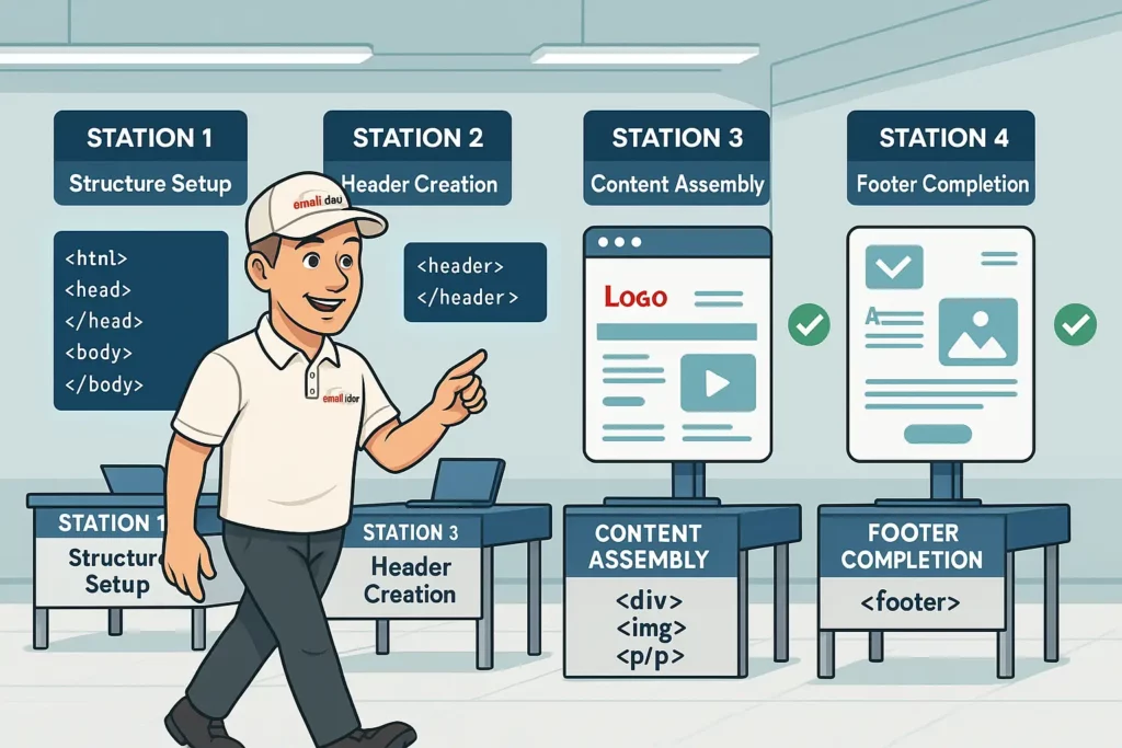
- Step-by-Step HTML Email Coding Tutorial
- Step 1: Set Up the Basic Structure
- Step 2: Create the Header Section
- Step 3: Add the Main Content Section
- Step 4: Add the Footer Section
- Cross-Client Compatibility Techniques
- Outlook-Specific Fixes
- VML for Outlook Buttons and Backgrounds
- Gmail App Fixes
- Responsive Email Design Mastery
- Mobile-First Approach
- Media Queries for Mobile Optimization
- Fluid Images Technique
- Stacking Columns on Mobile
- Troubleshooting Common Email Rendering Issues
- Issue: Images Not Displaying
- Issue: Text Rendering Differently Across Clients
- Issue: Spacing Inconsistencies
- Dark Mode Optimization Strategies
- Meta Tag for Color Scheme Support
- Dark Mode Media Queries
- Image Handling in Dark Mode
- Advanced Email Coding Techniques
- Interactive Email Elements with CSS
- AMP for Email (Where Supported)
- CSS Animation in Email
- Email Accessibility Best Practices
- Semantic Structure
- Alternative Text for Images
- Proper Link Text
- Color Contrast Ratios
- Screen Reader Considerations
- Testing and Quality Assurance Process
- Multi-Client Testing Workflow
- Critical Test Points
- Client-Specific Testing Focus
- Email Coding Resources and Templates
- Frameworks to Accelerate Development
- Starter Templates for Beginners
- Community Support
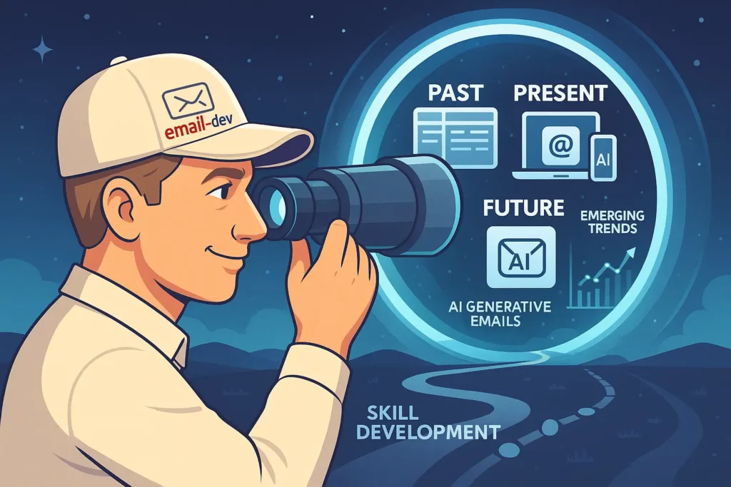
- Future-Proofing Your Email Development Skills
- Emerging Trends in Email Development
- Skills to Develop Next
- Your Email Development Journey
Introduction: Why HTML Email Coding Matters in 2025
In today’s digital landscape, email remains one of the most powerful marketing channels with an impressive ROI of $36 for every $1 spent, according to Litmus’s 2024 State of Email report. Yet behind every successful email campaign lies something often overlooked: properly coded HTML email templates that display flawlessly across all email clients.
If you’ve ever received an email where images were broken, text appeared too small on mobile, or buttons weren’t clickable—you’ve experienced firsthand why HTML email coding skills are invaluable. With over 4 billion daily email users worldwide and email marketing driving more conversions than any other channel (including social media), mastering email development is no longer optional for digital professionals.
This comprehensive guide will walk you through everything you need to know about HTML email coding, from fundamental concepts to advanced techniques that ensure your emails look perfect everywhere — whether opened in Gmail, Outlook, Apple Mail, or on a smartphone.
Table of Contents
- Understanding the Email Coding Landscape
- Essential HTML Email Coding Foundations
- The Email Development Toolkit
- Step-by-Step HTML Email Coding Tutorial
- Cross-Client Compatibility Techniques
- Responsive Email Design Mastery
- Troubleshooting Common Email Rendering Issues
- Dark Mode Optimization Strategies
- Advanced Email Coding Techniques
- Email Accessibility Best Practices
- Testing and Quality Assurance Process
- Email Coding Resources and Templates
- Future-Proofing Your Email Development Skills
Understanding the Email Coding Landscape

Why Email Coding Is Different from Web Development
HTML email development isn’t simply web development for email — it’s an entirely different discipline with unique challenges:
- Inconsistent rendering engines: Unlike websites where modern browsers generally follow standards, email clients use various rendering engines that interpret code differently.
- Limited CSS support: While websites enjoy full CSS3 support, many email clients (particularly Outlook) have severely restricted CSS capabilities.
- Table-based layouts: While web development moved away from tables decades ago, HTML emails still rely heavily on tables for layout structure.
- Inline CSS requirements: Many email clients strip
<head>and<style>tags, requiring inline CSS for styling.
According to Email on Acid’s 2024 Client Market Share report, your subscribers likely use a mix of these top email clients:
- Gmail (web/app): 41.4%
- Apple iPhone: 32.1%
- Outlook (desktop): 10.7%
- Apple Mail: 9.3%
- Samsung Mail: 2.1%
- Outlook.com: 1.9%
Each of these platforms renders HTML and CSS differently, creating significant challenges for email developers.
The Cost of Poor Email Coding
Poorly coded emails have tangible business impacts:
- Reduced engagement: 57% of subscribers will delete an email that doesn’t display properly on mobile without reading it.
- Brand perception damage: 21% of consumers report they’re less likely to purchase from a brand that sends broken emails.
- Missed conversion opportunities: According to Litmus, fixing rendering issues can improve click rates by up to 18%.
Essential HTML Email Coding Foundations

HTML Email Document Structure
Unlike websites, HTML emails follow a more restrictive structure:
<!DOCTYPE html>
<html lang="en" xmlns="http://www.w3.org/1999/xhtml" xmlns:v="urn:schemas-microsoft-com:vml" xmlns:o="urn:schemas-microsoft-com:office:office">
<head>
    <meta charset="utf-8">
    <meta name="viewport" content="width=device-width, initial-scale=1.0">
    <meta http-equiv="X-UA-Compatible" content="IE=edge">
    <meta name="format-detection" content="telephone=no, date=no, address=no, email=no">
    <meta name="x-apple-disable-message-reformatting">
    <title>Your Email Title</title>
    <!--[if mso]>
    <xml>
        <o:OfficeDocumentSettings>
            <o:AllowPNG/>
            <o:PixelsPerInch>96</o:PixelsPerInch>
        </o:OfficeDocumentSettings>
    </xml>
    <style>
        table {border-collapse:collapse;border-spacing:0;border:none;margin:0;}
        div, td {padding:0;}
        div {margin:0 !important;}
    </style>
    <noscript>
    <![endif]-->
    <style>
        /* Base styles */
        body {
            margin: 0;
            padding: 0;
            width: 100% !important;
            -webkit-text-size-adjust: 100%;
            -ms-text-size-adjust: 100%;
        }

        /* Client-specific styles */
        @media screen and (max-width: 600px) {
            .responsive-table {
                width: 100% !important;
            }
            .mobile-padding {
                padding: 10px 5% !important;
            }
        }
    </style>
</head>
<body style="margin: 0; padding: 0; background-color: #f6f6f6; font-family: Arial, sans-serif;">
    <!-- Preheader text (shows in inbox preview) -->
    <div style="display: none; max-height: 0; overflow: hidden;">
        Your preheader text goes here (around 85-100 characters is ideal)
    </div>

    <!-- Email content starts here -->
    <table border="0" cellpadding="0" cellspacing="0" width="100%" role="presentation">
        <tr>
            <td align="center" bgcolor="#f6f6f6" style="padding: 20px 0;">
                <!-- Email container -->
                <table class="responsive-table" border="0" cellpadding="0" cellspacing="0" width="600" role="presentation">
                    <!-- Email content rows go here -->
                </table>
            </td>
        </tr>
    </table>
</body>
</html>
This structure includes several critical elements:
- DOCTYPE and XML namespaces: These help Outlook and older email clients properly parse the HTML.
- Meta tags: These prevent unwanted formatting on mobile devices and disable auto-detection of phone numbers and addresses.
- MSO conditional comments: These provide Outlook-specific styling to address its rendering quirks.
- Responsive table structure: Tables within tables create the layout grid system for your email.
- Preheader text: This invisible text appears in inbox previews, increasing open rates.
Key Differences from Web Development
| Web Development | Email Development |
|---|---|
| Modern HTML5 semantic elements | Limited semantic elements; heavy table usage |
| External CSS files | Inline CSS with limited selector support |
| JavaScript functionality | No JavaScript support in most clients |
| Flexbox/Grid layouts | Table-based layouts |
| Modern CSS properties | Limited CSS property support |
| Media queries fully supported | Media queries work in some clients only |
The Email Development Toolkit

Having the right tools makes email development significantly easier:
Code Editors Optimized for Email
- Visual Studio Code with these essential extensions:
- Email Boilerplate
- HTML Email Preview
- Emmet (for faster HTML writing)
- Prettier (for code formatting)
Email Testing Platforms
- Litmus: The industry standard for email testing across 100+ email clients and devices.
- Email on Acid: Comprehensive testing suite with visual previews and spam testing.
- Testi@: More affordable option for smaller teams and freelancers.
Email Framework Options
- MJML: Open-source framework that simplifies responsive email development with its semantic syntax.
- Foundation for Emails: Responsive framework with pre-built components.
- Maizzle: Modern email framework using Tailwind CSS concepts.
According to a 2024 survey by Really Good Emails, 37% of professional email developers use frameworks like MJML to speed up development time by an average of 50%.
Step-by-Step HTML Email Coding Tutorial
Let’s build a simple yet robust email template from scratch:
Step 1: Set Up the Basic Structure
<!DOCTYPE html>
<html lang="en" xmlns="http://www.w3.org/1999/xhtml" xmlns:v="urn:schemas-microsoft-com:vml" xmlns:o="urn:schemas-microsoft-com:office:office">
<head>
    <meta charset="utf-8">
    <meta name="viewport" content="width=device-width, initial-scale=1.0">
    <meta http-equiv="X-UA-Compatible" content="IE=edge">
    <meta name="format-detection" content="telephone=no, date=no, address=no, email=no">
    <meta name="x-apple-disable-message-reformatting">
    <title>Simple HTML Email Template</title>
    <!--[if mso]>
    <xml>
        <o:OfficeDocumentSettings>
            <o:AllowPNG/>
            <o:PixelsPerInch>96</o:PixelsPerInch>
        </o:OfficeDocumentSettings>
    </xml>
    <style>
        table {border-collapse:collapse;border-spacing:0;border:none;margin:0;}
        div, td {padding:0;}
        div {margin:0 !important;}
    </style>
    <noscript>
    <![endif]-->
    <style>
        /* Your style rules here */
        @media screen and (max-width: 600px) {
            .responsive-table {
                width: 100% !important;
            }
            .mobile-text {
                font-size: 16px !important;
            }
        }
    </style>
</head>
<body style="margin: 0; padding: 0; background-color: #f6f6f6; font-family: Arial, sans-serif;">
    <!-- Preheader text -->
    <div style="display: none; max-height: 0; overflow: hidden;">
        Welcome to our simple HTML email template - perfect for beginners!
    </div>

    <!-- Email content starts -->
    <table border="0" cellpadding="0" cellspacing="0" width="100%" role="presentation">
        <tr>
            <td align="center" style="padding: 20px 0;">
                <!-- Main content container -->
                <table class="responsive-table" border="0" cellpadding="0" cellspacing="0" width="600" role="presentation">
                    <!-- Content will go here -->
                </table>
            </td>
        </tr>
    </table>
</body>
</html>
Step 2: Create the Header Section
<!-- Header Section -->
<tr>
    <td bgcolor="#ffffff" style="padding: 20px 30px; border-radius: 8px 8px 0 0;">
        <table border="0" cellpadding="0" cellspacing="0" width="100%" role="presentation">
            <tr>
                <td align="center">
                    <img src="https://via.placeholder.com/200x50" alt="Company Logo" width="200" style="display: block; border: 0;" />
                </td>
            </tr>
        </table>
    </td>
</tr>
Step 3: Add the Main Content Section
<!-- Main Content Section -->
<tr>
    <td bgcolor="#ffffff" style="padding: 20px 30px;">
        <table border="0" cellpadding="0" cellspacing="0" width="100%" role="presentation">
            <tr>
                <td class="mobile-text" style="font-family: Arial, sans-serif; font-size: 18px; color: #333333; padding-bottom: 20px;">
                    Hello there,
                </td>
            </tr>
            <tr>
                <td class="mobile-text" style="font-family: Arial, sans-serif; font-size: 16px; line-height: 24px; color: #666666; padding-bottom: 20px;">
                    Welcome to our simple HTML email template. This is where your main message content would go. Keep it concise and focused on a single call-to-action for best results.
                </td>
            </tr>
            <tr>
                <td align="center" style="padding: 20px 0;">
                    <!-- Button -->
                    <table border="0" cellpadding="0" cellspacing="0" role="presentation">
                        <tr>
                            <td align="center" bgcolor="#5CB85C" style="border-radius: 4px;">
                                <!--[if mso]>
                                <v:roundrect xmlns:v="urn:schemas-microsoft-com:vml" xmlns:w="urn:schemas-microsoft-com:office:word" href="https://example.com" style="height:40px;v-text-anchor:middle;width:200px;" arcsize="10%" stroke="f" fillcolor="#5CB85C">
                                <w:anchorlock/>
                                <center>
                                <![endif]-->
                                <a href="https://example.com" target="_blank" style="display: inline-block; padding: 12px 24px; font-family: Arial, sans-serif; font-size: 16px; color: #ffffff; text-decoration: none; border-radius: 4px; background-color: #5CB85C; font-weight: bold;">Click Me!</a>
                                <!--[if mso]>
                                </center>
                                </v:roundrect>
                                <![endif]-->
                            </td>
                        </tr>
                    </table>
                </td>
            </tr>
        </table>
    </td>
</tr>
Step 4: Add the Footer Section
<!-- Footer Section -->
<tr>
    <td bgcolor="#f0f0f0" style="padding: 20px 30px; border-radius: 0 0 8px 8px;">
        <table border="0" cellpadding="0" cellspacing="0" width="100%" role="presentation">
            <tr>
                <td style="font-family: Arial, sans-serif; font-size: 14px; color: #888888; text-align: center;">
                    © 2025 Your Company. All rights reserved.<br><br>
                    <a href="https://example.com/unsubscribe" style="color: #888888; text-decoration: underline;">Unsubscribe</a>
                </td>
            </tr>
        </table>
    </td>
</tr>
This basic template demonstrates several key email coding principles:
- Table-based layout structure
- Nested tables for content organization
- MSO-specific code for button rendering in Outlook
- Responsive class hooks for mobile optimization
- Proper image handling with defined dimensions
- Text styling with web-safe fonts
Cross-Client Compatibility Techniques

Making emails work consistently across clients requires specific techniques:
Outlook-Specific Fixes
Outlook (especially desktop versions) uses Microsoft Word’s rendering engine rather than a proper web browser engine, causing many headaches for email developers.
<!--[if mso]>
<table border="0" cellpadding="0" cellspacing="0" width="100%">
<tr>
<td width="600">
<![endif]-->

<div style="max-width: 600px; margin: 0 auto;">
    <!-- Content here -->
</div>

<!--[if mso]>
</td>
</tr>
</table>
<![endif]-->
This conditional code provides Outlook-specific table structures while allowing other clients to use more modern code.
VML for Outlook Buttons and Backgrounds
Outlook doesn’t support background images or border-radius for buttons. Use Vector Markup Language (VML) instead:
<!--[if mso]>
<v:rect xmlns:v="urn:schemas-microsoft-com:vml" fill="true" stroke="false" style="width:600px;height:400px;">
<v:fill type="tile" src="background.jpg" color="#333333" />
<v:textbox inset="0,0,0,0">
<![endif]-->

<div style="background-image: url('background.jpg'); background-position: center; background-repeat: no-repeat; background-size: cover; height: 400px;">
    <!-- Content here -->
</div>

<!--[if mso]>
</v:textbox>
</v:rect>
<![endif]-->
Gmail App Fixes
Gmail’s mobile app has unique requirements:
<div style="display: none; white-space: nowrap; font: 15px courier; line-height: 0;"> </div>
This strange-looking code prevents Gmail from collapsing layout tables on mobile devices.
According to Email on Acid testing data, implementing these cross-client fixes can eliminate rendering issues in over 95% of email clients.
Responsive Email Design Mastery

Responsive emails adapt to different screen sizes, improving engagement rates by up to 30% according to Litmus research.
Mobile-First Approach
Start with a narrow layout and expand for larger screens:
<style>
    /* Base mobile styles */
    .container {
        width: 100%;
        max-width: 375px;
    }

    /* Tablet and desktop styles */
    @media screen and (min-width: 600px) {
        .container {
            max-width: 600px;
        }
    }
</style>
Media Queries for Mobile Optimization
<style>
    @media screen and (max-width: 600px) {
        .mobile-full-width {
            width: 100% !important;
            max-width: 100% !important;
        }
        .mobile-padding {
            padding: 10px !important;
        }
        .mobile-center {
            text-align: center !important;
        }
        .mobile-hide {
            display: none !important;
        }
        .mobile-show {
            display: block !important;
            width: auto !important;
            max-height: inherit !important;
            overflow: visible !important;
        }
        .mobile-text {
            font-size: 16px !important;
            line-height: 24px !important;
        }
    }
</style>
Fluid Images Technique
Make images scale responsively:
<img src="image.jpg" width="600" style="width: 100%; max-width: 600px; height: auto; display: block; border: 0;" alt="Descriptive text" />
Stacking Columns on Mobile
Create multi-column layouts that stack on mobile:
<!--[if mso]>
<table role="presentation" width="100%">
<tr>
<td width="50%" valign="top">
<![endif]-->
<div style="display: inline-block; width: 100%; max-width: 300px; vertical-align: top;">
    <!-- Column 1 content -->
</div>
<!--[if mso]>
</td>
<td width="50%" valign="top">
<![endif]-->
<div style="display: inline-block; width: 100%; max-width: 300px; vertical-align: top;">
    <!-- Column 2 content -->
</div>
<!--[if mso]>
</td>
</tr>
</table>
<![endif]-->
Troubleshooting Common Email Rendering Issues

Issue: Images Not Displaying
Solution:
- Always include proper
alttext - Set explicit dimensions (width/height)
- Use
display: blockto prevent spacing issues - Host images on a reliable CDN
<img src="https://your-cdn.com/image.jpg" width="600" height="300" style="display: block; border: 0; width: 100%; max-width: 600px; height: auto;" alt="Descriptive alt text" />
Issue: Text Rendering Differently Across Clients
Solution:
- Use web-safe fonts as primary options
- Provide extended font stack fallbacks
- Set explicit font sizes and line heights
<p style="font-family: Arial, 'Helvetica Neue', Helvetica, sans-serif; font-size: 16px; line-height: 1.5; color: #333333; margin: 0;">Your text here</p>
Issue: Spacing Inconsistencies
Solution:
- Use tables for consistent spacing
- Set explicit padding values on table cells
- Avoid margin (not supported in many clients)
<table border="0" cellpadding="0" cellspacing="0" width="100%" role="presentation">
    <tr>
        <td style="padding: 20px 30px;">Content here</td>
    </tr>
</table>
Dark Mode Optimization Strategies

With over half of all users users enabling dark mode at least occasionally, optimizing for dark mode is essential.
Meta Tag for Color Scheme Support
<meta name="color-scheme" content="light dark">
<meta name="supported-color-schemes" content="light dark">
Dark Mode Media Queries
<style>
    :root {
        color-scheme: light dark;
        supported-color-schemes: light dark;
    }

    @media (prefers-color-scheme: dark) {
        .dark-mode-bg {
            background-color: #333333 !important;
        }
        .dark-mode-text {
            color: #f1f1f1 !important;
        }
        .dark-mode-invert {
            filter: invert(1) !important;
        }
    }
</style>
Image Handling in Dark Mode
<!-- Method 1: CSS inversion protection -->
<img src="logo.png" style="color-scheme: light; force-color-adjust: none; -webkit-force-color-adjust: none;" alt="Logo" />

<!-- Method 2: Dark mode specific image -->
<div style="display: block; width: 100%; max-width: 200px; margin: 0 auto;">
    <!--[if !mso]><!-->
    <div class="dark-mode-hide" style="display: block;">
        <img src="logo-light.png" width="200" style="width: 100%; max-width: 200px; height: auto; display: block; border: 0;" alt="Logo" />
    </div>
    <div class="dark-mode-show" style="display: none;">
        <img src="logo-dark.png" width="200" style="width: 100%; max-width: 200px; height: auto; display: block; border: 0;" alt="Logo" />
    </div>
    <!--<![endif]-->
    <!--[if mso]>
    <img src="logo-light.png" width="200" style="width:200px;height:auto;display:block;border:0;" alt="Logo" />
    <![endif]-->
</div>
Advanced Email Coding Techniques

Interactive Email Elements with CSS
While JavaScript is not supported in email, CSS can create interactive elements:
<style>
    .accordion-content {
        max-height: 0;
        overflow: hidden;
        transition: max-height 0.3s ease-out;
    }

    .accordion-trigger:active + .accordion-content,
    .accordion-trigger:focus + .accordion-content {
        max-height: 200px;
    }
</style>

<div class="accordion">
    <a href="#" class="accordion-trigger" style="display: block; text-decoration: none; padding: 15px; background-color: #f9f9f9; color: #333333; font-weight: bold;">Click to expand</a>
    <div class="accordion-content" style="background-color: #ffffff; padding: 0 15px;">
        <p style="font-family: Arial, sans-serif; font-size: 14px; line-height: 1.5;">This content will appear when clicked in supported email clients.</p>
    </div>
</div>
AMP for Email (Where Supported)
Google’s AMP for Email allows for truly interactive experiences:
<!doctype html>
<html amp4email>
<head>
    <meta charset="utf-8">
    <script async src="https://cdn.ampproject.org/v0.js"></script>
    <style amp4email-boilerplate>body{visibility:hidden}</style>
</head>
<body>
    <amp-carousel width="600" height="400" layout="responsive" type="slides">
        <amp-img src="image1.jpg" width="600" height="400" layout="responsive" alt="Image 1"></amp-img>
        <amp-img src="image2.jpg" width="600" height="400" layout="responsive" alt="Image 2"></amp-img>
        <amp-img src="image3.jpg" width="600" height="400" layout="responsive" alt="Image 3"></amp-img>
    </amp-carousel>
</body>
</html>
CSS Animation in Email
Subtle animations can increase engagement by 15% according to Litmus data:
<style>
    @keyframes pulse {
        0% { transform: scale(1); }
        50% { transform: scale(1.05); }
        100% { transform: scale(1); }
    }

    .animate-pulse {
        animation: pulse 2s infinite ease-in-out;
    }
</style>

<a href="https://example.com" class="animate-pulse" style="display: inline-block; padding: 12px 24px; background-color: #5CB85C; color: #ffffff; text-decoration: none; border-radius: 4px;">Shop Now</a>
Email Accessibility Best Practices

Making emails accessible isn’t just ethical — it expands your audience and may be legally required in many jurisdictions.
Semantic Structure
<div role="heading" aria-level="1" style="font-size: 24px; font-weight: bold; color: #333333;">This simulates an H1 heading</div>
<div role="heading" aria-level="2" style="font-size: 20px; font-weight: bold; color: #333333;">This simulates an H2 heading</div>
Alternative Text for Images
<img src="promotional-banner.jpg" alt="Summer sale - 30% off all products until July 31" width="600" style="width: 100%; max-width: 600px; height: auto; display: block; border: 0;" />
Proper Link Text
<!-- Bad example -->
<a href="https://example.com">Click here</a>

<!-- Good example -->
<a href="https://example.com">View our summer collection</a>
Color Contrast Ratios
Ensure text meets WCAG 2.1 AA standards with minimum contrast ratios:
- 4.5:1 for normal text
- 3:1 for large text (18pt+)
Screen Reader Considerations
<!-- Hide decorative elements from screen readers -->
<img src="decorative-divider.png" alt="" role="presentation" width="600" style="width: 100%; max-width: 600px; height: 20px; display: block; border: 0;" />

<!-- Add pronunciation guidance for unusual words -->
<span aria-label="MJML (pronounced edge-mail)">MJML</span>
Testing and Quality Assurance Process

Multi-Client Testing Workflow
- Initial development in a modern browser
- Local testing with email preview tools
- Comprehensive testing with Litmus/Email on Acid
- Targeted fixes for problematic clients
- Spam filter testing before sending
Critical Test Points
- Typography rendering
- Image display
- Link functionality
- Layout integrity
- Mobile responsiveness
- Dark mode appearance
- Load time/file size
Client-Specific Testing Focus
| Email Client | Common Issues |
|---|---|
| Outlook Desktop | Images, backgrounds, button rendering |
| Gmail | CSS support, promotions tab filtering |
| Apple Mail | Dark mode rendering |
| Outlook.com | CSS support inconsistencies |
| Mobile clients | Responsive behavior, tap targets |
Email Coding Resources and Templates

Frameworks to Accelerate Development
- MJML (mjml.io): Reduces development time by 50% with its semantic syntax
<mjml> <mj-body> <mj-section> <mj-column> <mj-text>Hello World</mj-text> </mj-column> </mj-section> </mj-body> </mjml> - Foundation for Emails: Includes pre-built components
<container> <row> <columns> <button href="http://example.com">Click Me</button> </columns> </row> </container> - Maizzle: Modern email framework using Tailwind CSS concepts
<div class="px-4 py-6 bg-white rounded shadow"> <p class="m-0 text-gray-800">Hello world!</p> </div>
Starter Templates for Beginners
- Cerberus (tedgoas.github.io/Cerberus): Responsive email patterns
- Really Good Emails’ Resources: Collection of tested templates
- Email Templates by Litmus: Production-ready starter templates
Community Support
- #EmailGeeks Slack: Active community of email professionals
- /r/EmailDevelopment on Reddit: Forum for troubleshooting
- Stack Overflow email-html tag: Technical solutions
Future-Proofing Your Email Development Skills
Emerging Trends in Email Development
- AI-Generated Email Code
- Tools like Adobe’s AI email builder are automating basic code generation
- Focus on customization and optimization skills that AI cannot yet master
- Interactive Email Experiences
- Shopping carts within emails
- In-email surveys and forms
- Interactive product galleries
- Email Client Evolution
- Gradual improvement in CSS support
- Increasing dark mode adoption
- Privacy changes affecting tracking and personalization
Skills to Develop Next
- Email accessibility expertise
- Dynamic content implementation
- Email sending infrastructure knowledge
- Marketing automation integration
- A/B testing methodology
Your Email Development Journey

HTML email coding may seem daunting at first, but it follows logical patterns once you understand the constraints and techniques. By mastering these fundamentals, you’ve taken the first step toward creating emails that not only look professional across all clients but also drive real business results.
Remember that email development is both a technical and creative discipline — the most successful email developers combine coding precision with an eye for design and an understanding of marketing principles.
Whether you’re building emails for your own projects, freelancing for clients, or working within a marketing
