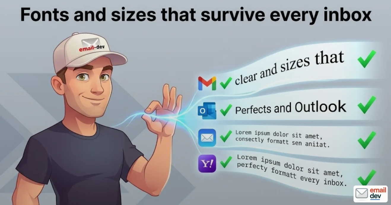
Quick answer: Good email typography means designing for legibility under failure. Use a web-safe font stack (Arial, Georgia, Verdana) as your foundation, set body text to 16px with a 1.4-1.6 line height, and treat custom web fonts as a progressive enhancement – they only render reliably in Apple Mail and a couple of other clients. Declare your fonts inline, and test across real inboxes before you send.
Here’s the thing nobody tells you when you start out: the font you pick is the least important typography decision you’ll make. I know that sounds backwards for an article about email typography, but stick with me. You can agonize over Söhne versus Inter for a week, hand it to the inbox, and watch Gmail quietly swap the whole thing for Arial without asking. So before we talk about which typefaces look gorgeous, we have to talk about the thing that breaks them – the rendering reality of email clients – because that’s where most beautifully designed emails go to die.
I build and test HTML emails for a living. Cross-client layouts, dark themes, the stuff that’s supposed to look the same in 40 different places and almost never does. And the single most common thing I get handed is a design file that’s typographically perfect – tight kerning, a custom display face, a delicate 13px caption – that will fall apart the second it leaves the designer’s screen. Not because the designer did anything wrong. Because email typography plays by rules that have basically nothing in common with web design, and a lot of people genuinely don’t know that until something breaks in front of a client.
So this is the guide I wish someone had handed me. It covers fonts, sizes, line height, fallbacks, dark mode, accessibility (which is now a legal thing, not just a nice thing), and where all of this is heading over the next five years. Written from the point of view of someone who actually renders this stuff, not someone admiring it in Figma.
- Why email typography breaks where website typography doesn’t
- The rendering engine problem (or: Outlook still runs on Word)
- The classic-versus-new Outlook split that’s happening right now
- “But it looked fine in the preview”
- Web-safe fonts: the foundation you actually build on
- Serif versus sans-serif – and the myth I’d like to bury
- A reference table you can actually use
- Custom and web fonts in email: the progressive enhancement reality
- Where web fonts actually render
- The three import methods and which ones fail where
- The metric-mismatch gotcha nobody warns you about
- Why you declare typography inline
- How to build a bulletproof font stack
- Copy-paste starter stacks
- The button caveat
- Font sizes that work on every screen
- The numbers
- Line height and letter spacing
- Alignment and line length
- The two-fonts rule (and when to break it)
- Responsive typography without losing your mind
- The hybrid approach
- Inline fallbacks plus media-query scaling
- A note for the GetCourse / Mailchimp / Braze / Salesforce crowd
- Email typography in dark mode (the part that ruins your week)
- What actually happens
- Fixes that hold up
- Accessible typography isn’t optional anymore (and there’s a law now)
- The baseline rules
- The regulatory reality (this is the fresh bit)
- How to test your typography (the part everyone skips)
- The minimum real-inbox set
- A word on the testing tools (and Litmus’s eye-watering new price)
- Test with real content, not lorem ipsum
- A quick pre-send typography checklist
- Where email typography is heading (2026 to 2030)
- Variable fonts: infrastructure on the web, still waiting in email
- Kinetic email typography: real on the web, fragile in the inbox
- The “imperfect by design” swing and the serif revival
- AI personalisation and the slow widening of what’s possible
- The one idea to take away
- Frequently asked questions
- What font size should email body text be?
- Do web fonts work in Gmail?
- Why does my email font change to Times New Roman in Outlook?
- What is the best font for an email newsletter?
- How many fonts should I use in one email?
- What line height should I use for email text?
- How do I make email typography accessible?
- Are custom web fonts worth using in email at all?
Why email typography breaks where website typography doesn’t
On the web, typography is basically solved. You drop in @font-face, you load a variable font, you set clamp() on your sizes, and every modern browser renders it more or less identically. You’ve got a decade of CSS support to lean on.
Email threw all of that out the window and then set the window on fire.
The core problem is that there is no standard. Every email client decided to handle HTML and CSS however it felt like, and the worst offenders are also the most popular. So you’re not designing for “the inbox” – you’re designing for 40-ish renderers that each have opinions, and several of them are openly hostile to good typography.
The rendering engine problem (or: Outlook still runs on Word)
Let me say this part plainly because it still shocks people. Outlook on Windows – the classic desktop version that a huge chunk of corporate users are stuck on – renders your email using Microsoft Word’s rendering engine. Word. The thing you write documents in. Specifically a version of that engine that traces back to 2007, which means it’s old enough to have a driver’s licence.
What that means in practice: no real CSS layout, no float, no flexbox, no grid, sketchy support for padding and margins, and a tendency to mangle line height and letter spacing on a whim. It will override spacing you set. It will ignore fonts you specify. If you don’t give it explicit instructions, it’ll reach for Times New Roman like a comfort blanket and ruin your whole brand voice in one render.
Gmail is a different flavour of pain. It uses a stripped-down browser engine, so it’s more modern than Outlook, but it aggressively rewrites your code. It removes a big slice of your CSS, including @font-face, and it’ll rewrite some inline styles – font size, weight, occasionally the whole layout – on send. Which is the part that bites people. You preview the email, it looks flawless, you hit send, and Gmail does its thing in transit. The preview lied to you.
Apple Mail, bless it, is the responsible adult in the room. Excellent modern CSS support, handles web fonts properly, respects your media queries. The catch is obvious the moment you check your own analytics: a chunk of your audience isn’t on Apple Mail. So building for the good client and hoping for the best is not a strategy, it’s a prayer.
The classic-versus-new Outlook split that’s happening right now
This one’s genuinely current and worth your attention. There are now two different Outlooks for Windows living in the world at the same time.
- Classic Outlook for Windows – the Word-engine one we just talked about. Limited everything.
- New Outlook for Windows – a rebuilt, web-based renderer that behaves more like Outlook.com.
Microsoft started force-switching business users (the Microsoft 365 Business Standard and Premium crowd) over to the new version from January 2025, and the transition is still very much mid-flight. The enterprise leg was originally slated to begin around April 2026, and Microsoft has already pushed that back – it’s slipped into 2027 now – while classic Outlook is officially propped up until at least 2029. So nobody should be planning their templates around classic dying any time soon. Long-term it’s good news – a web engine means better CSS, better font handling, fewer Word-era horrors – but during the transition you’ve effectively got a third Outlook to worry about, and the two versions render the same email differently. The inconsistency between classic and new Outlook is one of the more annoying things in email typography right now, and it is absolutely not going away tomorrow.
“But it looked fine in the preview”
If I had a pound for every time I’ve heard that. The preview pane in your ESP, or even in the client itself, frequently does not match what lands in the recipient’s inbox – because clients transform your code at delivery, dark mode kicks in based on the recipient’s settings, and font fallbacks resolve based on what’s installed on their device. Previews are a starting point. They are not proof. We’ll get to proper testing later, but file that away now.
Web-safe fonts: the foundation you actually build on
Right. Now that you know the ground is unstable, let’s pour a foundation that holds.
A “web-safe” (or “email-safe”) font is one that’s pre-installed on the vast majority of devices and operating systems, so the client doesn’t need to download anything. It just works. These are the unglamorous workhorses, and they are the backbone of solid email typography whether you like it or not.
The reliable list is short:
- Arial – the default-default. Boring, universal, fine.
- Helvetica – falls back to Arial on Windows anyway, but worth listing.
- Verdana – wider, very legible at small sizes, good for body copy.
- Tahoma – similar story, slightly tighter.
- Georgia – the go-to serif. Renders well, reads beautifully, my favourite fallback by a mile.
- Times New Roman – the serif everyone gets when they forget to set a fallback. Use it on purpose or not at all.
- Courier / Courier New – monospace, for when you want that look.
Serif versus sans-serif – and the myth I’d like to bury
There’s a persistent belief that sans-serif is “more readable on screens” and serif is “old-fashioned.” It’s mostly folklore. Reading studies consistently show most people experience no meaningful change in reading speed or retention between serif and sans-serif body text. So the choice isn’t about legibility – it’s about brand voice. Serif reads as established, editorial, trustworthy. Sans-serif reads as modern, clean, neutral. Pick based on the feeling you want, not on a readability claim that doesn’t really hold up.
One real, measurable thing fonts do affect: perception of the content itself. There’s research suggesting certain typefaces nudge how much people agree with what they’re reading. Small effect, but at scale on a list of a hundred thousand, small effects pay rent.
A reference table you can actually use
Here’s the cheat sheet. Primary font, the safest fallback to pair it with, and roughly where you stand on support.
| Font | Type | Best fallback | Support reality |
|---|---|---|---|
| Arial | Sans-serif | Helvetica, sans-serif | Universal |
| Verdana | Sans-serif | Geneva, sans-serif | Universal |
| Tahoma | Sans-serif | Verdana, sans-serif | Universal |
| Georgia | Serif | “Times New Roman”, serif | Universal |
| Times New Roman | Serif | Times, serif | Universal |
| Courier New | Monospace | Courier, monospace | Universal |
| Trebuchet MS | Sans-serif | Tahoma, sans-serif | Near-universal |
| Roboto | Sans-serif (web) | Arial, sans-serif | Gmail + Apple Mail only |
| Custom web font | Varies | A web-safe equivalent | Apple Mail reliably, almost nowhere else |
That last row is the one people forget, and it’s where the next section lives.
Custom and web fonts in email: the progressive enhancement reality
I want a custom font in my email. Of course you do. The brand has a beautiful display face, the designer spent money on it, and Arial feels like showing up to a wedding in cargo shorts. I get it.
Here’s the deal, and it’s not negotiable: custom web fonts in email are a progressive enhancement. They are a bonus that some recipients see and most don’t. If your typography only works when the custom font loads, your typography is broken.
Where web fonts actually render
Let’s be specific, because vague reassurance helps nobody:
- Apple Mail (macOS and iOS) – reliable.
@font-faceworks, Google Fonts load. This is the one place your custom face shows up as intended. - Gmail – does not support
@font-faceat all. It strips it. The only web fonts Gmail will display are Roboto and Google Sans, because those are Google’s own and baked in. - Outlook for Windows (classic) – no web font support. None. It’ll fall to your fallback, and if you didn’t set one, hello Times New Roman.
- Outlook.com / new Outlook / Outlook for Mac – partial and inconsistent. Don’t rely on it.
- Yahoo, Samsung Mail, others – varies, mostly unreliable.
So realistically, a custom font in email is “an upgrade for my Apple-heavy segment, and a graceful fallback for everyone else.” If your audience skews iPhone, that’s actually a decent chunk of people. If it skews corporate Windows, you’re basically designing your fallback font and pretending the custom one exists.
The three import methods and which ones fail where
You’ve got three ways to bring a web font in:
<link>in the head – cleanest, but stripped by plenty of clients.@importinside a<style>block – similar support, similar stripping.@font-facedeclared in a<style>block near the top of the email – the most reliable of the three in the clients that support anything.
Whichever you use, you need to protect Outlook from itself. The classic trick is to wrap your font import in an MSO conditional comment so Outlook ignores it entirely and just uses your fallback, instead of trying to load the web font, failing, and defaulting to Times New Roman. If you’re going the @font-face route, you can also add a line to your declaration:
mso-font-alt: 'Arial';
That tells Outlook which fallback to grab. It’s a small thing that saves you from a lot of “why is the whole email suddenly in Times New Roman” emails from your client.
The metric-mismatch gotcha nobody warns you about
This is the one that separates people who’ve actually shipped emails from people who’ve read a blog post about it.
When a web font fails to load and the client swaps in your fallback, the two fonts are almost never the same width and weight per character. Your custom font might be condensed; Arial is not. So a headline that fit perfectly on one line with the web font suddenly wraps to two lines in the fallback. A button label that was snug now overflows. A two-column block reflows. Your carefully balanced layout develops a limp.
This means your fallback isn’t just “the font people see when the nice one doesn’t load.” Your fallback is a layout decision. You have to design and test the fallback state as its own real version of the email, because for most of your list, the fallback is the email. I cannot stress this enough and I still see senior designers miss it.
Why you declare typography inline
Quick technical rule that’ll save you grief: put your font-family declarations inline, directly on the elements that matter – your <td>, your <p>, your headings. Not just in a <style> block in the head.
Why? Because clients strip head CSS constantly. Gmail’s a repeat offender. If your typography lives only in the head and the head gets gutted, your text falls back to the client’s default system font and your whole hierarchy collapses. Inline styles survive that. Belt and braces – keep your @font-face in the head for the clients that read it, but put the actual font stack inline on every element you care about. Yes, it’s tedious. Yes, it bloats the file a bit. Do it anyway.
How to build a bulletproof font stack
A font stack is just an ordered list of fonts in your font-family declaration. The client tries the first one, and if it can’t render it, moves to the next, and so on down to a generic family at the end. Good email typography depends on getting this stack right.
The anatomy goes:
- Custom / web font (the dream)
- Closest web-safe equivalent (the realistic backup)
- Generic family (
sans-seriforserif, the last line of defence)
Copy-paste starter stacks
For a clean sans-serif look:
font-family: 'YourBrandFont', Arial, Helvetica, sans-serif;
For something warmer / editorial with a serif:
font-family: 'YourBrandSerif', Georgia, 'Times New Roman', serif;
Georgia is genuinely the best serif fallback in email – it’s installed nearly everywhere and it’s actually pleasant to read, unlike its sad cousin Times New Roman. If you’re building a serif brand, design the whole thing assuming Georgia is what most people get, and you’ll be fine.
A solid system-font baseline that covers Windows, macOS, iOS, Android and most Linux setups without loading anything:
font-family: -apple-system, BlinkMacSystemFont, 'Segoe UI', Roboto, Helvetica, Arial, sans-serif;
That stack gives each platform its native UI font, which renders fast and looks at home everywhere. It’s a perfectly respectable choice for body copy and honestly what I reach for more often than people expect.
The button caveat
One specific landmine: don’t put web fonts on your buttons in Outlook for Windows. It can break the button text and cause weird wrapping. Keep your CTAs on a web-safe font even if the rest of your email is using a custom face. The CTA is the one element you absolutely cannot let render wrong, so play it safe there on principle.
Font sizes that work on every screen
Now the sizing. This is where email typography quietly wins or loses you money, because size is directly tied to readability, and readability is directly tied to whether anyone reads the thing.
The numbers
- Body text: 16px. This is the modern baseline. Treat 14px as your absolute floor and only go there if you’ve got a reason. Most people are reading on a phone, and 14px on a small screen is a squint.
- Headings: roughly 22-28px for an H1-equivalent, scaling down for sub-heads.
- Mobile body: bump to 16-18px if you’re scaling specifically for phones.
- Captions / fine print: 12-13px, and no smaller, because anything under 12px reads as “we’re hiding this from you.”
There’s a number that gets passed around the industry and it’s worth knowing: Click Laboratory once increased a form’s conversion rate by 133% by changing font size from 10pt to 13pt and adding a bit of line spacing. That’s it. That was the whole change. Bigger, more breathable text converted dramatically better. I’m not promising you 133% – that was one test on one form – but the direction of the effect is real and consistent. Bigger body text, within reason, reads better and performs better.
Line height and letter spacing
Line height is the unsung hero of email typography. Set it to 1.4 to 1.6 times your font size. Too tight and the lines crowd into each other and your eye loses its place; too loose and the paragraph falls apart into disconnected strips. For 16px body text, that’s roughly 22-26px of line height. Get this right and even Arial looks considered.
Letter spacing matters in two specific places:
- All-caps text – capital letters jam into each other, so add a touch of tracking to headings and labels in caps.
- Very small text – a little extra spacing keeps tiny captions legible.
Don’t go mad with it elsewhere. Default letter spacing on body copy is default for a reason.
Alignment and line length
Left-align your body text. I know justified looks tidy and “professional” in your head – it isn’t, in email. Justified text creates uneven word spacing (those ugly rivers of white running down the paragraph), and email clients have no decent hyphenation to fix it. Left-aligned text is easier to scan, gives you a consistent ragged-right edge your eye can track, and just reads faster. Centre alignment is fine for short headings and CTAs, terrible for paragraphs.
The two-fonts rule (and when to break it)
Use two fonts maximum: one for headings, one for body. That’s the safe default and 90% of the time it’s the right call. The exception is when you’ve got a genuine third role – say a monospace font for a coupon code or a data figure – where the different font carries actual meaning. Then a third is fine. Three fonts because they “looked cool together” is how emails start looking like ransom notes.
Responsive typography without losing your mind
Responsive email is where the technical reality gets messy, so let’s be honest about what’s actually supported instead of pretending media queries work everywhere.
The hybrid approach
Media query support across email clients is patchy. Apple Mail supports them fully. Gmail and the various mobile Outlooks support them partially – usually enough for basic mobile adaptation, but you can’t lean on them. Classic Outlook for Windows doesn’t need them at all because it isn’t responsive; it just renders at whatever fixed width you give it.
So the professional move is a hybrid approach:
- Build your base layout so it works at any width using percentage widths and
max-width, with tables and conditional widths doing the structural work. - Then layer media queries on top for the clients that honour them, to scale type up on small screens and stack columns.
Your base has to be readable without a single media query firing. The media queries are the polish, not the structure. A two-column layout that stacks to one column on mobile is completely doable – you’re just managing it with tables and conditional widths and testing it in about a dozen places, rather than writing three lines of CSS like you would on the web.
Inline fallbacks plus media-query scaling
Practically, that means:
- Set your default (usually desktop-ish) font sizes inline on the elements.
- Use a media query to bump body text up on narrow screens (e.g. 16px going to 18px under 480px).
- Accept that the clients ignoring your media query will get the inline size, and make sure that inline size is comfortable on its own.
A note for the GetCourse / Mailchimp / Braze / Salesforce crowd
If you’re sending through a course platform or a big ESP, you’ve got an extra gremlin: the platform’s own editor. Drag-and-drop builders and WYSIWYG editors love to “help” by rewriting your code, injecting their own styles, and occasionally truncating or distorting your careful layout. GetCourse in particular has a habit of mangling custom HTML. The defence is the same everywhere – keep your typography inline, keep the structure table-based and simple, and test the email after it’s gone through the platform, not just in your code editor. What you wrote and what the platform sends are sometimes two different emails.
Email typography in dark mode (the part that ruins your week)
Dark mode is the single fastest-growing reason my carefully built emails get reported as “broken,” and the maddening part is that I built them correctly. The client did the breaking.
What actually happens
When a recipient has dark mode on, the email client may do one of several things to your email, and crucially each client does it differently:
- Leave it alone (if you’ve told it not to touch the colours).
- Partially invert – flips some colours and not others, which is how you end up with dark text on a dark background, invisible.
- Fully invert – flips everything, including your nice white logo that’s now a black blob, and text contrast that was perfect in light mode and is now unreadable.
Email on Acid tested this years ago and found that an email which passes accessibility contrast checks in light mode can fail them after a client’s dark mode inversion. So “I designed it accessible” isn’t enough – you have to design it accessible in both modes, because the client gets a vote.
Fixes that hold up
- Use a near-black background like #121212 or darker grey rather than pure black, and off-white text rather than pure white – pure black-on-pure-white inverted gets harsh and the contrast can actually become uncomfortable.
- Bump font size and line height slightly in dark mode. Text genuinely reads as thinner on dark backgrounds, so a touch more size and breathing room helps.
- Use the
color-schemeandprefers-color-schememetadata to tell supporting clients you’ve handled dark mode yourself, so they back off the aggressive inversion. - Provide inline
background-colorfallbacks behind images and logos, so a stripped or inverted background doesn’t swallow your text. - Give your logo and any text-on-image a version that survives a dark background.
Dark mode in email typography is a “design it twice and test it twice” situation. There’s no single line of CSS that fixes it everywhere, because the clients refuse to agree on how dark mode should even work. Welcome to email.
Accessible typography isn’t optional anymore (and there’s a law now)
I used to file accessibility under “best practice, do it if you have time.” That filing is out of date, and if you’re sending marketing email to anyone in Europe, it’s potentially expensive.
The baseline rules
Accessible email typography comes down to a handful of concrete things:
- 16px+ body text. The size floor is an accessibility issue, not just a design preference.
- 4.5:1 contrast ratio between text and background for normal text (WCAG 1.4.3). Large text and icons can go down to 3:1.
- Real text, not text baked into images. Screen readers can’t read a JPEG. Text-in-images also vanishes or breaks in dark mode and when images don’t load.
- Resizable to 200% without losing content or function (WCAG 1.4.4). Low-vision readers zoom hard, and your layout needs to cope.
- Don’t rely on colour alone to convey meaning – back it up with text, an icon, or an underline.
Roughly 15% of your subscribers have a permanent or situational disability that affects how they read email – low vision, colour blindness, dyslexia, motor impairment. That’s not an edge case, that’s one in seven people on your list. And accessible email tends to get noticeably better engagement across all readers, because legible-for-everyone is just legible.
The regulatory reality (this is the fresh bit)
Here’s what changed and why I keep harping on about it. The European Accessibility Act took effect on 28 June 2025, and it applies to digital services for consumers – which includes marketing email. Fines can run past €100,000 in some member states. In the US, ADA enforcement around digital channels has been climbing, with thousands of digital-accessibility lawsuits filed in 2024 alone, and the legal interpretation keeps widening to cover more digital touchpoints.
Translation: accessible email typography moved from “nice gesture” to “compliance requirement” in 2025. If you’re a producer or an email manager and you’re shipping 13px grey-on-grey text in images, that’s now a legal exposure on top of being a bad reading experience. Most of the fix is just the good-typography stuff in this article – bigger text, real contrast, real text instead of images. You get compliance and better-looking emails in the same move, which is a rare win.
How to test your typography (the part everyone skips)
This is my actual job, so indulge me. You can do everything in this guide perfectly and still ship a broken email, because the only way to know how your typography renders is to render it – in real clients, with real content, before you send. Previews are not testing.
The minimum real-inbox set
At an absolute minimum, look at your email in:
- iOS Mail (huge share, and your best case for web fonts)
- Gmail (web and the app, because they differ, and because Gmail rewrites things)
- Outlook for Windows (the Word-engine horror show – if it survives here, it survives anywhere)
Those three catch the majority of typography disasters. Then, for breadth, you use a testing suite that previews across a hundred-plus client-and-device combinations so you’re not maintaining a drawer full of old phones.
A word on the testing tools (and Litmus’s eye-watering new price)
The two big names are Litmus and Email on Acid (now part of Sinch). Both let you preview across loads of clients, run pre-send checklists, and catch the rendering problems your eyes would miss.
Now, the fresh and slightly painful news: Litmus overhauled its pricing on 1 August 2025 and it stings. The cheap entry points are gone. The old Basic plan – the one freelancers and solo senders actually used, around $99/month – was killed outright, and the $199/month Plus plan got quietly rebadged as the new bottom rung and shoved up to $500 a month. So the cheapest way into Litmus now is Litmus Core at $500/month (billed monthly), which gets you 2,000 email previews, five users, and the automated QA checks across 100+ clients. They rolled it out with no real announcement, too – a lot of people found out when the bigger charge hit their card, which went down about as well as you’d expect, and the email community was not happy. For a big in-house team that lives in email, fine, it’s a workflow tool and it earns its keep. For a freelancer, a solo producer, or a small agency doing the occasional campaign, $500/month is genuinely hard to justify. If that’s you, look hard at Email on Acid and the other testing options, or build a lean manual test set across the three clients above and a couple of real devices. There’s no shame in testing on your actual phone and a borrowed Windows laptop when the tooling costs more than the project.
Test with real content, not lorem ipsum
Last thing, and it’s the one that trips up even careful people. Test with your actual copy, not placeholder text. Lorem ipsum has tidy, predictable word lengths. Real content has a 19-character German compound word, a bulleted list, a CTA that runs to two lines on mobile, an em-equivalent dash, a name with an accent. All of those behave differently from dummy text, and typography problems – awkward wraps, overflow, broken hierarchy – tend to show up specifically in the real-content edge cases. If you proof with lorem ipsum, you’re testing an email you’re never going to send.
A quick pre-send typography checklist
- [ ] Fallback font renders and still looks on-brand
- [ ] No layout reflow or broken wraps when the font swaps to the fallback
- [ ] Dark mode contrast holds in both partial and full inversion
- [ ] CTA button text is intact and on a web-safe font
- [ ] Body text is 16px and comfortable on mobile
- [ ] Email survives 200% zoom without breaking
- [ ] Tested with real copy in iOS Mail, Gmail, and Outlook for Windows
Where email typography is heading (2026 to 2030)
People love a trends section, so here’s mine – with the skepticism that comes from watching “the future of email” get announced every January for years. I’ll tell you what’s real, what’s coming, and what’s hype that hasn’t reached the inbox yet.
Variable fonts: infrastructure on the web, still waiting in email
On the web, variable fonts have crossed from trend to default. They’re treated as infrastructure in 2026 – one font file carrying every weight and width via adjustable axes, which slashes load times and simplifies brand systems. Designers genuinely aren’t shipping multiple static font files anymore where they can avoid it.
In email? It’s a watch-this-space, not a deploy-today. The clients that support custom web fonts at all are the same short list – Apple Mail, mostly – so variable fonts inherit all the same support gaps plus the extra weight. As more clients move to web rendering engines (the new Outlook transition is the big one), the surface area for variable fonts in email will slowly grow. But for the next couple of years, treat variable fonts in email as an Apple-Mail bonus, not a foundation. Build your fallback as if they don’t exist, because for most of your list they don’t.
Kinetic email typography: real on the web, fragile in the inbox
Animated, motion-based type is everywhere in web and social right now – text that breathes on scroll, letters that expand on hover, headlines that react to the viewport. It’s one of the defining trends going into 2026 and it’ll keep growing.
Email can do a little of this with CSS animation, but it’s brittle. It works in the WebKit-based clients (Apple Mail, Samsung Mail) and falls flat or static everywhere else, which means – say it with me – you design the static fallback first and let motion be the enhancement for clients that support it. Don’t build a campaign whose message depends on movement, because most recipients will see the frozen frame. Kinetic type in email is a delight for the audience segment that gets it and a non-event for everyone else.
The “imperfect by design” swing and the serif revival
Here’s a trend I actually like. After years of bland, sterile, geometric sans-serifs – the so-called “blanding” era, accelerated by a wave of samey AI-generated visuals – design is swinging hard the other way. The 2026 mood is “imperfect by design”: warmer serifs, handcrafted lettering, fonts with quirks and personality, type that reads as deliberately human in reaction to algorithmic sameness.
For email typography this is mostly a brand-voice signal rather than a technical one. The catch, as ever, is that your gorgeous quirky serif lives or dies on its fallback, and Georgia is about as characterful as your fallback’s going to get. So the move is: use the distinctive face for your Apple-Mail segment and your hero image headlines (rendered as text where you can, baked carefully into images where you must), and let a warm web-safe serif carry the body. The human-feeling typography trend is real and worth riding – just ride it knowing half your audience is reading it in a system font.
AI personalisation and the slow widening of what’s possible
Two slower currents worth naming. First, AI-driven personalisation is starting to touch type and layout, not just subject lines – adapting presentation to device and behaviour at scale. It’s early, and email’s rendering constraints will throttle how far it goes, but it’s coming. Second, and more importantly for typography specifically: as Microsoft retires the classic Word-engine Outlook in favour of the web-based new Outlook, the floor of what email clients can render is going to rise for the first time in the best part of two decades. That’s the single most consequential thing on this list. The day the Word engine is fully dead is the day email typography gets meaningfully easier – and we can finally stop coding around a 2007 word processor. Mind you, Microsoft has already shoved the enterprise timeline back a year and promised to keep classic alive until at least 2029, so “fully dead” is doing some heavy lifting in that sentence. I’m not holding my breath, but I’m cautiously optimistic, which for an email developer is practically giddy.
The one idea to take away
If you remember nothing else: design your email typography for the failure case, not the showcase. The font that loads in Apple Mail is the bonus. The fallback that loads everywhere else is the actual email. Set your body to 16px, your line height to 1.4-1.6, keep contrast above 4.5:1, declare everything inline, give Outlook its MSO fallback so it stops reaching for Times New Roman, and test in real inboxes with real copy before you send. Do that and you’ll be ahead of most of the beautiful, broken emails landing in inboxes today – the ones that looked perfect in the design file and fell apart the moment they met the renderer.
That’s the whole game. Pretty is easy. Pretty-everywhere is the job.
Frequently asked questions
What font size should email body text be?
Use 16px for body text as your standard. Treat 14px as the absolute minimum and only drop to it with good reason. On mobile you can bump body copy to 16-18px for comfort. Anything below 12px reads as fine print and hurts both readability and accessibility, so avoid it for anything you want people to actually read.
Do web fonts work in Gmail?
No, not really. Gmail strips @font-face and ignores most custom font imports, so any web font you include gets replaced by your fallback. The only web fonts Gmail will display are Roboto and Google Sans, because those are Google’s own and built in. For everything else in Gmail, design around your fallback font.
Why does my email font change to Times New Roman in Outlook?
Because classic Outlook for Windows uses Microsoft Word’s rendering engine, doesn’t support web fonts, and defaults to Times New Roman when it can’t find a specified fallback. Fix it by wrapping web font imports in an MSO conditional comment and adding mso-font-alt: 'Arial'; to your @font-face declaration so Outlook uses your chosen fallback instead.
What is the best font for an email newsletter?
The better question is the best font stack, not the best single font. Use a readable web-safe font as your foundation – Arial or Verdana for sans-serif, Georgia for serif – and optionally layer a custom web font on top as an enhancement for clients that support it. The “best” choice is whichever stack stays legible and on-brand when the custom font fails to load.
How many fonts should I use in one email?
Two maximum: one for headings and one for body text. A third is only justified when it carries genuine meaning, like a monospace font for a code or coupon. More than that and your email starts looking cluttered and amateurish, which undercuts trust before anyone reads a word.
What line height should I use for email text?
Set line height to 1.4-1.6 times your font size. For 16px body text, that’s roughly 22-26px. Too tight and lines crowd together so the eye loses its place; too loose and the paragraph stops reading as a unit. This single setting does more for email typography readability than almost any font choice.
How do I make email typography accessible?
Use 16px or larger body text, maintain a contrast ratio of at least 4.5:1 between text and background, use real text rather than text baked into images, support resizing to 200%, and never rely on colour alone to convey meaning. This also keeps you aligned with WCAG and with regulations like the European Accessibility Act, which took effect in June 2025 and applies to marketing email.
Are custom web fonts worth using in email at all?
Yes, as a progressive enhancement – if your audience skews toward Apple Mail and iOS, a meaningful chunk will see your custom font and it strengthens your brand. Just never let the design depend on it. Build and test the fallback as the real version, since for most recipients on Gmail and Outlook, the fallback is what they’ll actually see.
